Are you tired of paint colors that look perfect in the store but are completely wrong on your walls?
Accessible beige might be the solution you’ve been searching for. This warm, neutral shade is loved for how easily it adapts to different lighting and decor styles.
This gentle neutral creates a cozy atmosphere. It adapts well to different lighting conditions. The color complements both warm and cool accents without feeling heavy.
Many people struggle with choosing the right beige. Some beige can appear too yellow, pink, or gray, depending on the lighting. Accessible beige solves this problem with its balanced undertones.
I’ll walk you through everything you need to know about this versatile color. From undertones to coordinating palettes, you’ll learn how to use accessible beige effectively in your home.
What is the Undertone of Accessible Beige?
Accessible beige features a complex blend of gray and beige undertones.
This sophisticated mix prevents the common problems seen with traditional beige paints.
Most standard beiges pull heavily toward yellow or pink, creating unwanted color casts.
The beige foundation sets this shade apart from typical beige.
Greige combines gray and beige elements, resulting in a more contemporary appearance.
This modern base makes the color feel fresh rather than dated.
Key undertone characteristics:
- Morning light: Gray elements dominate
- Afternoon sun: Beige qualities emerge
- Evening artificial light: Balanced appearance
- Cloudy days: Cooler gray tones show
The undertone of stability makes decorating decisions easier. You can select furniture, rugs, and artwork without worrying about clashing color temperatures. This reliability saves time and reduces costly decorating mistakes.
Professional color consultants often describe accessible beige as having “chameleon-like” qualities. The paint adapts to its surroundings while maintaining its core character.
This flexibility explains its success in various architectural styles.
How Accessible Beige Trim Can Improve Your Space?
Accessible beige trim transforms rooms beyond simple color changes. This warm neutral makes spaces feel more cohesive and welcoming. The shift from white to accessible beige creates surprising improvements in how rooms look and feel.
1. Creates Visual Warmth
White trim can make rooms feel cold and clinical. Accessible beige trim adds instant warmth without overwhelming the space.
This subtle change makes rooms more inviting for daily living. The psychological impact helps guests feel more comfortable and welcome in your home.
2. Enhances Room Flow
Accessible beige trim creates better visual flow between connected spaces. Instead of jarring white lines that break up sight lines, this neutral allows rooms to blend naturally together.
This continuity proves especially valuable in modern homes with open concepts. The trim color helps define spaces without creating harsh boundaries.
3. Reduces Maintenance
Accessible beige trim hides dirt, scuffs, and minor damage better than white trim. This practical benefit saves time and money on maintenance while keeping your home looking fresh longer.
Families with children and pets especially appreciate this forgiving quality. The trim color masks daily wear that shows up immediately on white surfaces.
4. Supports Modern Design
Current design trends favor warmer, more natural color palettes. Accessible beige trim aligns perfectly with these contemporary preferences while remaining timeless enough to last through future trends.
Interior designers increasingly recommend this trim for clients wanting updated looks without major renovations. This simple change modernizes spaces instantly.
6. Improves Lighting
This trim color provides gentle light reflection without creating uncomfortable glare. It brightens spaces naturally while creating a comfortable ambiance throughout the day.
The medium LRV works well with various lighting conditions. Unlike bright white trim, it enhances both natural and artificial light beautifully.
Why Is Accessible Beige so Popular?
This paint color has gained massive popularity due to its versatility and timeless appeal. Interior designers frequently recommend it for clients who want a safe yet stylish choice.
The shade works across multiple decades of design trends without looking outdated.
Homeowners appreciate how forgiving this color can be. It hides minor wall imperfections better than pure white paints. Daily wear and tear becomes less noticeable, making it perfect for high-traffic areas.
Popularity factors:
- Resale value: Increases home marketability.
- Cost-effective: Reduces the need for frequent repainting.
- Family-friendly: Shows less dirt and scuffs.
- Design flexibility: Accommodates changing decor styles.
- Wide appeal: Satisfies most personal preferences.
What Is Accessible Beige’s LRV and Why Does It Matter?
Light Reflectance Value (LRV) measures how much light a paint color reflects back into a room.
Accessible beige has an LRV of 58, placing it in the medium-light range. This measurement helps you predict how bright or dark the color will appear on your walls.
The 58 LRV rating makes accessible beige suitable for most spaces. Colors with higher LRV values reflect more light, making rooms feel brighter. Lower LRV numbers absorb more light, creating darker, cozier atmospheres.
LRV benefits in different rooms:
- Living rooms: Provides adequate brightness without glare.
- Bedrooms: Creates a calming environment for rest.
- Hallways: Offers sufficient light reflection for navigation.
- Kitchens: Balances warmth with functional lighting needs.
| LRV Range | Light Reflection | Best Room Types | Accessible Beige Comparison |
|---|---|---|---|
| 0-20 | Very Low | Accent walls, cozy spaces | Much lighter |
| 21-40 | Low | Bedrooms, dining rooms | Lighter |
| 41-60 | Medium | Most living spaces | Perfect match (58) |
| 61-80 | High | Kitchens, bathrooms | Slightly darker |
| 81-100 | Very High | Small spaces need brightness | Much darker |
The table shows accessible beige sits in the ideal middle range for versatile use. This positioning means it won’t make rooms too dark or too bright. The medium LRV works well whether you have abundant natural light or rely mainly on artificial lighting.
What Colors Look Good with Accessible Beige?
Accessible beige pairs beautifully with both warm and cool color families. This versatility stems from its balanced undertones that don’t compete with other shades.
You can create sophisticated color schemes without worrying about clashing combinations.
Cool colors create refreshing contrasts with accessible beige walls. Navy blue, sage green, and soft lavender all complement this neutral perfectly. These combinations feel fresh and modern while maintaining visual harmony.
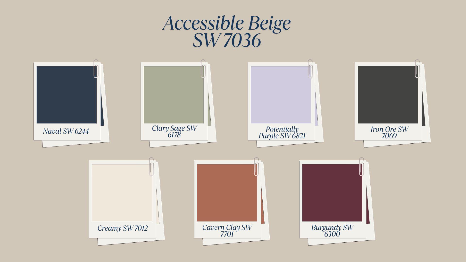
Successful color pairings:
- Naval SW 6244: Creates classic, timeless combinations
- Clary Sage SW 6178: Brings a natural, organic feeling
- Potentially Purple SW 6821: Adds gentle femininity
- Iron Ore SW 7069: Provides sophisticated contrast
- Creamy SW 7012: Offers subtle layering
- Cavern Clay SW 7701: Introduces earthy warmth
- Burgundy SW 6300: Creates a rich, luxurious mood
| Color Category | Specific Shades & Numbers | Room Applications | Design Style |
|---|---|---|---|
| Blues | Naval SW 6244, Distance SW 6243 | Living rooms, bedrooms | Traditional, coastal |
| Greens | Clary Sage SW 6178, Evergreens SW 6447 | Kitchens, bathrooms | Natural, farmhouse |
| Purples | Potentially Purple SW 6821, Grape Harvest SW 6285 | Bedrooms, sitting areas | Romantic, eclectic |
| Earth Tones | Cavern Clay SW 7701, Canyon Dusk SW 7608 | Dining rooms, dens | Southwestern, rustic |
These color partnerships work because accessible beige acts as a neutral anchor. It allows bolder accent colors to shine while providing visual stability. The combinations feel intentional rather than accidental.
What Colors Don’t Pair Well with Accessible Beige?
Certain color combinations can create muddy or unflattering results with accessible beige. These problematic pairings often stem from competing undertones or similar intensity levels. Avoiding these combinations helps maintain clean, intentional design schemes.
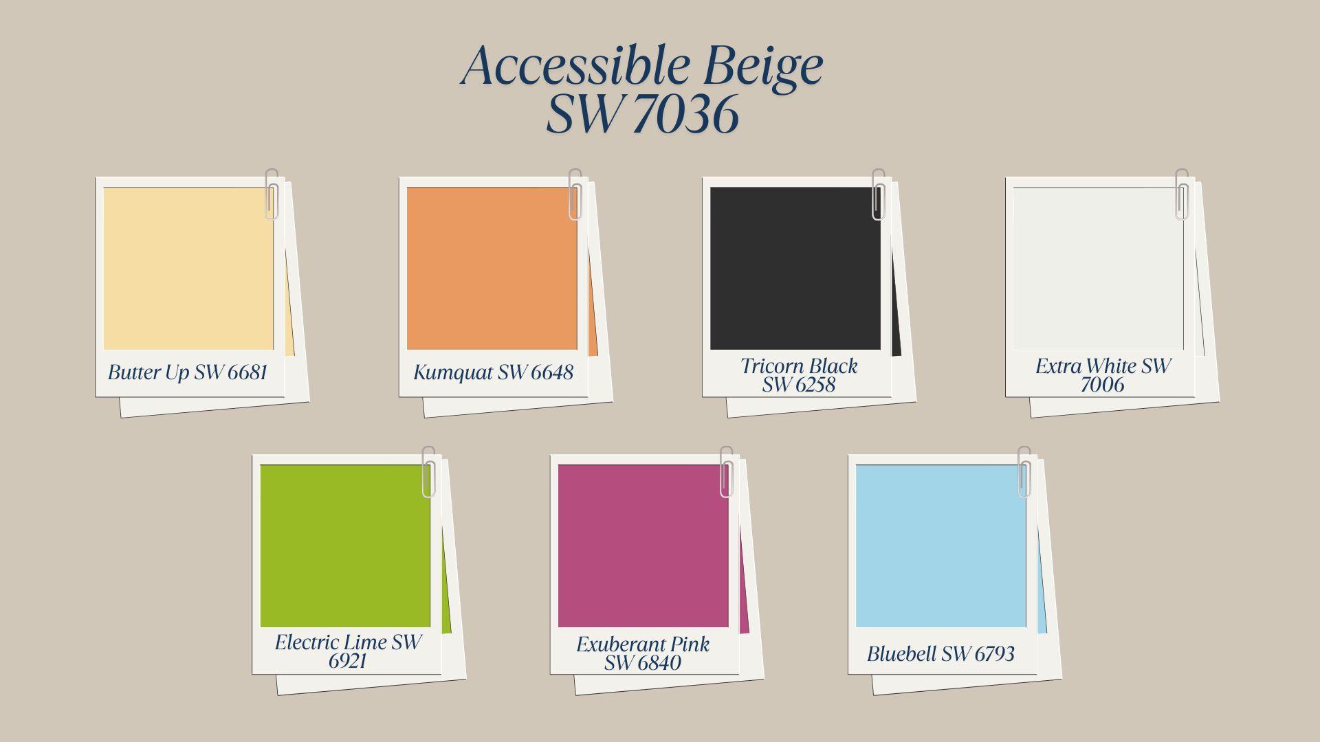
Because Accessible Beige has a balanced gray-beige base, avoid strong yellow or orange tones like Butter Up or Kumquat, which can create muddy or clashing results.
Problematic color combinations:
- Butter Up SW 6681: Competes with beige undertones
- Kumquat SW 6648: Creates a muddy appearance
- Tricorn Black SW 6258: Too harsh contrast
- Extra White SW 7006: Makes beige look dingy
- Electric Lime SW 6921: Clashes with gray undertones
- Exuberant Pink SW 6840: Creates a jarring combination
- Bluebell SW 6793: Too intense for balance
| Avoid These | Reason | Better Alternative | Alternative Code |
|---|---|---|---|
| Bright yellows | Competing undertones | Soft cream tones | Creamy SW 7012 |
| Pure white | Makes beige look dirty | Off-white shades | Natural Linen SW 9109 |
| Neon colors | Overwhelming intensity | Muted versions | Clary Sage SW 6178 |
| True black | Too stark a contrast | Charcoal grays | Iron Ore SW 7069 |
The key is to avoid colors that compete for attention or create unpleasant visual effects. When colors compete rather than complement each other, rooms feel chaotic instead of cohesive.
Stick to colors that either complement or gently contrast with the natural qualities of accessible beige.
Where Can You Use Accessible Beige?
Accessible beige works exceptionally well throughout most areas of your home. Its balanced nature makes it suitable for both public and private spaces while adapting to different functions seamlessly.
1. Living Rooms
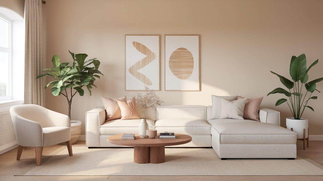
Perfect for main gathering areas where families spend most time. The color creates a welcoming atmosphere for guests while remaining comfortable for daily use.
It works with existing furniture and allows seasonal decorating changes without major renovations.
2. Bedrooms
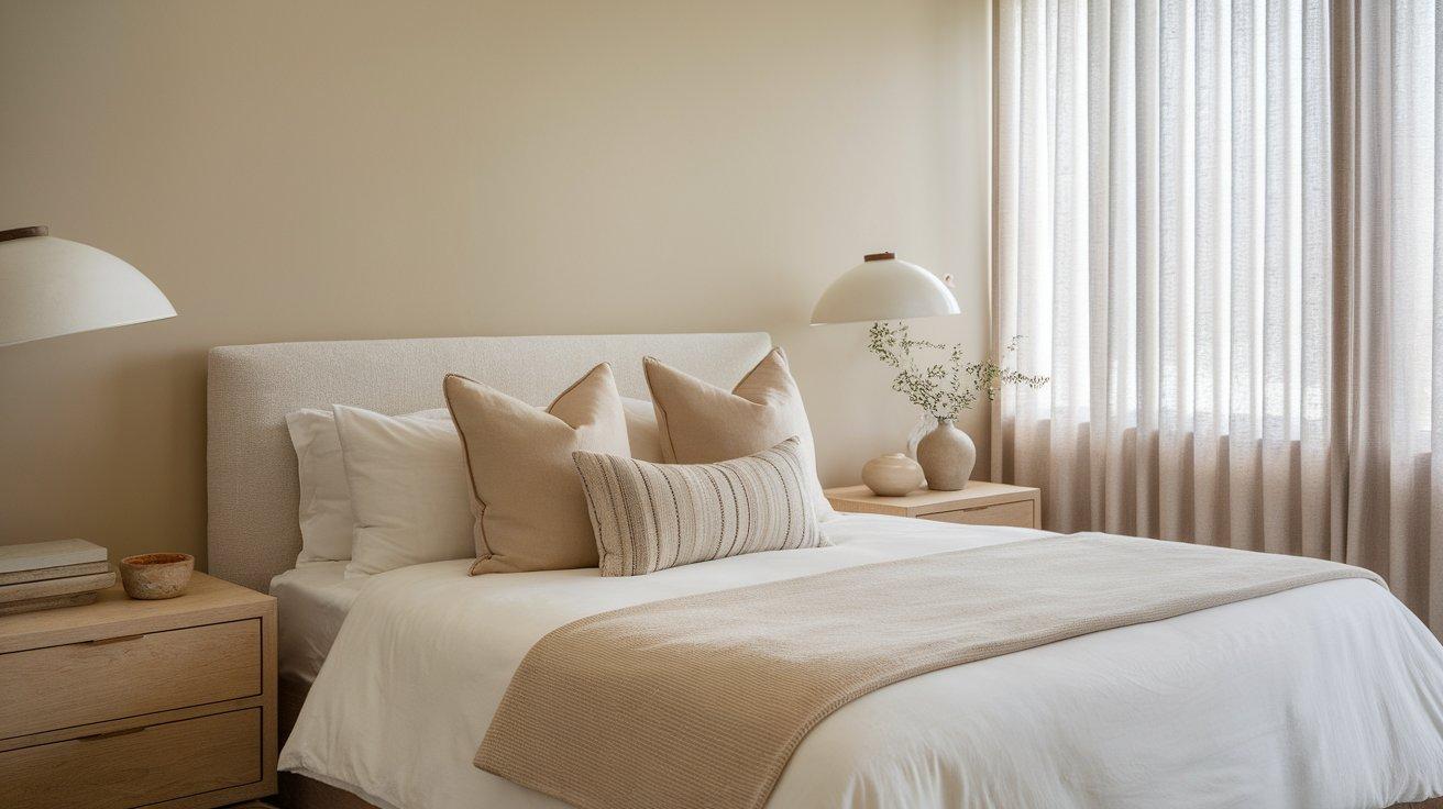
Creates calming environments conducive to rest and relaxation. The soft tone doesn’t stimulate or energize, making it ideal for sleep spaces. It coordinates well with various bedding colors and styles without competing for attention.
3. Kitchens and Dining Areas
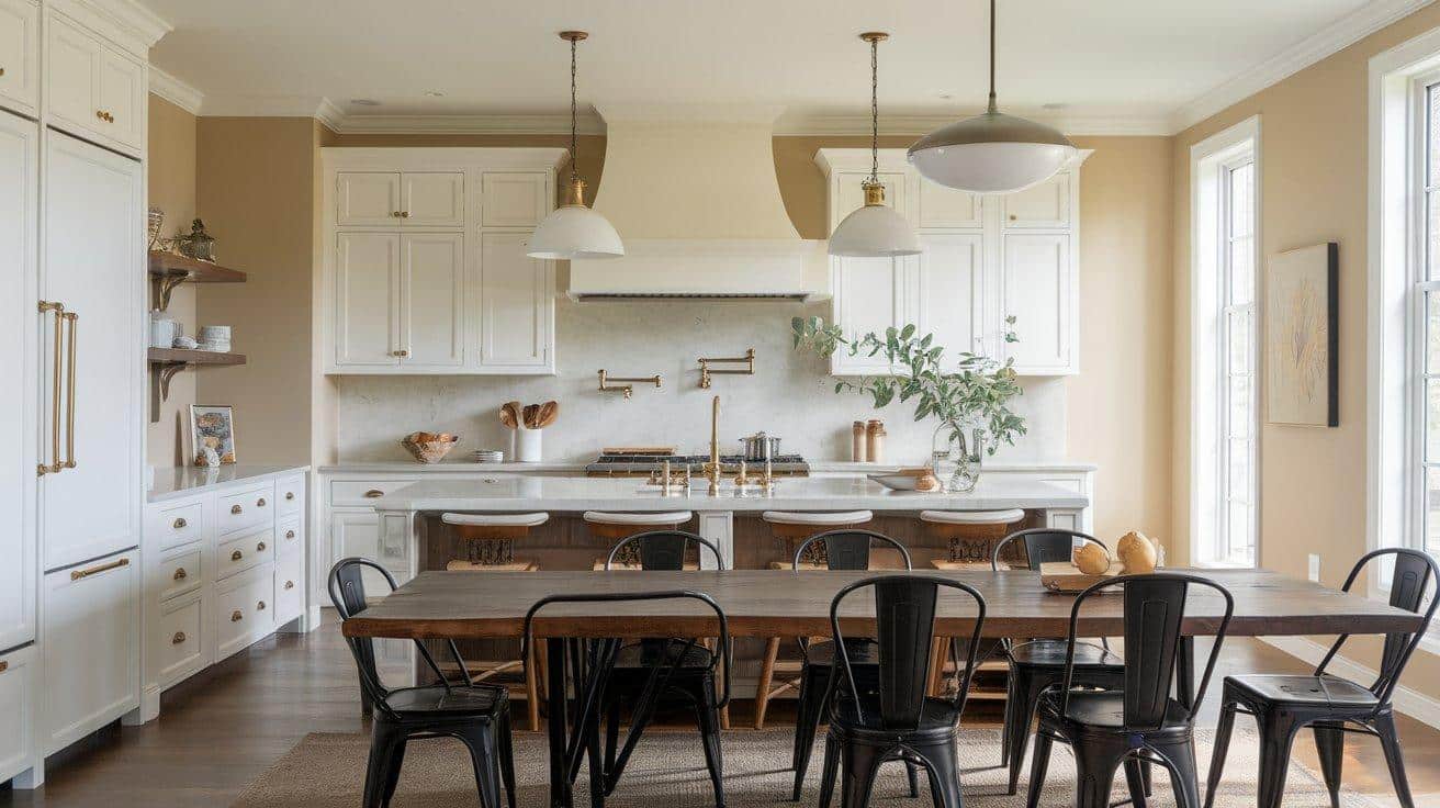
Provides a clean backdrop for cooking and entertaining spaces. The color complements both warm wood tones and cool metal finishes. It maintains freshness while adding warmth to functional areas where families gather for meals.
4. Bathrooms
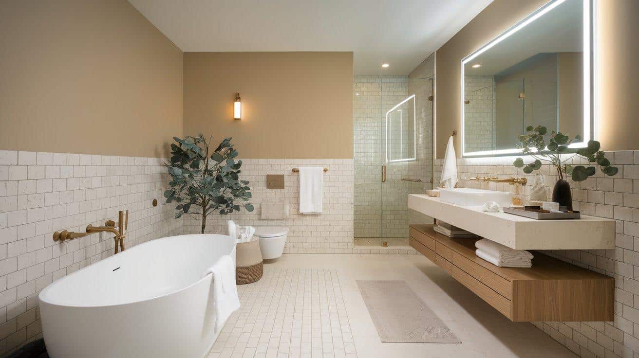
Works beautifully in bathrooms where spa-like atmospheres are desired. The neutral tone pairs well with white fixtures and various tile colors. It creates a clean, soothing environment that feels both fresh and warm for daily routines.
Conclusion
Accessible beige proves itself as more than just another neutral paint color. Its balanced undertones, versatile LRV rating, and broad compatibility make it a smart choice for various home situations.
From understanding its gray-greige undertones to exploring coordinating palettes, you now have the knowledge to use this color effectively.
The specific room applications and timing considerations help ensure successful results in your home.
This versatile neutral offers both immediate satisfaction and long-term value. Whether you’re preparing to sell, starting fresh, or wanting a reliable backdrop for changing decor, accessible beige delivers consistent performance.
What are your thoughts on using accessible beige in your next painting project? Share your experiences or questions in the comments below – I’d love to hear about your decorating plans!
Frequently Asked Questions
Is Accessible Beige Outdated?
No, accessible beige remains current and popular. Its gray-beige blend keeps it fresh compared to yellower beiges from past decades. This classic neutral continues gaining popularity.
How to Liven up a Beige Room?
Add colorful accent pieces, mix textures, include plants, and improve lighting. Use artwork, pillows, rugs, and decorative objects to create visual interest while keeping beige neutral.
What Color Neutralizes Beige?
Navy blue works excellently to balance beige tones. This classic pairing creates grounded looks while adding color depth. Navy accessories provide a perfect contrast without overwhelming beige.