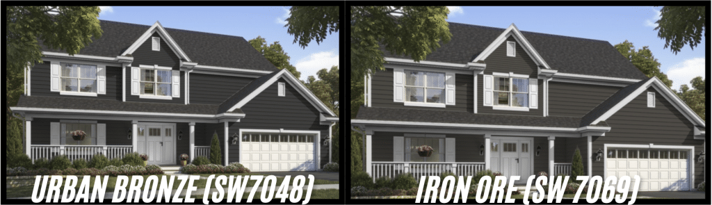
Deciding between Urbane Bronze and Iron Ore?
Both Sherwin-Williams colors bring rich depth and warmth to any room, but each creates a unique atmosphere.
Though they share similarities, their subtle differences can significantly impact your space. Urbane Bronze (SW 7048), with an LRV of 8, offers a softer, warmer feel, while Iron Ore (SW 7069) has an LRV of 6, providing a deeper, more dramatic effect.
We’ll probe the differences between these two shades, show how they look in real homes, and help you choose the perfect one for your style. Let’s find your ideal match!
Getting to Know Urbane Bronze and Iron Ore
Let’s start by looking at what makes these colors stand out. Both offer rich depth and warmth, but their distinct features suit different settings and styles.
Spotlight on Urbane Bronze (SW 7048)
Urbane Bronze is a deep, refined neutral that sits between gray and brown. With an LRV of 8, it absorbs light while maintaining its true color, offering a warm, rich feel.
The paint features soft gray undertones with subtle green hints, shifting slightly depending on lighting.
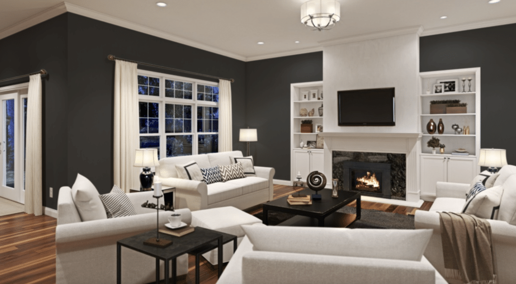
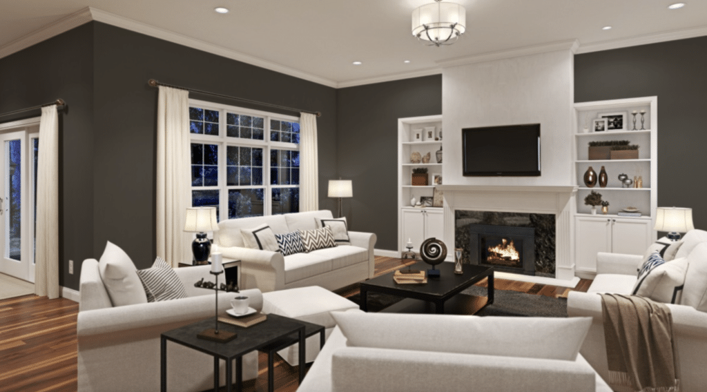
In spaces with plenty of natural light, Urbane Bronze reveals its full depth, creating a cozy, grounded atmosphere. It blends seamlessly with wood tones and natural materials, making it perfect for bridging indoor and outdoor environments.
This color enhances the ambiance of any room, giving it a unified, pulled-together look while providing a comforting, earthy vibe.
Exploring Iron Ore (SW 7069)
Iron Ore takes a different approach with its deeper tone and LRV of 6. This means it absorbs even more light than Urbane Bronze, giving it a more substantial presence.
While some might call it black paint, it’s a soft black that shows subtle warmth, especially in bright spaces.
What sets Iron Ore apart is how it changes in different lighting. In bright spaces, it reads as a rich, deep tone that adds definition without feeling heavy.
In areas with less light, it creates clear borders and strong statements, perfect for accent pieces or focal points.
The Role of LRV in Color Perception
Understanding Light Reflectance Values (LRV) helps you choose the right color for your space. LRV measures how much light a color reflects, with values ranging from 0 to 100—lower numbers reflect less light.
Urbane Bronze has an LRV of 8, while Iron Ore has an LRV of 6. This slight difference means Iron Ore will appear deeper in the same room. In spaces with little natural light, both colors will create a cozy, intimate feel.
In brighter rooms, both colors perform well, but their depth differs. Urbane Bronze reveals more color shifts throughout the day, while Iron Ore maintains its rich, consistent tone.
The Science of Undertones
Paint colors are like onions – they have layers. The main color you see first isn’t the whole story. Underneath, undertones add depth and character, changing how a color looks in different lights and next to other colors.
Think of undertones as the secret ingredients in your favorite recipe. You might not spot them immediately, but they make all the difference in the final result. This is key when comparing urbane bronze vs iron ore, as their undertones set them apart.
A Closer Look at Undertones
The Complex Undertones of Urbane Bronze
Urbane Bronze brings a mix of gray and green undertones to your walls. In morning light, you might notice more of its gray side. As the sun moves, those green notes start to show through.
This color doesn’t just sit on your walls – it moves with the light.
The mix of undertones makes Urbane Bronze work well with natural materials. Put it next to wood trim or stone features, and you’ll see how it pulls these elements together.
The color leans into its gray side in north-facing rooms, while southern light brings more warmth.
The Subtle Depths of Iron Ore
Iron Ore plays its undertones close to the vest. While it has warm green undertones, they’re more subtle than those in Urbane Bronze. Iron Ore often reads as a soft black that adds structure to a space without overwhelming it.
You might catch glimpses of these undertones in bright natural light, especially outdoors. Iron Ore often acts as a true neutral, making it a reliable choice for creating contrast. This subtle depth lets it work well with warm and cool color schemes.
How Light Affects These Colors
Natural light shows these colors in different ways throughout the day. In the morning light, Urbane Bronze might show more of its warmth, while Iron Ore maintains its steady presence.
North-facing rooms tell a different story – here’s what you need to know about each direction:
| Room Direction | Urbane Bronze | Iron Ore |
|---|---|---|
| North-Facing | It takes on a cooler look while maintaining depth | Maintains a rich, soft black appearance |
| South-Facing | Displays a full range of gray and green notes | Softens slightly while keeping true nature |
| Note | Requires good lighting | Requires good lighting |
Urbane Bronze and Iron Ore Side-by-Side Comparison
Interior Applications
Both colors stand out in different ways inside your home. Let’s look at where each one works best:
| Aspect | Details |
|---|---|
| Primary Undertones | Gray and green |
| Morning Light Effect | Gray undertones are more prominent |
| Afternoon/Evening Light Effect | Green undertones become more noticeable |
| Color Movement | Changes with light throughout the day |
| Best Pairings | Natural materials like wood trim or stone features |
| Effect in North-Facing Rooms | Leans into its gray side, cooler tones |
| Effect in South-Facing Rooms | Warmer tones come through, enhanced by natural light |
Exterior Applications
| Feature | Urbane Bronze | Iron Ore |
|---|---|---|
| Full House | Creates a welcoming feel, works with traditional styles, suits modern farmhouse | Creates bold statement, adds drama |
| Trim | Adds subtle definition, blends naturally | Makes sharp lines, high contrast look |
| Accents | Classic look on shutters, natural on garage doors | Bold front doors, strong window frames |
Similar Color Comparison
| Alternative Color | Compared to Urbane Bronze | Compared to Iron Ore |
|---|---|---|
| Peppercorn | More gray, less brown | Lighter, less depth |
| Tricorn Black | Significantly darker | Darker, true black |
| Black Fox | Warmer, more brown | Similar depth, warmer |
Drawing Inspiration for Your Style
Your choice between urbane bronze and iron ore shapes how your space feels. Both colors create distinct atmospheres, but they speak different design languages.
Modern Minimalist
Urbane Bronze settles into modern spaces with a gentle touch. It balances bright white walls and adds a layer of interest without taking over. The color makes sleek furniture stand out while keeping the space grounded.
Iron Ore confidently steps up the modern game. It creates clear lines and shapes in minimal settings, turning simple walls and features into strong statements. The color turns basic spaces into photo-worthy spots.
Traditional Spaces
Urbane Bronze works magic in traditional rooms. It respects classic style while adding a fresh feel. The color makes crown molding and built-ins look special, turning standard features into eye-catching elements.
Iron Ore brings new life to traditional spaces. It outlines beautiful trim work and makes architectural details sing. The color adds structure to formal rooms without feeling too bold.
Farmhouse Fresh
Urbane Bronze fits right into the farmhouse style. It works with wood beams, shiplap, and natural stone. The color feels at home next to vintage pieces and cotton textiles.
Iron Ore gives farmhouse style a current edge. It makes white walls look crisp and clean while adding definition to doors and windows. The color brings out the best in metal fixtures and lighting.
Conclusion
Choosing between Urbane Bronze and Iron Ore impacts the mood and appearance of your space.
Urbane Bronze (LRV 8) offers a warm, calm vibe with its brown-gray base and subtle green undertones, evolving with natural light throughout the day. It’s ideal for creating a relaxed, connected feel.
On the other hand, Iron Ore (LRV 6) is a deep, steady color that defines any area with bold, clear lines, perfect for making strong statements.
Your decision depends on your room’s lighting, style, and desired atmosphere—both colors can transform your space, so pick the one that best fits your vision.