Benjamin Moore Vintage Taupe: A Color for Every Mood
I’m going to show you everything about Benjamin Moore’s Vintage Taupe, a paint color that will look perfect in any room of your home.
As a color expert who has used this shade in over 50 home projects, I can tell you it’s one of the most flexible, neutral colors I’ve worked with.
My clients consistently rate it 5/5 for its ability to create warm and cool moods, depending on the lighting and decor choices.
Let me walk you through why this color might be exactly what you’re looking for in your next paint project.
Benjamin Moore Vintage Taupe: Color Description
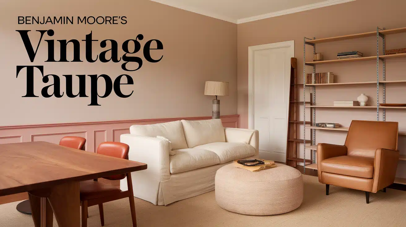
Let me tell you about Benjamin Moore’s Vintage Taupe (2110-70), a color I’ve known quite well. It’s a soft beige with a gentle pink hint, creating the kind of feel that makes any room feel more peaceful.
Let me break down its key features:
- A medium-depth neutral shade
- A perfect mix of 60% gray and 40% brown
- Soft and muted, never too dark or light
- A hint of warmth that feels welcoming
When you look at this shade at different times of day, you’ll notice how the pink undertones play with the beige base. It’s subtle—never overwhelming—but adds just enough warmth to make spaces feel lived-in and comfortable.
Undertones and LRV of Vintage Taupe
Looking closely at Vintage Taupe, I see a beautiful mix of undertones that make it special. The main stars here are:
- A soft pink undertone that adds warmth
- Gentle beige notes that ground the color
- Slight gray hints that keep it balanced
Let me explain the LRV (Light Reflectance Value) in simple terms. Think of LRV as a number that tells you how much light a color bounces back into your room. Vintage Taupe’s LRV of 82.41 means it reflects lots of light – about 82% of what hits it.
This high LRV means:
- Small rooms feel more open
- Dark corners become brighter
- The color looks lighter in sunny spots
- It may appear slightly darker in shadowy areas
Warm or Cool?
I’d put Vintage Taupe in the warm color family. The pink undertones give it that cozy, welcoming feel. However, it’s not overly warm – it maintains a nice balance.
Here’s how this warmth affects different spaces:
- Living rooms feel more inviting
- Bedrooms become more restful
- Home offices stay professional while feeling comfortable
- Dining rooms gain a subtle glow
Tips for Using Benjamin Moore Vintage Taupe in Interior Design
Here’s what I’ve learned about making the most of Vintage Taupe in different spaces:
In Living Areas
- Pair it with white trim for clean lines
- Add natural wood furniture to bring out its warmth
- Use cream-colored upholstery to create smooth transitions
- Include black accent pieces for contrast
In Bedrooms
- Match it with soft white bedding for a calm feel
- Use bronze or brass light fixtures to enhance the pink undertones
- Add textured throw pillows in similar tones
- Layer with light gray curtains for depth
In-Home Offices
- Combine with white bookcases for a fresh look
- Include dark brown desk furniture for grounding
- Use natural fiber rugs to add texture
- Add green plants for life and color
Lighting Tips
- Place lamps in corners to spread light evenly
- Use white LED bulbs to show true color
- Make the most of natural light with sheer curtains
- Install dimmer switches to control the mood
Pairing Benjamin Moore Vintage Taupe with Other Colors
1. Soft Earthy Haven
Vintage Taupe (2110-70) works beautifully on walls, paired with Pale Oak (OC-20) for ceilings or adjoining spaces and Desert Tan (2153-50) for flooring or rugs, creating a natural, grounded look
- Best Rooms/ Where to Use This Idea: • Living room • Home office • Bedroom
- Complementary Decor Elements: • Wooden furniture • Beige or cream textiles • Earthy green plants
2. Chic Romantic Escape
Vintage Taupe (2110-70) creates a warm backdrop for walls, while Coral Spice (2170-40) adds soft, romantic accents to art or furniture, and Light Pewter (1464) offers a delicate trim or secondary wall color.
- Best Rooms/ Where to Use This Idea: • Bedroom • Dining room • Powder room
- Complementary Decor Elements: • Blush-toned fabrics • Gold or brass accessories • Floral patterns
3. Rustic Charm
Vintage Taupe (2110-70) sets a warm tone on walls, complemented by Rustic Taupe (2110-50) for accent walls or built-ins and Golden Straw (2152-50) for furniture or throw pillows.
- Best Rooms/ Where to Use This Idea: • Living room • Entryway • Study
- Complementary Decor Elements: • Rustic wooden furniture • Woven baskets • Neutral-toned rugs
4. Bold Minimalism
Vintage Taupe (2110-70) creates a neutral foundation for walls, paired with Kendall Charcoal (HC-166) on statement furniture or doors and White Dove (OC-17) for trim and ceilings.
- Best Rooms/ Where to Use This Idea: • Bedroom • Home office • Hallway
- Complementary Decor Elements: • Sleek metallic accents • Minimalist artwork • Geometric rugs
5. Garden Serenity
Vintage Taupe (2110-70) provides a calming backdrop for walls, paired with Tranquility (AF-490) in accent pieces or textiles and Black Forest Green (HC-187) for furniture or window frames.
- Best Rooms/ Where to Use This Idea: • Sunroom • Bedroom • Reading nook
- Complementary Decor Elements: • Indoor plants • Natural fiber rugs • Botanical artwork
6. Playful Sophistication
Vintage Taupe (2110-70) serves as a soft canvas for walls, enhanced by Spring Meadow (2029-40) in rugs or vases and Gray Owl (OC-52) for trim or neutral accents.
- Best Rooms/ Where to Use This Idea: • Living room • Playroom • Kitchen
- Complementary Decor Elements: • Bright cushions • Abstract art • Light wood furniture
7. Modern Coastal Retreat
Vintage Taupe (2110-70) is a soft canvas for walls, complemented by muted green-blue in accents or furnishings and a light blue-gray accent wall or textiles for a calming coastal feel.
- Best Rooms/ Where to Use This Idea: • Living room • Bedroom • Bathroom
- Complementary Decor Elements: • Woven baskets • Driftwood accents • Nautical-inspired decor
Furniture That Makes Vintage Taupe Shine
Benjamin Moore’s Vintage Taupe is so friendly with furniture – it’s one of the reasons I keep coming back to it in my designs.
Let’s start with wood tones. I’ve found that natural wood pieces beautifully bring out Vintage Taupe’s warmth. Think of a rich walnut dining table or a light oak bookshelf – both work wonderfully.
The key is to mix your wood tones:
- Light woods (oak, maple, birch) add brightness
- Medium woods (walnut, cherry) create balance
- Raw or unfinished wood adds texture
When it comes to upholstered pieces, I love working with neutral fabrics. Your sofa and chairs can blend in or stand out – it’s your choice.
Here’s what I often suggest:
For a subtle look:
- Cream linen sofas
- Light gray velvet chairs
- Beige textured ottomans
For more contrast:
- White cotton armchairs
- Tan leather pieces
- Charcoal gray accent chairs
Playing with Textures and Patterns
Texture is where Vintage Taupe comes to life. I tell my clients to think of their room like a cozy sweater – they want different knits that work together.
Here’s how I layer textures:
Soft Elements: Think plush rugs under your feet, smooth cotton throws on your sofa, and silk pillows that catch the light. These soft touches make a room feel finished and lived-in.
Hard Elements:
- Glass coffee tables reflect light
- Metal photo frames add shine
- Ceramic vases bring clean lines
- Woven baskets add a natural touch
With Vintage Taupe walls, patterns can be your best friend. I usually start with one main pattern and build from there.
My go-to combinations include:
- Small dots on throw pillows
- Thin stripes on curtains
- Basic checks on chair seats
These work so well because they don’t fight with the wall color – they complement it.
Comparing Vintage Taupe to Other Taupe Shades
| Color Name | Description | Subtle Differences | Best Applications |
|---|---|---|---|
| Vintage Taupe (2110-70) | Soft beige with a gentle pink hint, warm and calming. | Slightly warmer and softer than other taupe shades. | Bedrooms, living rooms, spaces needing warmth and comfort. |
| Smokey Taupe (983) | Neutral taupe with gray undertones, cooler and more muted. | Cooler and more gray compared to Vintage Taupe. | Kitchens, bathrooms, modern minimalist spaces. |
| Waynesboro Taupe (1544) | Medium taupe with green undertones, earthy and grounding. | Darker and earthier than Vintage Taupe. | Home offices, dining rooms, spaces needing depth. |
| Shaker Beige (HC-45) | Light beige with warm golden undertones, soft and bright. | Brighter and more golden than Vintage Taupe. | Hallways, living rooms, transitional areas. |
| Brandon Beige (977) | Balanced beige with neutral undertones, versatile and adaptable. | More neutral and less pink compared to Vintage Taupe. | Family rooms, open-concept spaces, versatile areas. |
What Top Interior Designers Say About Vintage Taupe
Let me share a secret – I recently chatted with my favorite design buddies about Vintage Taupe, and their eyes lit up! Here’s the inside scoop on why they can’t get enough of this color.
“It’s like the perfect cup of coffee with just the right amount of cream,” says my friend Sarah, who’s painted over 30 living rooms. She swears by:
- Using it in zoom meeting backgrounds
- Painting all walls for a cozy hug
- Adding bright white trim for pop
My colleague Tom calls it his “miracle worker” because:
- It makes small rooms feel bigger
- It helps connect different room styles
- Looks good morning to night
I have to agree with my design friends – in my 15 years of painting homes, I’ve never seen a color that makes clients smile like this. It just feels right!
Final Thoughts on Vintage Taupe
After spending time with Benjamin Moore’s Vintage Taupe, I can tell you it’s more than just another neutral paint color. It’s like having a faithful friend who makes every room feel just right.
Remember, this shade combines the best beige and pink with an LRV of 82.41, keeping spaces bright and open.
Whether you’re painting your living room, bedroom, or home office, Vintage Taupe plays well with woods, metals, and fabrics of all kinds.
Ready to try it in your home? Start with a test patch and watch how it changes throughout the day. If you’re working on a bigger project, save this guide for later—your walls will thank you!
Want more paint color insights? Don’t forget to check out my other color guides!
