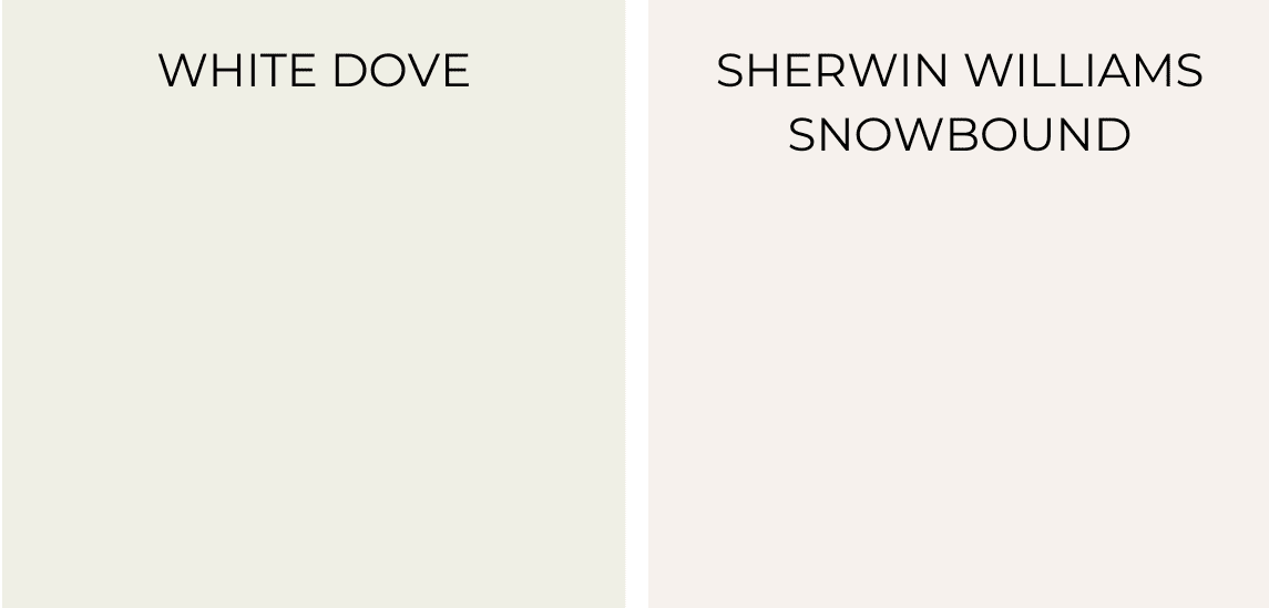
Sherwin William’s Snowbound Vs. White Dove to Choose From
Living with plain walls isn’t fun – I know because I spent months looking at paint samples.
White paint colors can be tricky, and homeowners often find themselves stuck choosing between Sherwin Williams Snowbound and Benjamin Moore White Dove.
I’ve worked with both these shades in different lighting conditions and spaces. I’ll help you understand the key differences between these whites.
In this guide, I’ll show you how each color looks in various rooms, explain their undertones, and share tips from my real experience to help you make the right choice for your home.
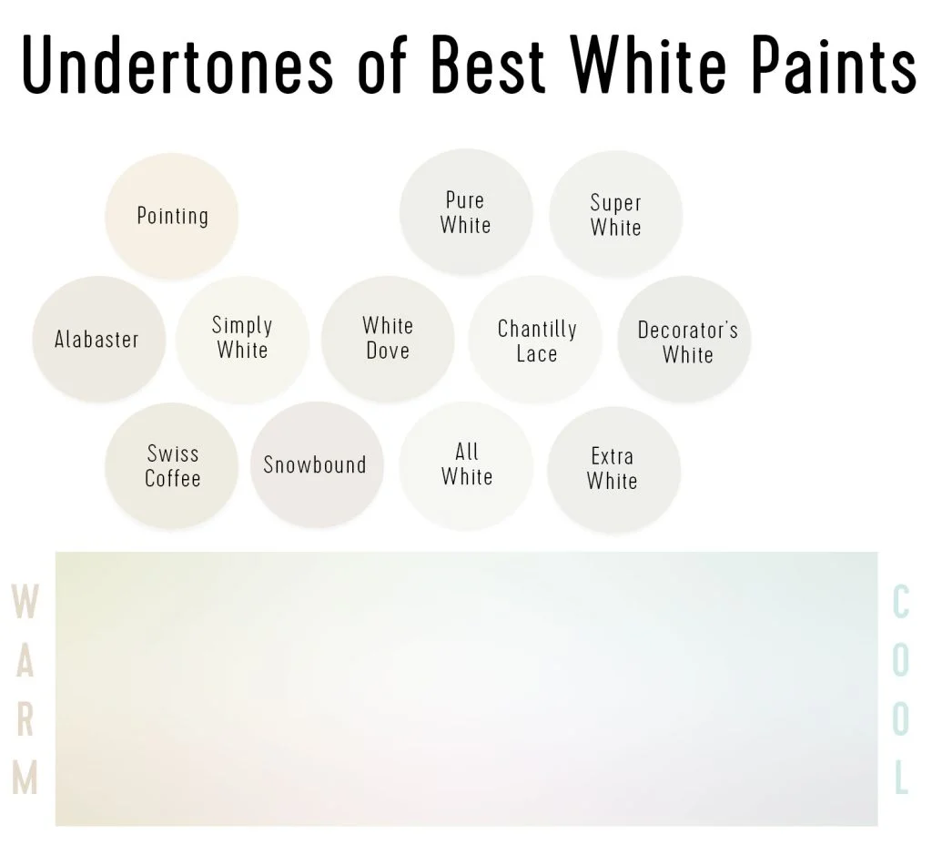
An Overview of White Paint Undertones
Between snowbound vs white dove, the main thing is that they aren’t just white – I learned this after testing many samples in my home. The hidden colors mixed into white paint create undertones that alter the perception of the color in your space.
Here are the main undertones in white paints:
- Yellow undertones make whites feel warm and soft
- Blue or gray undertones create a cooler, crisper look
- Green undertones can make whites appear fresh and clean
- Pink undertones add a gentle warmth different from yellow
When I test white paint, I look at it in both natural daylight and lamplight. The undertones show up differently as lighting changes throughout the day.
A quick tip from my experience: Put a pure white paper next to your paint sample. This simple test helps me spot the undertones more easily.
Brief About Sherwin William’s Snowbound
With a light reflectance value of 83, it brings brightness without glare. I love how this painting stays true to its color in both natural and artificial light.
Through my projects, I’ve seen it work beautifully in living rooms, bedrooms, home offices, and even on trim and cabinets.
The gray undertones help control unwanted yellow tints, making it a reliable choice for any room direction.
When my clients want a clean, bright space without the harshness of pure white, Snowbound often perfectly meets their needs.
Brief About Sherwin William’s White Dove
The paint has a light reflectance value of 85, which gives rooms a bright, welcoming feel. What makes this shade unique is its perfect balance – it’s warm but not yellow, soft but not dull.
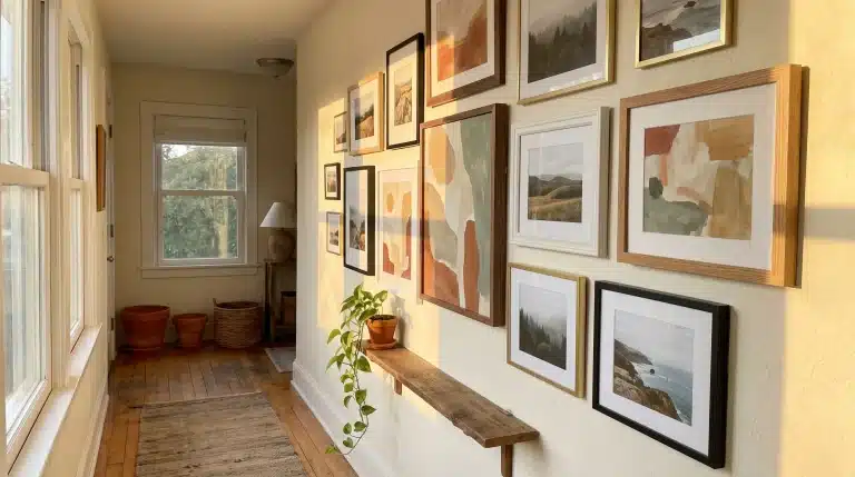
I’ve noticed it looks great in both morning and evening light, adapting nicely to different times of day. From my experience, White Dove stands out in kitchens, living areas, and bathrooms.
It’s also a top pick for trim work because it pairs well with other colors. I like how it creates a cozy atmosphere without feeling too creamy or stark.
Snowbound Vs. White Dove – Which One to Choose
| Feature | Snowbound | White Dove |
|---|---|---|
| Color Tone | Cooler white with soft gray undertones | Warmer white with creamy undertones |
| Light Reflectance Value | 83 | 85 |
| Best Use Cases | – Modern spaces with clean lines | – Traditional or farmhouse styles |
| – Rooms with plenty of natural light | – South-facing rooms | |
| – North-facing spaces that need brightening | – Kitchen and living spaces | |
| – Office spaces and trim work | – Areas wanting a warmer feel | |
| Visual Examples | – Brighter in direct sunlight | – Warmer in shaded areas |
| – Gray undertones appear in natural light | – Cozy, welcoming glow in evening light | |
| Pros | – Clean, bright appearance | – Warm, welcoming feel |
| – Reduces yellow tints | – Flexible in different light conditions | |
| – Works well with modern decor | – Great for trim work | |
| – Good light reflection | – Pairs well with many colors | |
| Cons | – Can feel cold in dark rooms | – Can look cream in certain lighting |
| – Might look too stark in small spaces | – Shows shadows more easily | |
| – Needs good lighting to shine | – Might be too warm for some spaces |
Sherwin-Williams White Dove Paint Specifications and Details
White Dove has an LRV of 85.38, making it sufficiently bright for most spaces while still maintaining a warm tone.
White Dove belongs to the yellow color family, which gives it natural warmth through subtle cream undertones that make spaces feel welcoming rather than sterile.
The paint remains consistent under various lighting conditions, ensuring minimal color shifts throughout the day. You can choose White Dove in multiple finish options to suit your needs.
The flat finish works well for low-traffic areas, such as bedrooms. Eggshell or satin finishes are perfect for living spaces and hallways, while semi-gloss works best for trim, doors, and high-moisture areas like bathrooms and kitchens.
Which Side to Choose? Snowbound vs White Dove
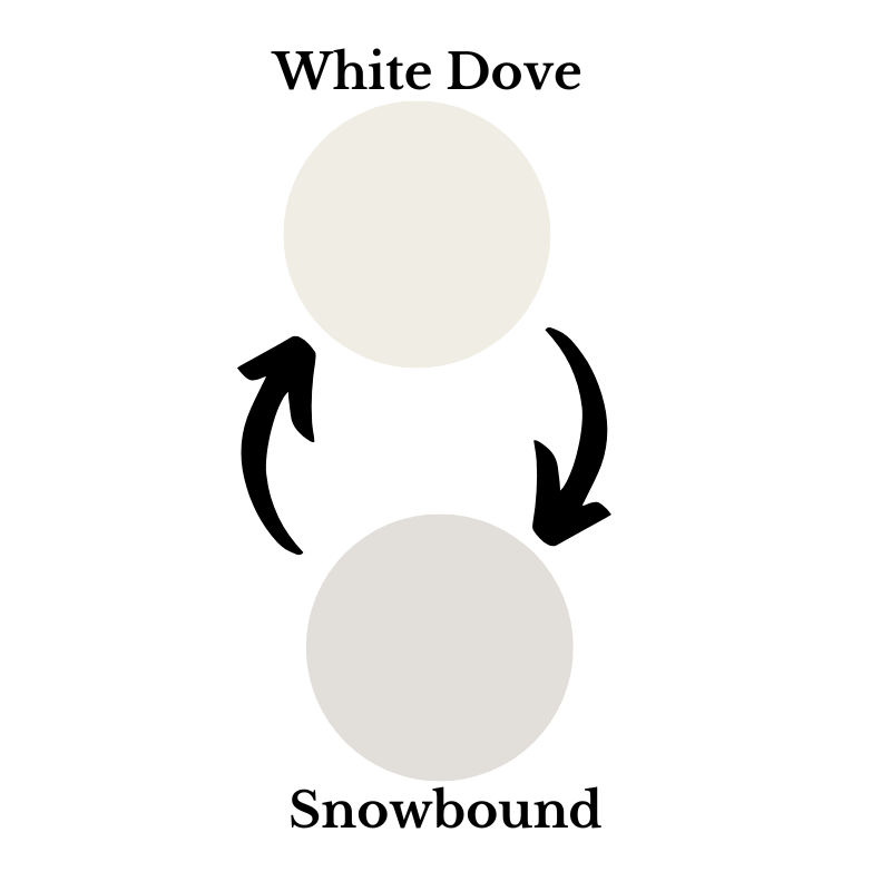
1. Lighting Conditions Your room’s natural light changes everything. North-facing rooms can feel cold, so White Dove’s warmth comes to the rescue. South-facing rooms get plenty of sun, making Snowbound’s cool tones work perfectly.
2. Room Purpose The wrong white kills a room’s vibe instantly. White Dove makes dining rooms feel cozy and inviting. Snowbound provides offices with the crisp, focused energy you need to get work done.
3. Existing Colors Most people mess this up. Snowbound makes gray and blue decor look stunning. White Dove pairs beautifully with wood furniture and earthy colors, creating a magazine-worthy look.
4. Room Size Small rooms with White Dove feel like warm retreats. Large rooms with Snowbound become bright, airy spaces that feel twice as big. It’s a clever application of color psychology.
5. Time of Day Watch your space change throughout the day. Morning rooms love Snowbound’s fresh, energizing feel. Evening spaces with White Dove create the perfect atmosphere for relaxation and unwinding.
Best Alternative White Paint Undertones to Consider
Bright White Options
These whites provide clean, crisp results with no color hints. I use them when clients want pure white walls that remain true under different lighting conditions.
- Pure White by Sherwin-Williams has a light reflectance value of 84
- Oxford White creates transparent, actual white walls perfect for art studios
- Both work well in modern homes with lots of natural light
Warm White Choices
Warm whites add comfort to your space without turning yellow or cream. I suggest these for rooms where you want cozy feelings but still need brightness.
- Swiss Coffee brings gentle warmth that’s less creamy than White Dove
- Simply White offers fresh looks while keeping spaces cozy
- Perfect for bedrooms and living rooms that need extra warmth
Cool White Selections
Cool whites have subtle gray notes that create sophisticated looks. My clients choose these for spaces that require a clean, modern feel.
- Chantilly Lace stands out with its clean, crisp appearance
- Decorator’s White adds subtle gray notes without looking too cold
- Both work great in bathrooms and kitchens
Neutral White Picks
Neutral whites balance warm and cool tones perfectly. I recommend these for whole-house color schemes because they work in any room.
- Cloud White maintains a perfect balance between warm and cool
- White Heron shows different personalities throughout the day
- Both stay flexible and work with any room style
Best Paint Combinations
Mixing different whites creates depth and interest in your home. I use these combinations to add visual texture without using bold colors.
- Light Gray walls with White Heron trim
- Cream walls with Swiss Coffee details
- Pure White walls with Oxford White trim
Where to Buy White Dove Paint and Pricing Information
Where to Buy White Dove Paint
You can find White Dove at any Sherwin-Williams retail location nationwide, and I always recommend that clients visit stores for color matching and expert advice from our staff. Sherwin-Williams also offers online ordering with home delivery or store pickup, which works great when you know exactly what you need and want to save time.
- Available at all Sherwin-Williams retail stores nationwide
- Staff can help with color matching and recommendations
- Order online from Sherwin-Williams‘ official website
Expected Pricing and Coverage
White Dove pricing varies by finish and paint line, but I help clients budget properly. One gallon typically covers about 350-400 square feet with proper application.
- Prices range from $50 to $80 per gallon, depending on paint line
- One gallon covers approximately 350-400 square feet
- Consider primer costs if painting over dark colors
Conclusion
After testing both colors in different homes, I understand why the snowbound vs white dove debate matters so much to homeowners.
Both whites can change how your space feels and functions. Your final choice depends on your room’s lighting, size, and purpose. If you prefer clean, bright spaces with modern touches, Snowbound might be the perfect choice. For those seeking warmth and versatility, the White Dove could be a better option.
Remember, there’s no wrong choice – it’s about what feels right in your space.
I’d love to hear about your experience with these colors. Have you used either of these shades in your home? Share your thoughts in the comments below.
Frequently Asked Questions
Does Snowbound Look Yellow?
No, Snowbound doesn’t show yellow tints, thanks to its gray undertones. From my experience painting many rooms, it stays true to its clean white appearance in both natural and artificial light.
Can Snowbound and White Dove Be Used Together?
Yes, I’ve successfully paired these whites. Snowbound works great on walls, while White Dove shines on trim. Their slight difference in undertones creates subtle depth without clashing or looking mismatched.
Which White Paint is Best for Low-Light Rooms?
In low-light spaces, I recommend White Dove. Its warmer undertones help brighten dark corners and create a welcoming feel. Snowbound might look too gray or flat in rooms with limited light.

