Wickham Gray Benjamin Moore: Best Rooms & Color Pairings
Gray paint sounds simple until you’re standing in the paint aisle staring at 47 different shades.
Wickham Gray Benjamin Moore keeps popping up in design blogs and Pinterest boards, but does it actually work in real homes?
This color has green and blue undertones that can look completely different depending on your lighting. Some rooms make it glow. Others turn it murky.
In this guide, you’ll learn the real specs behind HC-171, how it changes throughout the day, which rooms show it off best, and what whites and accent colors pair perfectly with it.
We’ll also compare it to similar grays so you know exactly what you’re getting before you commit.
Wickham Gray Color Profile and Specs
Let’s look at what makes Wickham Gray Benjamin Moore so special. Here are the technical details you need to know.
| Specification | Details |
|---|---|
| Benjamin Moore Color Code | HC-171 |
| Color Name | Wickham Gray |
| RGB Values | R: 186, G: 186, B: 177 |
| Hex Code | #BAB9B1 |
| LRV (Light Reflectance Value) | 67.87 |
| Color Family | Gray |
| Undertones | Green and Blue |
| Finish Options | Matte, Eggshell, Satin, Semi-Gloss, High-Gloss |
| Collection | Historical Collection |
The LRV of 67.87 means this color reflects about 68% of light. This makes Wickham Gray Benjamin Moore a light-to-medium tone that works in most rooms. It’s bright enough to keep spaces feeling open and airy.
What Wickham Gray Looks Like in Different Lighting
Light changes how wickham gray benjamin moore appears throughout the day.
North-facing rooms tend to look cooler, with stronger blue and green tones. South-facing rooms bring out the best in this color, making it appear lighter and more balanced.
East-facing spaces show warm tones in the morning, then shift to cooler tones by afternoon. West-facing rooms start dim and gray but glow with golden warmth in the evening.
For night lighting, warm bulbs (2700K to 3000K) add beige tones, while cool bulbs (4000K to 5000K) bring out true gray with blue and green notes.
Best Places to Use Wickham Gray
Wickham gray Benjamin Moore works in many spaces, but some rooms show it off better than others. Let’s look at where this color shines and where you need to be careful.
1. Living Rooms and Open Layouts
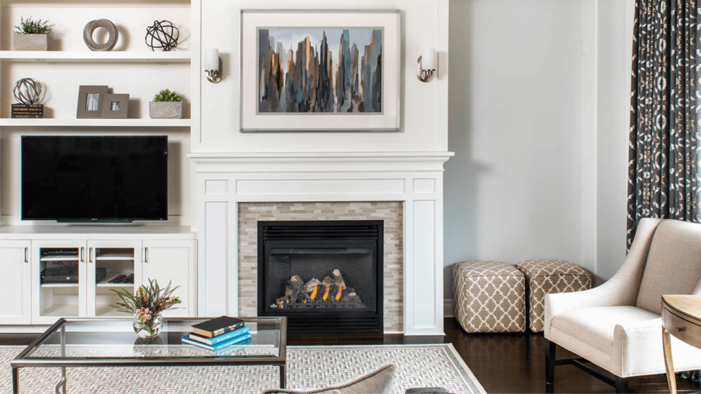
This color creates a soft neutral background that lets your furniture and decor stand out, and it pairs beautifully with wood tones, brass, black metals, and mixed finishes without competing for attention.
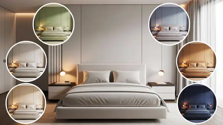
2. Bedrooms
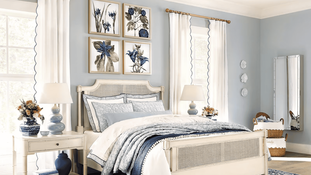
Wickham Gray Benjamin Moore has a calming effect that helps you relax, and you can keep it cozy by adding textured textiles, layered bedding, and pairing it with warm white trim instead of stark white.
3. Kitchens and Cabinets
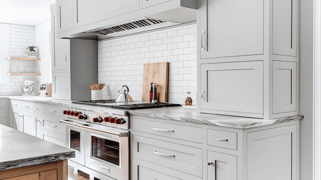
It works best on walls rather than cabinets, where the green undertones can look muddy, and coordinates well with white quartz, marble-look counters, and stainless steel appliances when used as a wall color.
4. Bathrooms
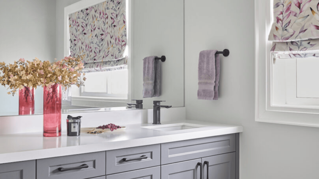
Wickham gray Benjamin Moore pairs nicely with white subway tile and chrome fixtures, but use satin or semi-gloss sheen in bathrooms to handle humidity and make cleaning easier.
5. Hallways and Low-Light Spaces
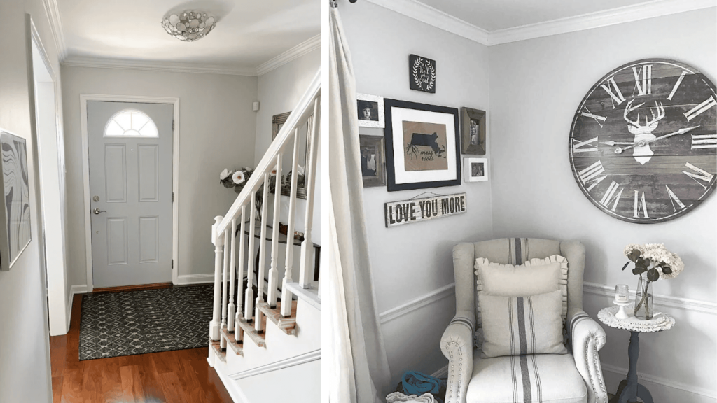
Many light grays go flat and lifeless in dim hallways, but Wickham Gray can skew moodier and show more green in darker spaces, so test it first or choose a brighter alternative if your hall has no windows.
6. Exterior Use

Test wickham gray benjamin moore on your exterior by checking how it looks in shade, with your landscaping reflection, and against your roof color, because it can read too cool or green outside depending on surrounding colors and light conditions.
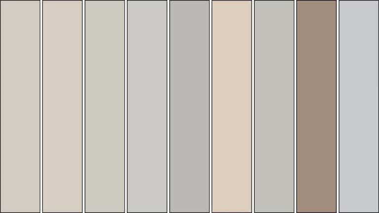
Best Coordinating Colors for Wickham Gray
Wickham gray Benjamin Moore pairs well with many color schemes. Here are the best ways to create a cohesive look in your space.
Monochrome Palette
- Lighter grays: Try Benjamin Moore Classic Gray (OC-23) or Stonington Gray (HC-170) for ceilings and trim
- Deeper grays: Use Chelsea Gray (HC-168) or Kendall Charcoal (HC-166) for contrast
- Placement tips: Add darker tones on kitchen islands, bathroom vanities, built-in shelving, or one accent wall to create visual interest
Cool and Airy Palette
- Blue accents: Pair wickham gray benjamin moore with soft blues like Palladian Blue (HC-144) or Gray Wisp (1570)
- Soft whites: Use White Dove (OC-17) or Simply White (OC-117) for trim and ceilings
- Pale woods: Light oak, whitewashed pine, or blonde maple complement the cool undertones perfectly
Warmer Balance Palette
- Warm neutrals: Balance the coolness with Edgecomb Gray (HC-173), Accessible Beige (SW 7036), or warm beige tones
- Natural textures: Add jute rugs, rattan furniture, terracotta pots, and honey-toned wood pieces
- Warm whites: Choose Linen White (912) or Swiss Coffee (OC-45) instead of cool whites
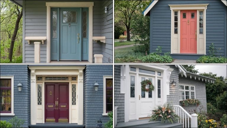
Pop of Color Accents
- Muted navy: Try Hale Navy (HC-154) for a classic look on doors or built-ins
- Dusty teal: Van Deusen Blue (HC-156) adds personality without overwhelming the space
- Soft sage:Saybrook Sage (HC-114) works beautifully with the green undertones in Wickham Gray Benjamin Moore
Wickham Gray vs Similar Benjamin Moore Colors
Choosing between similar grays can feel confusing. Here’s how Wickham Gray Benjamin Moore compares to other popular options.
Wickham Gray vs Gray Owl
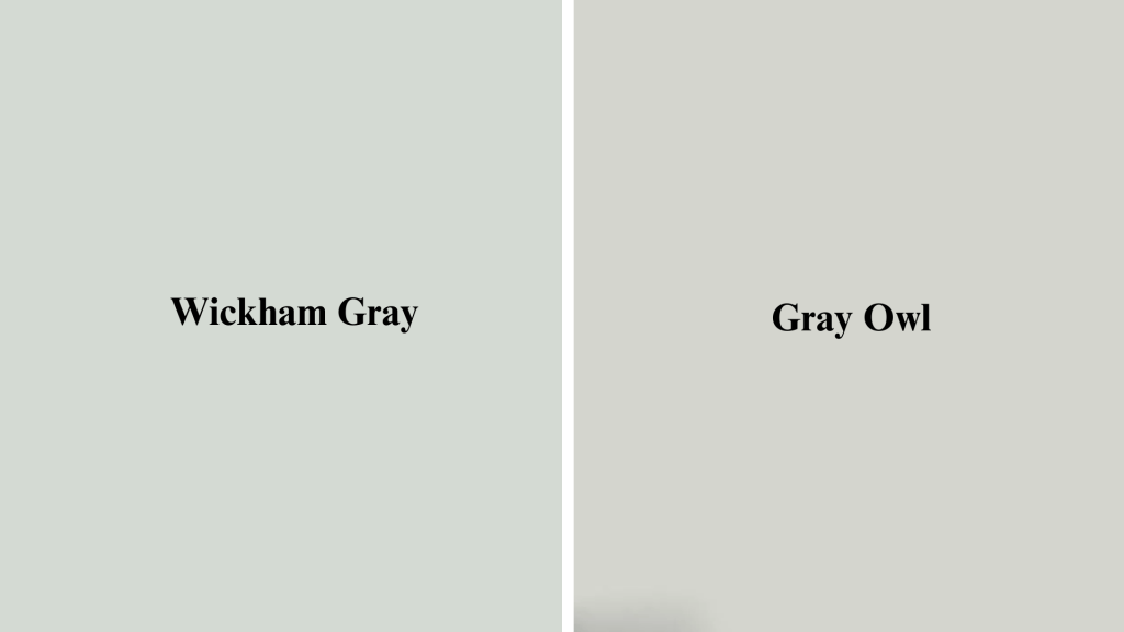
Gray Owl (OC-52) leans more blue and reads cooler than Wickham Gray.
People typically notice that Gray Owl feels crisper and more modern, while Benjamin Moore Wickham Gray has visible green undertones that make it softer and warmer.
Gray Owl also has a slightly higher LRV at 65, so it reflects more light.
Wickham Gray vs Stonington Gray
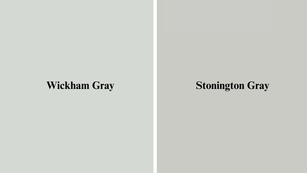
Stonington Gray (HC-170) is deeper with an LRV of 59, making it read darker and stronger on walls. Wickham Gray Benjamin Moore feels lighter and airier, with more green showing through.
Stonington works better for dramatic looks, while Wickham Gray suits spaces where you want subtle color without going too bold.
Wickham Gray vs Classic Gray
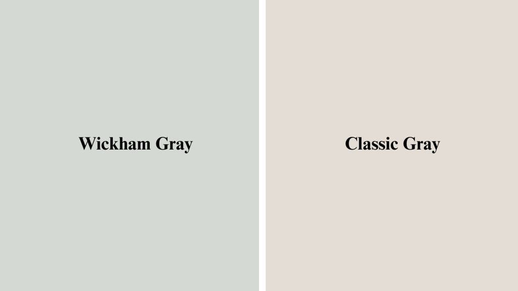
Classic Gray (OC-23) tends to appear warmer and greener when placed next to Wickham Gray.
The warmth comes from the beige undertones in Classic Gray, while Benjamin Moore Wickham Gray stays cooler with its blue and green base.
Classic Gray works in spaces where you want warmth, but Wickham Gray is better for a true soft gray look.
| Other Close Matches Readers Cross-Shop:
Many people also compare Wickham Gray (Benjamin Moore) with Revere Pewter (HC-172), Agreeable Gray (SW 7029), and Balboa Mist (OC-27). Place all swatches together on the same wall and watch how each color changes from morning to evening. Test them in your own space before committing, because your lighting will affect how each gray looks. |
Pairing Wickham Gray with Trim, Ceilings, and Whites
Getting the right white pairings makes all the difference with Wiccahams Gray Benjamin Moore. Here’s what works best for trim, ceilings, and accent colors.
| Element | Best Options |
|---|---|
| Crisp White Trim | Simply White (OC-117), Chantilly Lace (OC-65) |
| Warm White Trim | White Dove (OC-17), Linen White (912) |
| Ceilings | White Dove (OC-17) or the same color in flat sheen |
| Door Accents | Hale Navy (HC-154), Kendall Charcoal (HC-166) |
| Hardware | Matte black, aged brass, polished nickel |
Should You Choose Wickham Gray Benjamin Moore?
Wickham gray Benjamin Moore works best if you want a soft, versatile gray that stays calm without feeling flat.
It’s perfect for bright rooms with good natural light where the green and blue undertones can shine. This color suits you if you like neutral backgrounds that pair well with different decor styles.
However, skip it if your space has limited natural light or faces north, as the cool undertones can feel too gray or green. Also pass if you prefer true warm grays or greiges, since this leans cooler.
Test it in your space first by getting a sample and watching how it changes throughout the day.
If you love how it looks in both morning and evening light, Benjamin Moore Wickham Gray is a solid choice that won’t disappoint.
Wrapping It Up
Wickham Gray Benjamin Moore is a beautiful soft gray when used in the right space. It works best in rooms with good natural light where the green and blue undertones can balance properly.
Remember to test it on your walls first and watch how it changes from morning to evening. Pay attention to your room’s orientation and lighting before making the final call.
This color pairs well with both crisp and warm whites, giving you flexibility with trim choices. If you want a neutral that feels calm without being boring, Wickham Gray Benjamin Moore delivers.
Ready to try it in your space? Grab a sample pot and paint a large swatch on your wall. Live with it for a few days and see how you feel.
Have questions or want to share your Wickham Gray results? Drop a comment below and let’s talk about it.