Choosing between similar paint colors can feel like solving a puzzle. Agreeable Gray and Repose Gray are top choices for many homeowners, yet telling them apart isn’t simple.
Most people struggle to spot the tiny differences between these popular grays. The wrong choice might clash with your furniture or make rooms feel cold.
This guide breaks down the agreeable gray vs repose gray, key differences in tone, lighting effects, and room suitability between these shades. You’ll learn which gray works better in your space and decor.
Read on to find the perfect gray to make your walls look exactly how you want them.
Understanding the Paint Colors
Agreeable gray vs Repose gray are two of the most popular neutral paint colors, each offering a unique blend of warmth and subtle undertones. Understanding their differences in undertone and light reflectance can help you choose the perfect shade to complement your home’s style and lighting.
Agreeable Gray (SW 7029)
Agreeable Gray by Sherwin-Williams carries an LRV of 60, making it a lighter gray with warm undertones. Its RGB values (209, 203, 193) create a soft, warm feel that works well in living rooms and bedrooms.
This warm gray has slight beige undertones that show up in different lighting. It pairs well with white trim and wood tones. Agreeable Gray works best in south-facing rooms with lots of natural light.
Many home stagers pick this color for its ability to appeal to most people. This shade helps rooms feel bigger while providing enough color for visual interest. The hex code of agreeable gray is #D1CBC1.
Repose Gray (SW 7015)
Repose Gray by Sherwin-Williams has an LRV of 58, slightly darker than Agreeable Gray. Its RGB values (204, 201, 192) produce a cooler gray with subtle purple undertones.
This color shines in north-facing rooms and modern spaces with clean lines. Repose Gray works well in offices, hallways, and bathrooms. It creates a calm feeling without making spaces look cold.
The color changes throughout the day, showing more blue tones in evening light. Repose Gray pairs nicely with bright white trim and silver fixtures. Many designers choose it for its clean, simple look. The hex code of repose gray is #CCC8BF.
Background & Context Agreeable Gray and Repose Gray
Agreeable Gray vs Repose Gray, two popular neutral paint colors from Sherwin-Williams, are celebrated for their versatility and timeless appeal in interior design. While both offer a warm, calming backdrop, their subtle differences in undertones make them uniquely suited to various lighting conditions and aesthetic preferences.
The Rise of Gray in Modern Interiors
Gray has taken over home design in recent years. This shift happened as people moved away from the beige tones of the early 2000s.
Homeowners love gray for its ability to work with almost any style. It fits with the farmhouse, with modern and classic looks alike.
Gray walls offer a perfect base for colorful furniture and art. Unlike white, gray adds depth to rooms. Unlike beige, it feels fresh and current.
Gray also works well with both warm and cool accent colors. This makes updating a room’s look much easier over time.
About the Paints
Sherwin Williams is one of America’s oldest paint companies, founded in 1866. The brand has built trust through years of quality products. Their paints offer good coverage and lasting color.
Agreeable Gray and Repose Gray are two of Sherwin Williams’ best-selling colors. Both appear on countless walls across the country. Home stagers often pick these shades when preparing houses for sale.
Designers suggest them to clients who want colors that work in any setting. These grays have earned their spot at the top through their simple good looks.
Agreeable Gray vs Repose Gray Comparison Chart
Choosing between Agreeable Gray and Repose Gray can be challenging, as both are popular neutral paint colors with subtle differences. This comparison chart makes it easy to see how these shades differ in undertone, light reflectance, and overall feel.
| Feature | Agreeable Gray (SW 7029) | Repose Gray (SW 7015) |
|---|---|---|
| LRV (Light Reflectance Value) | 60 | 58 |
| Undertones | Warm beige/brown undertones | Cool blue/purple undertones |
| RGB Values | 209, 203, 193 | 204, 201, 192 |
| Design Style Match | Farmhouse, traditional, casual styles | Modern, minimalist, clean styles |
| Morning Light Effect | Appears warmer, more beige | Appears true gray |
| Evening Light Effect | Becomes softer, more muted | Shows more blue/purple tones |
| Trim Color Pairings | Pure White, Alabaster, off-whites | Extra White, Bright White, crisp whites |
| Flooring Match | Works well with warm wood tones | Pairs with cool-toned floors, gray tile |
| Feeling Created | Cozy, welcoming, soft | Clean, calm, clear |
A Side-By-Side Room Comparison
Seeing Agreeable gray vs Repose gray applied in real rooms helps highlight their unique characteristics. A side-by-side comparison allows you to visualize how each color interacts with lighting and decor.
The following are a few comparisons of Agreeable Gray vs. Repose Gray.
1. Bedroom
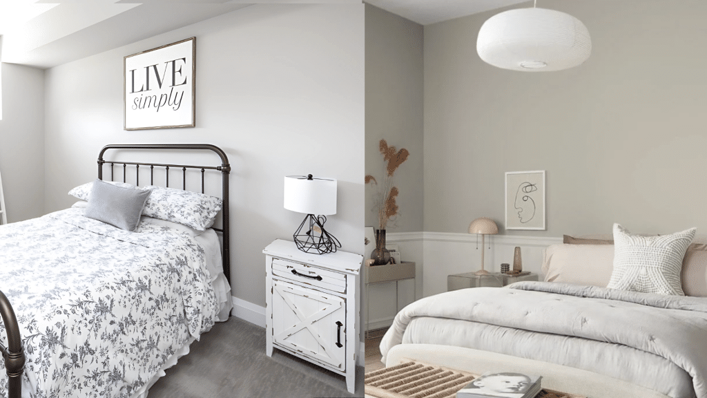
Agreeable Gray creates a warm feeling that helps with sleep and rest when used in bedrooms. It looks softer as the evening comes, working well with cream or beige bedding. The warm tones pair nicely with brass fixtures and make the space cozy without darkness.
In contrast, Repose Gray brings a cool, quiet feel to bedrooms that can make them seem larger.
It gains a light purple look in dim light and works better with white or blue bedding. This cooler gray matches with silver fixtures and creates an open, airy space for sleeping.
2. Kitchen
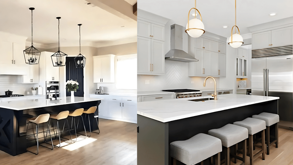
Agreeable Gray works well in kitchens with wood cabinets and stone counters in earth tones. It looks fuller in natural light and makes the kitchen feel more like home. Food often looks better against this warmer gray tone.
Repose Gray offers a different kitchen look, pairing with white or gray cabinets and marble or quartz tops.
It keeps its clean look under all types of lights and makes steel items stand out more. This gray creates a neat cooking space that feels fresh and tidy.
3. Living Room
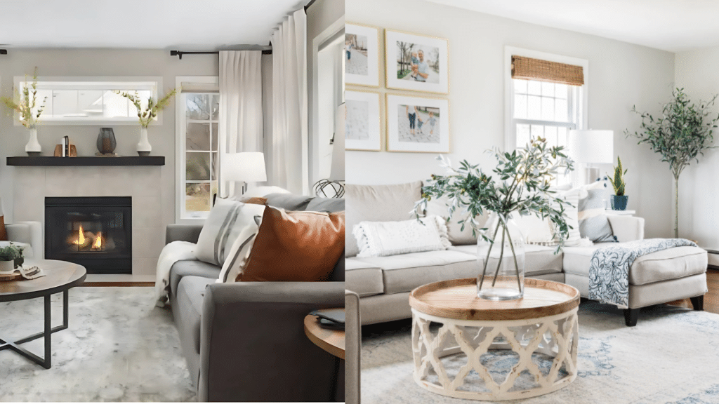
Agreeable Gray gives living rooms a warm setting for family time and guests. It fits with tan, brown, or cream furniture and looks great in rooms that have fireplaces.
In west-facing spaces, it shows more of its beige side as the day progresses. This color helps rooms feel lived-in and cozy for guests.
Repose Gray brings a sharp, clean look to living areas, working with gray, white, or blue furniture. The art looks better against it, showing its true color in north-facing rooms. The space feels more open and slightly more formal with this gray.
4. Bathroom
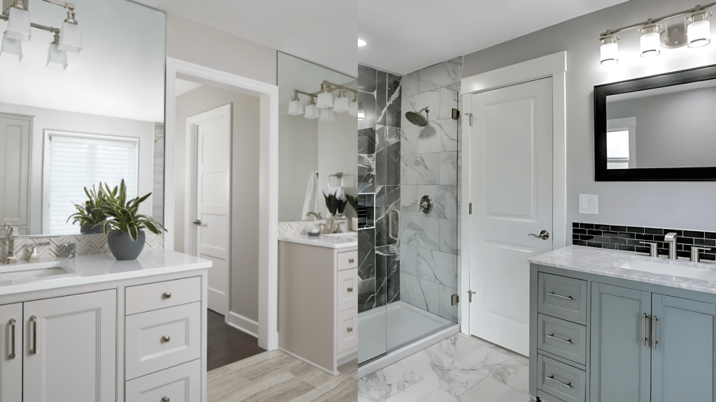
For bathrooms, Agreeable Gray adds warmth to a room that often feels cold. It works with beige or tan tiles and gold water fixtures.
The color helps soften harsh lights around mirrors and sinks. Many people find it creates a spa-like feel in their bath space.
Repose Gray gives bathrooms a clean, fresh look that matches white or gray tiles. It brings out the best chrome bath fixtures and helps light bounce in small spaces.
This gray shade creates a neat, hotel-like feel that many find clean and crisp.
The Pros and Cons of Agreeable Gray and Repose Gray
Both Agreeable Gray and Repose Gray have their strengths and drawbacks, making them suitable for different spaces and preferences. Understanding the pros and cons of each can help you make a more informed decision for your home.
Agreeable Gray
Pros: Agreeable Gray offers a warm feel that works in most homes. Its slight beige hints create a soft look that blends with many styles, from farmhouse to simple modern.
This color welcomes guests into a space and looks good with white and wood tones. It hides marks and scuffs better than lighter colors. Most rooms look good in this shade, making it a safe choice for whole-house color plans.
Cons: Agreeable Gray can look more beige than gray in some lights. This shift might not suit those who want a true gray look. It may seem too warm in rooms that get lots of yellow light.
The color might not fit spaces that aim for a stark, clean style. It also changes more than some other colors as the day goes on, which some find hard to plan around.
Repose Gray
Pros: Repose Gray gives a clean look that fits well in current homes. It works as a quiet canvas for bright items and bold art pieces.
The color creates an open feel in small spaces and brings a calm mood to busy areas. It pairs well with bright whites for a sharp, clear look—many like how it stays true to its gray tones in most lights.
Cons: This color might feel too cold if not mixed with warm items like wood or soft fabrics. In evening light, it can show hints of blue or purple that some don’t expect.
It lacks the cozy sense that warmer grays bring to a space. In dark rooms with little sun, it may look flat or dull. Homes with warm woods might find that this gray clashes with their built-ins.
Tips for Choosing Your Perfect Gray
Selecting the ideal gray paint involves more than just picking a shade from a swatch. Consider factors like natural light, room size, and existing furnishings to ensure your chosen gray increases your space beautifully.
1. Consider Room Direction
- North-facing rooms get cooler light – Agreeable Gray helps warm these spaces up.
- South-facing rooms get warm, yellow light – Repose Gray keeps these areas from feeling too warm.
- East-facing rooms are brightest in the morning – both grays work well here
- West-facing rooms get afternoon warmth – colors will look more yellow later in the day
2. Test Paint Samples Properly
- Buy sample pots of both colors
- Paint large squares (at least 2 feet by 2 feet) on different walls
- Look at the samples during morning, noon, and evening
- Check how they look under both natural light and your home’s lighting
- Place samples next to your trim, flooring, and main furniture
3. Match to Your Home’s Features
- Wood tones matter – warm woods pair better with Agreeable Gray
- Consider your floors – cool tile works better with Repose Gray
- Look at fixed elements like countertops and cabinets
- Think about metal finishes – brass works with Agreeable, chrome with Repose
4. Consider the Big Picture
- Think about the flow between rooms if using different colors
- Consider the mood you want – warm and cozy or cool and fresh
- Look at how the colors work with your whole house color plan
- Ask yourself which color makes you feel better when you see it
Conclusion
Agreeable Gray vs Repose Gray comes down to your room, light, and style. Both colors offer good options for today’s homes with a different feel.
Agreeable Gray brings warmth and comfort to spaces, working well with wood and earth tones. Repose Gray gives a cleaner look that fits with whites and cool colors.
The right gray can make a room look exactly as you want it. Test both colors on your walls at different times of day. Watch how they change with the sun and your lights, and notice which makes you smile when you see it.
In the end, the perfect gray is the one that makes your home feel right to you. Trust what you see and how the color makes you think.