
What color cabinets will still look good in ten years?
This question keeps many homeowners like you awake at night. Kitchen renovations cost thousands of dollars. Nobody wants their choices to feel outdated quickly.
Certain cabinet shades remain relevant across decades. These shades complement various decor trends. They transition smoothly as styles evolve. Your kitchen stays fresh year after year.
Picking the right cabinet color sets the foundation. It significantly impacts the overall appearance of your kitchen.
The perfect shade creates a space you’ll love. It also adds value to your home.
Ready to find your perfect cabinet color?
Let’s find out various color options that stand the test of time. These choices will keep your kitchen looking great for years to come.
How to Choose the Right Timeless Color for Your Kitchen?
Begin by considering the natural light in your kitchen. North-facing rooms need warmer tones. South-facing spaces can accommodate a broader range of fabulous shades. Light affects how colors appear throughout the day.
Think about your home’s overall style. Traditional homes suit classic whites and creams. Modern spaces work well with grays and blacks. Pick tones that harmonize with your home’s design bones.
Consider these factors when choosing:
- Flooring color and material: Dark cabinets need lighter floors for balance, while light cabinets work with any flooring shade.
- Countertop selections: Your cabinet color should complement counter patterns and veining without competing for attention.
- Backsplash options: Busy backsplashes require solid cabinet colors, while simple tiles allow for more varied cabinet colors.
- Appliance finishes: Stainless steel pairs well with most colors, but black appliances restrict cabinet choices to lighter shades.
- Wall colors: The adjacent wall paint should contrast sufficiently with the cabinets to clearly define the spaces.
Test paint samples on cabinet doors. Live with them for several days. Notice how they look at different times. Light shifts throughout the day can alter perception.
Don’t forget about maintenance needs. Lighter colors show dirt more easily. Darker shades hide fingerprints better. Choose based on your lifestyle and cleaning habits.
29 Timeless Kitchen Cabinet Colors
Check these 29 cabinet colors that stand the test of time. Each shade offers unique benefits and styling opportunities. These colors have proven their staying power through decades of design trends.
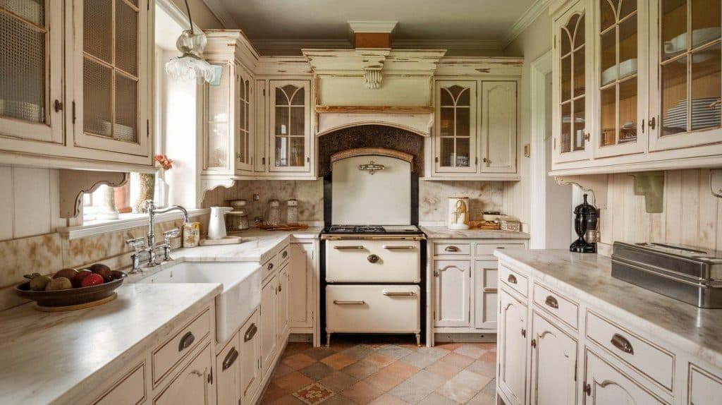
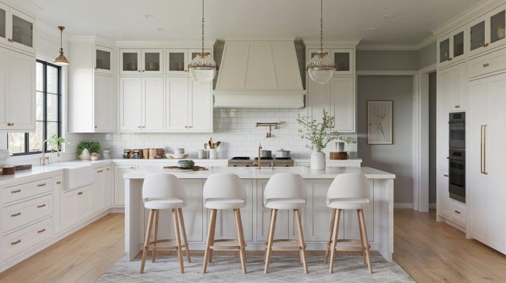
1. Pure White
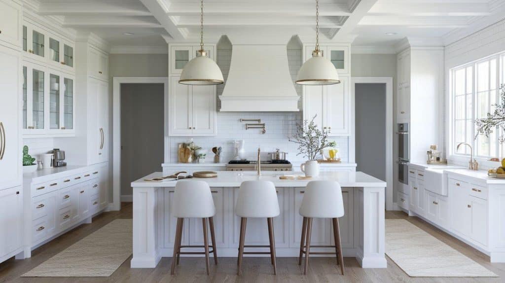
Pure white cabinets create clean, bright kitchens. This shade works in any style of home. It reflects light, making spaces feel larger. White pairs with every accent color imaginable.
Maintenance requires more attention with pure white. Spills and marks show quickly. Regular cleaning keeps them looking fresh. The effort pays off in versatility.
Pro tip: Use semi-gloss or high-gloss finishes. They’re easier to wipe clean. Matte finishes show wear faster.
2. Off-White
Off-white offers warmth without yellowing. This softer alternative to pure white feels cozy and inviting. It seamlessly bridges traditional and contemporary styles. The subtle undertones add depth.
Popular off-white shades include Swiss Coffee and Cloud White. These colors hide imperfections better than stark white. They create inviting atmospheres in any kitchen.
Key consideration: Check undertones in your lighting. Some off-whites lean pink, others yellow or gray.
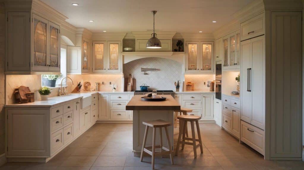
3. Cream
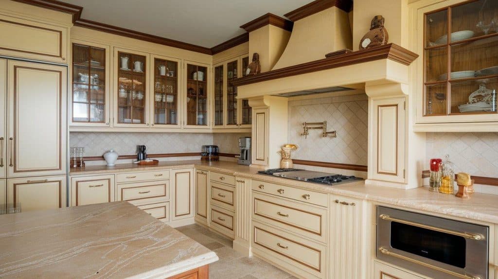
Cream cabinets bring warmth to kitchens. This classic choice suits traditional and transitional spaces. The yellow undertones create welcoming environments. Cream works beautifully with wood accents.
This color ages gracefully over time. Minor wear blends into the warm tones. Cream cabinets feel timeless and comfortable.
Styling tip: Pair with oil-rubbed bronze or brass hardware for a classic look. These warm metals enhance the cream’s cozy feel.
4. Greige
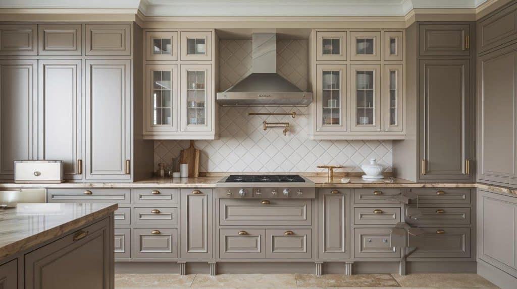
Greige, a fusion of gray and beige, effortlessly balances warm and cool undertones. Its understated elegance adapts gracefully to shifting trends, offering a polished yet welcoming foundation for any kitchen.
The color works with various hardware finishes. Both brass and chrome complement greige beautifully. This flexibility makes updating simple.
Key note: Greige acts as a chameleon color. It shifts appearance based on surrounding colors and lighting.
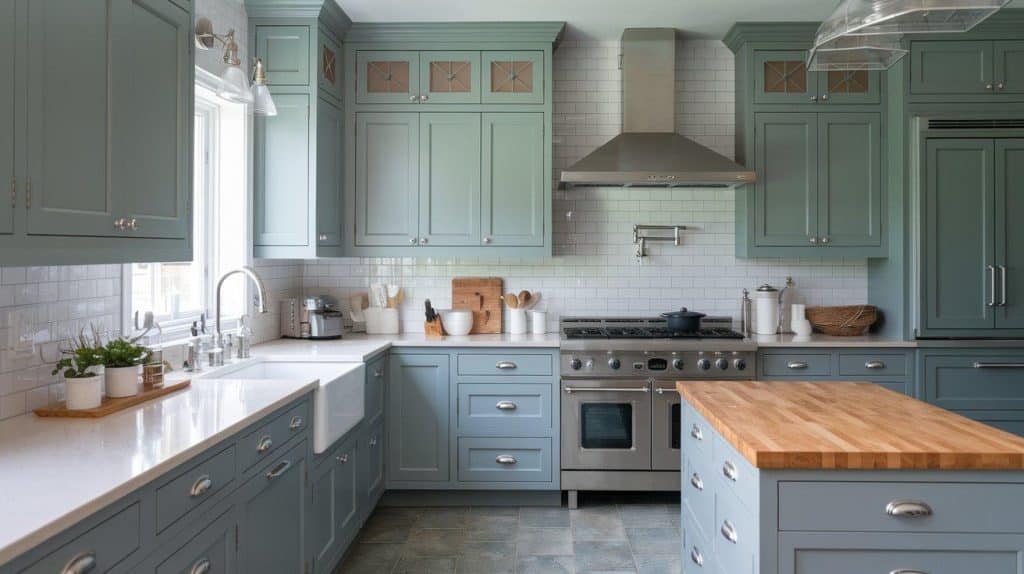
5. Warm Gray
Warm gray adds a touch of elegance without feeling stark. The subtle brown undertones prevent coldness. Works across contemporary and classic layouts. Provides a soothing base for bold accents.
This versatile color complements a wide range of design elements. Both natural wood and metallic finishes work well. Warm gray provides endless styling options.
Important note: Always check how light from different directions affects the tone. Cool light can make warm gray appear flat.
6. Taupe
Taupe offers an understated style. This brown-gray blend has an earthy and grounded feel. It complements natural materials beautifully. Taupe cabinets create serene kitchen environments.
The color hides well in daily wear. Minor scratches blend into the neutral tone. This makes taupe practical for busy families.
Pro tip: Layer different taupe shades for depth. Use lighter taupes on walls with darker cabinet tones.
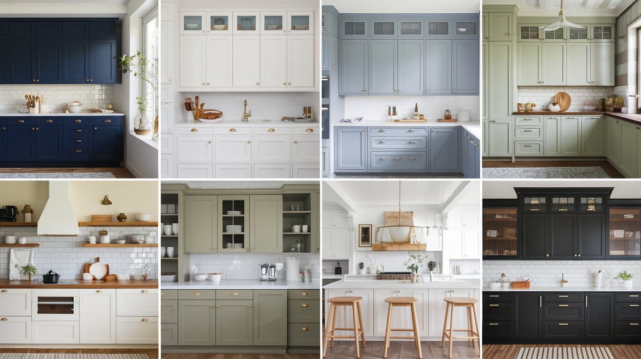
7. Navy Blue
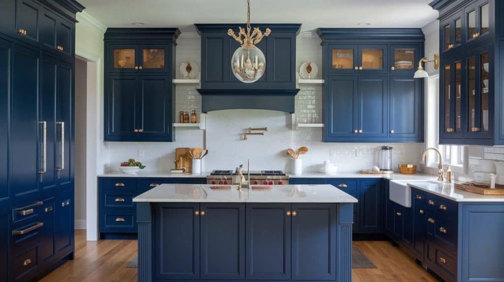
Navy blue makes a classic statement. This deep shade feels both traditional and fresh. It adds color without overwhelming spaces. The Navy works as a neutral in many designs.
The richness of the navy creates focal points. It grounds kitchen designs effectively. This color commands attention while remaining timeless.
Styling tip: Mix navy lowers with white uppers. This combination prevents heaviness in smaller kitchens.
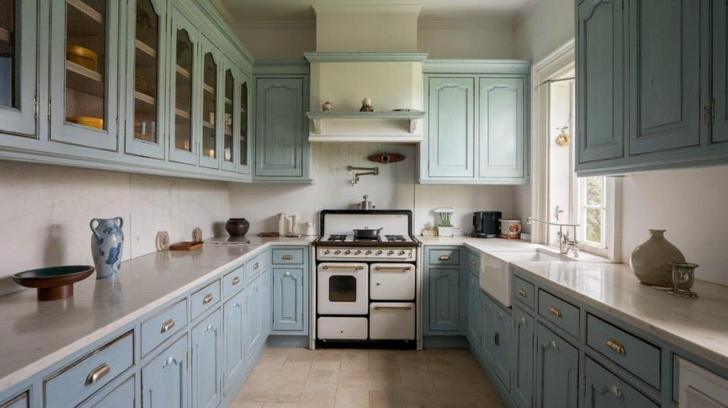
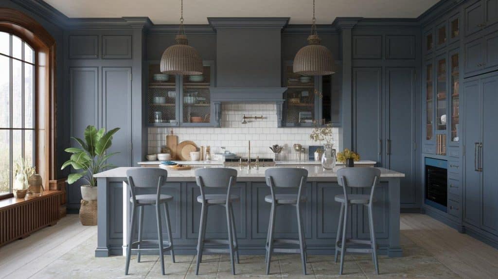
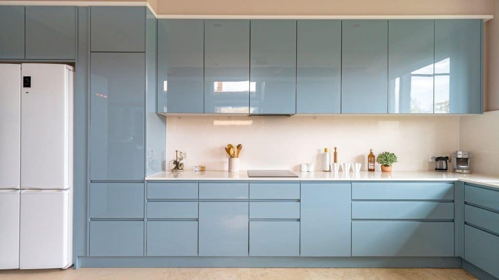
8. Slate Blue
Slate blue offers a subtle color. This muted shade exudes a sense of enlightenment and calmness. It bridges the gap between neutral and colorful. Slate blue ages beautifully over time.
The color complements both warm and cool palettes. This versatility ensures long-term satisfaction. Your kitchen stays current through the latest trends.
Key consideration: Slate blue varies widely between brands. Always test your specific shade before committing.
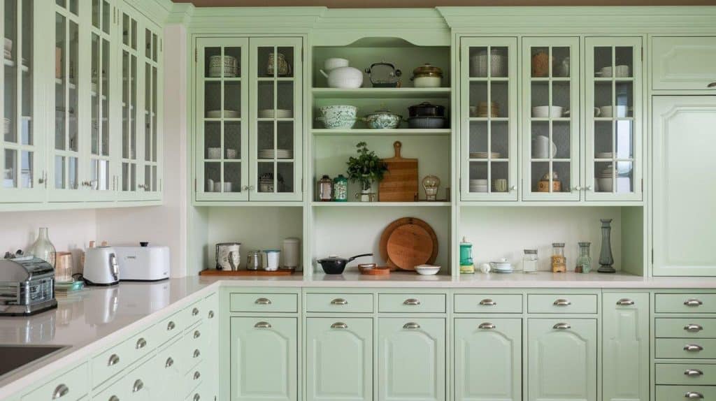
9. Sage Green
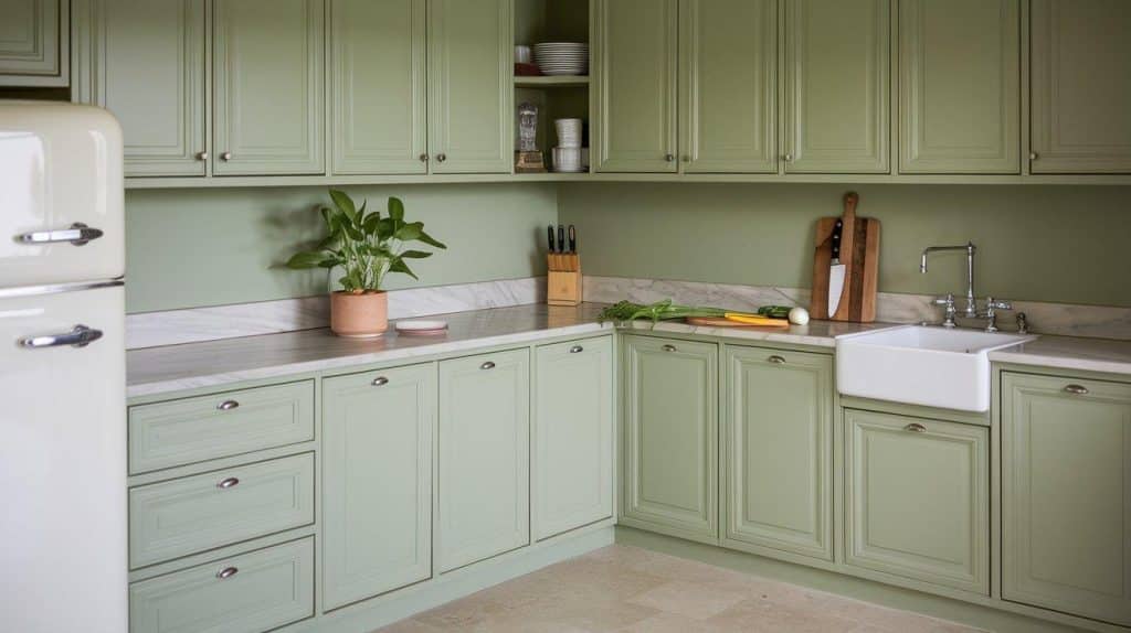
Sage green brings nature indoors. This soft, muted green feels timeless. It creates peaceful kitchen atmospheres. The color works in various design styles.
Light plays beautifully with sage green. Morning sun enhances its freshness. Evening light deepens its richness.
Design insight: Sage green calms busy kitchens. Its natural connection reduces visual stress.
10. Olive Green
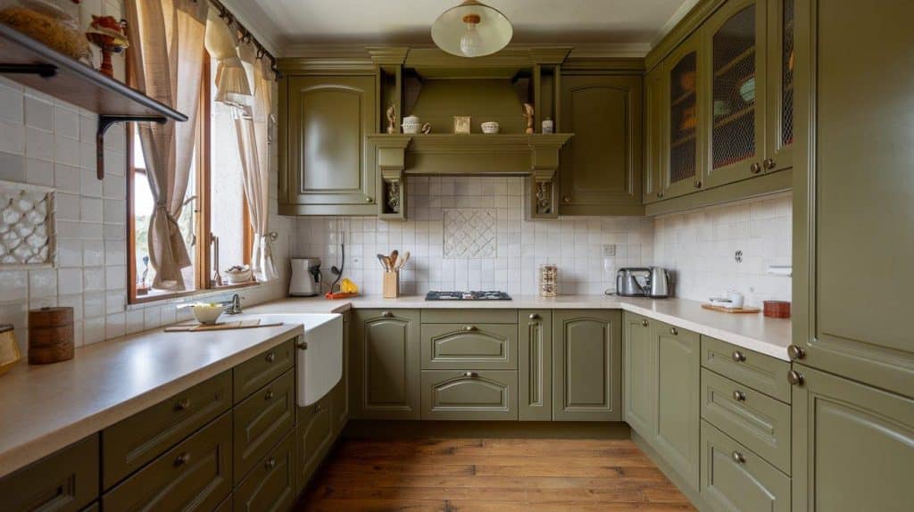
Olive green offers deeper color saturation. This earthy tone feels grounded and stable. It suits kitchens with natural light. Olive creates urbane, unique spaces.
The color complements Mediterranean and farmhouse styles. It also works in modern settings. This adaptability ensures lasting appeal.
Avoid this: Using olive oil in dark kitchens. Without proper light, it can feel heavy and dated.
11. Deep Charcoal
Deep charcoal provides drama without harshness. This near-black shade feels cultivated. It anchors kitchen designs beautifully. Charcoal works as a neutral base.
The color creates striking contrasts. Light countertops pop against charcoal cabinets. This combination feels both modern and timeless.
Important note: Invest in quality under-cabinet lighting. Dark cabinets require additional illumination for optimal functionality.
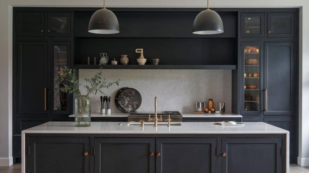
12. Black
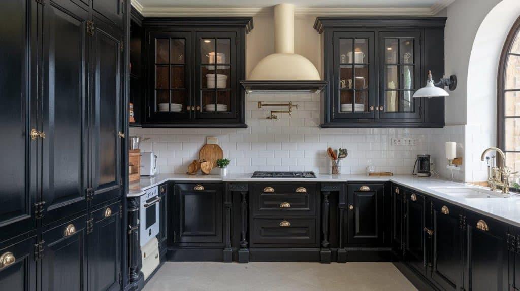
Black cabinets make bold statements. This classic color never truly goes out of style. It creates striking contrasts in kitchens. Black suits contemporary and traditional spaces equally.
Proper lighting becomes crucial with black cabinets. Under-cabinet lights prevent dark corners. The dramatic effect rewards careful planning.
Pro tip: Opt for matte black for a modern look. Glossy black suits are glamorous, traditional styles better.
13. Soft Beige
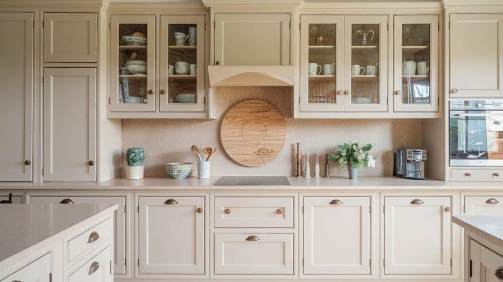
Soft beige offers a quiet culture. This warm neutral feels inviting and comfortable. It bridges various design styles effortlessly. Beige creates cohesive kitchen designs.
The shade works with existing wood tones. It complements most flooring choices naturally. Soft beige provides a calming foundation.
Styling tip: Add texture through hardware and backsplashes. Beige benefits from interesting surface variations.
14. Almond
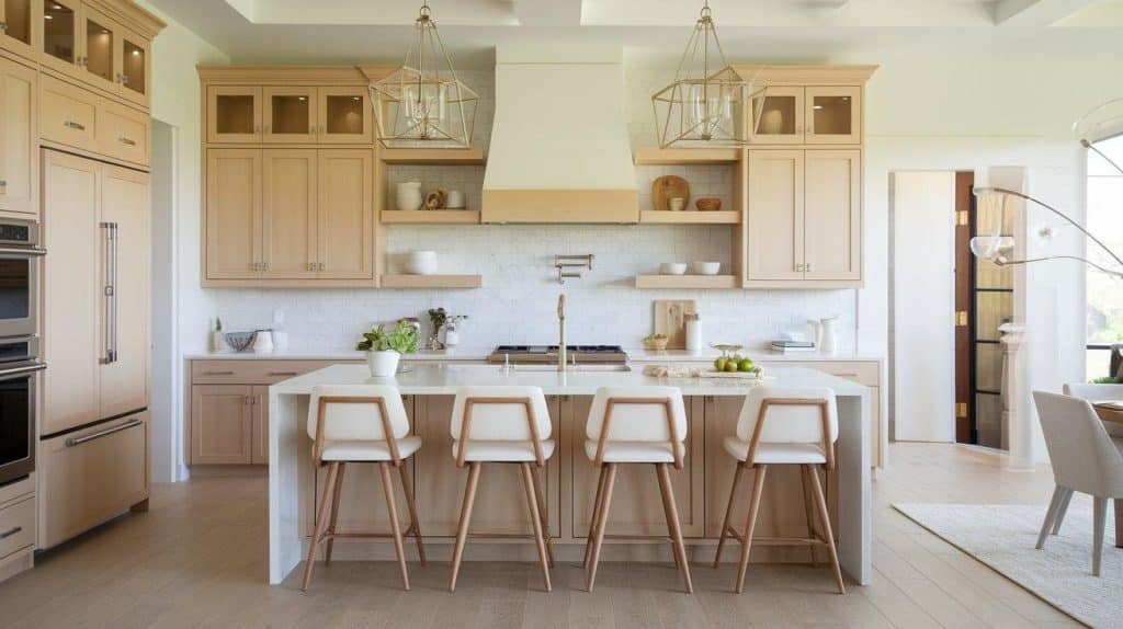
Almond brings subtle warmth to kitchens. This creamy neutral feels fresh and clean. It offers more depth than basic white. Almond cabinets suit various lighting conditions.
The shade complements both modern and traditional hardware. This flexibility allows easy updates. Your kitchen evolves without major renovations.
Key consideration: Almond shows its warm undertones in evening light. Test during different times of day.
15. Dusty Blue
Dusty blue adds gentle color. This muted shade exudes a sense of calm and collectedness. It brings personality without overwhelming. The color suits various kitchen styles.
Dusty blue creates vintage charm naturally. It feels both nostalgic and current. This duality ensures lasting appeal.
Design insight: Dusty blue pairs beautifully with copper accents. This combination feels fresh yet timeless.
16. Mushroom
Mushroom offers earthy sophistication. This brown-gray blend feels organic. It creates warm, inviting kitchens. Mushroom cabinets ground your design naturally.
The color hides wear exceptionally well. Daily use won’t show as quickly. This makes the mushroom perfect for busy households.
Important note: Mushroom varies significantly between manufacturers. Some lean more brown, others more gray.
17. Buttermilk
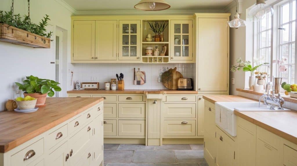
Buttermilk provides creamy warmth. This soft yellow-white feels cheerful. It brightens kitchens without being bold. The shade suits cottage and farmhouse styles.
Natural light enhances buttermilk’s glow. The color creates sunny atmospheres year-round. It brings warmth to north-facing kitchens.
Avoid this: Pairing buttermilk with cool grays. The undertones clash, creating visual discord.
18. Dove Gray
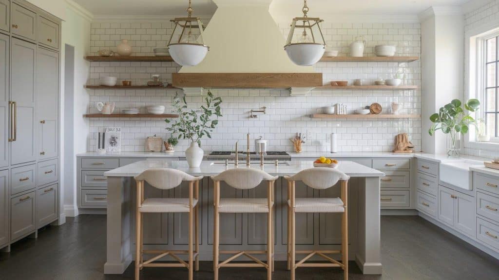
Dove gray offers perfect neutrality. This medium-light gray feels balanced. It avoids both coldness and darkness. Dove gray adapts to any decor style.
The shade works in north and south-facing rooms. Its balanced undertones prevent color shifts. Your cabinets look consistent throughout the day.
Pro tip: Use dove gray as a bridge color. It seamlessly connects darker and lighter elements.
19. Antique White
Antique white brings vintage charm. This warm white has subtle aging. It feels collected and comfortable. The color suits traditional kitchen designs.
The slight patina adds character immediately. New kitchens gain instant warmth. Antique white prevents sterile feelings.
Styling tip: Embrace imperfection with antique white. Distressed finishes enhance its vintage appeal.
20. Stormy Gray
Stormy gray adds depth and interest. This blue-gray shade feels moody yet neutral. It creates urbane kitchen atmospheres. The color works in various lighting conditions.
Stormy gray complements both warm and cool accents. This versatility ensures design flexibility. Your kitchen stays fresh through updates.
Key consideration: Stormy gray can appear blue or gray depending on the surroundings. Test with your specific elements.
21. Mocha
Mocha brings rich warmth to kitchens. This coffee-inspired brown feels cozy. It creates intimate dining spaces. The color suits traditional and rustic styles.
The depth of mocha adds luxury. It feels substantial and grounding. Kitchens gain immediate refinement.
Design insight: Mocha works best with plenty of natural light. It can feel heavy in darker spaces.
22. Espresso
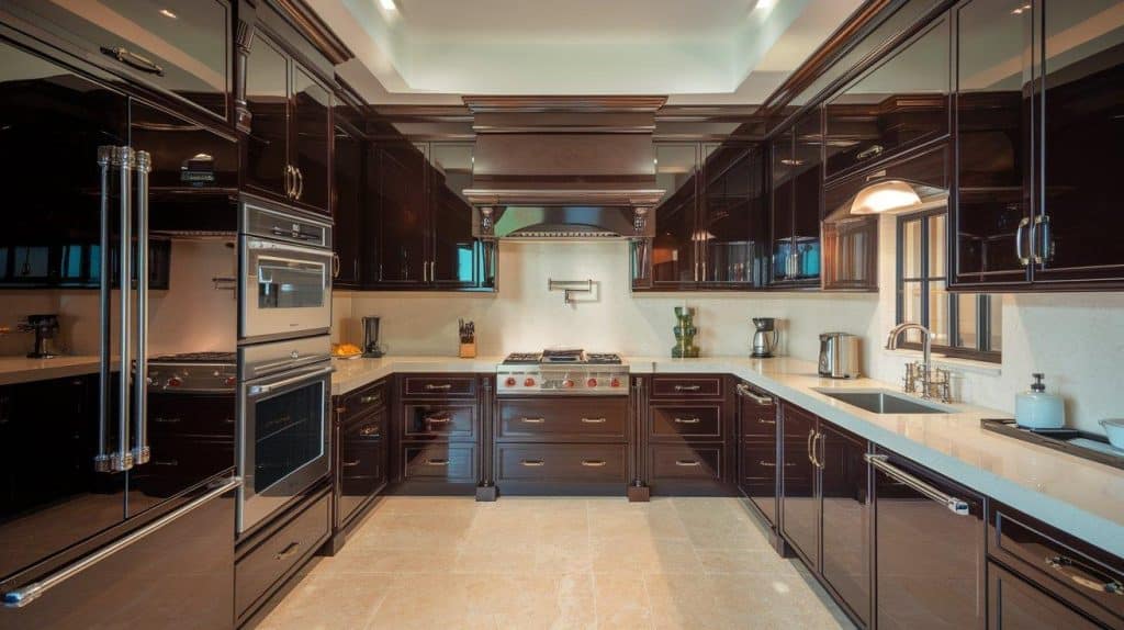
Espresso offers deep, luxurious color. This dark brown feels substantial. It anchors kitchen designs powerfully. Espresso cabinets make strong style statements.
Good lighting becomes essential with espresso. Under-cabinet fixtures prevent shadows. The rich color rewards proper illumination.
Important note: Espresso shows every fingerprint. Consider your household’s activity level before choosing.
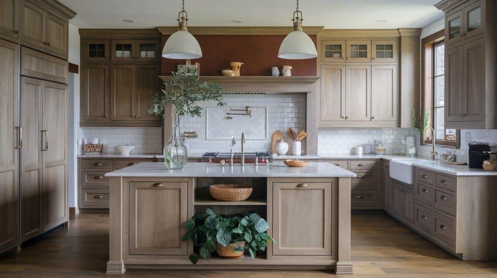
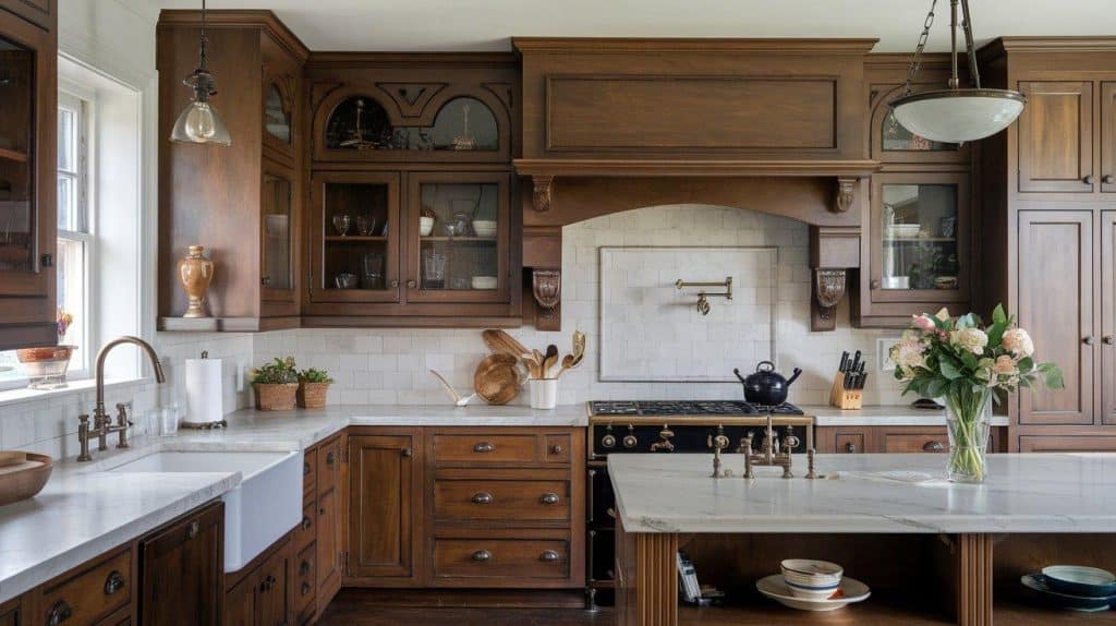
23. Walnut
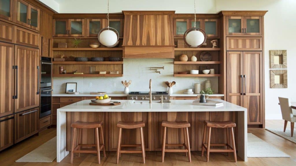
Walnut stain showcases natural wood beauty. This medium-brown tone feels organic. It highlights wood grain patterns. The color suits various design aesthetics.
Each walnut cabinet features a unique grain pattern. No two pieces look identical. This natural variation adds authentic character.
Pro tip: Seal walnut properly to prevent fading. UV protection maintains its rich color longer.
24. Honey Oak
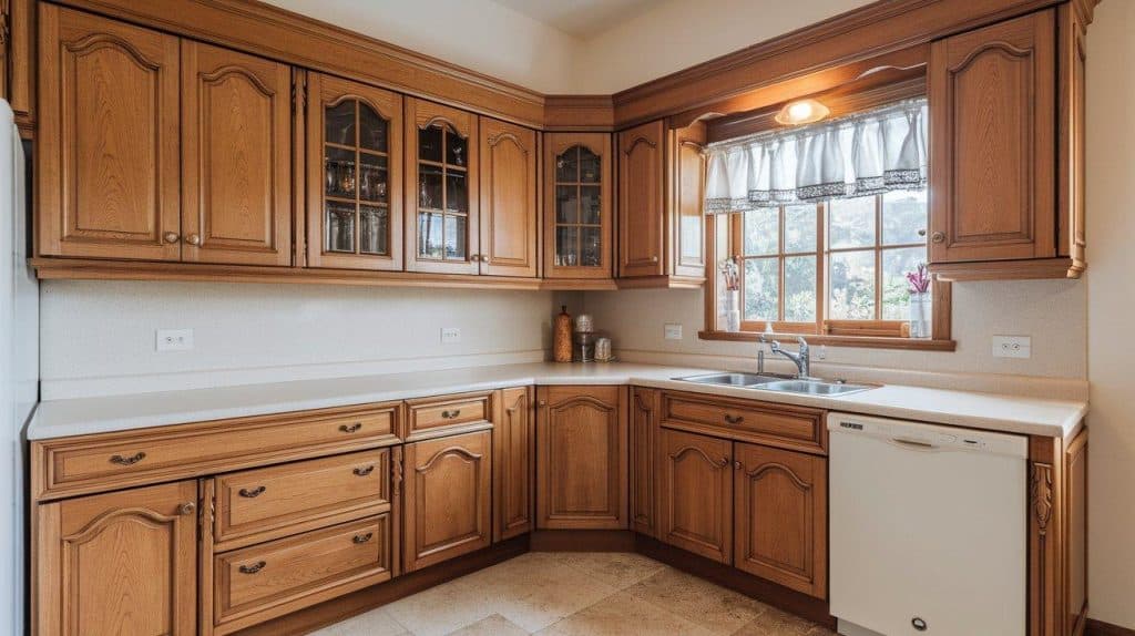
Honey oak brings golden warmth. This classic wood tone feels familiar. It creates comfortable, lived-in kitchens. The shade complements many design elements.
While trends fluctuate, quality honey oak endures. Proper styling keeps it current. The warmth never truly goes out of fashion.
Styling tip: Update honey oak with black hardware. This modern touch prevents dated appearances.
25. Driftwood
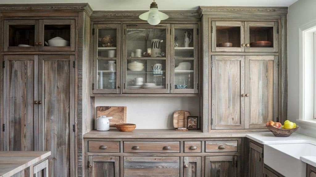
Driftwood offers weathered refinement. This gray-brown shade feels coastal. It brings texture and interest naturally. The color suits relaxed kitchen styles.
The weathered appearance hides imperfections. Daily wear becomes part of its charm. Driftwood improves with age.
Key consideration: Driftwood finishes vary in texture. Some are smooth, while others prominently display wood grain.
26. Pewter
Pewter provides metallic neutrality. This gray with a slight sheen feels modern. It reflects light subtly. Pewter cabinets add quiet luxury.
The color works in contemporary and transitional kitchens. Its understated shine feels urbane. Hardware choices become especially important.
Avoid this: Mixing pewter with too many metallics. The subtle sheen competes with shiny finishes.
27. Soft Mint
Soft mint brings subtle freshness. This pale green feels clean and airy. It adds color without overwhelming. The shade suits vintage and modern styles.
The whisper of color gently brightens spaces. Soft mint creates cheerful atmospheres. It works particularly well in smaller kitchens.
Design insight: Soft mint looks best with white or light wood. Dark colors overpower its delicate nature.
28. Cool Gray
Cool gray offers crisp neutrality. This blue-undertoned gray feels fresh. It creates clean, modern kitchens. The color works in contemporary spaces.
Cool gray requires warm accents for balance. Wood elements prevent coldness. Strategic styling ensures inviting atmospheres.
Important note: Cool gray can feel sterile without proper styling. Add warmth through accessories and lighting.
29. Cloud White
Cloud white provides soft brightness. This gentle white feels airy. It reflects light without harshness. The shade suits every kitchen style.
Unlike stark white, cloud white feels approachable. It maintains brightness while adding softness. This balance creates comfortable spaces.
Pro tip: Cloud white works as trim with any cabinet color. Its versatility makes it a designer favorite.
How to Prevent Premature Wear and Fading?
Protecting your cabinet investment requires understanding what causes damage. Direct sunlight fades colors over time. Cooking moisture warps finishes.
Heat from appliances causes cracking. Grease buildup dulls surfaces. Harsh cleaners strip protective coatings. Knowing these threats helps you take preventive action.
Key prevention strategies:
- Install UV-filtering window treatments: These block harmful rays that can fade colors and yellow finishes.
- Use exhaust fans consistently: They remove moisture and grease before they damage surfaces.
- Apply protective sealers annually: They create barriers against spills and humidity damage.
- Position heat sources carefully: Keep cabinets away from ovens and dishwashers when possible.
- Monitor indoor humidity levels: Maintain 30-50% humidity to prevent warping or cracking.
- Choose appropriate cleaning products: Match cleaners to your specific cabinet finish type.
Care and Maintenance Tips for Timeless Kitchen Cabinets
Proper care and maintenance keep your cabinets looking fresh for years to come. Learn daily cleaning routines that prevent damage. These simple habits protect your kitchen investment.
Weekly cleaning routine suggestions:
- Dust cabinet tops and corners.
- Clean hardware with appropriate cleaners.
- Check for loose hinges or handles.
- Wipe interior shelves.
- Polish wood cabinets, if needed.
Monthly deep cleaning prevents buildup. Remove items from cabinets occasionally. Clean interiors thoroughly. This prevents odors and staining.
Address minor damage immediately. Touch up small scratches quickly. Tighten loose hardware regularly. Minor repairs prevent larger problems.
Professional maintenance extends cabinet life. Annual inspections catch issues early. Refinishing services refresh tired finishes. Investment in care pays long-term dividends.
Conclusion
Choosing timeless cabinet colors creates a lasting beauty in your kitchen. These hues evolve gracefully with shifting styles.
Your investment stays protected through years of style shifts. Durable shades and consistent upkeep reward you for years.
Remember that maintenance matters as much as color selection. Simple daily habits can help preserve the appearance of your cabinets.
Take the time to test colors in your specific lighting conditions. Consider your home’s style and existing elements. The perfect cabinet color enhances your entire kitchen design.
Which timeless shade fits your vision? Share your thoughts or questions in the comments below!
Frequently Asked Questions
What Kitchen Cabinet Color Is Outdated?
Stark white, cool grays, and dark cherry stains feel dated in 2025. Bright yellows, oranges, and bold blues also look old-fashioned now.
Are Walnut Cabinets Dated?
No, walnut remains stylish. Wood never goes out of style – only how you use it matters for modern appeal.
What Makes Kitchen Cabinets Look Dated?
Pine or hickory wood with granite counters has an old-fashioned look. Gold or brass fixtures on cabinets also clearly show their age.