Choosing the right gray paint can feel overwhelming. With hundreds of shades available, many homeowners spend weeks testing samples and still feel unsure. That’s where Sherwin-Williams Agreeable Gray (SW 7029) stands out as a trusted choice.
This warm gray shade has earned its place as one of Sherwin-Williams’ top-selling colors, and for good reason. Agreeable Gray creates a welcoming atmosphere in any room while maintaining a clean, modern look.
This guide teaches you everything about Agreeable Gray, from its unique undertones to the best room pairings. We’ll cover lighting effects, coordinating colors, and real-home examples.
Plus, you’ll get practical tips for using this versatile shade in your space. Let’s explore why Agreeable Gray might be the perfect choice for your next painting project.
What Kind of Color is Agreeable Gray (SW 7029)?
Sherwin-Williams Agreeable Gray sits between gray and beige, making it one of the most flexible neutral colors available.
Many paint experts call it the perfect “greige” – a blend of the best qualities of both shades.
Is It More Gray or Beige?
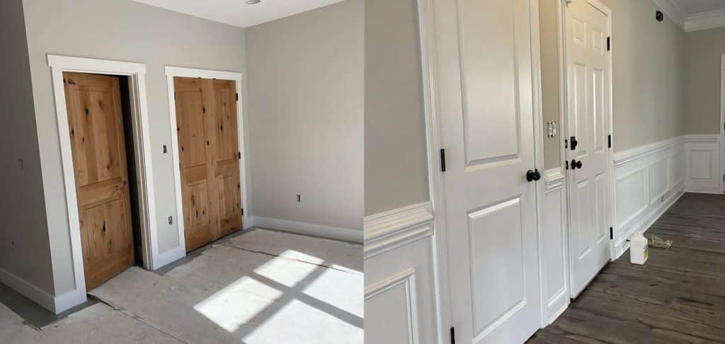
Think of Agreeable Gray as a chameleon in the paint world. At first glance, you might see a soft gray, but look again, and warm beige tones emerge. This dual nature makes it different from pure gray paints, which can feel cold or stark.
The color leans slightly toward the gray side but has enough beige to warm your walls.
Imagine mixing a cup of warm coffee with a splash of cream—that’s how the gray and beige elements come together in this shade.
Exploring Agreeable Gray’s Undertones
The magic of Agreeable Gray lies in its subtle undertones. Unlike some grays that show purple or blue, this shade carries gentle green and brown undertones. These warm notes help the color stay neutral in most lights.
To spot these undertones in your space:
- Look at the paint during different times of day
- Compare it against pure white paper
- Check how it looks near windows and in corners
- Test it on multiple walls in the same room
Light Reflectance Value (LRV) of Agreeable Gray
With an LRV of 60, Agreeable Gray is right in the middle of the light-to-dark scale. This number tells us how much light the color reflects—in this case, 60% of light bounces back into the room.
This medium LRV means Agreeable Gray can make smaller rooms feel open without being too bright. It also helps larger spaces feel cozy without darkening them too much. The color provides enough contrast to highlight white trim while staying light enough to keep rooms feeling fresh.
This LRV helps maintain brightness even with limited natural light in north-facing rooms. South-facing spaces benefit, too, as the color absorbs just enough light to prevent glare during bright afternoons.
RGB & Hex Codes for Perfect Pairing
Agreeable Gray’s specific color codes are:
- RGB Values: R: 209, G: 203, B: 193
- Hex Code: #D1CBC1
These numbers tell a detailed story about this paint color. The RGB values show balanced amounts of red, green, and blue light, explaining why Agreeable Gray stays neutral. The close numbers (209, 203, 193) reveal why this shade blends so well with other colors.
The hex code #D1CBC1 helps when shopping online for furniture or decor. Copy this code into design apps or websites to find items that work with your painted walls. This makes coordinating pillows, rugs, or curtains much easier.
Popular Similar Colors to Agreeable Gray
Sometimes, finding the right gray means looking at several options. While Agreeable Gray stands out as a top choice, several other Sherwin-Williams colors offer similar qualities with subtle differences.
Comparable Sherwin-Williams Colors
| Color Name | Description | Ideal Use |
|---|---|---|
| Repose Gray | A slightly cooler shade that steps back from the warmth of Agreeable Gray, providing a fresh and clean look. | Modern homes with clean lines. |
| Colonnade Gray | It leans into its beige side, offering extra coziness if Agreeable Gray isn’t warm enough. | Spaces with natural wood and traditional furniture. |
| Alpaca | A bolder cousin of Agreeable Gray, adding more depth while staying neutral. | Spaces need personality while remaining neutral. |
| Mindful Gray | Offers a stronger presence by enhancing the greige concept, suitable for larger rooms. | Larger rooms that can handle a deeper tone. |
| Gossamer Veil | A lighter take on greige that keeps rooms open and bright, perfect for small or dim spaces. | Small or dimly lit spaces need brightness. |
Best Colors to Pair with Agreeable Gray
Choosing colors to pair with Agreeable Gray opens up countless design options. This flexible neutral works with many color schemes, making it ideal for creating different moods in your home.
Warm Neutrals and Earth Tones
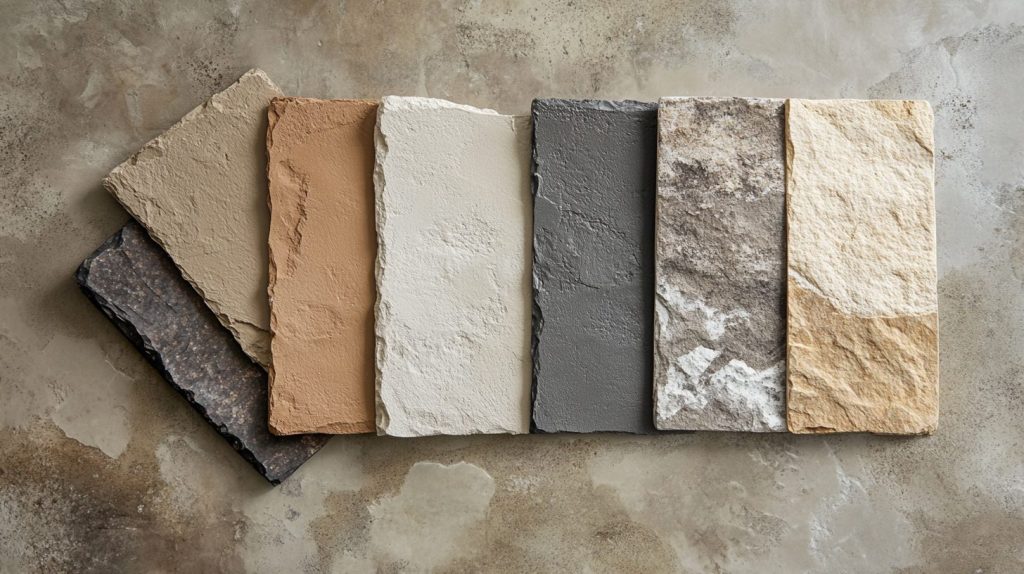
Agreeable Gray pairs beautifully with the following:
- Soft browns like Sherwin-Williams Accessible Beige
- Rich tans that bring warmth to the space
- Gentle cream shades for a layered look
- Natural stone colors for added depth
These combinations create spaces that feel grounded and inviting. They work well in living rooms and bedrooms where comfort matters most.
High-Contrast Colors for a Modern Look
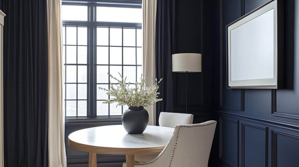
To add visual interest, try:
- Deep navy blue for statement walls
- Charcoal gray for bold accents
- Black window frames or door hardware
- White marble for countertops
These pairings create clear visual breaks and add interest to your space. The contrast helps define areas and create focal points.
Crisp Whites for a Clean, Classic Appeal
White elements that work well include:
- Pure White (SW 7005) for trim
- Extra White (SW 7006) for ceilings
- Bright white cabinets in kitchens
- White tile backsplashes
Combining Agreeable Gray with white creates clean lines and makes spaces feel fresh and open.
Accent Colors for Agreeable Gray Rooms
| Decor Element | Accent Choices | Details |
|---|---|---|
| Furniture Choices | Cognac leather chairs | Adds warmth and luxury. |
| Dark wood tables | Provides a rich, grounding effect. | |
| Navy blue sofas | It introduces a deep, serene color that contrasts nicely with the neutral wall. | |
| Natural linen pieces | It keeps the room feeling light and airy. | |
| Artwork Selection | Black and white photographs | It adds a classic, timeless touch. |
| Watercolor prints in soft blues | Softens the room with gentle color splashes. | |
| Abstract pieces with earth tones | Incorporates natural, soothing colors. | |
| Metal wall art in bronze or gold | It introduces metallic elements that catch the light and add elegance. | |
| Accessories and Textiles | Green plants | Brings life and vibrancy to the room. |
| Blue-gray throw pillows | It complements the wall color while adding a layer of comfort. | |
| Woven baskets in natural fibers | Adds texture and practical storage. | |
| Copper or brass light fixtures | Enhances the room with warm lighting and stylish fixtures. |
Ideal Spaces to Use Agreeable Gray in Your Home
Agreeable Gray works well in many rooms, but some spaces let this color shine. Let’s examine how to use this versatile shade throughout your home.
Living Rooms
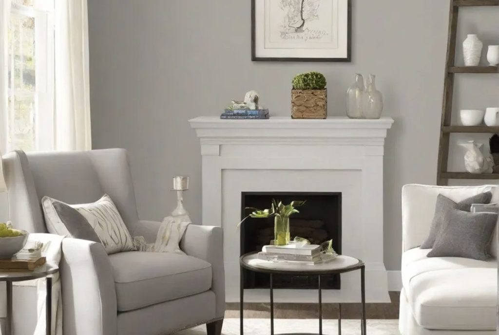
Agreeable Gray creates a perfect backdrop for family life in living spaces. The color stays fresh morning to night and:
- It makes rooms feel open and bright
- It helps furniture stand out
- Creates a cozy feeling for gatherings
- Allows art and decor to shine
Bedrooms
Your bedroom should feel peaceful, and Agreeable Gray helps create this mood by:
- Setting a quiet, restful tone
- Working well with any bedding color
- Looking soft in lamp light
- Making mornings feel bright and fresh
Kitchens
Kitchens painted in Agreeable Gray offer:
- A clean look that hides minor marks
- Good contrast with white cabinets
- The warmth that makes the space feel welcoming
- Flexibility with different counter materials
Entryways and Hallways
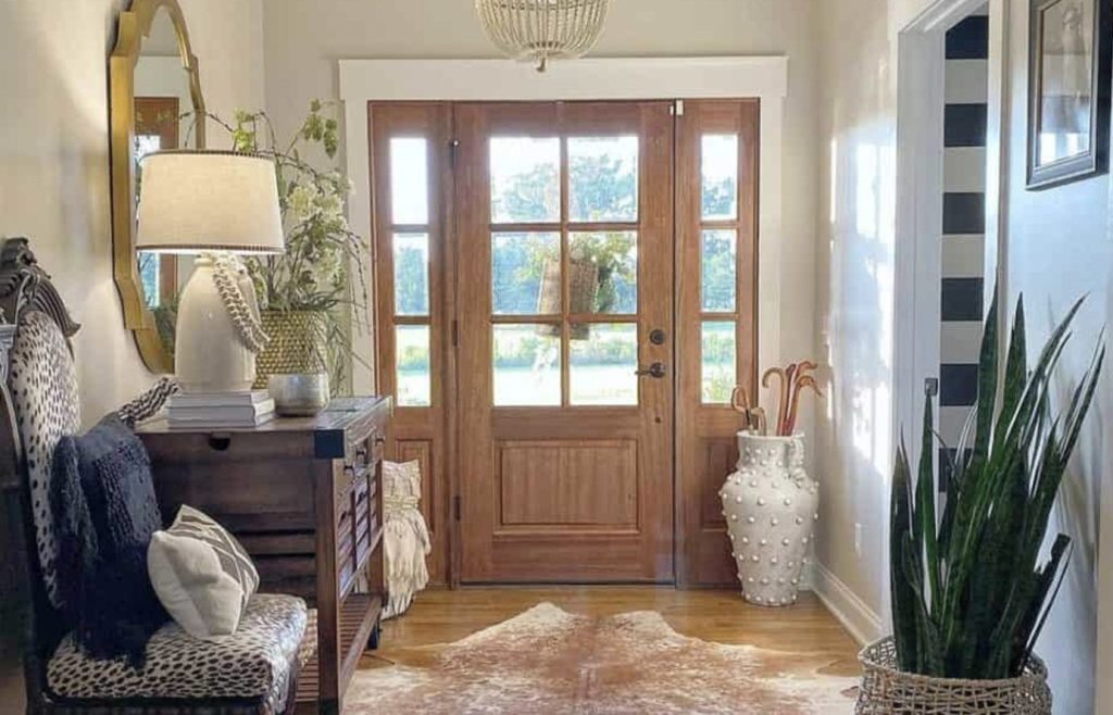
First impressions matter, and Agreeable Gray in these spaces:
- Sets a welcoming tone
- It makes narrow spaces feel wider
- Handles high traffic well
- Links different room colors smoothly
Is Agreeable Gray Still Popular?
The staying power of Agreeable Gray speaks to its quality as a paint choice. In 2024, this shade continues to win over homeowners and designers alike.
Why It’s a Timeless Choice
Agreeable Gray remains popular because it offers what many homeowners want – a reliable neutral that works in any setting. Unlike trendy colors that come and go, this shade has proven its worth year after year.
The color’s success comes from its simple beauty and ability to work with changing styles. As home design trends shift, Agreeable Gray adapts without needing a refresh.
Current Trends with Agreeable Gray in 2024
In 2024, homeowners are using Agreeable Gray in new ways:
- Pairing it with natural wood tones
- Adding black metal accents
- Combining it with stone textures
- Using it in minimalist spaces
Pros and Cons of Choosing Agreeable Gray
Let’s look at what makes this color work – and where it might not be your best choice.
| Advantages | Disadvantages |
|---|---|
| Works with any design style | It can look different in various lights |
| It makes rooms feel bright and open | It might feel too safe for some tastes |
| Hides wall marks well | It needs thoughtful lighting choices |
| It pairs well with most colors | It could feel plain without proper styling |
| Stays fresh-looking for years | It may require sample testing in multiple spots |
| Makes decorating easy |
Conclusion
Understanding Agreeable Gray shows why it’s a trusted choice for so many homes. This balanced blend of gray and beige brings warmth and style to any room while staying fresh through changing trends.
As we’ve seen, Agreeable Gray works well in various spaces, from bright kitchens to cozy bedrooms. Its medium-light reflectance value helps rooms feel open yet comfortable, and its versatile nature means it pairs well with many colors and styles.
Before you start painting, remember to test samples in your space. Watch how the color changes throughout the day and how it works with your existing decor. When ready, visit your local Sherwin-Williams store for samples or paint supplies.
With proper planning, Agreeable Gray can help create the welcoming, stylish home you want.
