
Blue is the secret weapon of artists and designers who want their work to stand out. This color sits opposite orange on the color wheel, creating a striking pair that catches the eye instantly.
Color combinations often confuse beginners who don’t understand which shades work well together. Color theory can feel complicated initially, but knowing about opposite colors makes design choices much easier.
I’ll show you exactly how orange and blue work as opposite colors across different color systems. These color wheel basics will help you create more effective designs, whether painting, designing websites, or planning home decor.
In this article, you’ll learn what color is opposite of orange and why it matters, how blue and orange relate on different color wheels, and practical ways to pair these colors in your projects.
Unveiling Orange and Its Opposite Across Different Color Models
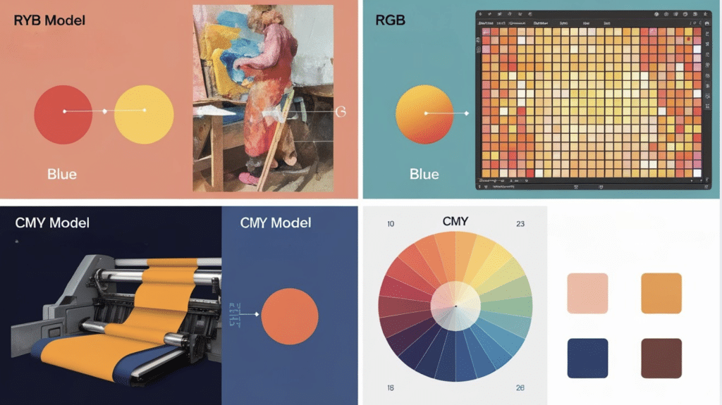
Check out how the color orange and its complementary counterpart are defined and visualized in various color models, from traditional art to digital design.
This overview highlights the dynamic contrasts and harmonious relationships that orange creates across different color systems.
RYB Model (Traditional Paints)
In the red-yellow-blue model, orange is created by mixing red and yellow, with blue as its opposite. This pairing creates intense contrasts in the artwork.
The RYB model uses subtractive color mixing methods and is best for physical media like oils, acrylics, and watercolors.
RGB Model (Digital Screens)
In digital screens, orange comes from red and green light, with azure blue as its opposite. This pairing creates a better contrast than pure blue.
Digital artists often adjust to ensure the best balance, as pure blue doesn’t work as effectively with orange.
CMY Model (Print & Physical Inks)
In printing, orange is formed by mixing yellow and magenta inks, with cyan as its opposite. This color system is key to creating balanced, professional prints.
The addition of black ink (CMYK) helps deepen tones and enhance contrast in print materials.
The Role of Hue Variations
Different shades of orange pair with various blue tones, like peach with navy or burnt orange with teal.
The opposite of orange depends on its hue and saturation, with color wheels helping artists fine-tune their combinations.
Color Theory Basics
Color theory provides a set of rules for how colors interact based on their position on the color wheel. Primary colors cannot be created by mixing other colors.
Secondary colors are formed by mixing two primary colors. Tertiary colors come from mixing primary and secondary colors.
When you understand these relationships, you can predict how colors will interact. When mixed, opposite pairs cancel each other, creating neutral browns or grays. This happens because they contain opposite parts of the color spectrum.
The Role of Light & Pigments with Orange Color
Light and pigments affect color in completely different ways. With light (like on screens), colors become brighter when combined – this is called additive color mixing. Full red, green, and blue light together create white.
When mixed, pigments (like paint) make colors darker; this is called subtractive color mixing. Mixing all pigment colors creates muddy brown or black tones. This difference explains why digital and physical artists must approach color differently.
Practical Applications of Orange and Blue Pairings
- Art & Design: Artists like Vincent van Gogh used orange and blue contrasts for visual impact. Modern designers utilize this pairing to highlight key elements while maintaining harmony. Interior designers might pair blue walls with orange accents to create balance.
- Marketing & Branding: Orange and blue create trust while appearing friendly and creative. Financial services often combine navy blue (stability) with orange (friendliness). Sports teams like the New York Knicks use this combo for high visibility and energy, while food brands use it for flavor and shelf impact.
- Digital Media & Gaming: Video games and films use the orange-blue contrast for eye-catching promotional materials. The pairing helps make important elements stand out in interfaces. Movie posters often feature orange elements against blue backgrounds to grab attention.
- Fashion & Aesthetics: Orange and blue make bold fashion statements. Navy blue outfits with orange accessories strike a balance of professionalism and creativity. This pairing also works well in home décor and beach themes, creating a pleasing aesthetic between warm and cool tones.
- Color Harmony: Orange and blue create a perfect balance, illustrating how opposites can work together. Understanding this relationship helps make better creative choices, whether in painting, website design, or fashion.
Perception & Psychology of Orange and Blue
Our brains process orange and blue in fascinating ways. Orange feels warm, active, and friendly. It connects to energy, joy, and creativity. Blue creates feelings of calm, trust, and stability. It suggests depth, peace, and authority.
Movie posters often use orange and blue because this contrast creates visual appeal while setting up emotional balance. The warm-cool tension between these colors helps images stand out.
Color perception also varies by culture and personal experience. In some cultures, orange links to change and spirituality, while blue represents loyalty or healing.
When used together, orange and blue create a balanced feeling; the coolness of blue offsets the warmth of orange. This pairing works well for creating focus points in artwork or guiding attention in design projects.
Understanding these effects helps you choose colors that make your desired mood in your creative work.
Enhancing Visual Impact Through Color Pairings
1. The Art of Creating Contrast in Artwork
- Color Contrast: Artists use the contrast between orange and blue to make their work stand out.
- Vivid Effect: The colors look more vivid when placed next to each other because they draw attention.
- Focal Use: Famous artists used warm orange tones against cool blue backgrounds to create focal points.
- Visual Balance: Landscape paintings often feature orange sunsets meeting blue waters, creating a striking visual balance.
- Learning Tool: Art students practice this pairing to understand how contrasting colors enhance each other’s intensity.
2. How Digital Designers Use Orange and Blue
- Web & App Design: Designers use orange and blue to guide user attention.Blue is often used for backgrounds, while orange highlights buttons and text.
- Movie Posters & Video Game Covers: The color pairing makes visuals pop, with action movie characters often lit in orange against blue backgrounds.
- Digital Tools: Designers test different shades to find the perfect match—soft blues with bright oranges or deep blues with burnt orange.
- Data Visualization: Orange data points stand out against blue backgrounds, improving readability.
3. Fashion Statements and the Power of Color Pairings
Orange and blue create bold, eye-catching outfits.
- For formal wear: A navy blue suit with an orange tie exudes confidence.
- Casual wear: Orange shirts with blue jeans or blue tops with orange accessories offer balanced looks.
- Interior Design: Blue walls with orange accents, like lamps or pillows, create a calm yet lively atmosphere.
- Small Touches: Items like blue phone cases with orange details or blue bags with orange stitching make a noticeable impact.
Conclusion
Color relationships offer more than just visual appeal; they create balance and harmony in any creative project. The opposition between orange and blue is a perfect example of how colors can work together despite their differences.
This guide has shown you why these colors sit opposite each other and how this relationship changes across different color systems.
Understanding this color pairing helps you make better creative choices, whether you’re painting, designing websites, or planning your wardrobe.
The next time you notice orange and blue together in nature, art, or everyday objects, take a moment to observe how they interact.
The connection between these colors demonstrates color theory at its most practical and beautiful.