
Choosing the right color can feel like a leap of faith. I get it – it’s a big decision that can completely transform your home’s appearance.
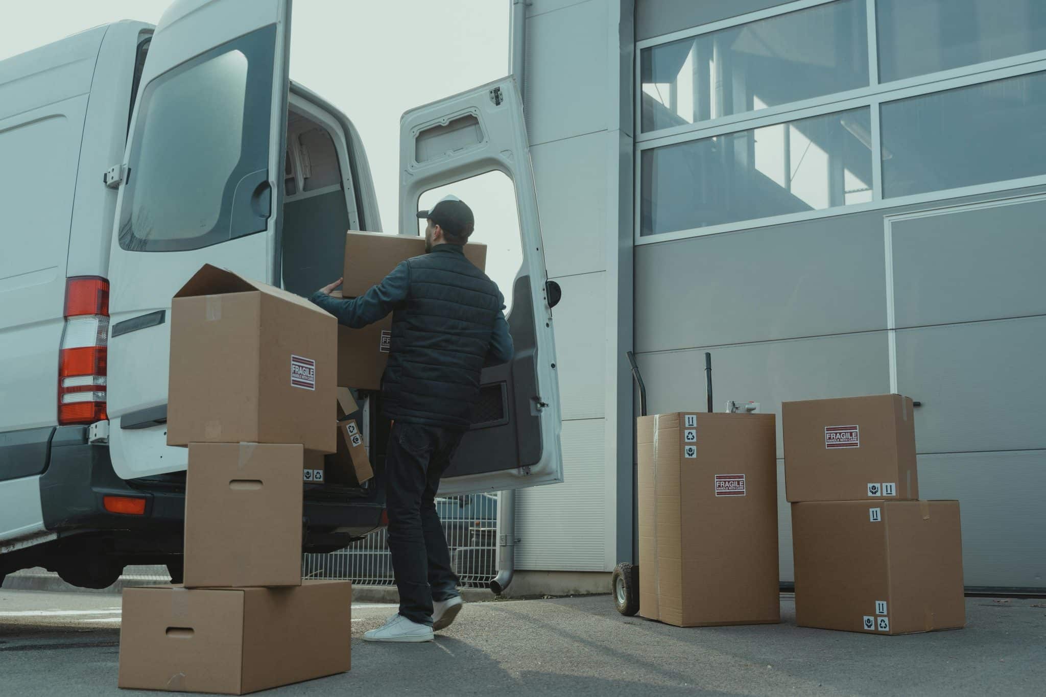
In today’s post, I will explain why Benjamin Moore Graphite is a top choice for home exteriors. This deep charcoal shade has helped transform over 500 homes in my design portfolio, making it my most-used dark neutral.
My clients consistently love how this color highlights textures and complements modern and classic home styles.
Let’s examine what makes this bold paint color special, from its technical specs to real-world applications, and consider some alternatives.
Ready to see if this might be the perfect shade for your home? Let’s get started.
Benjamin Moore Graphite: A Bold, Timeless Shade for Any Space

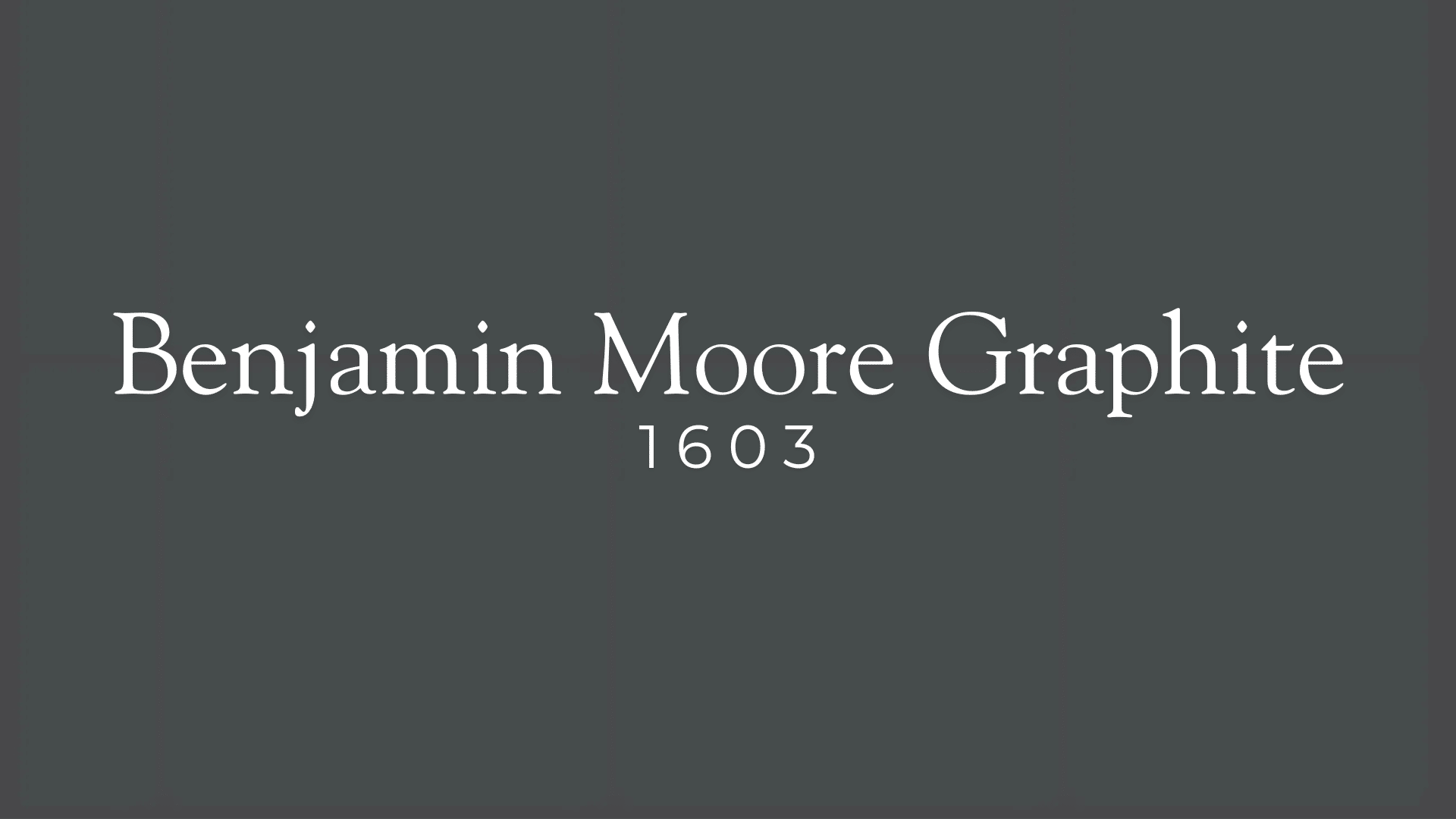
Benjamin Moore Graphite is a deep charcoal shade that adds a rich, bold look to interiors and exteriors.
This color offers more depth than pure black, bringing enough contrast to make a statement while staying useful across many styles.
The dark tone creates drama without being too harsh, making it ideal for homeowners who want something with character.
Homeowners and color experts value this paint’s ability to complement modern, classic, and mid-range styles. It performs well on siding, brick, stucco, and cabinets.
What sets it apart from other dark paints is that it maintains a rich, neutral look without strong color hints underneath.
This color’s mood feels refined yet bold – perfect for those seeking class with a touch of boldness. It pairs well with light accents to contrast or blend into a single-color plan.
This shade works well in many light settings, making it useful in various rooms and spaces.
What Makes Benjamin Moore Graphite Unique?
Light and Color Properties
The LRV (Light Reflectance Value) of 5.66 tells us this paint soaks up more light than it sends back, creating a deep, rich effect. Unlike total black, it doesn’t make too much darkness but adds depth and appeal.
The paint lacks strong color tones underneath, which many other charcoal paints have – some lean blue, green, or brown, but Graphite stays more neutral, making it more useful with different colors.
Practical Uses and Benefits
This color works well in sunny and dim spaces, though it’s always best to test it in your lighting. You can use it for bold main items like a front door or as a smart background for lighter colors.
Since it doesn’t have strong color hints, it pairs easily with many other shades.
Graphite works best in homes with good lighting or lighter trim to prevent the space from feeling too heavy. The color also fits well in factory-style, country, and current plans, blending nicely with wood, metal, and stone.
Testing remains key – use peel-stick samples to see how it reacts in your space.
Where to Use Benjamin Moore Graphite?
Exterior Applications

Graphite creates a strong first impression on home exteriors, whether on siding, stucco, or brick. Its dark, rich shade draws the eye and sets a tone of class and style.
Graphite works well with light-colored trims, natural wood details, or metal bits.
Many homeowners choose this color to create a modern yet lasting look distinct from common color choices.
Consider how much sunlight your home gets when using such a dark shade outside. South-facing walls will look slightly warmer, while north-facing sections might appear cooler. This slight shift adds depth to the overall look without clashing.
Interior Spaces

Graphite adds depth and contrast in living rooms, bedrooms, and kitchens inside your home. It can work as a focus wall or cover full rooms for a moody feel.
The dark shade forms a perfect canvas for art, light fixtures, and other home items to stand out against.
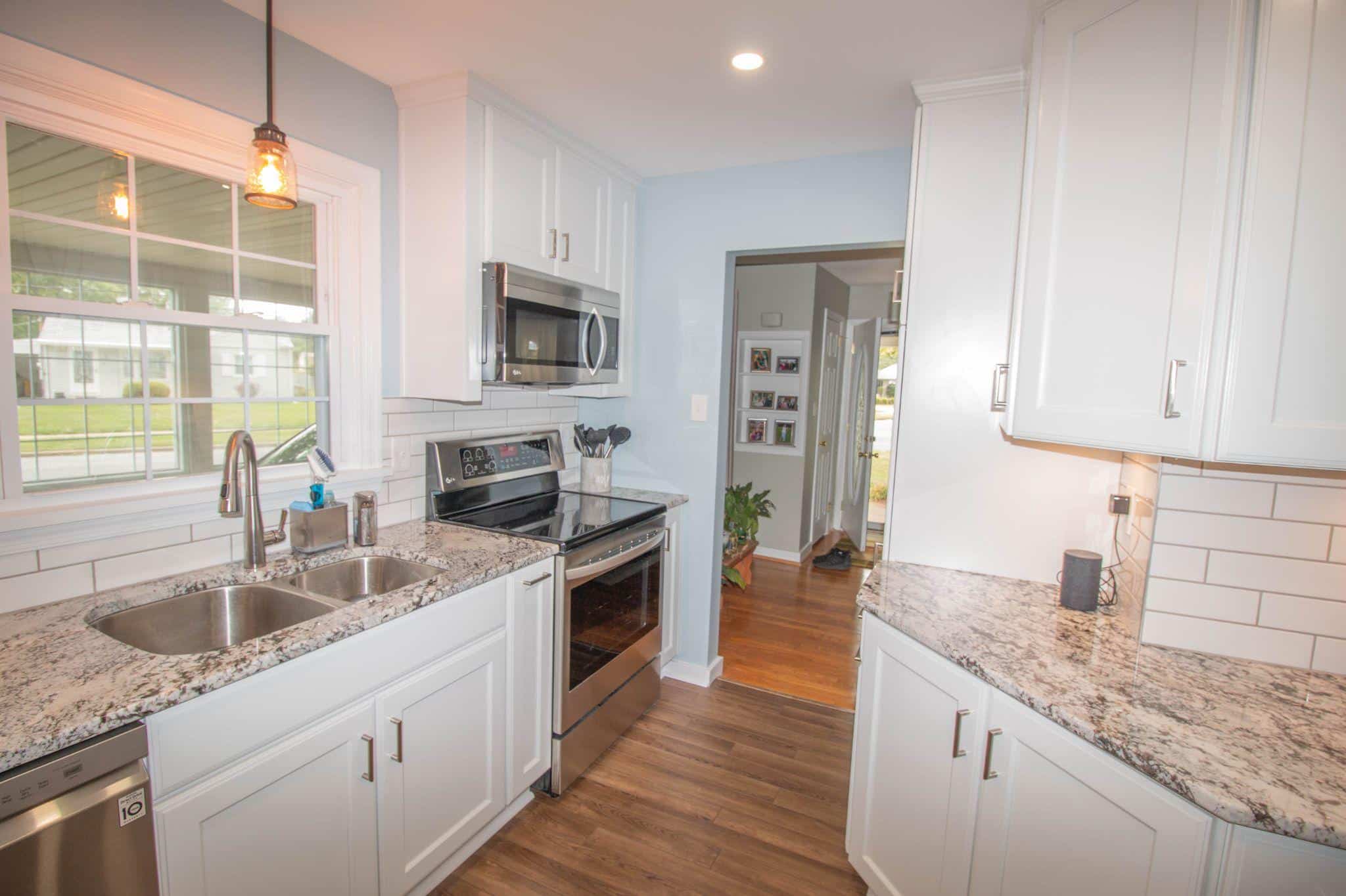
Graphite cabinets offer a sleek, modern option for kitchens and bathrooms instead of white or wood cabinets. The color looks great with gold, brass, or matte black pulls and knobs. This small change can greatly impact how the whole room feels.
Accent Features

Using Graphite on accent walls, doors, window frames, or shelves adds a high-end touch without taking over the space. The dark color draws attention to chosen parts while letting other items in the room shine.
It’s an easy way to add style without changing your color plan.
The color works well in open spaces where natural light keeps it from feeling too dark and closed in. Pair it with warm wood tones for a balanced, welcoming look.
It fits great in a modern farmhouse, factory, and current design styles.
Natural Material Partnerships with Graphite
| Natural Material | Ideal Features | Effect of Pairing with Graphite |
|---|---|---|
| Wood Accents | Cedar shake details, exposed beams, wooden doors, porch ceilings | Creates a balanced contrast between Graphite’s cool depth and wood’s warmth. Both raw and stained wood enhance Graphite’s natural beauty without overwhelming it. |
| Stone Features | Gray fieldstone foundations, light limestone accents, mixed river rock, slate pathways | It offers striking visual contrast, with Graphite highlighting the rugged texture and unique color variations of the stone. This pairing works well to emphasize the earthiness of stone. |
The variation in stone textures against Graphite’s solid presence creates depth and interest that changes throughout the day as light shifts.
Similar Colors to Benjamin Moore’s Graphite
1. Wrought Iron by Benjamin Moore

(LRV 6.16) offers slightly more brightness with cool blue-gray hints. It works well for main exterior walls, front doors, window frames, and metal accents.
2. Iron Ore by Sherwin Williams

(LRV 6) brings brown hints and warmth in sunlight. This rich shade looks great on textured surfaces, exteriors, cozy spaces, and accent walls.
3. Black Panther by Benjamin Moore

(LRV 4.42) provides a deep, almost-black look with bold contrast against light colors. It’s perfect for modern designs, accent pieces, and glass or metal surfaces.
Testing Benjamin Moore Graphite Before You Paint
Smart Testing Methods
Before painting your entire home with Graphite, you can use a few methods to ensure it’s the right choice. Start by painting several 2×2 foot squares on different sides of your home.
This allows you to see how the color looks in various lighting. Check each test area during the morning, noon, and evening to observe any changes in color appearance.
Assessing how it looks under sunny and cloudy conditions is also important, as lighting can significantly affect the final look. Apply two coats of paint to get a true sense of the color depth, as a single jacket can sometimes misrepresent the tone.
Finally, compare the samples against your trim and accent colors to ensure everything complements each other effectively.
Surface-Specific Testing
Since different surfaces absorb and display paint differently, testing Graphite on the exact material you plan to paint is important.
For wood, apply samples to both smooth and rough sections to see how the texture impacts the final look.
When testing on brick, paint both the bricks and mortar lines, as the material’s porous nature can affect color absorption.
Cover a larger section for stucco to observe how shadows and texture influence the shade. On siding, paint an entire panel to understand how Graphite will appear across the full surface.
Conclusion
Is Benjamin Moore Graphite right for your home? This rich charcoal shade brings bold style and timeless appeal to any space.
To use it well, remember three key points: First, check how it looks in your actual lighting—this deep tone changes throughout the day.
Second, try samples in different spots before committing. Third, pair it with contrasting light colors or warm woods to create balance.
Whether you choose Graphite for your entire exterior, kitchen cabinets, or just an accent wall, this versatile shade works across many home styles, from modern to traditional.
Ready to make a statement? Test a sample, mind your lighting, and enjoy the