Want a fresh look for your coffee table without buying something new? Paint can make all the difference!
Most folks don’t think about painting their coffee table. They stick with the same old wood finish or glass top year after year. But a simple paint job can turn an ordinary table into the main focus of your room.
With the right paint ideas, your coffee table can match your style – from bold colors to subtle patterns. You’ll impress guests and feel happy every time you look at it. Plus, it’s a weekend project that costs way less than buying new furniture.
Keep reading to see 31 paint ideas for coffee tables that will help you create a stunning centerpiece for your living room. Try one this weekend!
Why You Should Consider Painting Your Coffee Table?
Painting your coffee table offers many benefits that go beyond just changing its color.
- Paint costs much less than buying new furniture. A can of paint and some basic tools can save you hundreds of dollars.
- You can create a look that fits your exact taste and home style. Store-bought tables rarely match perfectly.
- Old furniture gets a second life, which helps reduce waste and saves money.
- Paint can fix small flaws and marks that make older tables look worn out.
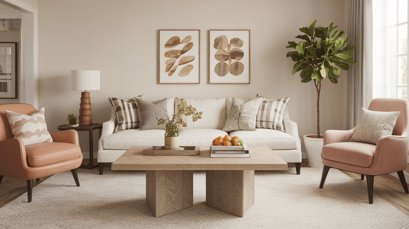
A painted coffee table can become the focal point in your living room.
The right color can tie together other design elements or add a pop of contrast. You control the final look, from matte to glossy, solid to patterned. This small change can make a big impact on how your whole room feels.
31 Stunning Paint Ideas for Your Coffee Table
Here are unique paint ideas for your coffee table – from simple single-color options to creative patterns and textures that can transform any table into a statement piece
1. Classic White for a Timeless Look

White paint makes any coffee table blend with most home styles. It works well in small rooms by making the space look bigger and brighter. The clean look stays in style year after year.
Pro Tip: Apply a clear top coat to protect against coffee stains and marks.
2. Bold Black for Dramatic Contrast

Black coffee tables create a strong focal point in your living room. They stand out against light floors and rugs while adding depth to your space. Black also hides stains and marks better than lighter colors.
Pro Tip: Use a semi-gloss finish for easier cleaning and a slight shine.
3. Soft Pastels for a Calming Ambience

Light blue, mint, or pale pink add a gentle touch to your room. These soft colors create a peaceful feeling without being too loud. They work well in beach-themed or casual spaces.
Pro Tip: Mix white paint with your color choice to create a custom pastel shade.
4. Rustic Wood Finish with a Paint Wash

A thin paint wash lets the wood grain show through while adding color. This method keeps the natural look of wood while updating its style. It works great for country or farmhouse themes.
Pro Tip: Water down your paint to about 50% thickness for the perfect wash effect.
5. Gold Accents for a Luxurious Touch

Adding gold paint to table edges or legs creates a high-end look. The warm metallic tone catches light and adds warmth to your room. It pairs well with glass tops or dark painted surfaces.
Pro Tip: Use painter’s tape for clean lines when adding gold accents.
6. Ombre Effect for a Gradient of Colors

Blending two or more colors from light to dark creates visual interest. The smooth color change makes a simple table look custom-made. This works well with colors in the same family.
Pro Tip: Spray with water while paint is wet to help colors blend smoothly.
7. Tropical Vibes with Bright, Bold Colors

Teal, coral, or sunny yellow bring energy to any room. These vibrant colors make your coffee table a statement piece. They work especially well in rooms with neutral walls and furniture.
Pro Tip: Test bold colors on scrap wood first to make sure you like the intensity.
8. Matte Finish for a Subtle Look

A flat finish absorbs light instead of reflecting it. This creates a soft, modern feel that doesn’t compete with other shiny items in your room. Matte looks especially good on darker colors.
Pro Tip: Clean matte finishes with a soft cloth to avoid burnishing the surface.
9. Geometric Patterns for a Bold Statement

Triangles, squares, or zigzags add modern flair to a simple table. These patterns catch the eye and create a custom piece of art. They can tie together various colors from your room.
Pro Tip: Use low-tack tape to create clean, sharp pattern lines.
10. Chalk Paint for an Antique Look

Chalk paint creates a soft, velvety texture that looks aged and classic. It applies easily without much prep work. The finish can be left as is or distressed for more character.
Pro Tip: No need to sand or prime first – chalk paint sticks to most surfaces.
11. Metallic Silver for a Sleek, Modern Vibe

Silver paint adds a cool, clean feel to your living space. It works well with glass, chrome, and other modern materials. The reflective quality makes it eye-catching without being too flashy.
Pro Tip: Apply thin layers and let each dry fully for the smoothest finish.
12. Marble Effect for a Touch of Classiness

Faux marble techniques create a high-end look without the high cost. The swirling patterns add visual texture to your coffee table. White with gray or gold veining works in most settings.
Pro Tip: Practice the marbling technique on paper before trying it on your table.
13. Herringbone Pattern for Texture
A painted herringbone pattern adds depth and interest to a flat surface. The zigzag design looks complex but can be made with simple tape methods. It works with both bold and subtle color combos.
Pro Tip: Draw your pattern lightly in pencil first as a guide for your tape placement.
14. Wood Stain with Painted Details for a Custom Look

Combine stain for the main surface with painted accents for contrast. This highlights the table’s design features while keeping some natural wood visible. The mix of finishes adds depth.
Pro Tip: Always apply stain first, then add painted details after it fully dries.
15. All-White with Colorful Drawer Pulls

Paint the whole table white, then add bright knobs or handles. This simple approach makes updating your look easy in the future. Just change the hardware when you want a new style.
Pro Tip: Seal white paint well to prevent yellowing over time.
16. Art Deco Inspiration with Bold, Straight Lines

Clean lines and high contrast create a 1920s-inspired look. Black and gold or black and white work especially well for this style. The structured patterns add a touch of old-world class.
Pro Tip: Use a ruler and pencil to mark your lines before painting for perfect results.
17. Two-Tone for an Upscale Feel

Paint the top one color and the base another for a custom look. This method highlights the table’s structure and adds visual interest. It works well when matching colors from other room items.
Pro Tip: Use the darker shade on the lower portion to ground the piece.
18. Bold Stripes for a Playful Style

Horizontal or vertical stripes turn a basic table into a fun focal point. Wide stripes look modern while thin ones feel more classic. The pattern works in kids’ rooms or casual living spaces.
Pro Tip: Use a level when making stripe guidelines to keep lines perfectly straight.
19. Watercolor Effect for a Soothing and Artistic Design

Soft, flowing colors that blend into each other create a dreamy look. This painting style feels artsy and one-of-a-kind. Soft blues and greens work well for a calm feeling.
Pro Tip: Work quickly while paint is wet to create smooth color transitions.
20. Chevron Pattern for a Dynamic Look
![]()
The zigzag pattern adds energy and movement to your coffee table. Chevron works in both bold color combos and subtle tone-on-tone approaches. It fits well with modern home styles.
Pro Tip: Make a cardboard template to help create even chevron points.
21. Distressed Finish for a Vintage Appeal

Adding worn spots and scratches on purpose creates an aged, loved look. This style works well in farmhouse and cottage themes. It’s also practical for hiding future real wear and tear.
Pro Tip: Sand edges and corners lightly for natural-looking wear patterns.
22. Neon Accents for a Fun, Retro Look

Small pops of bright colors on a neutral base add playful energy. These accents can be stripes, dots, or painted edges. The contrast creates a modern, youthful feel.
Pro Tip: A little neon goes a long way – use it sparingly for best results.
23. Abstract Art Design for a Modern Twist

Free-form shapes and splashes of color turn your table into artwork. The random patterns mean no mistakes are possible – it’s all part of the design. This works well with colors from your room.
Pro Tip: Look at modern art for inspiration before starting your design.
24. Stenciled Patterns for Intricate Detailing

Pre-made stencils help create complex designs with little artistic skill needed. Floral, geometric, or word stencils all create different moods. The finished look is professional and precise.
Pro Tip: Secure stencils with spray adhesive for the sharpest lines.
25. Polished Concrete Look with Gray Paint

Gray paint with a glossy finish mimics the look of trendy concrete. This industrial style works well in modern and loft-like spaces. It’s much lighter and cheaper than real concrete.
Pro Tip: Add a bit of sand to your paint for authentic concrete texture.
26. Textured Finish with Salt Wash for Depth

Adding salt to wet paint creates a bumpy, textured look when removed. This method adds visual interest and a weathered beach feel. It works best with light colors like white and pale blue.
Pro Tip: The more salt you use, the more texture you’ll create.
27. Boho Chic with Earthy Tones and Patterns

Browns, rusts, and creams in flowing patterns create a free-spirited look. These earthy colors feel warm and welcoming. They match well with natural materials like jute, rattan, and clay.
Pro Tip: Use a sea sponge instead of a brush for natural-looking texture.
28. Banded Design with Contrasting Colors

Painted bands or rings around table edges add a sporty, modern touch. The clean lines create a finished, intentional look. This works well on round tables to highlight their shape.
Pro Tip: Use a compass tool to mark perfect circles for banded designs.
29. Floral Design for a Fresh, Vibrant Appeal
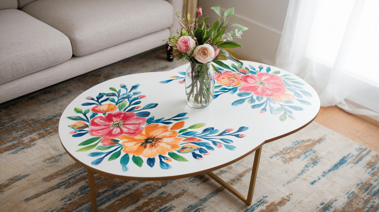
Hand-painted flowers or leafy patterns bring nature indoors. These organic shapes soften the look of a square or rectangular table. They work in both bold and subtle color schemes.
Pro Tip: Start with simple flower shapes if you’re new to hand painting.
30. Plaid Pattern for a Classic, Cozy Look

Crossing lines create a timeless pattern that feels warm and familiar. Plaid works in traditional spaces or to add a touch of coziness to modern rooms. Red and black or blue and white are classic combos.
Pro Tip: Paint the base color first, then add the crossing lines once dry.
31. Bright Neon for a Fun and Playful Accent

Full neon coverage makes a bold statement in any room. These attention-grabbing colors work well in modern spaces or kids’ areas. They can match other bright accents in your room.
Pro Tip: Apply a white base coat first to make neon colors more vivid.
3 Pro Tips for Painting Your Coffee Table
These simple tips will help you get professional results on your coffee table painting project
1. Prepare the Surface Properly
Sand the old finish with medium then fine grit paper. Clean off all dust with a damp cloth. Let dry fully before painting. Good prep leads to better results.
2. Choose the Right Paint for Your Table Material
Wood tables: Use latex or chalk paint. Metal tables: Apply metal primer first. Glass tables: Use special glass paint or enamel. Plastic tables: Need plastic-specific primer.
3. Techniques for Creating Unique Designs
Painter’s tape: Press firmly for clean lines and shapes. Stencils: Hold flat and dab paint with a sponge brush. Dry brushing: Use minimal paint on a dry brush for texture.
Conclusion
Painting your coffee table is a simple way to refresh your living space without spending a lot of money. With just a few basic tools and some paint, you can create a piece that fits your home perfectly. The ideas we’ve shared range from easy one-color projects to more detailed designs that make a statement.
Remember to prep your surface well, use the right paint for your table material, and take your time with the process. Your efforts will result in a coffee table that feels new and looks great.
Why not pick one of these ideas and try it this weekend? Your coffee table is waiting to become your room’s new favorite feature!