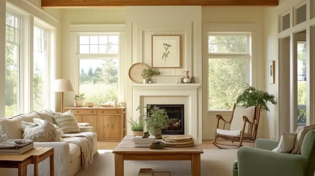
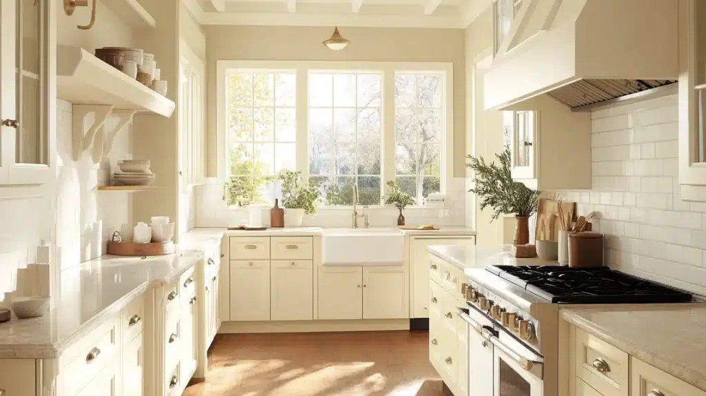
Having tested over 100 white paint colors in real homes, I keep returning to two questions from my clients: “What’s the difference between Dover White and Alabaster?” and “Which one will work in my space?”
As a paint color consultant, I’ve seen these whites transform rooms – and sometimes cause unexpected problems.
Both colors have unique personalities that can either make or break your space.
Let’s explore what eight years of working with these popular Sherwin-Williams whites have taught me about when they shine and fall short.
Understanding the Basics of Dover White
What is Dover White?
Sherwin Williams Dover White belongs to the soft white family, setting it apart from pure whites. While many white paints can look clean and bright, Dover White always shows its warm side.
Its noticeable yellow tones make it a distinctive choice that requires careful planning. This isn’t a plain white that blends into the background—it’s a color that makes its presence known in your space.
LRV (Light Reflectance Value) of Dover White
With an LRV of 83, Dover White sits in an interesting spot. On a scale where 0 is black, and 100 is pure white, this rating puts it closer to off-white than true white.
This means it won’t give you that bright, reflective quality of cleaner whites. Instead, it offers a softer, more muted look that adds warmth to your walls or trim.
Key Characteristics of Dover White
The yellow base in Dover White creates clear likes and dislikes regarding color pairs.
What Works:
- Green-based neutrals bring out their best qualities
- Earthy tones complement its warmth
- Deeper shades that share similar warm bases
What Doesn’t:
- Colors with taupe or pink hints clash with its yellow tones
- Light grays often look off because of competing undertones
- Purple-based colors can make the yellow look too strong
For Trim and Cabinets:
- Keep other whites out of the room to avoid making the yellow more obvious
- Skip white appliances or bright white decor items
- Let Dover White be the brightest element in your space
Understanding the Basics of Alabaster
What is Alabaster?
Sherwin Williams Alabaster is often mistaken for a true white, but it’s better understood as a soft white with cream. While many seek it out as a clean white option, its warm nature sets it apart.
The cream base is made from yellow tones, which blend in smoothly instead of standing out, creating a gentle, welcoming feel.
LRV (Light Reflectance Value) of Alabaster
At 82 on the LRV scale, Alabaster tells an important story about its character. True whites typically rate 90 or higher, so this lower number reveals Alabaster’s softer side.
This rating means it won’t give you that bright, stark look – instead, it offers a more subtle presence that adds comfort to your space.
Key Characteristics of Alabaster
Alabaster shows its true colors when paired with different materials.
What Works:
- Traditional granite countertops, especially from early 2000s homes
- Warm beige wall colors
- Spaces where you want to avoid stark contrasts
What Needs Care:
- Modern marble with gray veining
- Contemporary quartz surfaces
- Cool-toned materials and finishes
Best Uses:
- Perfect for homes with existing warm-toned elements
- Works well in spaces that need softness
- Suits traditional or transitional-style homes
Comparison Table: Dover White vs. Alabaster
| Feature | Dover White | Alabaster |
|---|---|---|
| Color Family | Warm white with strong yellow undertones | Warm white with cream undertones |
| LRV (Light Reflectance Value) | 83 (Closer to off-white) | 82 (Soft, nearly off-white) |
| Undertones | Yellow-based, can clash with pinks or blues | Cream-based, softer, and less intense |
| Ideal Lighting | Bright rooms to avoid amplifying the yellow | Works well in both bright and dim lighting |
| Room Suitability: Which White Works Best? | Best for earthy or green-toned pairings; ideal for trims and cabinets in traditional spaces | Works across neutral or transitional spaces; pairs with beige and warm finishes |
| Popular Pairings for Dover White and Alabaster | Matches with earthy tones like Livable Green or Ancient Marble; avoid taupe, pink, or purple tones | Complements beige walls and traditional granite countertops; avoid modern cool-toned finishes. |
| Challenges | Difficult to pair with taupe or cool grays | It may appear too warm for modern finishes |
| Popular Appeal | Classic, suitable for traditional spaces | Versatile and works across many styles |
Testing Colors: Why It Matters
Paint colors can trick your eyes. What looks perfect on a tiny chip might feel wrong on your walls. Here’s what I’ve learned from testing hundreds of white paint colors in real homes:
Natural Light Changes Everything
Your room’s lighting makes a huge difference:
- Morning light shows the truest color
- Midday sun brings out yellow tones
- Evening light can make whites look darker
- North-facing rooms make whites look cooler
- South-facing rooms boost warm tones
Watch for Undertone Shifts
White paints change their look based on what’s nearby:
- Dover White’s yellow comes out more next to pure white
- Alabaster looks more cream near bright whites
- Both colors look different against wood tones
- Flooring can push whites warmer or cooler
- Furniture affects how whites look in your space
Smart Testing Methods
Follow these steps for better results:
- Use large test patches (at least 12×12 inches)
- Paint samples on all walls that will use the color
- Test near trim, windows, and doors
- Look at colors during different times of day
- Check under your normal room lighting
- Use peel-and-stick samples to move them around
- Compare options side by side
- Take photos to spot undertones more easily
Give yourself time – rushing a white paint choice often leads to redoing the work later. Watch your test patches for at least 24 hours before making your final pick.
Summing Up
Both colors can look beautiful, but they need the right setting to shine.
Take time with your samples, watch them in different lights, and trust what you see in your space more than any expert advice.
Most importantly, remember that the perfect white is the one that makes you feel good every time you walk into your room.
Need more paint color advice? Check out my other color guides, where I break down everything from clean whites to complex neutrals.
Frequently Asked Questions
Will Dover White Look Too Yellow in My Home?
Without proper testing, yes, it might. Dover White’s yellow tones are closer to pure whites or in rooms with cool lighting. Test large samples first.
Is Alabaster Too Bright or Too Muted for My Decor Style?
Alabaster sits on the muted side of white. If you want crisp, modern looks, it might feel too soft. It fits better with traditional or transitional styles.
How Do These Colors Pair with Other Elements in My Space (floors, Furniture, Fixtures)?
Dover White needs green or earth-toned elements to shine. Alabaster works with warm wood, traditional granite, and cream tones. Both struggle with cool finishes.
Are there any Potential Drawbacks or Common Issues with Either Color?
Dover White can look too yellow near white decor, and alabaster might appear dull in modern settings. Both colors need good lighting to avoid looking flat or dim.


