Are you looking to transform your space with a bold and timeless color?
I’m about to show you why Chelsea Gray might be exactly what you’re searching for.
This isn’t just another gray paint color. It’s a designer favorite that has completely transformed ordinary spaces into extraordinary ones.
After helping countless homeowners make their color selections, I can confidently say that Benjamin Moore’s Chelsea Gray stands out for its remarkable versatility and sophisticated depth.
Ready to learn how this rich, charismatic shade could be the game-changer your home needs?
Let’s jump into everything you need about Chelsea Gray, from its perfect pairings to real-world applications that inspire your next painting project.
Why Chelsea Gray Is the Ultimate Choice for a Home Makeover
Transform your space with Chelsea Gray, a sophisticated choice that bridges classic and contemporary design.
This Benjamin Moore shade creates a visual impact while maintaining a sense of tranquility, making rooms feel grand and approachable.
Its depth provides the perfect backdrop for various design elements, from modern furnishings to traditional accents, adapting seamlessly to your style preferences.
Key Features & Characteristics
Distinctive Chelsea Gray’s unique character has carefully balanced undertones.
Its LRV of 22.16 places it in the sweet spot between light and dark, offering enough depth for drama without overwhelming your space.
Natural light reveals subtle violet undertones, while artificial lighting brings out warmer brown notes, creating an ever-changing canvas throughout the day.
This complexity adds interest to walls without competing with other design elements.
Where to Use Chelsea Gray in Your Home
1. Living Room

Chelsea Gray creates a graceful foundation in living spaces, especially when applied to feature walls behind sofas or fireplaces.
The color’s depth enhances architectural details while providing a sophisticated backdrop for artwork and decor. Natural light through windows allows the color to shift subtly throughout the day, adding visual interest.
2. Kitchen
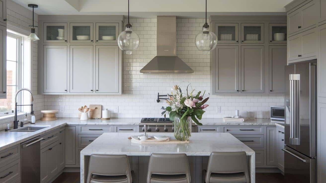
Applied to kitchen cabinets, Chelsea Gray delivers a modern yet timeless look.
The color pairs beautifully with marble countertops and stainless steel appliances, creating a balanced, high-end appearance.
It works particularly well in kitchens with abundant natural light, whose undertones create subtle variations.
3. Bedroom

In bedrooms, Chelsea Gray establishes a serene retreat atmosphere.
The color’s depth promotes restfulness while maintaining enough warmth to feel inviting.
It is an excellent backdrop for light-colored bedding and creates a cozy environment with rich textiles.
4. Home Office

Chelsea Gray brings focus and sophistication to home offices without feeling cold or corporate.
The depth of the color provides an excellent background for video calls and creates an environment conducive to productivity and creativity.
Ideal Color Combinations & Pairings with Chelsea Gray Paint
Chelsea Gray shows remarkable versatility in color combinations.
1. Chelsea Gray & Seapearl Combination

Pair it with Benjamin Moore’s Seapearl for a crisp, clean contrast on trim work and moldings.
2. Chelsea Gray & Tricorn Black for Modern Drama

For modern drama, combine it with Sherwin Williams’ Tricorn Black on doors and windows.
The color also harmonizes beautifully with natural materials, such as warm woods, marble, and metals like brass, which copper enhances its sophisticated character.
3. Chelsea Gray with Warm Woods, Marble & Brass Accents

For a softer approach, Benjamin Moore’s Revere Pewter offers a complementary warm neutral that balances Chelsea Gray’s depth.
Application Tips: Achieving a Flawless Look
Proper surface preparation sets the foundation for Chelsea Gray’s optimal appearance.
Begin by thoroughly cleaning walls and repairing imperfections; even minor flaws become noticeable under this sophisticated shade.
Apply a high-quality primer matched to your final paint color, which ensures even coverage and true color representation.
Test paint samples in different areas and observe them throughout the day. Natural and artificial lighting significantly affect how the color presents itself.
For interior walls, choose an eggshell finish to balance durability with grace.
This finish conceals minor wall imperfections while providing enough sheen to facilitate cleaning. A satin or semi-gloss finish benefits doors and trim, offering enhanced durability and subtle contrast.
When painting, use high-quality brushes and rollers appropriate for your surface texture to achieve smooth, even coverage.
Chelsea Gray in Different Home Styles
1. Modern Homes

Chelsea Gray brings sophistication to modern architecture through clean lines and minimal ornamentation.
It creates dramatic contrast in contemporary settings when paired with bright whites and black accents.
The color enhances the geometric shapes and angular features typical of modern design while maintaining visual interest through its subtle undertone variations.
2. Traditional Homes

In traditional architecture, Chelsea Gray offers an updated take on classic color schemes.
Its depth complements ornate moldings and detailed trim work, while its warmth harmonizes with traditional wood furnishings.
The color respects historical elements while providing a fresh, current feel to established architectural styles.
3. Transitional Homes

Chelsea Gray shines in transitional spaces, bridging contemporary and traditional elements. Its versatility allows it to complement both modern furniture and classic architectural details.
The color creates cohesion between design elements, making it perfect for homes that blend different style periods.
Chelsea Gray Alternatives: Exploring Similar Shades
Benjamin Moore’s Kendall Charcoal offers a deeper alternative, with an LRV of 12.96.
It presents warmer undertones and increased drama, which works particularly well for those seeking a more pronounced statement.
Sherwin Williams’ Dovetail offers a softer approach. Strong violet undertones and an LRV of 26 create a gentler presence while maintaining sophistication.
With an LRV of 17.12, Amherst Gray strikes a middle ground. Its subtle green undertones read particularly well in natural daylight.
Chelsea Gray’s Performance Over Time
The longevity of Chelsea Gray proves impressive in both high-traffic areas and varying environmental conditions.
The color maintains its depth and complexity even after years of exposure to natural light, resisting the fading often seen in darker paint colors.
Regular cleaning with mild soap and water keeps the finish fresh, while its neutral base helps it adapt to changing design trends.
The color is resilient in humid environments, maintaining its finish without developing unsightly marks or streaks.
Its enduring appeal makes it a reliable choice for long-term design plans, providing consistent beauty through various seasons and years.
Conclusion
Chelsea Gray is more than a passing interior and exterior paint color trend.
Its remarkable ability to adapt from modern farmhouse exteriors to sophisticated urban spaces makes it a color that transcends fleeting design preferences.
The deep charcoal undertones create depth, while subtle hints of warmth prevent the shade from feeling stark or industrial.
Through changing light conditions and across different materials, Chelsea Gray maintains its sophisticated character while revealing new dimensions.
This paint color strikes that elusive balance between making a statement and providing a timeless backdrop for your space.
Whether paired with crisp whites, dramatic blacks, or natural materials, Chelsea Gray consistently delivers that perfect blend of confidence and refinement that makes a house feel like home.