Have you noticed how the right paint color can completely change a room? Rockport Gray stands out as a timeless neutral that works in countless spaces.
This medium-toned gray with warm undertones offers a perfect balance—not too dark, not too light—making it suitable for walls, cabinets, or exteriors.
With Rockport Gray, you can create a calm background that highlights your furniture and decorations or use it to make a subtle statement on its own. It pairs well with white trim for a clean look or with natural woods for a cozy feel.
Try Rockport Gray in your living room, kitchen, or bedroom to see how this versatile neutral can bring a sense of balance and comfort to your home.
Understanding Rockport Gray
Rockport Gray has an LRV of 36.6. This places it in the medium range of the light-to-dark scale. The LRV tells us how much light this color reflects – with zero being pure black and 100 being pure white.
At 36.6, Rockport Gray reflects more light than initially mentioned, making it a true medium-toned neutral that balances light absorption and reflection.
This color contains subtle brown and green notes, which warm up what could otherwise be a cool gray.
These warm hints make it more friendly and less stark than pure grays. It’s technically a “greige” – a mix of gray and beige – which helps it adapt to different lighting situations.
Under bright natural light, Rockport Gray shows more of its gray tones. In spaces with warm artificial lighting, its brown hints become more noticeable.
This flexibility makes it work well in both north-facing rooms (which need warmth) and south-facing rooms (which benefit from its cooler aspects).
The color’s medium depth means it creates enough contrast with white trim and ceilings to define architectural details without harsh lines.
Why Choose Rockport Gray?
1. Timeless Appeal and Adaptability
Rockport Gray has stood the test of time while many color trends have come and gone. Its balanced mix of gray with warm undertones gives it staying power that purely trendy colors lack.
Homeowners who choose Rockport Gray often keep it for years without feeling the need to repaint. The color’s middle-of-the-road depth means it won’t look dated as color preferences shift from light to dark and back again.
This long-lasting appeal makes it a smart choice for those who want to paint once and enjoy the results for many years.
2. Works Well in Modern, Traditional, and Transitional Spaces
Few colors cross style boundaries as effectively as Rockport Gray. In modern spaces, it provides a soft background that lets clean lines and simple furniture stand out.
The color adds warmth without competing with the minimalist approach. In traditional homes, it complements wood tones and classic furniture without feeling too new or stark.
For transitional spaces that blend old and new elements, Rockport Gray serves as the perfect mediator, helping different styles coexist beautifully. This flexibility saves you from selecting different colors for differently styled rooms.
3. Complements a Variety of Color Palettes
Rockport Gray plays well with nearly all color groups. It pairs beautifully with soft blues and greens, creating a calm, nature-inspired look.
With warm colors like rust, gold, or terracotta, it provides a cool contrast that balances the palette. When used with crisp whites, it creates clean lines and definition without harsh contrasts.
Even with bold accent colors like navy or burgundy, Rockport Gray holds its own without fighting for attention. This compatibility makes it ideal for open floor plans where multiple color schemes need to flow together.
Best Spaces to Use Rockport Gray
1. Living Room
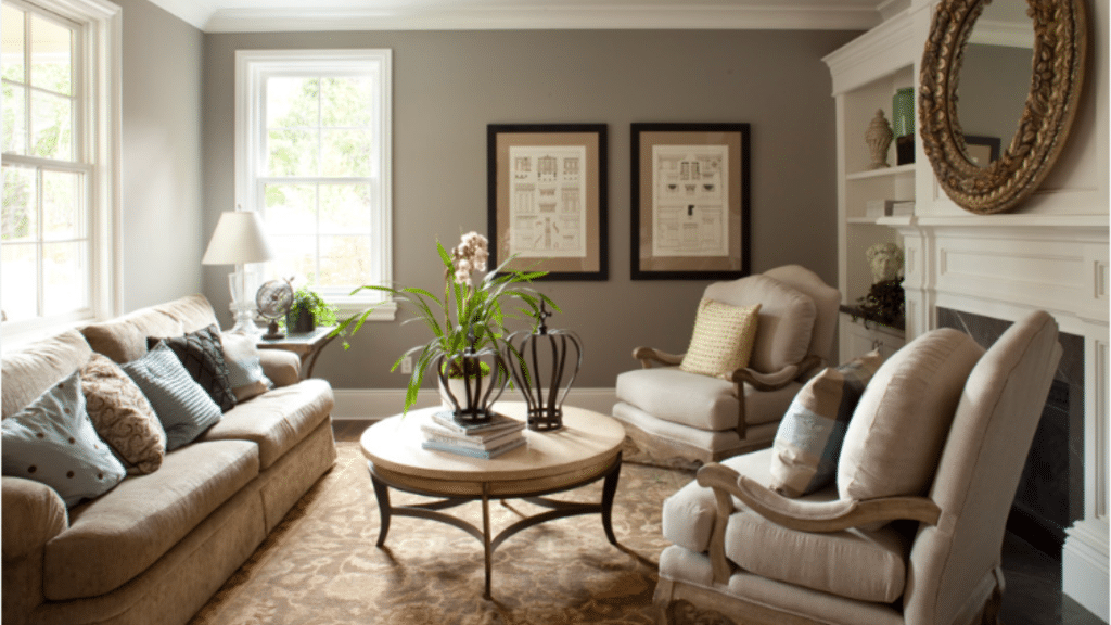
Living rooms thrive with Rockport Gray on the walls. The color’s medium depth adds coziness without making the space feel small or dark. Its warm undertones help create a welcoming feeling for both family and guests.
This gray works exceptionally well in living rooms with natural light, changing subtly throughout the day, adding interest to the space. Pair it with cream or off-white trim to define doorways and windows without stark contrasts.
Add textured throws and pillows in complementary colors to bring the whole room together around this friendly neutral.
2. Bedroom
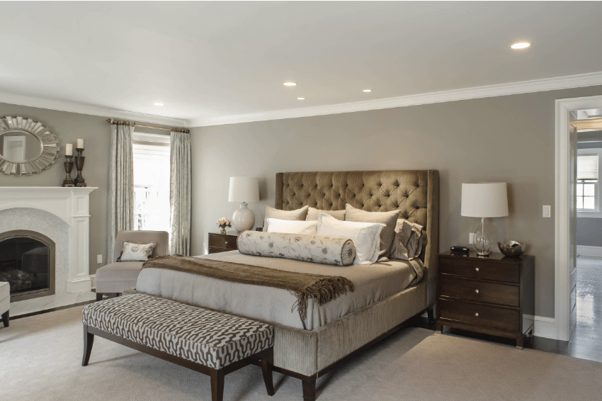
Bedrooms benefit from Rockport Gray’s calming presence. The color isn’t too stimulating nor too dull, hitting the perfect balance for rest.
Its warm undertones make the space feel safe and cozy at night while still looking fresh in the morning light.
White bedding stands out cleanly against this background color, while wood furniture finds a natural partner in these gray-brown tones. For a luxurious feel, pair with soft fabrics and gentle lighting.
The color works equally well in master bedrooms and guest rooms, offering a restful backdrop for all who enter.
3. Kitchen
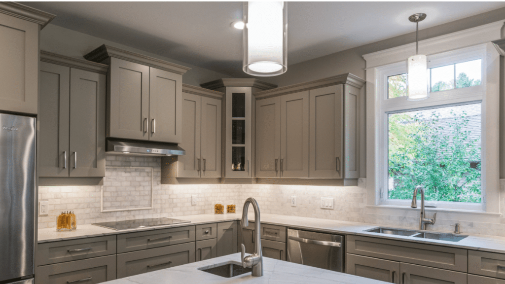
Kitchens painted with Rockport Gray stand out from the crowd of white kitchens. On walls, it creates a rich background for white or wood cabinets.
On cabinets themselves it offers depth without the heaviness of darker colors. The color hides minor marks and splashes better than lighter options, making it practical for busy cooking spaces.
It pairs well with many counter materials, from white marble to dark granite. Under kitchen lighting, Rockport Gray maintains its character while creating a pulled-together look that makes even budget kitchens appear more high-end.
4. Bathroom
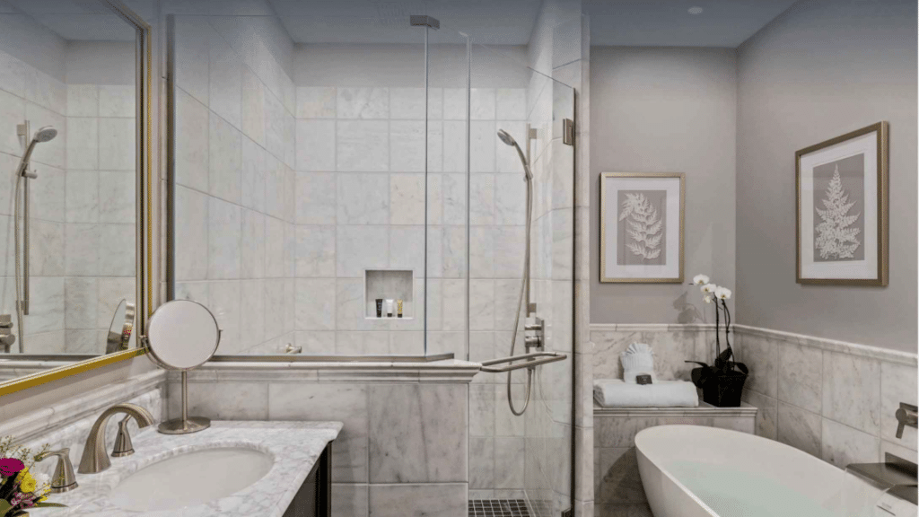
Bathrooms wrapped in Rockport Gray take on a spa-like quality. The muted color creates a sense of calm that’s perfect for morning routines or evening soaks.
It reflects just enough light to keep smaller bathrooms from feeling closed-in. The color works beautifully with white fixtures, making them look crisp and clean by contrast.
For added effect, use white towels and natural elements like wood or plants to complete the peaceful feeling. Both powder rooms and main bathrooms gain a touch of class with this reliable, neutral shade.
5. Exterior
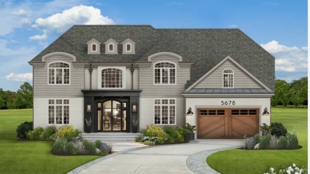
Exteriors painted Rockport Gray stand out among homes without looking flashy. The color shifts beautifully in outdoor light, sometimes appearing more gray, sometimes showing its warmer side.
It pairs wonderfully with white trim for a classic look or black trim for a more current style. Stone or brick elements find a smart partner in this adaptable color.
Unlike pure grays that can look flat on large exterior surfaces, Rockport Gray’s subtle undertones add dimension to the façade.
The color works on various housing styles, from colonial to craftsman to modern, adding curb appeal and lasting good looks.
Tips for Using Rockport Gray Successfully
- Test the color in your specific space, as lighting greatly affects how it appears.
- Pair with crisp white trim like Benjamin Moore’s White Dove for a clean contrast.
- Balance with wood tones – it works especially well with medium to dark woods.
- Add metal accents in silver, brass, or bronze to enhance this versatile gra.y
- Include plenty of light-colored furniture to prevent the room from feeling too heavy.
- Use lighter window treatments to allow maximum natural light with this medium-toned color.
- Consider Rockport Gray for cabinetry – it hides smudges better than white options.
Conclusion
Rockport Gray offers a well-balanced neutral that fits many homes and styles.
We’ve seen how this medium-toned color adapts to different rooms and lighting conditions. Its subtle brown undertones make it warmer than pure grays while keeping its clean, current look.
From living rooms to exteriors, this color creates spaces that feel both fresh and comfortable. Its strength lies in its ability to work with various color schemes and furniture styles without taking over the room.
When you choose Rockport Gray, you’re selecting a color that will look good today and years from now.
Its lasting appeal means you won’t need to repaint soon. This reliable neutral stands ready to make your home look its best, season after season, year after year.