Choosing the wrong white paint can turn your dream room into a decorating nightmare.
Most homeowners think Eider White looks like a safe, neutral choice, just another pretty off-white that will work anywhere.
But this Sherwin-Williams color (SW 7014) has surprised many people with its tricky undertones that can shift from warm gray to subtle pink depending on your lighting.
Understanding what it really looks like in different rooms can save you from costly painting mistakes and help you use this color successfully.
In this guide, you’ll learn precisely what makes it unique, see its technical properties, and find out which rooms work best with this complex neutral.
We’ll also show you how lighting affects this paint color and when you might want to consider an alternative instead.
Eider White (SW 7014) Color Overview
This is an off-white paint color by Sherwin-Williams (SW 7014) that offers more dimension than pure white without going entirely gray.
It’s a warm neutral that feels clean but not stark, which is why it appeals to both modern and classic interiors.
Many homeowners choose it for its soft warmth that doesn’t drift into cream or beige.
That said, its undertones can vary with lighting and surrounding finishes.
| Specification | Details |
|---|---|
| Color Name | Eider White |
| Color Family | White |
| LRV (Light Reflectance Value) | 73 |
| RGB Values | R: 226, G: 222, B: 216 |
| HEX Code | #E2DED8 |
| Location Number | 256-C5 |
Always test a sample in your lighting before making a final choice.
Now that you’ve seen the technical details, it’s important to understand how this color behaves under different lighting conditions.
The Role of Undertones of SW-7014
This color carries a subtle mix of tones that shift depending on the room and light source. In brighter spaces, it leans soft and balanced.
But in low-light areas, hints of taupe or muted purple may appear.
These shifts aren’t always visible at first glance, which is why paint often looks different on the wall than it does on a sample card.
- Subtle grey undertones: These give the shade a cooler look in certain lighting, especially when paired with crisp whites or cooler furnishings. The grey softens the warmth, making the color feel more grounded.
- Violet hints: In dim spaces or near cooler tones, a faint purple cast can emerge. This effect is more noticeable on shaded walls or in rooms with limited natural light.
Once the undertones are clear, the next step is to see how this shade performs in everyday spaces.
Room-by-Room Ideas for Eider White
This paint color works beautifully in many spaces, but knowing where to use it makes all the difference. This warm neutral adapts to different rooms while maintaining.
Let’s explore the best ways to incorporate soft neutrals throughout your home.
1. Living Room Application
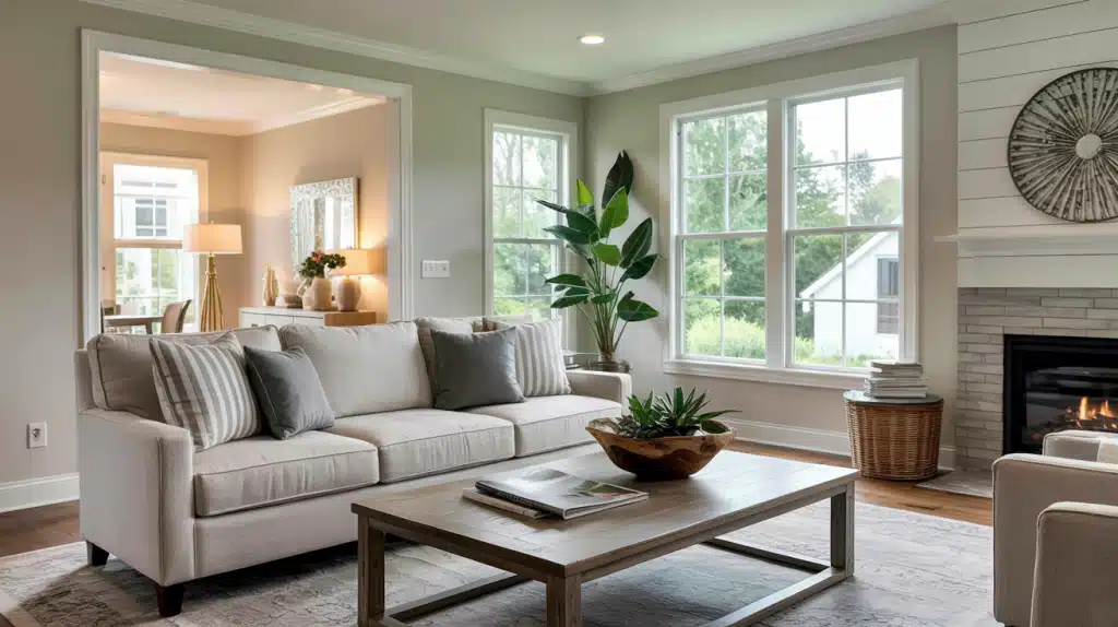
Your living room benefits from this paint color because it creates a welcoming atmosphere without feeling cold. This color works especially well in open floor plans where you need a neutral backdrop.
The warm undertones complement both modern and traditional furniture styles.
Consider using this color on accent walls behind your sofa or fireplace.
Room Styling Tips:
- Use darker throw pillows to make the walls pop
- Add metallic accents to enhance warm undertones naturally
- Place mirrors strategically to reflect light and depth
2. Bedroom Comfort
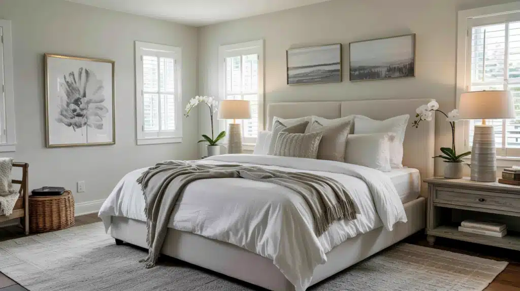
Bedrooms feel cozy and serene with the muted neutral on the walls. This color promotes relaxation while keeping the space bright and airy.
Master bedrooms particularly benefit from the warm undertones that make the room feel inviting.
Guest bedrooms also work well with the off-white hue because it appeals to most people’s taste preferences.
The neutral nature ensures your guests feel comfortable in the space.
Styling Tips:
- Layer white bedding for texture against painted walls
- Add soft lighting to enhance a cozy room atmosphere
- Include natural wood furniture for a warm undertone complement
3. Kitchen Versatility
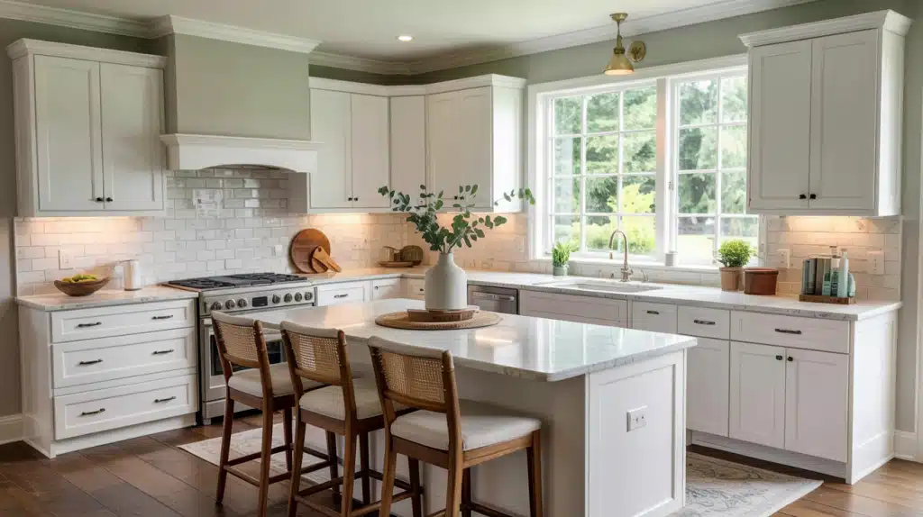
Kitchens painted in soft neutral colors create a timeless look that won’t go out of style. This color works as both a wall color and a cabinet color, depending on your design goals.
When used on walls, it makes white cabinets pop beautifully.
The color handles kitchen lighting well, from under-cabinet fixtures to natural window light.
The soft neutral maintains its appeal even in busy cooking spaces with lots of activity.
Styling Tips:
- Install warm LED bulbs to prevent cool clashing
- Use natural countertops to enhance a neutral, warm feel
- Add colorful backsplash tiles for visual wall interest
4. Bathroom Applications
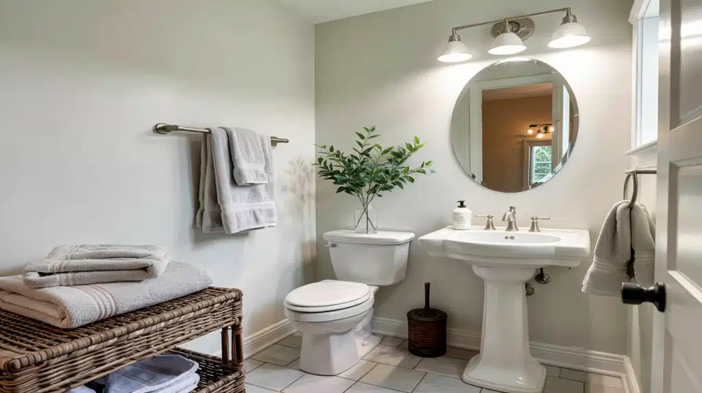
Bathrooms benefit from this soft neutral, especially in spaces without windows. The color stays bright and clean-looking while adding subtle warmth.
Small powder rooms feel larger when painted with this light, reflective color.
The moisture resistance of quality paint ensures to holds up well in humid bathroom conditions. Pair it with white fixtures for a classic, spa-like feel.
Styling Tips:
- Choose warm fixtures to complement paint color undertones
- Add fluffy towels for a classic spa-like room atmosphere
- Include plants to enhance soothing paint color quality
5. Hallways and Entryways
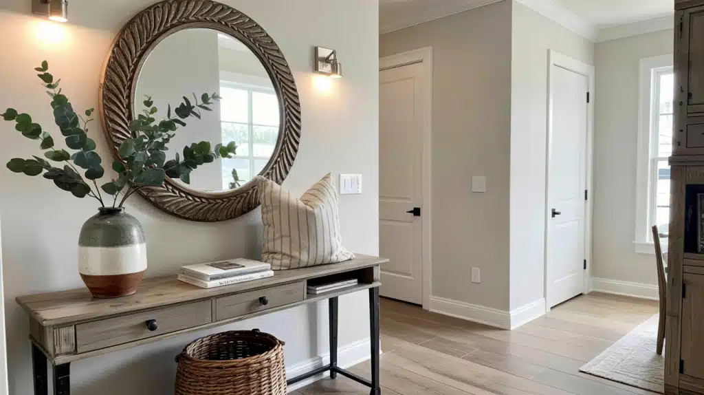
Narrow hallways benefit from the light-reflecting properties of the color. This color makes these transitional spaces feel larger and brighter.
Entryways painted in this neutral color create a welcoming first impression for guests.
Styling Tips:
- Install wall sconces for an even paint color highlighting
- Use warm rugs to complement the wall paint color
- Add matching frames for visual wall interest creation
After exploring where this color works best, it’s helpful to know what other shades offer a similar feel or flexibility.
Similar Shades to SW 7014
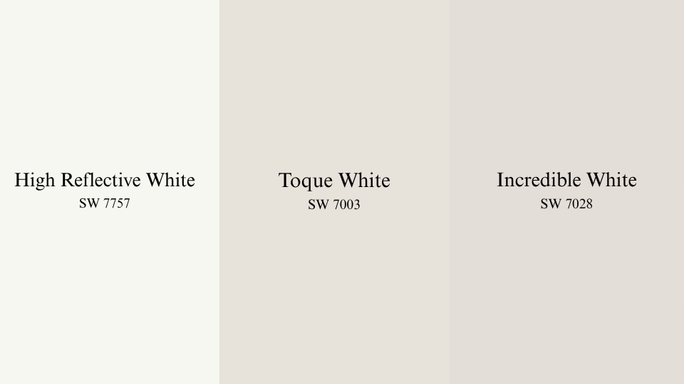
Looking for alternatives to Eider White? These three Sherwin-Williams shades share similar depth, tone, and flexibility, each with its subtle difference.
1. High Reflective White SW 7757
- This is one of the brightest whites available in the Sherwin-Williams collection.
- It delivers strong contrast when paired with muted or mid-tone colors.
- Often used for trim, ceilings, or doors where clarity and brightness are preferred.
- It lacks visible undertones, making it a straightforward option in varied lighting.
2. Toque White SW 7003
- A soft off-white that leans warm with a touch of beige in its base.
- It maintains subtlety even under intense daylight, avoiding glare.
- Suitable for open areas where a neutral foundation is needed.
- Unlike stark whites, it introduces comfort without feeling heavy.
3. Incredible White SW 7028
- Offers a blend of taupe, gray, and a slight pink-purple hue depending on light.
- Balances between cool and warm elements, adjusting to the room’s direction.
- Effective in living rooms, kitchens, and bedrooms where a soft backdrop works well.
- With an LRV of 74, it reflects light moderately while maintaining character.
If you’ve settled on this shade or something similar, the next step is to choose colors that pair well with it.
Coordinating Colors for SW 7014
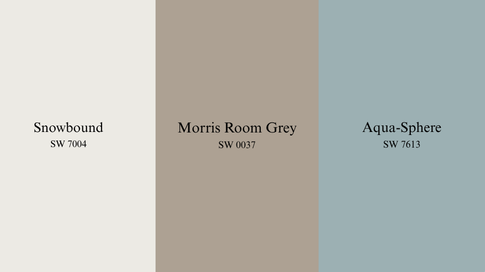
Pairing Eider white with the right companions can upgrade any space; these shades add depth, structure, and harmony without competing for attention.
1. Snowbound SW 7004
- Clean white with a cool, soft base
- Reflects light without harshness
- Ideal for trim and bright rooms
- Avoid mixing with warmer whites
2. Morris Room Grey SW 0037
- A deep gray-green shade rooted in historical palettes.
- Provides grounded contrast when used with soft neutrals.
- Ideal for feature walls, built-ins, or smaller rooms needing depth.
- Pairs well with natural wood tones and matte black accents.
3. Aqua-Sphere SW 7613
- A medium blue with hints of gray that add a relaxed tone to any space.
- It introduces color without overwhelming when used alongside soft off-whites.
- Works nicely in bathrooms or accent walls where a bit of coolness is needed.
- Complements brushed nickel, white tile, or light oak furnishings
With color pairings in place, keeping your walls in good shape over time becomes the next priority.
Maintenance Tips for Eider White
Keeping this shade looking fresh requires regular care and attention to the surfaces it’s applied on. These tips can help extend its appearance and durability over time:
- Dust walls regularly using a dry microfiber cloth to prevent buildup.
- Wipe gently with a damp sponge for spots or fingerprints, especially in high-contact areas.
- Use mild soap and water on stained sections; avoid harsh cleaners that can damage the finish.
- Avoid scuffing by being mindful of furniture placement and movement.
- Touch up small marks with leftover paint stored in a sealed container.
- Check corners and baseboards for wear, as these areas tend to show signs of use first.
Conclusion
Getting the right results with this soft neutral depends on choosing the right finish and applying it carefully. Whether you opt for matte in quiet spaces or satin in busy areas, this off-white suits many rooms.
Ensure that you test in your actual lighting conditions before committing. Large swatches help you avoid surprises once the paint is up.
The finish you choose will seriously impact its appearance in your home. Matte softens the color, while semi-gloss makes it appear brighter.
Satin works well for most rooms thanks to its balance of appearance and durability.
Want to try it out? Stop by a Sherwin-Williams location and grab some paint samples to see how Eider White works in your space.