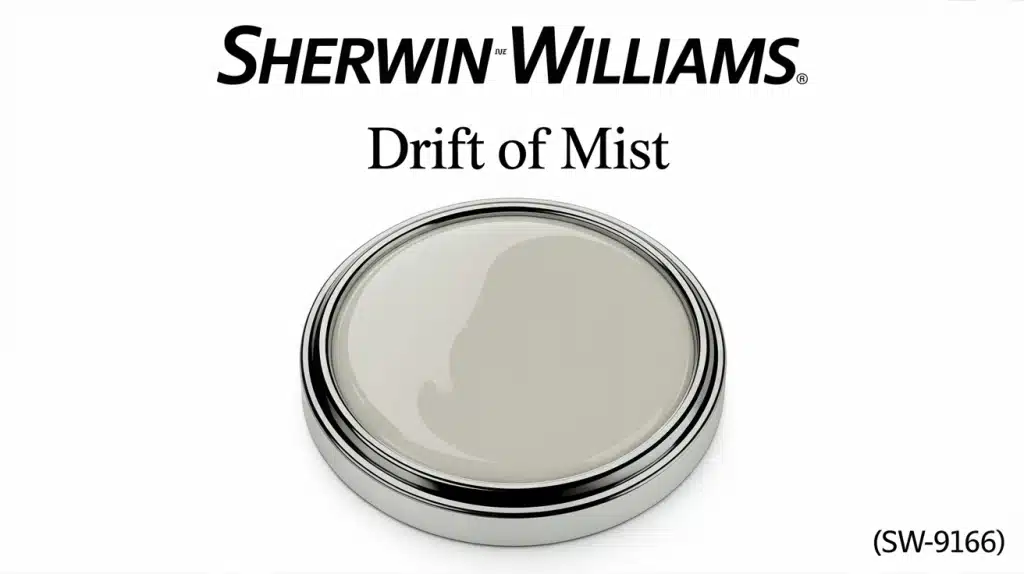
Ever walked into a room and felt instantly calm? That’s the magic of Drift of Mist paint color.
This soft gray creates spaces that feel both cozy and refined. Many homeowners struggle to find the perfect neutral that works in every room and lighting condition.
Drift of Mist solves this problem beautifully. This Sherwin-Williams color (SW 9166) has subtle green and blue undertones that shift throughout the day. It pairs well with wood furniture, colorful accents, and modern fixtures.
This guide covers everything about this versatile neutral. We’ll explore room ideas, color combinations, and application tips. Expert insights and examples show how this color works in different spaces.
Ready to change homes with this versatile neutral? Let’s find out why Drift of Mist might be the perfect paint choice.
Drift of Mist: Paint Color Basics
Drift of Mist is a soft, light gray from Sherwin-Williams. It offers a balanced look that sits between gray and beige, often referred to as greige.
Its Light Reflectance Value (LRV) is 69, which means it reflects a good amount of light and can brighten up spaces.
This neutral tone has very gentle green and blue undertones. These keep it from feeling cold or flat, helping rooms feel calm and comfortable. The color subtly shifts with changing light, looking fresh during the day and a bit warmer at night.
Though part of the gray color family, Drift of Mist leans warmer than a classic gray while still being cooler than a true beige.
It brings a quiet, calming feel to interiors and works in nearly any room without overpowering other elements.
Why Choose Drift of Mist for Your Home?
This versatile neutral offers the perfect balance between style and function. This Sherwin-Williams neutral works beautifully in any room, making it a smart choice for homeowners.
Morning sunlight brings out the fresh quality of Drift of Mist, while evening light makes it feel cozy. The color works with wood tones, metallic finishes, and colorful accents equally well.
Here’s what makes this color special:
- Versatile lighting performance: Looks great in natural and artificial light
- Flexible decorating options: Works with any furniture style or color scheme
- Calming atmosphere: Creates peaceful, relaxing spaces
- High-quality coverage: Durability with easy maintenance
- Timeless appeal: Won’t go out of style like trendy colors
- Room-to-room flow: Perfect for open floor plans and whole-house painting
Room-by-Room Inspiration for Drift of Mist Paint
Drift of Mist paint color works wonderfully in almost every room of the house. This soft gray creates a peaceful atmosphere that makes spaces feel larger and brighter.
1. Living Room Setup
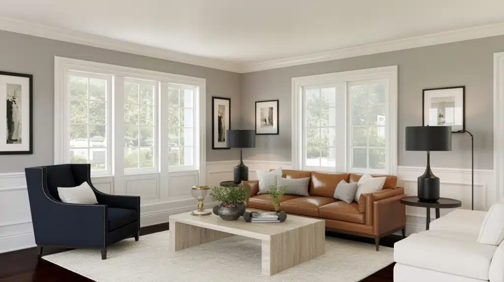
Start with this soft gray on the walls to create a welcoming backdrop that doesn’t compete with furniture or decor. The balanced undertones work with both bold and neutral furniture pieces.
The color changes beautifully from day to night lighting.
2. Bedroom Changeover
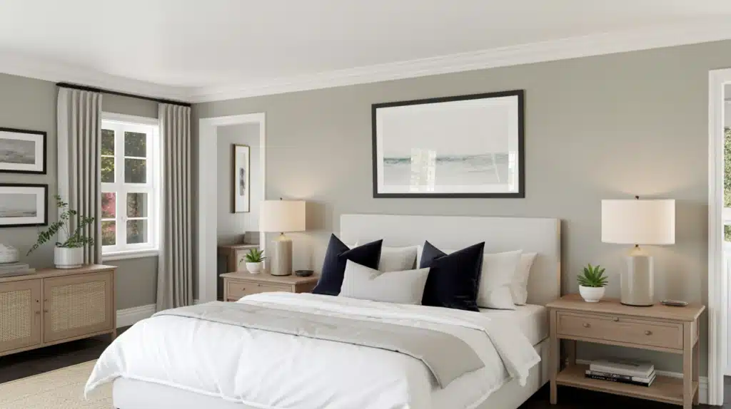
Apply drift of mist, where the calming green and blue undertones promote better sleep and relaxation. This soft gray feels peaceful without being cold or sterile.
The color works with any bedding color from whites to deep blues.
3. Kitchen Makeover
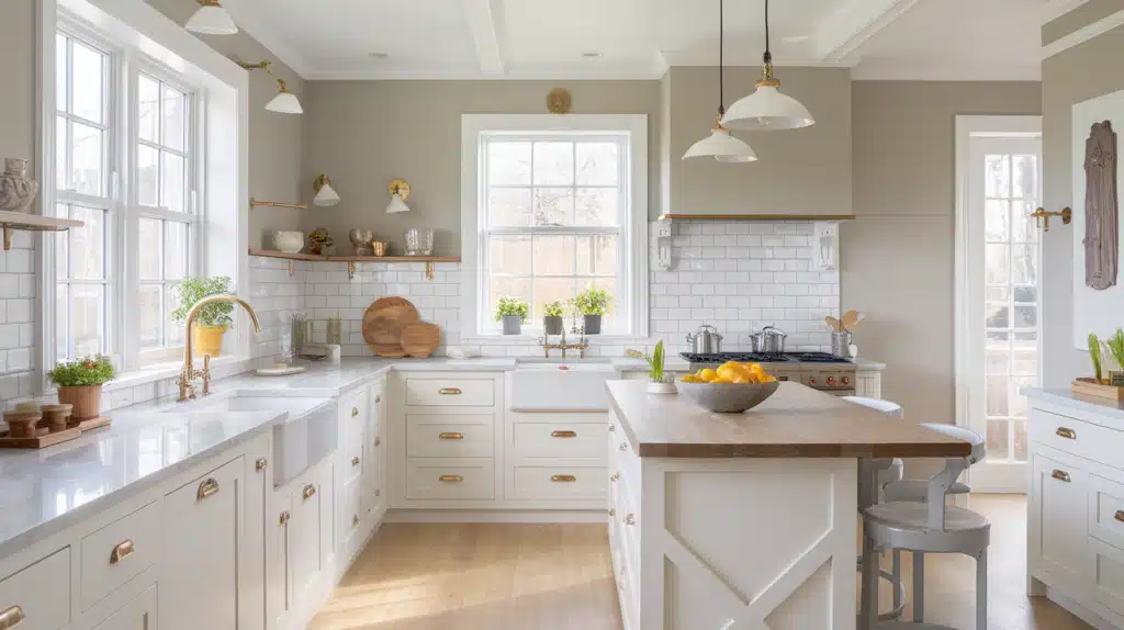
Paint walls to complement white cabinets perfectly while adding warmth that pure white walls can’t provide. The color works with both marble and wood countertops.
This shade handles kitchen lighting changes well throughout the day.
4. Bathroom Refresh
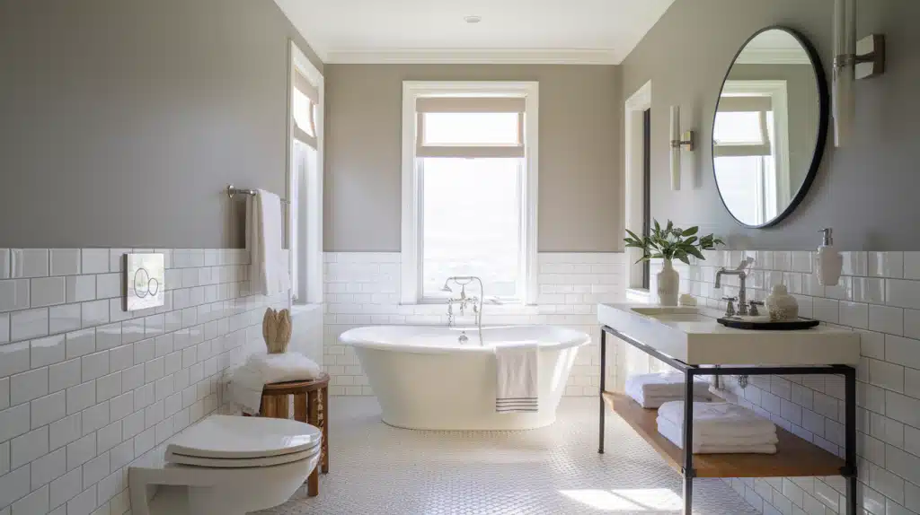
Convert the space for a spa-like feeling with Its soft, misty quality. The color works beautifully with white fixtures and any metal finishes.
It reflects light well, making small bathrooms feel larger.
5. Hallway Connection
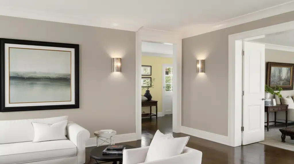
Complete the flow by connecting different spaces smoothly while maintaining visual interest. The Color Flows Well into adjacent rooms without clashing.
It makes narrow hallways feel wider and More Open.
Furniture and Decor Pairing Ideas with Drift of Mist (SW 9166)
The colour works beautifully with many furniture styles and decor pieces. The soft gray background lets furniture and accessories shine without competing for attention. This neutral base makes it easy to change decor styles over time.
Here’s how to style your space with Drift of Mist:
- Wood furniture – Light oak, maple, walnut work well with green undertones
- Metal finishes – Brushed nickel, matte black, bronze, and brass all pair nicely
- Fabric textures – Linen, cotton, and velvet enhance the calming quality
- Leather pieces – Cognac, tan, dark brown, or black leather work with Drift of Mist
- Glass and ceramics – Clear glass and white ceramics brighten the space
Similar Color Options for Drift of Mist
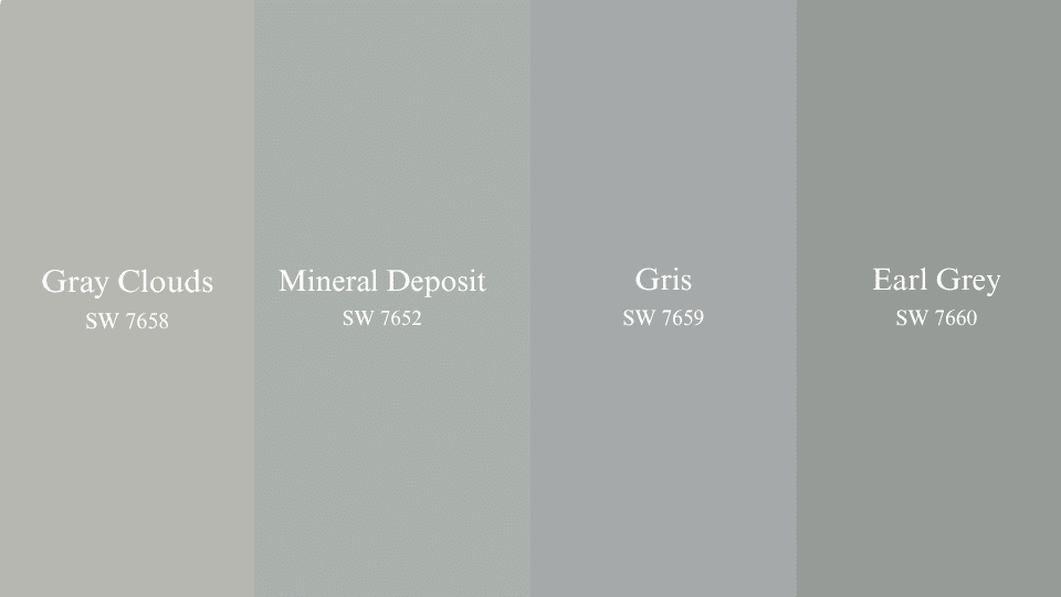
These four tones offer depth and range for those seeking a slightly darker or cooler alternative to Drift of Mist.
1. Gray Clouds (SW 7658)
- Has a slightly cooler tone that leans into blue-gray
- Great for adding a soft, quiet feel to any space
- Works well in natural light without feeling cold
- Offers contrast against wood tones or white trim
2. Mineral Deposit (SW 7652)
- Features a balanced mix of gray and green
- Suits both small and large rooms with its gentle presence
- Blends smoothly with stone or tile surfaces
- Adds depth without overpowering other elements
3. Gris (SW 7659)
- Deeper and more grounded than lighter neutrals
- Creates a solid base for accent colors or layered textures
- Looks good with matte finishes and brushed metals
- Holds up well in low-light conditions
4. Earl Grey (SW 7660)
- Richer in tone, leaning toward a stormy gray
- Ideal for accent walls or cabinetry
- Pairs well with both warm leathers and soft fabrics
- Brings dimension to open or shared spaces
Coordinating Colors That Work Well
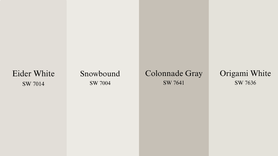
These shades pair naturally with Drift of Mist, offering balance and support without competing for attention.
1. Eider White (SW 7014)
- Slightly warm with a hint of gray that softens bright spaces
- Keeps walls feeling balanced when paired with muted tones
- Maintains its tone under different lighting conditions
- Great for trim or ceilings when cooler whites feel too stark
2. Snowbound (SW 7004)
- A clean white with a subtle warmth
- Helps brighten up corners without looking sharp
- Works well as a backdrop for artwork and decor
- Brings contrast when used next to wood finishes
3. Colonnade Gray (SW 7641)
- Sits comfortably between warm and cool
- Easy to use for feature areas like built-ins or cabinetry
- Gives structure without feeling too dark
- Matches well with brushed nickel or soft gold accents
4. Origami White (SW 7636)
- A soft neutral with just a touch of warmth
- Keeps a space light while supporting other tones
- Helps tie together trim, walls, and ceilings smoothly
- Fits traditional and modern styles equally well
Conclusion
Drift of Mist delivers everything homeowners want in a neutral paint color. This classy gray adapts to changing light while maintaining its soft, welcoming character throughout your home.
SW 9166 works equally well with modern minimalist decor or traditional furnishings. Its balanced undertones prevent the flat look common with basic grays, giving walls subtle depth and interest.
Before painting, test samples in different rooms and lighting conditions. Consider using eggshell finish for walls and satin for trim to create professional results. With proper preparation, this versatile shade transforms any space into a calming retreat.
Ready to experience the perfect neutral? Pick up a sample today and see your rooms in a whole new light.