Are you tired of plain white trim? Me too! That’s why I started playing with darker trim colors against light walls in my house. The results were amazing rooms felt more put-together and custom without major renovations.
My guests noticed right away, asking what made my spaces feel so different.
Contrast trim isn’t just a passing trend. It’s a design technique with real staying power that dates back centuries. Homes with colored trim against white walls have a charm that basic white-on-white can’t match.
Ready to see how this small change could make a big difference in your home?
Let’s look at what contrasts trim special and how to use it.
What is Contrast Trim?
Contrast trim turns the usual home painting approach upside down. Instead of white trim with colored walls, this style uses light walls (often white) with darker trim.
The trim work – baseboards, door frames, window casings, and crown molding stands out in a deeper shade than the surrounding walls.
This design choice dates back many years but has seen renewed interest among homeowners looking for simple updates with major impact.
Its beauty lies in its simplicity: Just a few paint cans can completely change a room’s feel.
Why Contrast Trim Works in Any Home Style?

Contrast trim is uniquely suited to nearly any house style. From century-old Victorians to brand-new builds, this paint technique adapts to its surroundings while making a noticeable impact on how a space feels.
This approach fits many homes because it emphasizes existing features rather than adding new ones. It is versatile and accessible for most homeowners.
Classic vs. Modern Appeal
In traditional homes, contrast trim has deep roots. Early American and European houses often featured dark wood trim against light walls, partly from necessity, as lighter paints were more costly.
These homes showcased craftsmanship through detailed trim work that stood out against simpler wall surfaces.
Today’s return to contrast trim honors this heritage while giving it a fresh life. Modern homes now incorporate this technique with updated color palettes.
What once might have been dark brown woodwork might now be charcoal gray or navy blue paint, creating a link to design history while feeling current.
Many designers now use contrast trim to add character to newer homes that might lack built-in historical details.
When trim is painted in a contrasting shade, a contemporary home with clean lines can gain depth and interesthade.
Instant Architectural Enhancement
One of the most compelling reasons to try contrast trim is how it draws attention to a home’s structural details. Elements that might go unnoticed with white-on-white paint suddenly become focal points when given a different color.
When painted in contrast to the walls, crown molding at the ceiling, chair rails, wainscoting, and window casings all gain prominence.
These details often represent the craftsmanship that went into a home, and highlighting them brings that quality forward.
The frame effect created around windows and doors is particularly striking. Like a picture frame around artwork, darker trim creates boundaries that draw the eye and make what’s within the frame more noticeable.
Windows appear more substantial, and doorways gain importance as transitions between spaces.
Choosing the Perfect Contrast Trim Color
Selecting the right color combination for your contrast trim is crucial for creating an intentional and cohesive look. The paint colors you choose will set the mood for your entire space, so it’s worth taking the time to consider options carefully.
The best color pairings balance contrast with harmony, creating distinction without jarring visual transitions. Your choice will depend on your home’s style, color preferences, and how bold you want the final effect.
Applying Contrast Trim to Different Areas of the Home
Contrast trim can be used throughout your home in various ways. Each area presents unique opportunities to highlight architectural features and create visual interest.
This approach is beautiful because it can be tailored to specific spaces while maintaining a cohesive look throughout the home.
Let’s look at how contrast trim works in different areas and the specific considerations for each application.
Doors & Windows

Doors and windows naturally create openings in your walls, making them perfect candidates for contrast trim treatment. When framed with a contrasting color, these elements gain importance and become focal points in your rooms.
Window casings painted in a contrasting color help draw attention to outdoor views. The trim acts like a picture frame, making the view beyond feel more intentional and considered.
Contrast trim can highlight interesting panel details or beautiful hardware that might go unnoticed for doors.
Interior doors with contrasting trim create clear transitions between rooms, helping to define separate spaces within open floor plans.
Baseboards & Crown Molding

Baseboards and crown molding sit at your walls’ top and bottom boundaries, creating natural opportunities for contrast. These horizontal elements help ground the space and draw the eye around the room.
Darker baseboards create a solid foundation for walls, almost like anchoring them to the floor. This can be especially effective in rooms with high ceilings, helping to balance the vertical expanse with strong horizontal lines.
Crown molding in a contrasting color draws attention upward and highlights the transition between wall and ceiling. This can make ceilings appear higher, making rooms feel more complete.
Accent Walls & Special Features

Contrast trim pairs beautifully with accent walls and special architectural features, enhancing their impact and creating thoughtful designs.
Contrast trim helps contain the pattern and creates a clean border using wallpaper. This framing effect is particularly important with bold patterns that might otherwise feel overwhelming if they ran right to the edge of the ceiling or floor without a visual break.
The trim color can be pulled from a color within the wallpaper pattern, creating a cohesive connection.
For example, if your wallpaper has navy blue elements, navy trim would tie everything together beautifully.
10 Most Popular Contrast Trim Styles & Inspirations
Different home styles lend themselves to unique contrast trim approaches. These popular combinations show this technique’s versatility across various design aesthetics. Find inspiration from these established styles or mix elements to create your own unique look.
1. Modern Farmhouse – White Walls with Deep Charcoal Trim
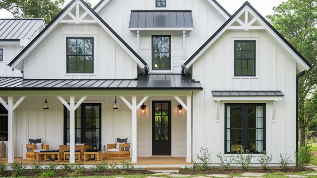
This combination brings fresh contrast to the farmhouse look. Clean white walls keep spaces bright and airy, while charcoal trim defines doorways and windows. This pairing works well with wooden furniture and black metal accents, typically in farmhouse decor.
2. Parisian Elegance – Muted Pastel Walls with Rich, Dark Green Trim

French-inspired interiors often feature soft wall colors like pale pink or blue-gray paired with forest green trim. This combination feels both classic and fresh. The contrast highlights ornate molding while maintaining the comfort that French apartments are known for.
3. Industrial Chic – Exposed Brick with Black Trim

This pairing combines raw textures with clean lines. The warmth of brick walls gains structure from matte black trim.
This combination works especially well in lofts and converted spaces, where maintaining industrial elements honors the building’s history while adding modern polish.
4. Scandinavian Simplicity – Light Wood Trims with Soft Gray Walls

This pairing emphasizes natural materials and quiet comfort. Pine or oak trim brings warmth to light gray walls, creating gentle contrast. The look feels clean and bright without being stark, perfect for homes where calm and connection to nature are priorities.
5. Vintage Revival – Deep Jewel-Toned Trims for Historic Homes

Rich ruby, sapphire, or emerald trim adds historical accuracy to older homes. These deep colors highlight original woodwork while feeling both traditional and fresh.
This approach works well in Victorian, Craftsman, and Colonial Revival homes with ornate trim details worth showing off.
6. Minimalist Monochrome – Subtle Tone-on-Tone Trim

For a refined, understated look, walls and trim in the same color family create quiet sophistication.
The trim might be just two shades darker than the walls, defining without strong contrast. This approach feels modern and thoughtful, letting furniture and art take center stage.
7. Eclectic Boldness – Bright-Colored Trim in Playful Interiors

Homes with personality shine with colorful trim. Sunny yellow, coral, or teal trim against white walls creates happy, lively spaces. This works well in creative homes with collected art and unique furniture. Each doorway becomes a moment of joy with unexpected color.
8. Coastal Calm – Soft Blue Trim with Crisp White Walls

Beach-inspired homes feel fresh with this combination. Pale blue trim reminiscent of sea glass or summer skies creates a clean, breezy aesthetic. The contrast is gentle yet noticeable, perfect for creating a relaxed mood without going too theme-heavy on coastal decor.
9. Urban Sophistication – Matte Black Trim for Dramatic Contrast
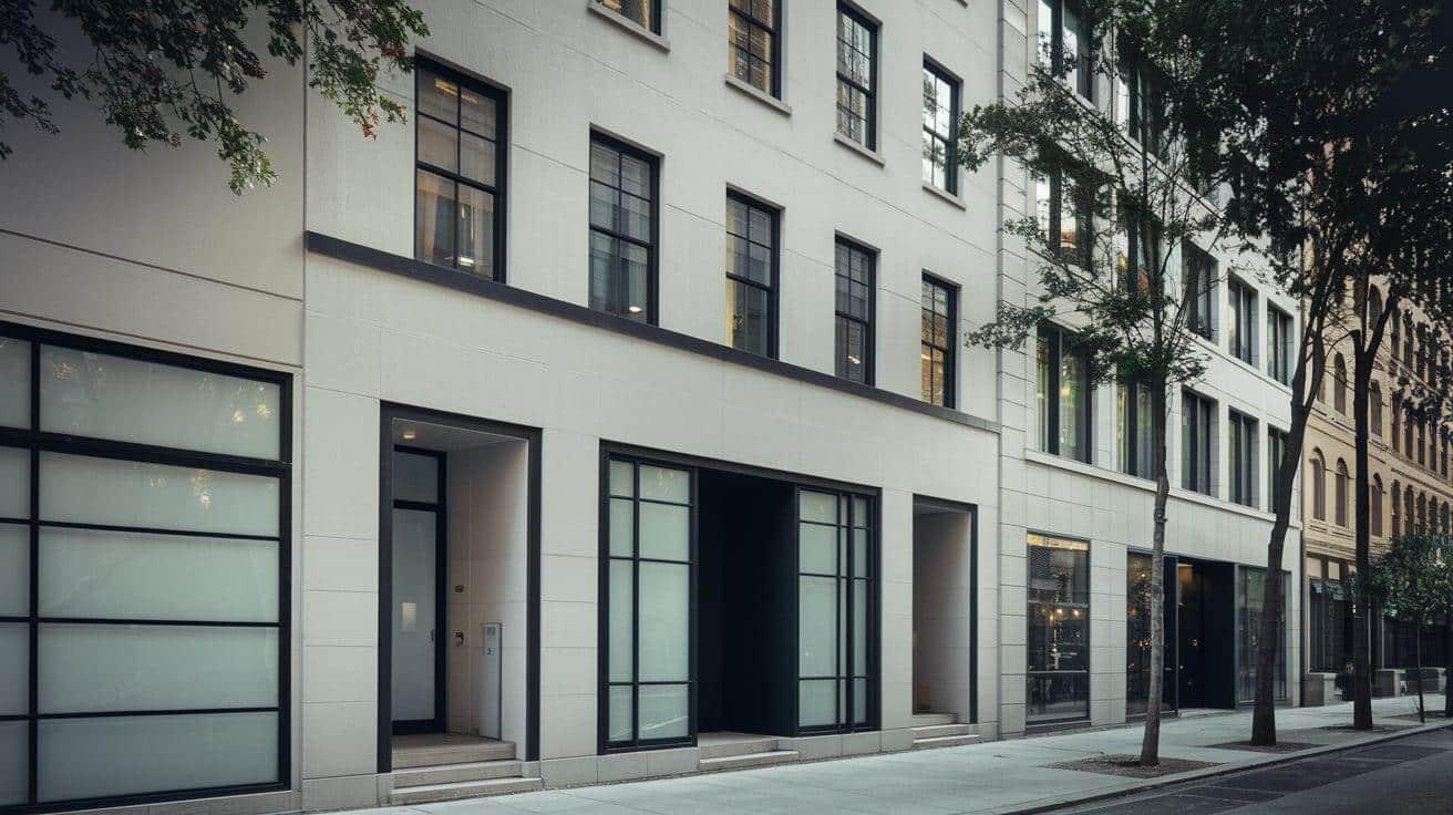
City apartments and townhomes gain architectural interest with this bold pairing. The strong lines of black trim add structure to white or light gray walls. This combination works with many styles, from minimal to classic, creating a photogenic background for modern life.
10. Mid-Century Modern – Warm Walnut Trim with Neutral Walls

Homes built between 1945-1975 often featured beautiful wood trim that looks fresh again today. Natural walnut against soft white or taupe walls creates organic contrast.
This combination honors mid-century design principles while fitting perfectly with today’s return to natural materials.
The Bottom Line
Are you ready to try contrast trim in your home? This simple paint technique offers big rewards with minimal effort.
The visual impact can transform your spaces, whether you choose bold black trim against bright white walls or a subtle tone-on-tone approach.
Remember to test your color choices in different lighting before committing, and consider starting with a smaller room if you’re hesitant about the change. The beauty of paint is that it’s always fixable if you try something new later.
If you’ve used contrast trim in your home, I’d love to hear about your experience! Share your paint color combinations or photos in the comments below.
Which contrast trim style from our top ten list appeals to you most?