Seeking the perfect warm gray that feels timeless and effortless? You’ve found it in Sherwin-Williams Agreeable Gray (SW 7029).
This beloved neutral has won over countless homeowners and designers, but choosing the right coordinating colors can feel overwhelming.
The wrong paint combinations can make your beautiful gray walls look muddy or clash with your decor.
But when you pair Agreeable Gray with the right trim colors, accent shades, and room-specific palettes, magic happens.
In this guide, you’ll learn precisely what makes Agreeable Gray so special, why color coordination matters, and the best pairings for trim, accents, and whole-home color schemes that create attractive, cohesive spaces.
Why Agreeable Gray Is the Ideal Neutral?
Sherwin-Williams Agreeable Gray (SW 7029) stands out as the perfect warm beige that works in any home. This balanced neutral brings together the best of gray and beige without leaning too heavily toward either side.
It feels cozy yet fresh, making spaces look bigger while still feeling warm and inviting.
Agreeable Gray: What to Know
| Property | Details |
|---|---|
| Color Code | SW 7029 |
| Color Family | Warm Greige |
| LRV (Light Reflectance Value) | 60 |
| What LRV 60 Means | Reflects 60% of light – perfect for most rooms without being too bright or too dark |
| Undertones | Balanced beige and gray with slight warm hints |
| Best Room Types | Living rooms, bedrooms, kitchens, hallways |
| Lighting Sensitivity | Moderate, appears warmer in warm light, cooler in cool light |
11 Best Colors to Coordinate with Agreeable Gray
Learn which whites, neutrals, and bold hues work beautifully with Agreeable Gray. Perfect pairings for a timeless, warm, and inviting home.
Best Trim Colors for Agreeable Gray Walls
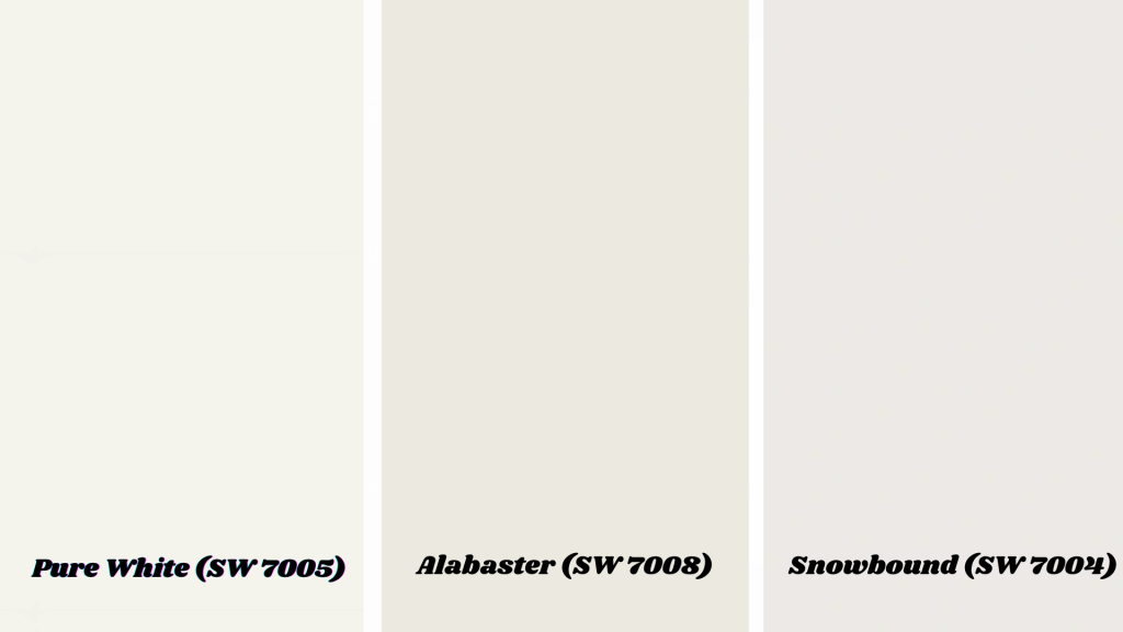
Pure White offers the perfect crisp contrast against Agreeable Gray without feeling too harsh. This classic white trim makes your gray walls look more defined and polished.
It works well in modern spaces that require clean lines and a fresh appeal. The contrast is noticeable but not overwhelming, creating a timeless look that feels both current and classic.
Alabaster brings warm undertones that blend beautifully with Agreeable Gray’s greige nature. This soft white creates gentle transitions that feel cohesive and calming throughout your home.
It’s perfect for traditional or transitional spaces where you want everything to flow together smoothly. The warm base in Alabaster complements the beige hints in Agreeable Gray perfectly.
Snowbound provides a slightly cooler white that balances Agreeable Gray’s warmth in bright, sunny rooms. This trim choice works well in south-facing spaces where Agreeable Gray might feel too warm.
It creates a fresh, clean contrast that keeps your walls from looking muddy or dull. The cooler undertones help maintain that perfect greige balance throughout the day.
Warm Neutrals That Pair Beautifully
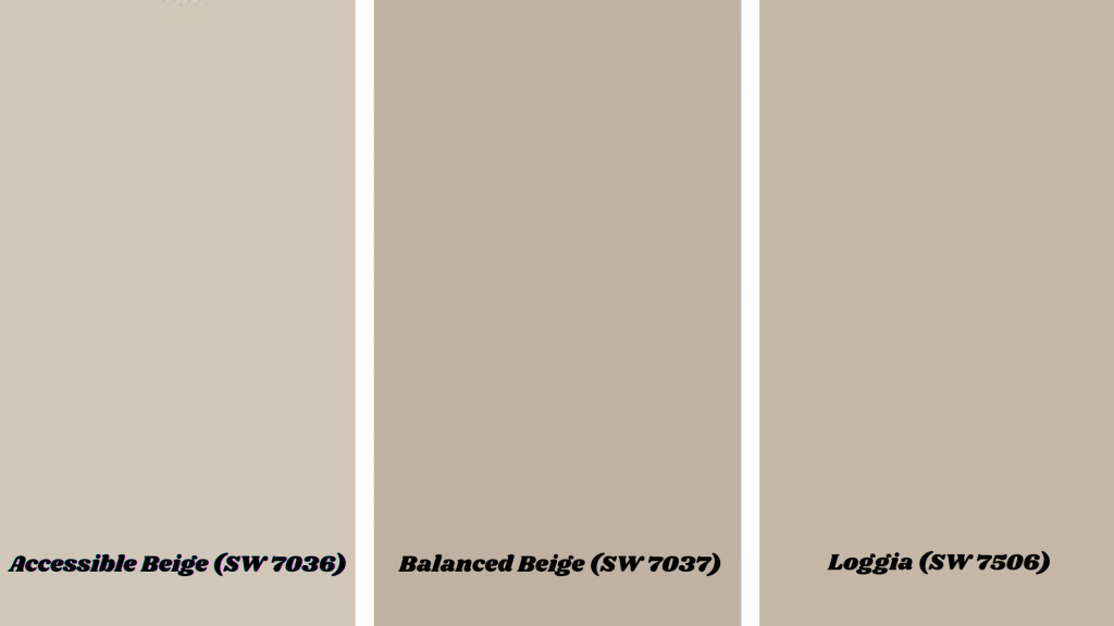
Accessible Beige offers a soft contrast that works perfectly in adjacent rooms or as accent walls. This warm beige has just enough difference from Agreeable Gray to create visual interest without jarring transitions.
It feels cozy and welcoming while still maintaining that neutral foundation you want. Use it in dining rooms next to Agreeable Gray living spaces for a natural flow that feels intentional.
Balanced Beige steps deeper into warm territory, making it perfect for living rooms with Agreeable Gray as your main anchor. This richer beige creates a cozy focal point while still complementing your gray walls nicely.
It works beautifully on feature walls or in spaces where you want more warmth and depth. The color feels grounded and substantial without being too heavy or dark.
Loggia brings taupe with earthy undertones that add refined depth to your Agreeable Gray palette. This color has more complexity than basic beige, with hints of brown and gray that create visual richness.
It works well in studies, bedrooms, or any space where you want a more dramatic but still neutral backdrop. The earthy quality makes it feel natural and grounding in your overall color scheme.
High-Contrast Accent Colors
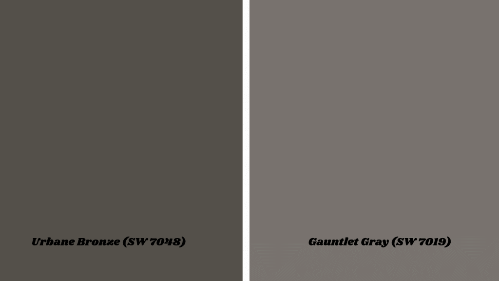
Urbane Bronze delivers bold contrast that makes built-ins, kitchen islands, or exterior doors truly stand out.
This rich, dark bronze has warm undertones that complement Agreeable Gray’s greige nature perfectly. It creates cultivated drama without feeling too heavy or overwhelming in your space.
Use it on front doors, bathroom vanities, or library built-ins where you want to make a statement while maintaining a balanced and timeless overall feel.
Gauntlet Gray brings moody sophistication that works beautifully on kitchen cabinets or accent walls. This deep charcoal gray has just enough warmth to coordinate with Agreeable Gray without clashing.
It creates depth and visual weight that grounds your space while maintaining that neutral foundation.
Perfect for lower kitchen cabinets, bathroom vanities, or feature walls where you want drama that still feels cohesive with your overall color scheme.
Fresh Cool Tones that Work
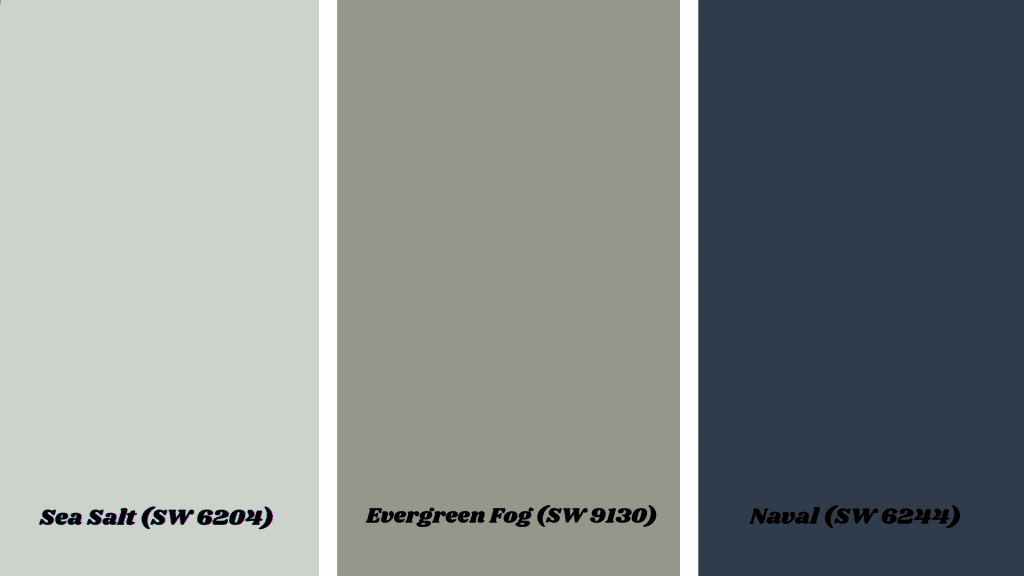
Sea Salt offers a muted green-blue that creates an instant spa-like feel in any room. This soft, calming color has just enough gray in it to coordinate seamlessly with Agreeable Gray walls.
It brings a sense of tranquility and freshness that works especially well in bathrooms, bedrooms, or any space where you want to feel relaxed.
The gentle blue-green undertones add visual interest while maintaining that serene, neutral atmosphere throughout your home.
Evergreen Fog brings sage green with soft depth that feels both modern and timeless. This muted green has enough gray mixed in to complement Agreeable Gray without creating jarring transitions.
It works beautifully in kitchens, dining rooms, or living spaces where you want to add natural color without overwhelming the space.
The earthy sage quality makes it feel grounded and refined while still bringing that fresh, organic element to your color palette.
11. Naval (SW 6244)
Naval provides classic navy that creates a refined contrast while maintaining a refined appeal. This deep blue has enough richness to stand up to Agreeable Gray without competing for attention.
It works perfectly on kitchen islands, bathroom vanities, or accent walls where you want traditional grace with modern appeal.
The timeless navy quality makes it feel both classic and current, adding depth and personality to your neutral foundation.
Agreeable Gray: Room-by-Room Pairing Schemes
Practical palette suggestions with Agreeable Gray as the foundation for every space in your home. These combinations create cohesive flow while giving each room its personality and purpose.
- Living Room: Agreeable Gray + Pure White trim + Warm taupe accents. This classic combination creates a welcoming space that feels both polished and comfortable for entertaining guests.
- Bedroom: Agreeable Gray + Sea Salt accents + Soft white trim. The calming sea salt brings spa-like tranquility, perfect for rest in your private retreat.
- Kitchen:Agreeable Gray walls + Gauntlet Gray lowers + Pure White uppers. This two-tone cabinet approach adds visual interest while maintaining an open and functional space.
- Bathroom:Agreeable Gray + Evergreen Fog accents. The soft sage green creates a fresh, natural feel that makes your bathroom feel like a peaceful escape.
- Exterior:Agreeable Gray siding + Urbane Bronze front door + White trim. This combination offers timeless curb appeal with cultured contrast, welcoming guests home.
Summing It Up
Agreeable Gray proves why it’s one of the most trusted neutrals for modern homes.
Its balanced beige tone works beautifully with crisp whites, like Pure White, warm neutrals, such as Accessible Beige, and bold accents, like Urbane Bronze.
Whether you prefer subtle, flowing transitions or dramatic contrasts, this versatile color adapts to your style.
Remember to test your chosen colors in your actual space before making a commitment. Lighting changes how every color appears, so what looks perfect in one room might feel different in another.
Ready to start your Agreeable Gray change? Begin with one room and build your palette from there.
Which color combination caught your eye? Share your favorite pairing in the comments below!
Choosing the perfect shade? Explore more paint color ideas and inspiration.