Have you ever walked into a bathroom that felt just right? Not too stark, not too dark—just perfectly balanced?
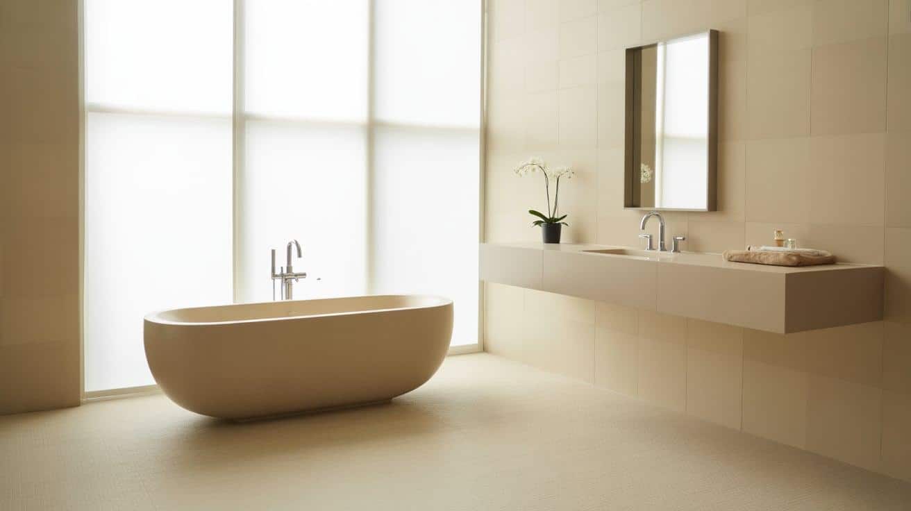
Beige is back, and it’s better than ever in bathrooms. Accessible Beige (SW 7036) offers the calm vibe you want with the style you need. This Sherwin-Williams color works wonders in bathrooms because it sits in that sweet spot between warm and cool.
People love this shade because it works well with white fixtures, wood tones, and metal finishes. In 2024, more people will be moving away from stark whites and cold grays. They want comfort and ease in their homes.
What makes this color so special? It changes with the light throughout the day. Morning sun brings out its warmth, and evening light shows its subtle depth. And the best part? It makes small bathrooms feel bigger and open.
What Makes Accessible Beige an Ideal Bathroom Color?
Bathroom colors matter more than you might think. The right shade sets the mood for your morning routine and evening wind-down time. Accessible Beige stands out as a top pick for many good reasons.
Accessible Beige brings a soft, welcoming feel to any bathroom. It’s not harsh or cold like some whites can be. This color works well with many styles, from modern to classic. The color has hints of gray and yellow. This mix helps it fit with most fixtures and tiles.
- Light-friendly – Reflects light better than darker tones
- Space-enhancing – Makes small rooms feel larger and more open
- Versatile with fixtures – Complements white tubs, sinks, and toilets
- Forgiving surface – Hides water marks and small flaws better than pure white
- Mood-changing – Shifts slightly with the light throughout the day
- Easy to accent – Works with many colors for towels, rugs, and décor
- Timeless appeal – Won’t look dated in a few years like trendy colors
Many bathrooms lack windows or have limited space. Accessible Beige shines in these spots. It has enough color to warm up dark corners but stays light enough to make rooms feel bigger, making it a smart choice for powder rooms and master baths alike.
To understand why many prefer this shade over others, explore the full Accessible Beige vs Agreeable Gray comparison to see which suits your bathroom best.
How to Integrate Accessible Beige into Your Bathroom Design?
When planning a bathroom update, Accessible Beige offers a blank canvas that pairs well with many design elements. This makes creating a pulled-together look much easier.
Combining Different Materials
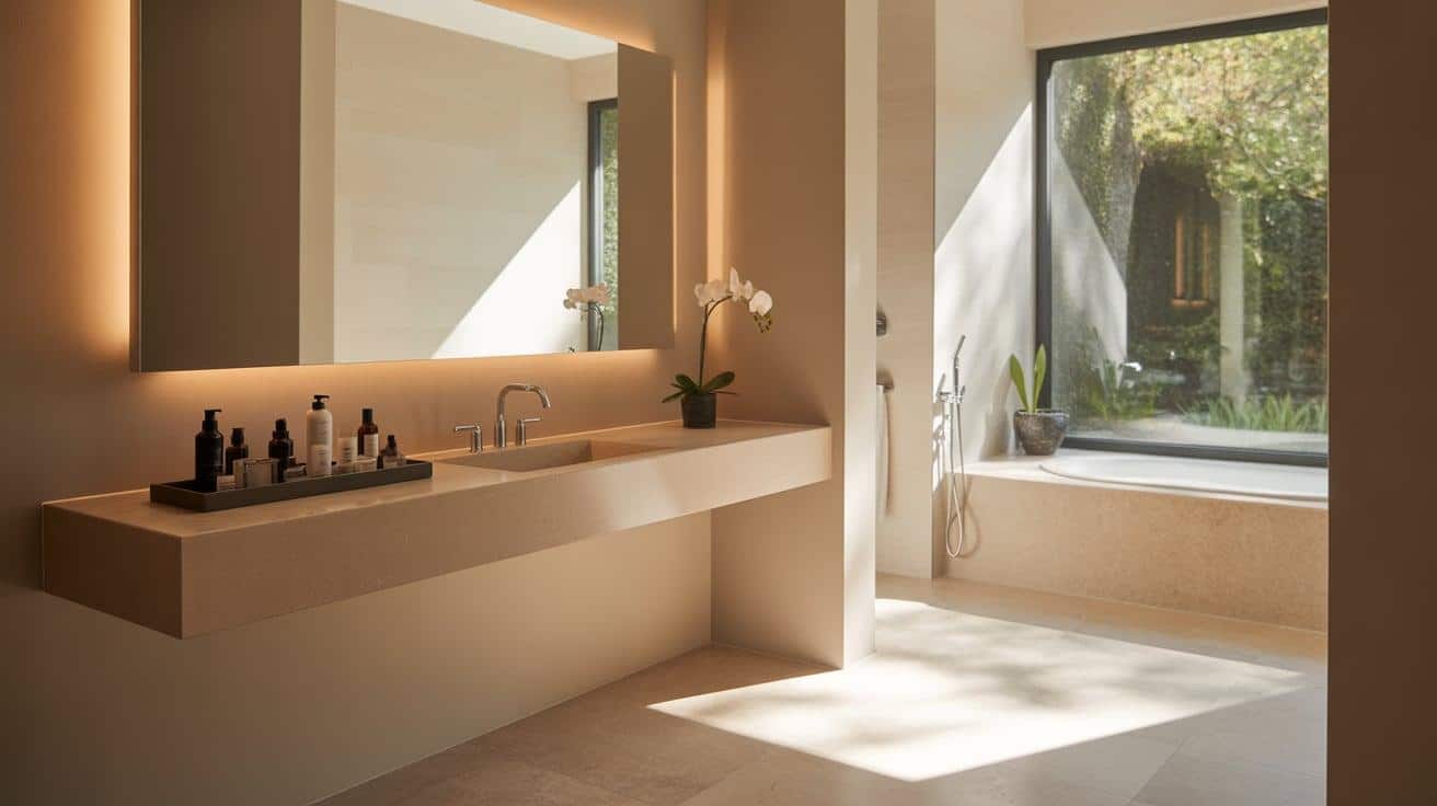
The beauty of Accessible Beige lies in how well it works with various bathroom materials. White subway tiles create a clean, classic contrast against this wall color. Wood-look tiles gain depth against this soft neutral, giving your bathroom a cozy feel.
For countertops, white quartz creates a fresh, clean look that brightens the space. Marble with gray or beige veins blends seamlessly for a high-end feel.
Flooring choices matter too. Dark wood adds warmth and contrast, making both elements look better. Gray tile creates a modern feel without clashing with the walls.
Suitable Accents and Fixtures
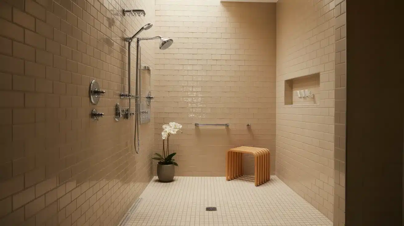
The right metals and accents can make Accessible Beige sing in your bathroom. Silver fixtures create a stunning contrast against the soft walls, and brushed brass adds warmth without looking dated.
Your mirror choice makes a big impact, too. Black-framed mirrors create striking focal points that draw the eye. Don’t forget the soft elements. White towels keep the look clean and spa-like, while adding pops of color through accessories lets you update the look easily.
Lighting Tips to Highlight Accessible Beige in Your Bathroom
The right lighting can make Accessible Beige look its best. This color changes throughout the day based on light sources. Here’s how to light your beige bathroom for maximum appeal.
| Lighting Type | Best Options | Effect on Accessible Beige | Best For |
|---|---|---|---|
| Natural Light | South-facing windows | Brings out golden undertones | Morning routines |
| North-facing windows | Enhances gray notes | More neutral look | |
| Skylights | Shows true color evenly | Accurate color viewing | |
| Bulb Types | Warm white (2700-3000K) | Enhances a cozy feeling | Evening relaxation |
| Daylight (5000K) | Shows the most accurate color | Makeup application | |
| Soft white (3500K) | Balanced middle ground | All-purpose use | |
| Fixture Styles | Vanity sconces | Reduces shadows | Face-focused tasks |
| LED strips | Adds a soft glow | Ambient lighting | |
| Recessed cans | General illumination | Overall brightness |
Lighting to avoid with Accessible Beige:
- Fluorescent tubes – Can make beige look green or flat and lifeless
- Yellow-tinted bulbs – Exaggerate yellow tones, making the color look muddy
- Single overhead lights – Create harsh shadows and don’t showthe wall color well
- Very cool/blue lights – Can make the warm beige feel cold and uninviting
Even in bathrooms with few or no windows, Accessible Beige creates a warm, welcoming feel. The color absorbs and reflects light, making spaces feel more open and bright.
For the most flattering look, aim the light at faces rather than directly down from the ceiling. This makes the beige walls look better and provides the most useful light for daily tasks.
Complementary Colors for Accessible Beige in the Bathroom
Choosing the right companion colors can make Accessible Beige shine in your bathroom. The right color combinations create spaces that feel planned and personal. Here’s how to pick colors that work well together.
| Color Category | Best Choices | Why It Works | Where to Use |
|---|---|---|---|
| Whites & Creams | Extra White (SW 7006), Pure White (SW 7005), Alabaster (SW 7008) |
Prevents beige from looking too yellow, creates clean transitions, and adds brightness | Trim, Ceiling, Cabinets |
| Soft Greens | Sea Salt (SW 6204), Rainwashed (SW 6211), Sage Green |
Brings nature indoors, Creates a calm, spa-like feel, Works with beige undertones | Accent wall, Towels, Plants |
| Muted Blues | Quietude (SW 6212), Silver Strand (SW 7057), Misty (SW 6232) |
Adds water element, creates cool balance, feels peaceful | Shower curtain, Small wall area, Art |
| Dark Accents | Naval (SW 6244), Iron Ore (SW 7069), Urbane Bronze (SW 7048) |
Creates modern contrast, adds depth, and makes beige look lighter | Hardware, Mirror frames, Small details |
The key is using dark colors sparingly. Too much can overwhelm the space, especially in smaller bathrooms. Focus on small touches that add personality without dominating the room.
What to Avoid When Using Accessible Beige in Your Bathroom?
Even a great color like Accessible Beige can look wrong when paired with certain elements. Knowing what to avoid helps you create a bathroom that feels put together and well-designed.
- Overly bright accent colors: Neon shades and very bright colors fight with the subtle nature of beige. They make the walls look dull by comparison. Stick with softer tones for a more cohesive look.
- Too many stark white surfaces: While some white works well, using too much can make Accessible Beige look muddy or drab. The contrast can be jarring rather than complementary when overused.
- Yellow-toned lighting: This type of light brings out unwanted yellow tones in the beige. Opt for daylight bulbs that show the true color instead of older incandescent options.
- Brown wood tones that match too closely: When wood is nearly the same shade as your walls, everything blends. Choose wood that’s either darker or lighter for the needed contrast.
- Busy patterns that compete for attention: Bold wallpaper or heavily patterned shower curtains can make the space feel cluttered. Let the walls be the quiet background for just one or two patterned items.
- Bronze fixtures that blend in: Some bronze tones disappear against beige walls. Test your hardware choices against your paint to make sure they stand out enough to be seen.
- Beige on all surfaces: Using the same color on walls, floors, and fixtures creates a bland, washed-out space. Break it up with contrasting elements to create visual interest and depth.
The goal with Accessible Beige is balance. It works best when it has companions that enhance its warmth without fighting for attention or fading into the background.
Final Thoughts
Accessible Beige offers the perfect middle ground for bathroom walls—not too bold, not too bland. It’s a color that feels at home in spaces of all sizes.
When used well, this shade brings warmth without feeling dated. It plays nicely with whites, soft greens, muted blues, and dark accents. Just remember to avoid overly bright colors and too much stark white that might fight with its subtle charm.
The right lighting makes all the difference. Whether you have windows that flood the room with sun or need to rely on fixtures, this color adapts beautifully.
What makes Accessible Beige so useful? It’s a color you can live with for years. While trends come and go, this shade stays relevant and fresh. Your guests will notice how good your bathroom feels without knowing exactly why. That’s the magic of choosing the right color.