Is your house exterior dull and worn? According to real estate experts, the right paint color combination can increase your home’s value by up to 6%.
With thousands of options available, selecting the perfect color pairing can feel overwhelming. Many homeowners waste time and money on sample cans, only to end up with mismatched shades that don’t complement their homes’ architecture.
Good news – we’ve researched Benjamin Moore’s most successful exterior paint combinations to save you the guesswork. These 24-time-tested color pairings have helped countless homeowners create stunning curb appeal.
Ready to find your ideal exterior color scheme?
Let’s explore these professionally approved Benjamin Moore combinations, which will make your home stand out beautifully in the neighborhood.
Factors to Consider When Choosing Exterior Paint Colors
- Architectural style of the home: Paint colors need to match your home’s design features. A Colonial house works with whites and blues, while a Craftsman benefits from earth tones. Pick colors that enhance your home’s key features, such as trim, shutters, and other details.
- Climate and surroundings: Weather affects how colors look and last. Bright sunlight fades dark colors faster, while shade makes light colors look darker. Match your paint with existing features like brick, stone, and plants.
- HOA restrictions (if applicable): First, review your Homeowners Association rules. Then, get their approved color list and stay within these guidelines to avoid having to repaint later.
- Undertones and lighting effects: Colors change as daylight shifts. Put samples on different walls and watch them throughout the day. A gray that looks perfect in the store might show unwanted purple tones outside.
24 Stunning Benjamin Moore Exterior Paint Color Combinations
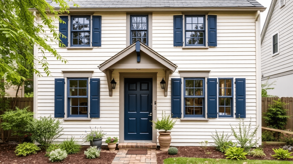
1. Horizon & Simply White & Black Beauty

This combination offers clean, simple sophistication. Horizon is the gentle main color—a soft gray with blue hints that change subtly with the light.
Simply White brightens the trim with pure, fresh appeal without appearing stark. Black Beauty adds depth to shutters and doors, creating a sharp contrast that makes the other colors pop.
This trio works particularly well on traditional Colonial and Federal-style homes, making architectural details more prominent.
2. Revere Pewter & White Dove & Kendall Charcoal

This reliable color scheme brings warmth and balance. Revere Pewter functions as an adaptable main color, providing a warm gray that feels welcoming in any light.
White Dove offers soft white trim that’s neither too bright nor too dull. Kendall Charcoal delivers rich contrast on accents without the intensity of pure black.
This combination suits various home styles, from modern farmhouses to transitional designs.
3. Edgecomb Gray & Chantilly Lace & Hale Navy

This refined palette combines warmth with classic appeal. Edgecomb Gray creates a gentle main color that shifts between beige and gray tones throughout the day.
Chantilly Lace provides crisp, clean trim work that enhances architectural features. Hale Navy offers rich blue depth for shutters and doors, adding sophistication without overwhelming the softer main colors. This trio excels on Cape Cod and coastal-style homes.
4. Swiss Coffee & Stormy Monday & French Beret
This subtle yet striking combination balances warmth and sophistication. Swiss Coffee’s warm white main color feels soft and inviting rather than stark.
Stormy Monday brings medium-toned gray accents that add interest without overwhelming. French Beret provides deep blue-black contrast for focal points like doors or shutters. This grouping works beautifully on cottage-style and contemporary homes.
5. Hale Navy & Cloud White & Caliente

This timeless trio offers a strong visual impact. Hale Navy functions as a rich, deep main color that brings sophistication to any architectural style. Cloud White creates a clean, bright trim that pops against the navy base.
Caliente adds a bold red accent for doors that draws the eye and welcomes guests. This combination works exceptionally well on Colonial and Craftsman homes, creating a look that’s both classic and memorable.
6. Black Forest Green & White Dove & Amherst Gray

This nature-inspired palette brings calm and character. Black Forest Green serves as a rich main color that changes with the light while staying true to its forest roots.
White Dove provides gentle contrast on trim without harsh brightness. Amherst Gray offers a middle-tone accent for architectural details that bridges the contrast between the other shades. Perfect for Tudor and mountain-style homes.
7. Raccoon Fur & Classic Gray & Tequila Lime

This modern color scheme makes a statement. Raccoon Fur creates a sophisticated dark gray base that sets a contemporary tone. Classic Gray softens the look with subtle trim work that doesn’t compete for attention.
Tequila Lime brings unexpected zest to doors or accent areas, adding personality while maintaining balance. This combination shines on modern and mid-century style homes.
8. Wrought Iron & Chantilly Lace & Essex Green

This bold yet balanced trio commands attention. Wrought Iron provides a near-black main color that creates drama without feeling harsh. Chantilly Lace adds bright, clean trim that defines architectural features clearly.
Essex Green brings deep forest-inspired accents that complement both the dark base and light trim. This combination suits Victorian and contemporary homes seeking strong curb appeal.
9. Shaker Beige & White Heron & Van Deusen Blue

This versatile combination brings together warmth and coastal charm. Shaker Beige provides a neutral main color that works across different lighting conditions. White Heron creates clean, fresh trim that brightens the overall look.
Van Deusen Blue adds rich color to doors and shutters, bringing depth without overpowering. This trio performs well on beach houses and traditional suburban homes, offering year-round appeal.
10. Alexandria Beige & Swiss Coffee & Newburyport Blue

This balanced palette offers refined comfort. Alexandria Beige serves as a rich main color that feels both classic and current. Swiss Coffee brings soft white trim that complements without stark contrast.
Newburyport Blue provides stately accents for architectural features, creating focal points that enhance the home’s character. This grouping excels on Mediterranean and French country homes.
11. Saddle Brown & Muslin & Hunter Green

This earth-toned collection brings natural warmth. Saddle Brown creates a grounded main color that connects with the landscape. Muslin offers gentle, warm white trim that softens the overall effect.
Hunter Green brings strong natural accents that complement both the brown base and cream trim. This combination works beautifully on ranch and rustic style homes.
12. Rustic Taupe & Cloud White & Knoxville Gray

This sophisticated neutral palette delivers subtle depth. Rustic Taupe functions as a complex main color that shifts between warm and cool tones. Cloud White adds bright, clean trim that defines architectural lines.
Knoxville Gray brings medium-toned accents that bridge the light and dark elements. This trio suits American Foursquare and transitional style homes perfectly.
13. Gray Owl & Super White & Blue Note

This refined trio creates visual interest through subtle contrasts. Gray Owl serves as a light, adaptable main color that shifts between gray and blue notes throughout the day.
Super White brings pure, bright trim that defines edges and details clearly. Blue Note adds rich, deep accents to doors and shutters, creating eye-catching focal points. This combination excels on urban townhouses and modern farmhouse styles.
14. Sea Pearl & Horizon & Narragansett Green

This soft, sophisticated palette brings subtle layers. Sea Pearl provides a gentle main color that offers warmth without being too beige. Horizon creates understated trim that flows naturally with the main color.
Narragansett Green delivers deep, natural accents that ground the lighter tones. This grouping works wonderfully on coastal and New England style homes.
15. Beacon Gray & Chantilly Lace & Gentleman’s Gray
![]()
This crisp combination offers modern appeal. Beacon Gray creates a light, fresh main color that stays true throughout different light conditions. Chantilly Lace adds bright, clean trim that enhances architectural details.
Gentleman’s Gray brings deep, rich accents that add sophistication without heaviness. This trio suits contemporary and updated traditional homes.
16. Pale Oak & Dove Wing & Van Deusen Blue

This balanced palette offers timeless charm. Pale Oak functions as a soft, warm main color that creates a welcoming base. Dove Wing provides gentle white trim that complements without stark transitions.
Van Deusen Blue adds structured accents that bring depth and interest to key features. This combination shines on bungalows and cottage-style homes.
17. Chelsea Gray & Simply White & Onyx

This sophisticated neutral scheme creates strong visual definition. Chelsea Gray provides a medium-toned main color that brings richness without feeling heavy. Simply White creates bright, fresh trim that pops against the gray base.
Onyx delivers deep black accents that add sharp contrast to doors and shutters. This trio performs beautifully on both modern and traditional architecture, highlighting structural elements with clarity.
18. Iron Mountain & Chantilly Lace & Kendall Charcoal

This layered gray palette offers depth and distinction. Iron Mountain serves as a strong main color that sets a confident tone. Chantilly Lace brings crisp white trim that creates clean lines throughout.
Kendall Charcoal adds nuanced darker accents that complement the main color while creating subtle contrast. This combination works exceptionally well on contemporary and Prairie-style homes.
19. Stormy Sky & White Dove & Graphite

This versatile trio balances light and shadow. Stormy Sky creates a medium blue-gray main color that changes beautifully with natural light.
White Dove offers soft white trim that feels warm and inviting. Graphite brings deep, rich accents that ground the overall design. This grouping suits Colonial Revival and transitional style homes perfectly.
20. Metropolitan & Oxford White & Black Beauty

This modern palette delivers clean, precise contrast. Metropolitan functions as a pure gray main color that stays consistent in different lights. Oxford White provides sharp, clear trim that defines edges precisely.
Black Beauty creates bold accents that add drama to key architectural features. This combination excels on modern and minimalist home designs.
21. Backwoods & Simply White & Sea Haze

This nature-inspired collection offers subtle strength. Backwoods creates a deep, grounded main color that connects with natural surroundings. Simply White provides clean, fresh trim that brightens the overall effect.
Sea Haze adds medium-toned accents that bridge the contrast between light and dark elements. This combination works particularly well on mountain homes and woodland retreats.
22. Knoxville Gray & Edgecomb Gray & Deep River

This sophisticated neutral scheme layers different depths. Knoxville Gray serves as a rich main color that brings substance without feeling too dark. Edgecomb Gray creates gentle trim that flows smoothly with the main color.
Deep River adds strong accents that complete the composition with deeper tones. This trio excels on Arts and Crafts and traditional style homes.
23. Guilford Green & Cloud White & Van Deusen Blue
This fresh color scheme brings natural balance. Guilford Green provides a soft, natural main color that shifts subtly with changing light. Cloud White brings clean trim work that defines architectural details.
Van Deusen Blue creates rich accents that complement both the green base and white trim. This grouping suits Cape Cod and cottage-style homes beautifully.
24. Blue Spruce & White Dove & Hale Navy

This coordinated blue palette offers depth and harmony. Blue Spruce functions as a medium-toned main color that stays true throughout the day. White Dove adds soft white trim that feels welcoming rather than stark.
Hale Navy adds deeper accents that ground the design while maintaining color harmony. This combination shines on coastal and New England-style homes.
Tips for Testing Exterior Paint Colors
- Use large swatches and test in different lighting: Paint test patches at least 4 feet wide on different sides of your house. Check these samples in the morning, noon, and evening light. Colors shift throughout the day, so viewing them at different times helps ensure you’ll be satisfied with your choice year-round.
- Consider using digital visualizers like Benjamin Moore’s Color Portfolio App. This app lets you try colors virtually before committing to paint. It lets you see how different combinations look on your actual house, saving you time and money by helping you narrow down choices before buying sample cans.
- Observe color choices in homes similar to yours: Look at houses in your neighborhood with similar architecture. Take photos of color combinations you like, especially on homes facing the same direction as yours. This gives you real-world examples of how colors work together on houses like yours.
Conclusion
Picking the right exterior paint combination makes a lasting impact on your home’s character. These Benjamin Moore color pairings are reliable starting points for any architectural style when in doubt.
Each trio balances main colors, trim, and accents to create a unified look that works in different lighting conditions.
Remember that color selection takes time. It’s worth investing effort in testing samples and observing them at different times of day.
Your home’s surroundings, architectural features, and natural light all play key roles in how colors appear.
These time-tested combinations from Benjamin Moore have helped many homeowners create beautiful exteriors that feel genuine to their home’s style while maintaining broad neighborhood appeal.
Take your time, test thoroughly, and trust your personal preferences.