Ever spent hours staring at paint swatches, hoping to find that perfect moody paint color?
I’ve been there. Picking a paint color that works in multiple rooms, looks great in any light, and stays in style is tricky.
Most paint colors claim to do it all but fall short – either too bright, too dark, or just plain wrong when the paint dries.
That’s what makes Sherwin Williams Pewter Green special.
This muted sage green effortlessly bridges the gap between calm neutrals and statement colors.
This shade creates magic in dozens of spaces, from kitchen cabinets to bedroom walls.
The best part? It looks stunning in both modern and traditional homes without trying too hard.
Understanding Pewter Green SW 6208
At its heart, Pewter Green SW 6208 brings depth to any space without feeling heavy. With an LRV of 12, this paint absorbs more light than it reflects yet avoids looking too dark.
I often describe it to my clients as a muted sage that knows how to play well with others—it’s the perfect middle ground between making a statement and staying subtle.
Finish Recommendations with Pewter Green
| Surface Type | Recommended Finish | Notes |
|---|---|---|
| Walls | Matte/Flat | Best for hiding surface imperfections |
| Cabinetry | Satin | Durability for high-touch surfaces |
| Trim | Semi-gloss | Clean lines and easy maintenance |
| Exterior | Satin/Semi-gloss | Weather resistance |
Psychology Behind Pewter Green – Balance, Depth, and Elegance
Paint colors do more than coat your walls – they set the entire mood of your space. Pewter Green brings a natural serenity to rooms without feeling overly dark or intense.
I’ve noticed that this color creates a balanced atmosphere, perfect for spaces where one wants to feel centered and refreshed.
In my experience working with clients, this shade excels in spaces for focus and relaxation. It carries the calming qualities of nature-inspired tones while maintaining a sophisticated edge that works in professional settings.
How Light Shapes the Color
One of the most fascinating aspects of Pewter Green is its relationship with light. Here’s what I’ve observed in different lighting scenarios:
South-Facing Rooms

The warm sunlight brings out the color’s natural undertones, making it appear softer and more inviting. The green base becomes more prominent, creating a welcoming atmosphere.
North-Facing Rooms

The cooler light emphasizes the gray undertones, creating a more subdued, sophisticated look. This makes it an excellent choice for formal dining rooms or home offices.
Making Pewter Green Work Inside Your Home
1. Living Spaces

I’ve seen Pewter Green turn ordinary rooms into stunning spaces. In the living room, it adds character to built-in shelving or as an accent on a fireplace wall.
The color creates a perfect background for artwork, especially when paired with soft cream upholstery and natural wood furniture.
2. Kitchen Magic

Thinking about updating your kitchen? Pewter Green cabinets offer a fresh take on neutral kitchens.
I especially love it paired with light stone countertops and warm metal pulls. Try painting just the lower cabinets or island for smaller kitchens – it grounds the space while keeping things open and bright.
3. Restful Bedrooms

In bedrooms, this color creates a cocoon-like feeling without being too dark. Layer in cream bedding, woven textures, and warm wood pieces to create a balanced, peaceful space.
The color looks particularly striking with morning light, making your bedroom feel fresh yet cozy.
4. Bathroom Sophistication
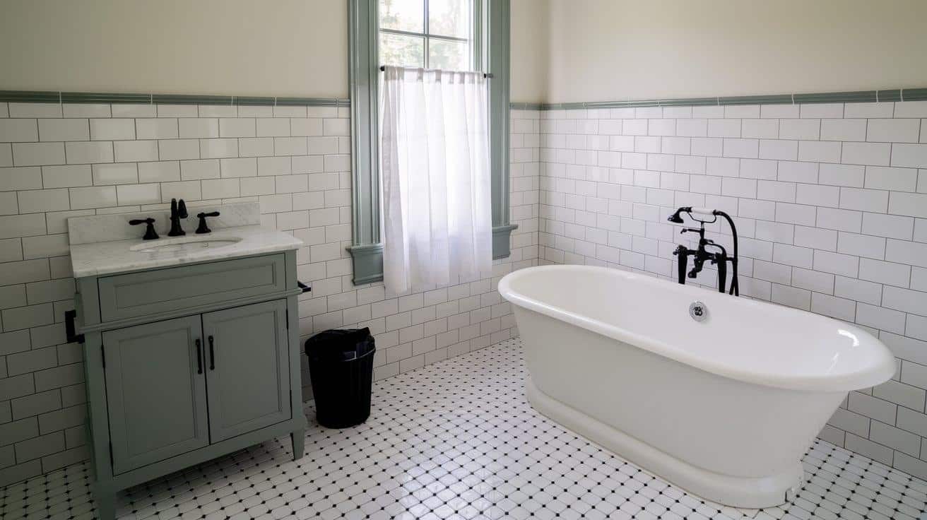
Consider painting the vanity in Pewter Green for bathrooms. It pairs beautifully with white tile and marble counters. Add black fixtures for contrast, creating a custom look that feels current and timeless.
Smart Pairing Tips:
- Light fixtures: Mix metals like brass and black for added interest
- Textiles: Natural linens and cotton in cream, beige, or soft gray
- Flooring: Works with both light and dark wood tones
- Artwork: Gold frames pop beautifully against this backdrop
Perfect Pairs: Making Pewter Green Shine
Light and Bright Partners

The beauty of Pewter Green lies in its play with light colors. When paired with SW Alabaster on trim or walls, it creates a fresh, clean look that feels balanced and intentional.
For those who love Benjamin Moore, Simply White offers a similar appeal. Both options open spaces while letting Pewter Green’s character show through.
Middle Ground Neutrals

Are you looking for something between light and dark? SW Accessible Beige and Repose Gray create smooth transitions with Pewter Green. These middle-tone neutrals add depth without competing for attention.
I often suggest these colors for open floor plans where rooms must naturally flow together.
Comparing Popular Green Paint Colors
Pewter Green vs. Dried Thyme

When clients ask me about these two colors, I explain it this way: Pewter Green brings depth and sophistication to a space, while Dried Thyme offers a softer, more casual feel.
With an LRV of 12, Pewter Green creates more impact than Dried Thyme’s lighter LRV of 21.
In real homes, here’s what I’ve noticed:
- Pewter Green shines on kitchen cabinets and feature walls where you want that extra bit of richness
- Dried Thyme feels at home in sunny spaces where you want a hint of nature without too much intensity
Pewter Green vs. Rosemary

Think of these as cousins with different personalities. Pewter Green keeps cool with gray undertones, perfect for modern spaces and crisp contrasts.
Conversely, Rosemary feels more natural and earthy – like fresh herbs in your garden.
Best Uses for Each:
- Pewter Green: Modern kitchens, sophisticated offices, striking exteriors
- Rosemary: Cozy living rooms, garden-inspired spaces, rustic settings
Pewter Green vs. Night Owl

Here’s an interesting duo – deep and rich but with distinct characteristics. Pewter Green maintains its green identity while staying balanced, whereas Night Owl leans into deeper, moodier territory with strong brown undertones.
Practical Applications:
- Pewter Green works beautifully in spaces where you want depth without darkness.
- Night Owl creates stunning accent walls in well-lit rooms or dramatic powder rooms.
Conclusion
Choosing a paint color should be exciting, not overwhelming. After exploring Pewter Green’s versatility, one thing becomes clear: This shade brings something special to any space it touches.
From modern kitchens to cozy bedrooms, it creates the perfect balance of sophistication and comfort.
Before you pick up that paintbrush, remember to test Pewter Green in your space at different times of the day. Grab a few paint samples and live with them for a few days.
Please pay attention to how the color shifts from morning to evening and how it plays with your existing decor.
Ready to make your space feel more intentional?
Whether you’re looking for an accent wall or a full room refresh, Pewter Green might be the color you’ve been looking for.