Want a paint color that works in any room? Gray Matters by Sherwin-Williams has become a top choice for homeowners looking for the perfect neutral shade.
This sophisticated gray paint offers something unique: It changes its appearance throughout the day, shifting between cool and warm tones as natural light moves through your space.
By selecting Gray Matters, you’ll create spaces that feel clean and modern while remaining timeless.
This adaptable shade pairs beautifully with both bold accents and subtle tones, making it ideal for living rooms, bedrooms, or even kitchen cabinets.
Are you ready to change your walls with this reliable neutral? Let’s examine why Gray Matters might be the ideal paint choice for your next project.
What Makes Gray Matters (SW 7066) Special?
Undertones and Color Characteristics
Gray Matters (SW 7066) stands out among neutral paints because of its complex character. This medium-toned gray shows subtle blue-green undertones that become more noticeable as light changes throughout the day.
In morning sunlight, the color leans toward a cooler blue cast, while evening light brings out warmer aspects, making it highly flexible for various design styles.
The paint’s versatility shines in different lighting conditions. Under natural sunlight, it displays a fresh, clean appearance that brightens spaces.
With artificial lighting, particularly warm LED bulbs, the color takes on a softer, more intimate quality. Near windows, you might notice its blue undertones becoming more pronounced, while interior walls showcase its warmer gray base.
During overcast days, the color maintains a consistent, reliable tone that keeps rooms feeling comfortable.
The subtle color shifts make it an excellent choice for open floor plans. They create visual continuity while highlighting different facets of the space.
Light Reflectance Value (LRV) and How it Affects Spaces
With an LRV of 39, Gray Matters sits right in the middle range of the light-to-dark scale.
This balanced LRV means the color reflects enough light to keep rooms feeling open but absorbs sufficient light to provide depth and interest to your walls.
This moderate LRV helps create a sense of space in smaller rooms without feeling stark. In larger rooms, it provides enough color saturation to feel grounded and cozy.
The paint’s mid-range LRV also makes it particularly effective in rooms with varying light levels throughout the day.
The color maintains brightness without appearing cold or dim in north-facing rooms. In south-facing spaces, it prevents glare while preserving the room’s welcoming atmosphere.
This versatility extends to artificial lighting. Under LED lights, the color maintains its depth without darkening too much, while incandescent bulbs bring out its warmer qualities.
The balanced LRV also makes Gray Matters an excellent choice for hallways and transitional spaces, where it creates visual flow without becoming too light or dark as lighting conditions change.
In rooms with limited natural light, the color reflects available light efficiently while maintaining its character and preventing the space from feeling closed in.
Best Rooms for Gray Matters
1. Living Rooms

In living spaces, Gray Matters brings a sense of calm while maintaining visual interest. This medium-toned gray creates an excellent base that helps other elements shine.
Your colorful artwork will stand out perfectly against these walls, while textiles and furnishings gain more visual weight. The color shifts subtly as daylight changes, keeping the space fresh and interesting throughout the day.
For maximum effect, pair it with crisp white trim and add textural elements like woven throws, velvet pillows, or natural wood furniture.
2. Bedrooms
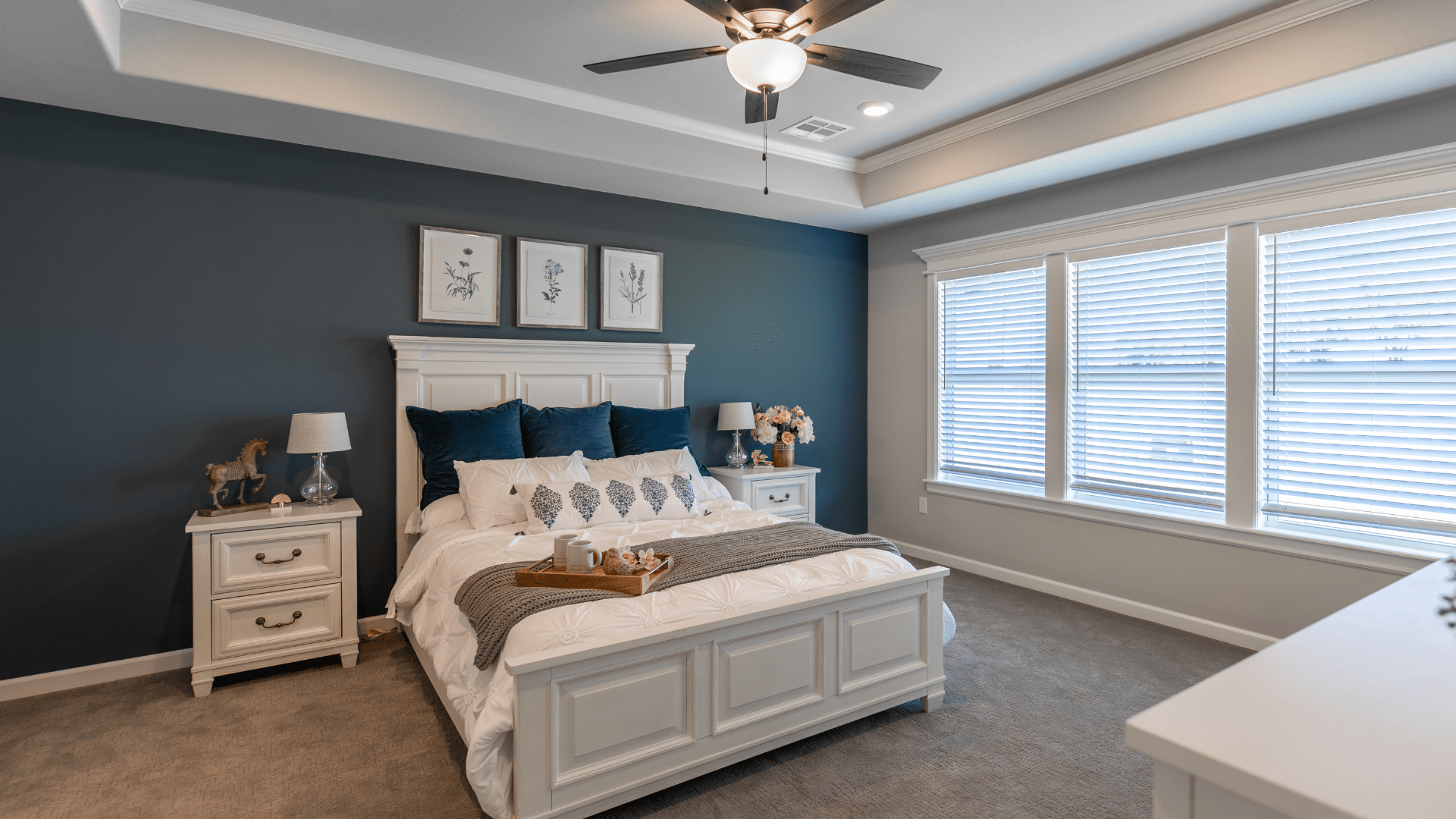
Bedrooms painted in Gray Matters foster rest and relaxation without feeling dull. The color’s subtle undertones create depth that works particularly well in master suites and guest rooms.
It forms a perfect partnership with both light and dark bedding choices, allowing you to change your bedroom’s look seasonally without repainting.
Add metallic accents through light fixtures or mirror frames to enhance the room’s sophistication.
3. Kitchens

Kitchen spaces benefit from Gray Matters’ ability to complement various materials. On cabinets, it creates a contemporary look that pairs wonderfully with quartz or marble countertops.
When used on walls, it offers a refined backdrop for both light and dark cabinetry.
The color maintains its appeal under different lighting conditions, from bright morning sun to evening task lighting, making it especially suitable for kitchens that serve as gathering spaces throughout the day.
4. Bathrooms

In bathrooms, Gray Matters creates a spa-like atmosphere. The color works exceptionally well with white porcelain fixtures and chrome or nickel hardware.
Its medium tone provides enough contrast to make white elements pop while maintaining a serene environment. Consider using it on all walls or as an accent wall behind a vanity mirror for maximum impact.
5. Exterior Applications

On home exteriors, Gray Matters proves its worth as a versatile choice. As a main siding color, it provides a sophisticated look that stands up to changing light conditions.
The shade works particularly well with white trim, creating clear definition for architectural details. For stone or brick homes, it serves as an excellent accent color for trim or doors.
The color maintains its integrity in outdoor settings and complements various landscaping choices, from formal gardens to natural settings.
Complementary Sherwin-Williams Colors
1. Pure White (SW 7005)

This clean white carries subtle warm undertones that prevent it from appearing stark or sterile. In natural daylight, Pure White reveals its creamy qualities while maintaining brightness.
When used on crown molding or baseboards alongside Gray Matters walls, it creates beautiful architectural definition. In kitchens, Pure White cabinets with Gray Matters walls form a timeless combination that brightens the space.
For ceiling applications, it provides a soft glow that opens up the room without harsh reflection. The color maintains its warmth even under LED lighting, making it versatile for various lighting conditions.
2. Extra White (SW 7006)

With its crisp, cool undertones, Extra White brings a contemporary edge to any pairing with Gray Matters. Under morning light, it appears bright and clear, while evening light emphasizes its blue undertones.
This shade excels on window trim, where it creates sharp contrast against Gray Matters siding. In bathrooms, Extra White tile or fixtures against Gray Matters walls create a spa-like atmosphere.
The combination particularly shines in home offices or modern kitchens, where the contrast helps define work spaces while maintaining visual interest.
3. Evergreen Fog (SW 9130)

This complex green-gray color shifts throughout the day, showing sage characteristics in bright light and deeper forest hints in shadows. When paired with Gray Matters in living spaces, it creates depth without overwhelming the room.
The color works beautifully with kitchen islands or bathroom vanities, and it complements Gray Matters walls. In home libraries or studies, an Evergreen Fog accent wall backed by Gray Matters creates a sophisticated reading nook.
The combination also works well in dining rooms, where the natural undertones encourage lengthy, comfortable gatherings.
4. Urbane Bronze (SW 7048)
This deep brown-gray brings substantial weight to any color scheme. In the morning light, it reveals complex coffee undertones, while the afternoon sun brings out its mineral qualities.
As exterior trim with Gray Matters siding, it defines windows and doors with striking contrast. Inside, it makes an excellent choice for built-in bookcases or fireplace surrounds, where Gray Matters serves as the main wall color.
The combination creates a dramatic effect in home theaters or media rooms, where the deeper tone absorbs light while Gray Matters provides balance.
5. Sea Salt (SW 6204)

This subtle green-blue shade changes like ocean water throughout the day. Morning light emphasizes its fresh, minty undertones, while evening light brings out softer, grayer aspects.
In primary bathrooms, sea salt ceilings or vanity areas paired with gray matter walls create a refreshing start to each day. For bedrooms, the combination promotes restful sleep while maintaining visual interest.
In sunrooms or breakfast nooks, these colors work together to bring natural elements inside without overwhelming the space.
The pairing also works beautifully in home offices, where the gentle contrast helps maintain focus without causing eye strain.
Styling Tips for Rooms with Gray Matters
- Furniture Selection: Medium and light wood tones create beautiful harmony with Gray Matters. White upholstery offers a clean contrast, while navy or charcoal pieces add depth. Natural materials like rattan or woven textures bring warmth and interest to the space without competing with the wall color.
- Fabric Choices: Mixing textures makes Gray Matters come alive. Consider velvet throws, linen curtains, or wool rugs to add dimension. The pattern mixing works well against this neutral backdrop. Try combining geometric prints with organic patterns in similar color families for visual interest without overwhelming the space.
- Artwork and Accessories: Black and white photography stands out beautifully against Gray Matters walls. For color, copper or brass accents add warmth, while chrome or nickel finishes emphasize the cooler undertones. Glass vases and mirrors help reflect light and enhance the color’s subtle variations throughout the day.
- Plants and Greenery: Live plants thrive visually against Gray matter. The color makes an excellent backdrop for both dark green foliage and lighter, silvery leaves. Large palm fronds create striking silhouettes, while smaller potted herbs or succulents add life to shelves and windowsills.
- Window Treatments: Sheer white curtains allow natural light to play with the wall color while maintaining privacy. For more coverage, consider textured Roman shades or woven wood blinds that complement the wall color without exactly matching it—layer curtains with blinds to control light levels throughout the day.
Conclusion
Choosing the right gray paint can significantly improve your home’s atmosphere. Gray Matters by Sherwin-Williams is a reliable choice that bridges the gap between cool and warm tones.
Its medium-light reflectance value of 39 makes it suitable for various spaces, while its subtle blue-green undertones add character without being overbearing.
This shade brings out the best in complementary colors, from clean whites to deeper brown grays.
Its versatility shows in how it adapts to different lighting conditions and room purposes, making it an excellent option for both interior and exterior applications.
For homeowners seeking a gray that offers flexibility and lasting style, Gray Matters delivers a balanced solution that works across many design styles and living spaces.