In today’s post, I’m sharing my complete guide to Sherwin Williams Peppercorn, a rich charcoal gray that combines light and shadow.
If you’re considering this color for your home, you’ll want to read this first.
I’ve spent years testing and using this shade in various settings, from kitchen cabinets to exterior walls.
After painting multiple rooms and surfaces, I’ve learned exactly how this moody gray behaves in different lighting conditions and what makes it work (or not) in specific spaces.
Ready to learn if Peppercorn is the right choice for your home?
Let’s examine what makes this complex gray paint color special and explore how to use it successfully in your space.
What is Peppercorn Color?
Sherwin Williams Peppercorn (SW 7674) falls into the family of deep charcoal grays.
This shade sits comfortably between a true black and a medium gray, offering the perfect balance for those who find black too intense but still want a bold statement.
The color has gained popularity because it provides character without overpowering a space.
The Science Behind Peppercorn’s Visual Appeal
1. Is Peppercorn a Warm or Cool Color?
What makes Peppercorn so intriguing is that it’s a chameleon.
While many paint colors lean warm or cool, Peppercorn plays both sides. In certain lights, it shows subtle hints of warmth; in others, it pulls back to its cooler gray base.
This trait makes it particularly useful when working with varied color schemes.
2. Understanding LRV and Its Impact
Peppercorn has an LRV (Light Reflectance Value) of 10. In practical terms, it absorbs 90% of light and reflects only 10%. In bright rooms, this creates a rich, defined look.
However, the color can appear nearly black in spaces with limited natural light.
You’ll need good lighting to appreciate its subtle nuances for optimal results.
3. Undertones of Peppercorn
The real secret to Peppercorn’s success lies in its undertones. Depending on your lighting situation, you might notice hints of blue, green, or violet within its gray base.
The time of day, direction of natural light, and type of artificial lighting all influence which undertones become more noticeable.
Interior Application of Sw Peppercorn
1. Living Room

Use Peppercorn on a single wall to create a focal point. It pairs beautifully with light-colored furniture and metallic accents. The color adds depth without making the space feel smaller.
2. Kitchen
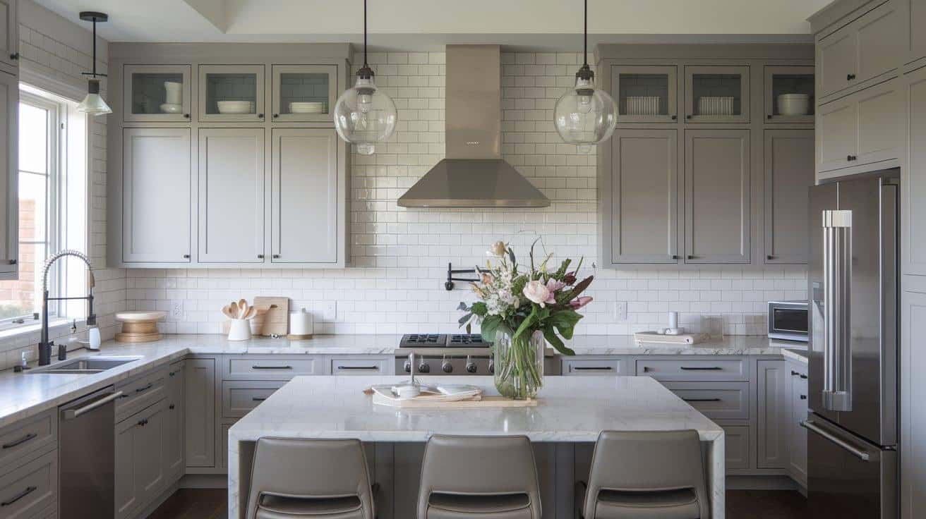
Peppercorn shines on kitchen cabinets, particularly on islands or lower cabinets when paired with light upper cabinets. It handles cooking splatters well and maintains its richness over time.
3. Dining Room

Peppercorn on the dining room walls creates an intimate atmosphere perfect for evening gatherings. Consider painting the ceiling white to maintain balance and prevent the space from feeling too closed in.
4. Bedroom

Peppercorn works best as an accent wall behind the headboard in bedrooms. It creates a cozy feeling without overwhelming the space where you rest.
Exterior Applications of Peppercorn

1. Why Peppercorn Works for Home Exteriors
Peppercorn creates striking curb appeal on home exteriors.
Its deep charcoal tone works particularly well on:
- Front doors for a bold entrance
- Window frames to define architectural features
- Full-house exteriors, when paired with light trim
- Garage doors for subtle contrast
2. Perfect Trim and Accent Colors for Exteriors
For a balanced exterior look with Peppercorn, consider these pairings:
- Sherwin Williams Pure White (SW 7005) for crisp contrast
- Benjamin Moore White Dove for softer transitions
- Sherwin Williams Alabaster for a gentle white that complements the depth of Peppercorn
- Natural stone or brick elements pair naturally with this shade
How to Sample Peppercorn Before Painting
Getting your paint color right first saves time, money, and effort. Here’s my complete guide to testing Peppercorn in your space:
Smart Sampling Methods
- Purchase peel-and-stick paint samples instead of relying on small paint chips.
- Get multiple samples to test on different walls
- If using traditional paint samples, paint large 12×12-inch squares
- Paint samples on white poster board if you don’t want to mark your walls
Strategic Sample Placement
- Place samples at eye level on each wall you plan to paint
- Test near windows and corners
- Put samples next to trim, flooring, and existing furniture
- Keep samples at least 3 feet apart to assess each spot individually
Lighting Assessment
- Check the color during morning light (before 10 AM)
- Observe during the bright afternoon sun
- Look at evening lighting conditions
- Test under your regular artificial lighting
- Note how the color appears on cloudy versus sunny days
Additional Testing Tips
- Take photos at different times of the day to compare
- Look at the samples from different angles and distances
- Consider how the color interacts with your fixed elements like countertops or flooring
- Test how it looks with your window treatments open and closed
Complementary Colors & Pairing Suggestions
1. Best Neutral Pairings

- Light grays for subtle contrast
- Creamy whites for warmth
- Soft beige tones for balance
- Greige shades for depth
2. Daring Color Combinations

- Muted sage green for natural harmony
- Soft navy blue for sophisticated depth
- Deep teal for rich contrast
- Mustard yellow for an unexpected pop
3. Alternative Dark Colors Similar to Peppercorn

- Benjamin Moore Iron Mountain
- Sherwin Williams Gauntlet Gray (slightly lighter)
- Benjamin Moore Gray 2121-10
- Behr Shadow Mountain
- Valspar Mark Twain Gray Brick
Best Paint Finishes for Different Uses
1. Matte Finish
- Ideal for Living room and bedroom walls
- Benefits: Hides surface imperfections
- Considerations: Less washable than other finishes
2. Satin Finish
- Perfect for Family rooms and hallways
- Benefits: Balances durability with a subtle sheen
- Cleaning: Handles regular washing well
3. Semi-Gloss
- Trimming doors and cabinets
- Benefits: Maximum durability
- Features: Creates subtle contrast with matte walls
Conclusion
After exploring Peppercorn’s unique characteristics, it’s clear why this complex charcoal gray has earned its place in modern home design.
From its adaptability in various lighting conditions to its striking presence in interior and exterior applications, this shade offers more than just a color choice. It creates an experience.
My time working with Peppercorn has shown me its true beauty lies in its subtleties.
Its ability to shift from cool to warm tones throughout the day, bring depth to a space without overwhelming it, and complement both traditional and contemporary settings make it special.
Whether you’re painting a single accent wall or reimagining your home’s exterior, Peppercorn proves that sometimes the perfect color isn’t black or white. It’s somewhere beautifully in between.