Paint colors are funny things. When you think you’ve found a simple white, it is much more. That’s exactly what happened when I first met Sherwin Williams Natural Choice in a client’s dining room.
She wanted “just white,” but we discovered a chameleon that shifted from creamy white to pale blue depending on the light.
After using it in countless homes over the years, I’ve come to appreciate its nuances. Today, I’m sharing everything you need about this subtle beauty.
What is Sherwin Williams Natural Choice?
Color Characteristics
Natural Choice creates an interesting spot in the world of neutral paint colors.
Unlike typical off-whites, it brings a soft, warm presence to walls without feeling heavy. Looking at it straight on, you might see.
Base Color Notes
- Soft beige foundation
- Gentle gray hints
- Warm white base
- Light flax tones
How it Reads
- Changes from warm white to pale blue
- Shows different faces in various spaces
- It can look warmer or cooler based on the lighting
- Takes on surrounding color influences
Technical Details
Understanding the numbers helps predict how Natural Choice will perform in your space:
Light Properties
- LRV of 73 means it reflects good light
- Bright enough to keep rooms open
- Not so light that it washes out
- Strong enough to show its character
Color Science
- Sits in the warm neutral family
- Works as a bridge between white and beige
- Carries enough depth to create contrast
- Light enough to feel fresh
The Power of Undertones
Understanding Undertones
Natural Choice isn’t a simple one-note color. Like a well-composed melody, it combines several subtle tones.
Main Composition
- Warm beige takes center stage
- Creamy notes add softness
- Gray tones provide balance
- Hints of cream keep it cozy
Subtle Shifts
- It never feels too warm or cool
- Maintains a balanced neutral base
- Stays fresh without being stark
- Blends smooth with other colors
Lighting Impact
Morning Light
- Beige tones wake up first
- Creamy warmth comes forward
- Feels fresh and clean
- Perfect for east-facing rooms
Midday Sun
- Shows its truest color
- Balanced between warm and cool
- Keeps spaces bright
- Maintains depth and interest
Evening Hours
- Gray notes emerge
- Warmth softens naturally
- Creates cozy atmosphere
- Stays welcoming
Interactions with Surroundings
Flooring Effects
- Cool tiles might pull out green hints
- Warm wood enhances cream tones
- Dark floors create contrast
- Light floors blend smoothly
Furniture Impact
- Brown wood brings out the warmth
- White pieces create a soft contrast
- Metal accents stay neutral
- Fabric colors influence undertones
Where Does Natural Choice Shine? Best Rooms and Uses
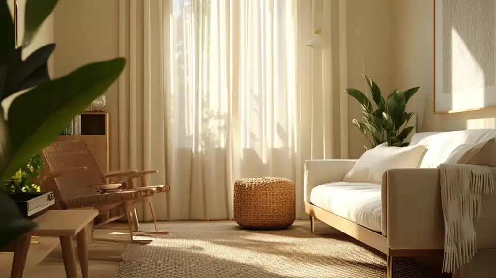
1. Living Rooms
Perfect For:
- Open floor plans
- Family gathering spots
- Reading nooks
- TV watching areas
Design Tips:
- Layer with textured throws
- Add natural wood pieces
- Mix in cream fabrics
- Include woven baskets
- Keep art simple
2. Bedrooms
Sleep-Ready Setting:
- Gentle morning light
- Soft evening glow
- Calming backdrop
- Clean but cozy feel
Styling Ideas:
- White bedding pops nicely
- Natural fiber rugs work well
- Linen curtains add texture
- Wood furniture adds depth
3. Kitchens
Cabinet Combinations:
- White cabinets stay crisp
- Wood tones look rich
- Mixed materials blend well
- Stone counters coordinate easily
Functional Benefits:
- Hides minor marks
- Keeps spaces bright
- Easy to clean look
- Works with appliances
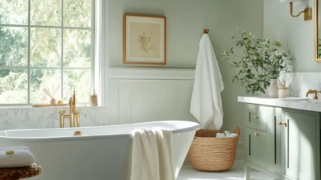
4. Bathrooms
Small Space Solutions:
- It opens up tight areas
- Reflects natural light
- Stays clean-looking
- Creates flow
Perfect Pairings:
- Brass fixtures shine
- Bronze adds warmth
- Marble looks luxe
- Tiles blend smoothly
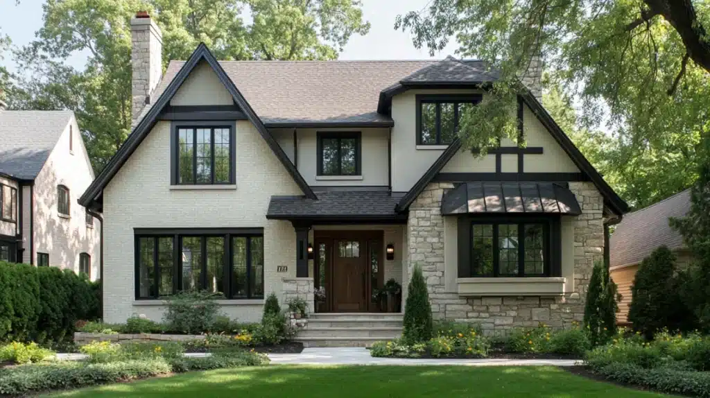
5. Exteriors
Curb Appeal:
- It feels fresh but not stark
- Ages gracefully
- Hides dust well
- Looks good year-round
Material Matches:
- Stone elements blend
- Brick looks rich
- The dark roof contrasts nicely
- Wood trim enhances warmth
Styling Tips and Decor Pairings for SW Natural Choice
Furniture and Accessories
Wood Elements
- Oak pieces add warmth
- Walnut creates depth
- Pine keeps things light
- Maple brings subtle richness
Metal Accents
- Brass catches light
- Bronze stays subtle
- Copper adds warmth
- Mixed metals work well
Living Elements
- Leafy plants pop
- White flowers blend
- Natural branches add texture
- Woven baskets complement
Coordinating Colors
Perfect Paint Partners
- White Flower trim creates clean lines
- Shoji White for gentle contrast
- Requisite Gray adds depth
- Deep navy for a modern touch
Room Color Flow
- Light colors maintain openness
- Medium tones add interest
- Dark accents create focus
- Neutrals blend smoothly
Finishes and Textures
Interior Finishes
- Eggshell for living spaces
- Satin in high-traffic areas
- Pearl for subtle shine
- Flat for ceilings
Exterior Choices
- Matte hides surface flaws
- Low luster adds protection
- The soft texture stays clean
- Even coverage matters
Pros and Cons of Sherwin Williams Natural Choice
| Category | Pros | Cons |
|---|---|---|
| Versatility | – Suitable for any room size | – Might feel too warm for those preferring cooler tones |
| – Works with various styles, from traditional to modern | – Can clash with pure whites or strong cool grays | |
| Light Management | – Reflects light without being harsh | – Sensitive to lighting changes, appearing different throughout the day |
| – Ideal for bright or north-facing spaces | ||
| Color Pairing | – Blends well with natural wood, warm metals, and most fabrics |
Paint Availability: Finishes Offered and Price Ranges
Availability
Sherwin-Williams Natural Choice paint is available at Sherwin-Williams stores nationwide, as well as at retailers such as Lowe’s and Home Depot, making it accessible to most customers.
Finishes
The paint is likely available in various finishes, including flat for a matte look, eggshell for a subtle sheen, satin for a smooth finish, semi-gloss for durability, and gloss for high reflectivity, catering to different project needs.
Price Ranges
Prices vary by product line, with basic options like Captivate starting at approximately $45 per gallon, while premium lines, such as Duration and Emerald, may cost between $75 and $100 per gallon. Check local stores for exact pricing.
Comparing SW Natural Choice to Similar Colors
| Aspect | Natural Choice | Oyster White | White Duck | Shoji White |
|---|---|---|---|---|
| Key Difference | Warm with creamy undertones | Neutral with balanced gray-beige undertones | Slightly darker, leans more beige | Cooler with gray undertones |
| Best Use | Cozy interiors | Modern, neutral spaces | Rustic or farmhouse aesthetics | Minimalist and contemporary styles |
| Style Suitability | Versatile, airy designs | Neutral modern or casual spaces | Warm, rustic, or earthy aesthetics | Clean and modern interiors |
Summing Up
Natural Choice might seem unassuming at first glance, but that’s its secret power. Like a good friend, it adapts to your needs while staying true to its character.
Through hundreds of consultations, I’ve watched it solve tricky trim situations and brighten dark spaces without ever feeling stark. Is it perfect for every room? No paint color is.
But if you’re seeking that sweet spot between warm and fresh, crisp and cozy, Natural Choice deserves a closer look. Trust me – sometimes, the best choices are the most natural ones.

