Let me tell you about a paint color that often confuses clients: Sherwin Williams Oyster White. Don’t let the name fool you – this isn’t your typical white paint.
I’ve found it’s more like a chameleon, shifting between soft gray and gentle beige depending on your space.
My clients often pick it when they want something that feels fresh but not stark.
Today, I’ll share everything I’ve learned about this shade, from its hidden undertones to its perfect pairings.
What is Oyster White?
Despite its name, Sherwin Williams Oyster (SW 7637) White isn’t a true white. This paint color sits uniquely between light gray and beige, creating what experts call a “greige.”
While most whites reflect 90% or more light, Oyster White takes a softer approach.
The color shows different sides:
- A light, warm base that feels cozy
- Soft gray tones that add style
- Subtle beige that brings warmth
- Gentle undertones that shift with light
With an LRV of 72, it reflects less light than typical whites. This means it won’t wash out in bright rooms like pure whites often do. Instead, it maintains its character while keeping spaces open and bright. The hex code for Oyster White is #E5DFD2.
Click here to buy Sherwin-Williams Oyster White.
How Undertones Work in Oyster White
Oyster White is known for its subtle blend of gray, beige, and soft green undertones, which lend it a unique warmth and versatility. These undertones shift noticeably throughout the day, influenced by natural and artificial lighting, as well as surrounding decor and finishes
The real charm of Oyster White lies in its complex undertones:
Primary Notes
- Yellow-gold warmth shows up first
- Beige adds depth and comfort
- Gray keeps it current and fresh
Light Changes Everything
- The morning sun brings out the yellow notes
- Midday light shows its true greige nature
- Evening light emphasizes the gray
- Artificial lights can pull out different tones
Room Elements Matter
- Wood tones increase the warmth
- Cool flooring might show green hints
- Furniture colors can pull out different undertones
- Nearby colors affect how it reads in the space
Best Rooms for Oyster White
This color excels in a variety of spaces, from living rooms and bedrooms to kitchens and bathrooms, offering a cozy yet airy backdrop. Its adaptable undertones make it especially suitable for open floor plans and restful bedrooms where a soft, inviting atmosphere is desired.
1. Living Rooms

Oyster White creates a soft, inviting backdrop that complements furniture without overpowering it. It maintains its depth even in expansive areas, making it suitable for large spaces. This color also performs well on accent walls, providing a focal point that keeps rooms bright without appearing stark.
2. Bedrooms
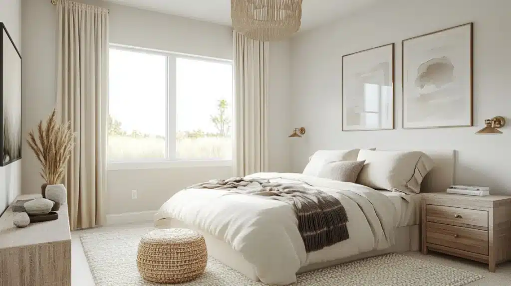
Oyster White adds gentle warmth that promotes restful sleep, making it an ideal base for bedding. It creates a calm, soothing morning light that increases tranquility and remains soft and comforting during evening hours, ensuring a peaceful and inviting bedroom atmosphere throughout the day.
3. Kitchens
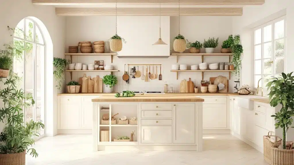
Oyster White pairs beautifully with natural wood, increasing warmth and texture in any space. It works seamlessly on walls alongside white cabinets, maintaining a clean and fresh look. Additionally, this color resists washing out under task lighting, ensuring that spaces stay vibrant and inviting without losing their subtle depth.
Decor Pairings & Lighting Considerations for Oyster White
Sherwin-Williams Oyster White is a versatile warm greige that suits many decor styles and lighting conditions. Its subtle undertones pair well with natural textures and metals, while its appearance shifts with changing light, increasing warmth or coolness throughout the day.
Furniture Choices
Natural wood furniture brings a sense of warmth to rooms painted in Oyster White, while linen upholstery increases the overall softness. White furniture provides a gentle contrast, keeping the space light. Choosing dark wood creates a bold statement, making the muted greige walls feel more dramatic and visually interesting.
Perfect Partners
Oyster White pairs well with cream or white textiles, which keep the look soft and inviting. Natural fiber rugs add texture and comfort underfoot. Brass or bronze metals introduce a touch of elegance, while green plants bring in freshness. Textured ceramics complete the look with subtle visual interest.
Lighting Considerations for Oyster White
Natural light changes how Oyster White appears throughout the day. In bright rooms, the color looks truest, while north-facing spaces reveal more gray tones. South-facing rooms increase their warmth, and east or west exposures cause the shade to shift as the day progresses, adding dynamic character to the space.
Testing Tips
To ensure Oyster White works well in your room, move samples around to different walls and check them in both morning and evening light. Test the color under your usual lamps and observe it from all angles. Comparing it against existing furnishings helps you see how it will fit with your decor.
Pros and Cons of Sherwin-Williams Oyster White
Sherwin-Williams Oyster White is a popular paint color known for its subtle blend of warmth and neutrality, making it a versatile choice for both interiors and exteriors. Before deciding if it’s right for your space, it’s important to weigh the key pros and cons that come with this unique “greige” shade.
Pros:
- Versatile for both interiors and exteriors; works well on walls, trim, and brick.
- Warm, welcoming undertones that shift with lighting, adding depth and interest.
- Brightens rooms without being stark or clinical, thanks to its LRV of 72.
- Pairs well with wood tones, natural stone, and warm metals.
- Hides dirt and fingerprints better than pure whites.
- Maintains a cozy yet classy look across different design styles.
- Doesn’t wash out in bright sunlight, making it ideal for exteriors.
Cons:
- Not a true white, can look beige or greige, especially indoors.
- It may feel too warm for those preferring crisp, modern whites.
- Can show subtle green or gray undertones, depending on lighting.
- Not bright enough for trim in some settings.
- Might clash with very light or yellow siding as exterior trim.
- Needs to be tested in your space, as appearance shifts with light and surroundings.
- Creamier trims may look yellow when paired with Oyster White
Comparison Table: Oyster White vs. Similar Colors
Oyster White pairs beautifully with natural wood tones, creamy or white textiles, and metallic accents like brass or bronze. The following is a comparison of Oyster with similar colors.
| Aspect | Oyster White | Alabaster | Shoji White | Zurich White | Requisite Gray | White Flower |
|---|---|---|---|---|---|---|
| LRV (Light Reflectance Value) | 72 (less reflective) | 82 (brighter and cleaner) | Similar to Oyster White | 76 (slightly lighter) | 45 (mid-tone depth) | High (clean but soft) |
| Undertones | Gray and beige mix with yellow hints | Cream undertones dominate | More gray undertones | Crisp, less yellow | Earthy base | Soft warmth |
| Key Features | Warm, soft, versatile | Bright, stark in direct light | Cool, suits modern decor | Fresh, clean feel | Adds contrast and depth | Complements all options |
| Style Suitability | Modern or casual decor | Traditional decor | Modern, minimalist styles | Fresh and crisp designs | Rustic, earthy aesthetics | Works with all styles |
Summing Up
This color shines when you want that perfect middle ground between stark and soft.
While it needs good lighting to show its best side and takes some patience to test properly, it rewards you with a timeless look that works across many styles.
Remember, paint colors are personal – what matters most is how it makes you feel in your space.
Take time with samples, watch the light changes, and trust your instincts.