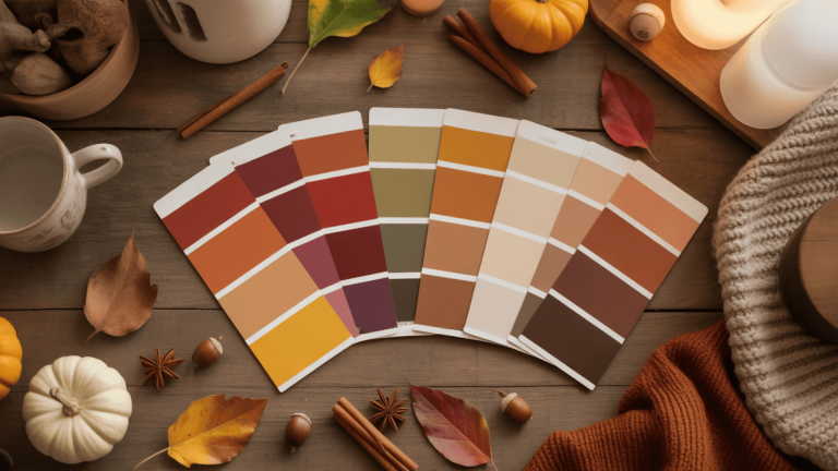
21 Fall Color Palette Ideas with Hex Codes for Every Use
Most people think fall means only orange and red. That assumption leads to palettes that feel too themed before the season even starts.
A well-chosen fall color palette goes far beyond those two shades. The right combination works for decor, photos, weddings, and branding all season long.
Here you’ll find warm, earthy, moody, and cool-toned palettes, complete with hex codes, best use cases, and the most common mistakes worth avoiding.
Pick the section that fits the project at hand. Each palette is ready to use as-is or adjust based on the specific setting.
What Is a Fall Color Palette?
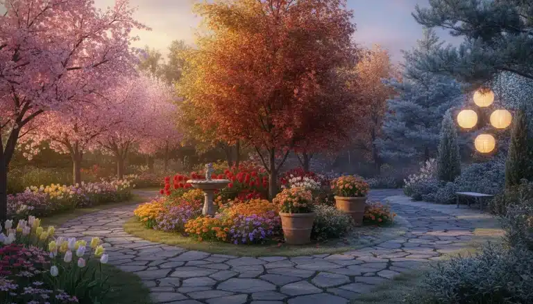
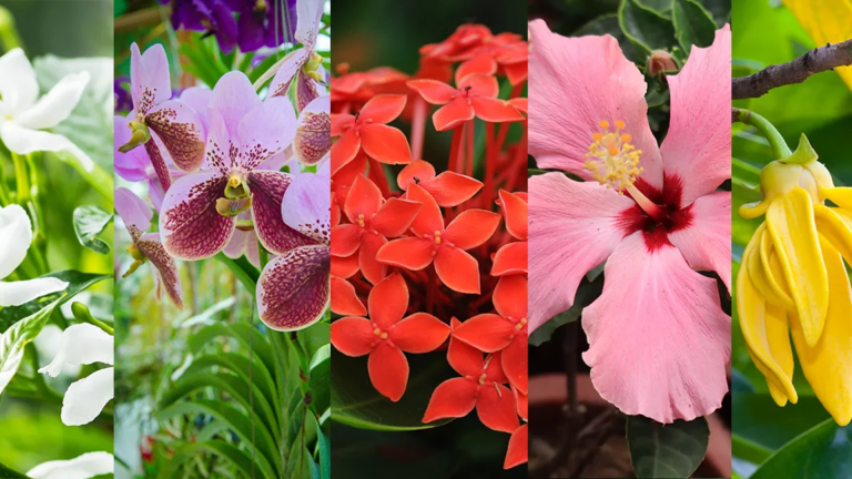
A fall color palette is a group of colors that capture the look of autumn. Common shades include rust, terracotta, mustard, olive, burgundy, brown, sage, cream, taupe, and forest green.
These colors feel seasonal because they reflect what you see in autumn. Changing leaves, wood tones, golden light, and cooler weather all shape what naturally looks right for the season.
Fall palettes can be warm or cool, muted or bold. Many people assume fall means only orange and red, but sage, taupe, green, and cream are just as seasonal and versatile.
Warm Fall Color Palettes
Warm fall palettes use orange, red, and yellow undertones. Creams and neutrals soften strong colors and keep them balanced for use in decor, branding, weddings, and seasonal graphics.
1. Pumpkin Spice
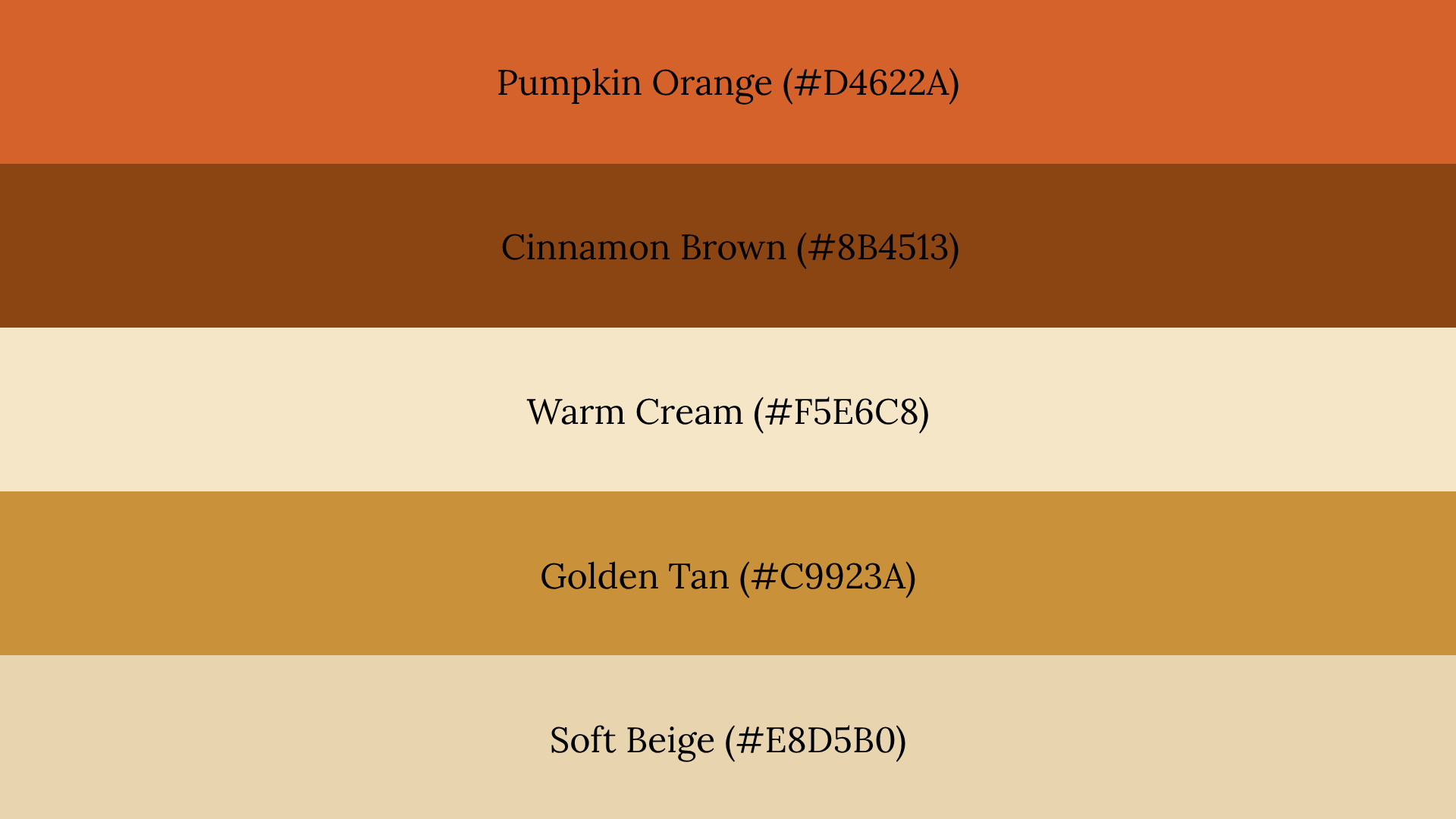
Orange, cinnamon brown, and cream work well together because orange brings warmth, brown grounds it, and cream softens the weight. This palette suits food branding, home decor, and seasonal graphics.
Watch Out For: Too much orange makes the palette feel like a Halloween theme rather than a general autumn one. Balance it with brown and cream.
2. Rust and Cream
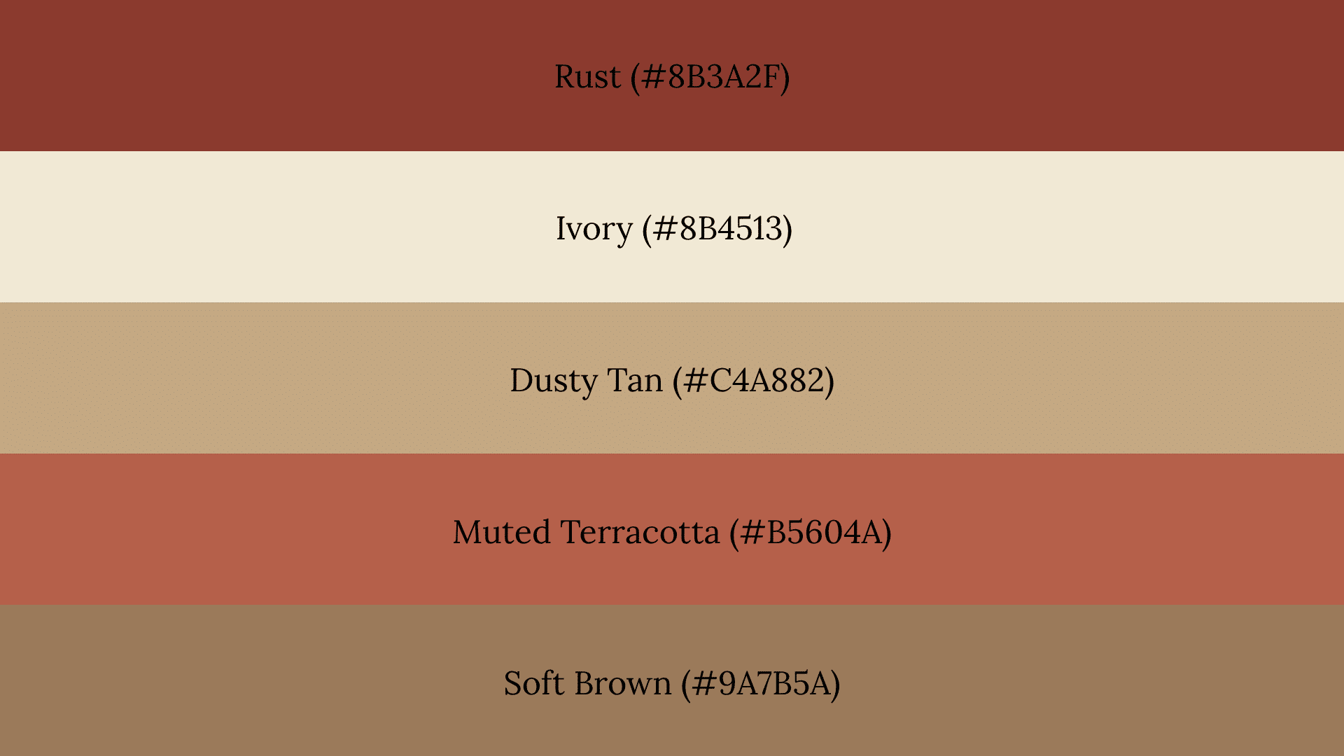
Cream softens the heaviness rust carries and keeps the palette from feeling too dark or closed in. This combination works best for interior styling and lifestyle branding.
Watch Out For: Too many light tones alongside ivory removes the depth that makes this palette feel autumnal. Keep at least one deeper rust or brown in the mix.
3. Burgundy and Gold
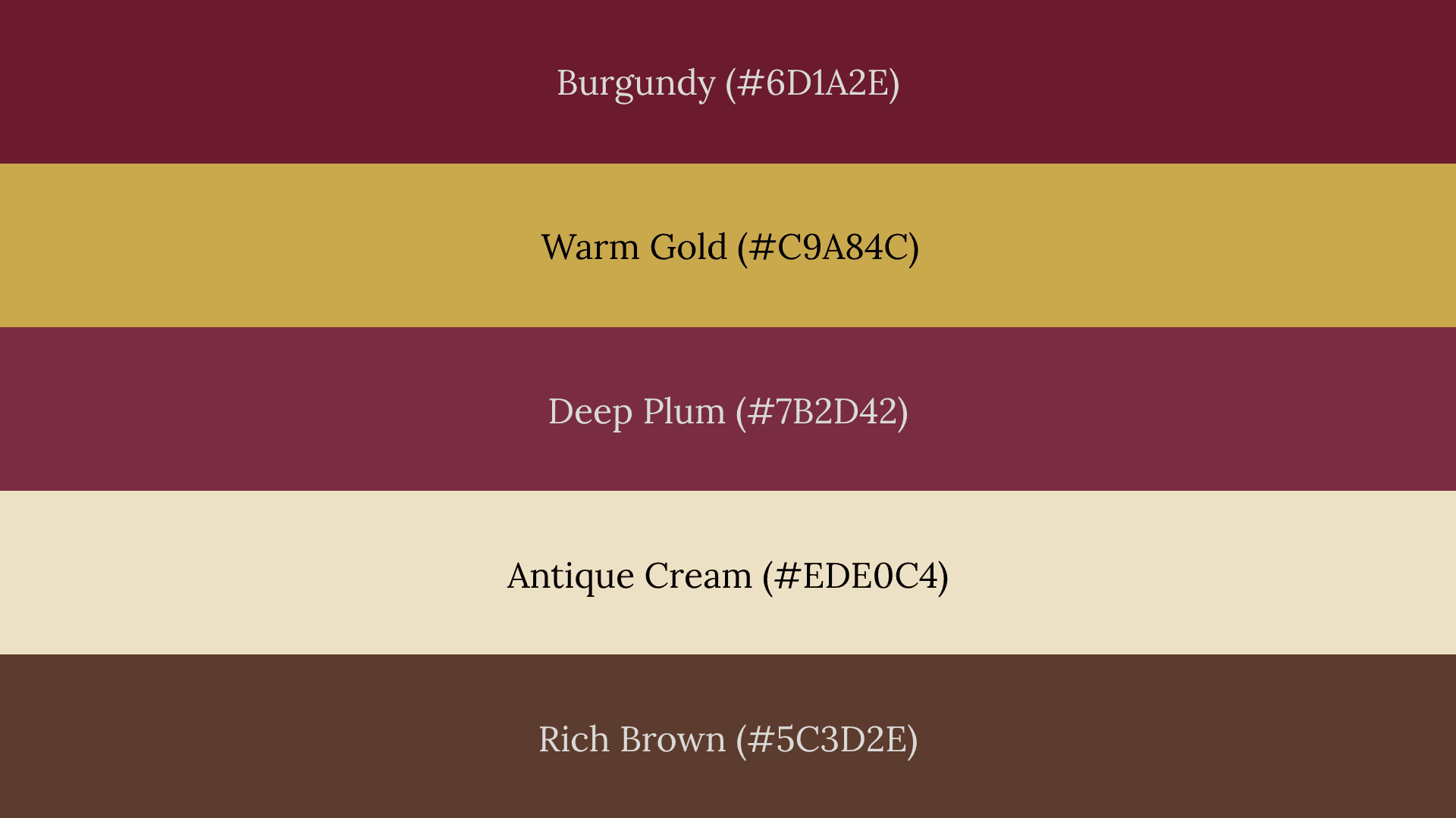
Burgundy adds richness without looking harsh because it carries enough brown to stay warm. This palette fits weddings, fashion styling, and luxury branding well.
Watch Out For: Leaning too heavily on both gold and burgundy at full intensity can make the palette feel stiff and overly formal. Add a soft cream or warm brown to loosen it up.
Earthy Fall Color Palettes
Earthy fall palettes draw from forests, clay, and neutral landscapes. Muted greens and browns reduce visual intensity, making these palettes calmer and more flexible for decor, branding, photography, and weddings.
4. Olive and Clay
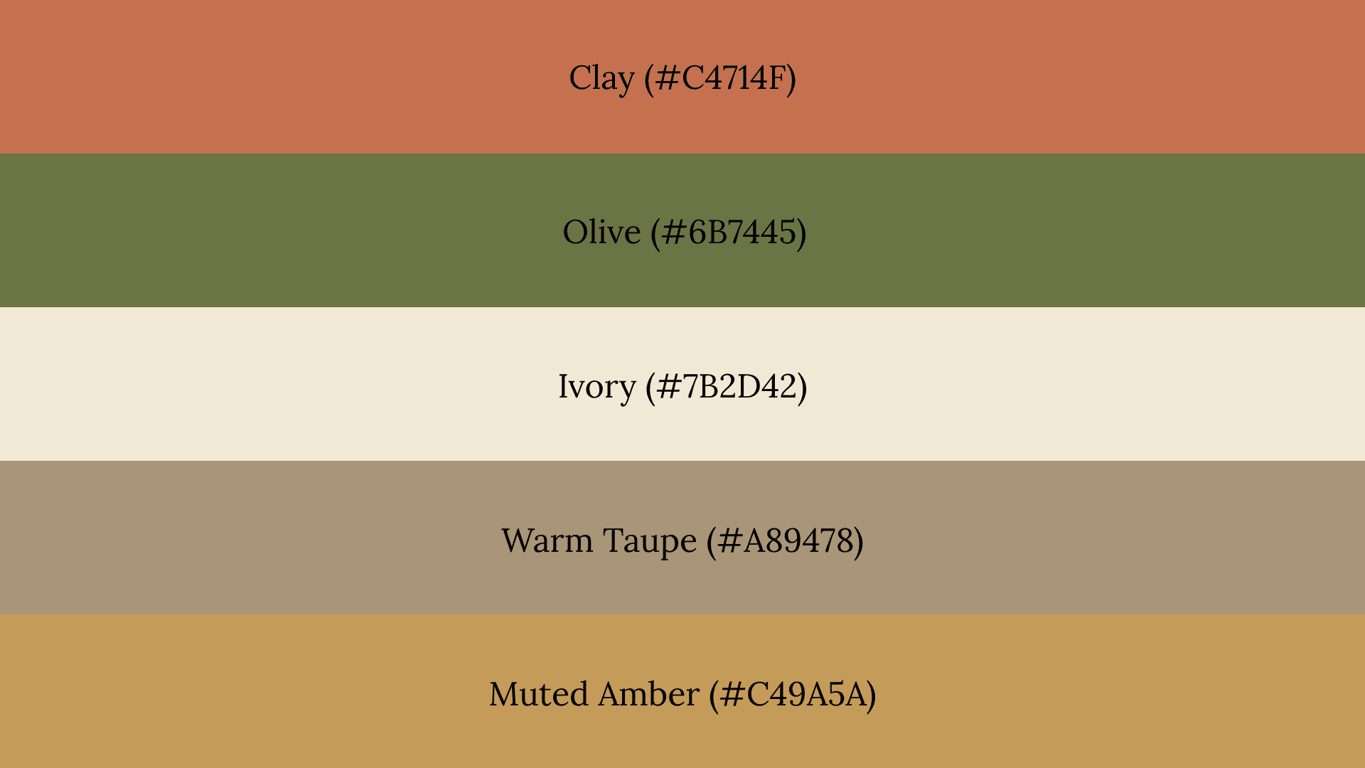
Olive cools down the warmth of clay just enough to keep the palette balanced. This combination works well for home decor and family photo outfits in outdoor settings.
Watch Out For: Using only clay and olive without a neutral removes all contrast. Add a warm cream or light taupe to keep the palette from looking flat.
5. Sage and Taupe
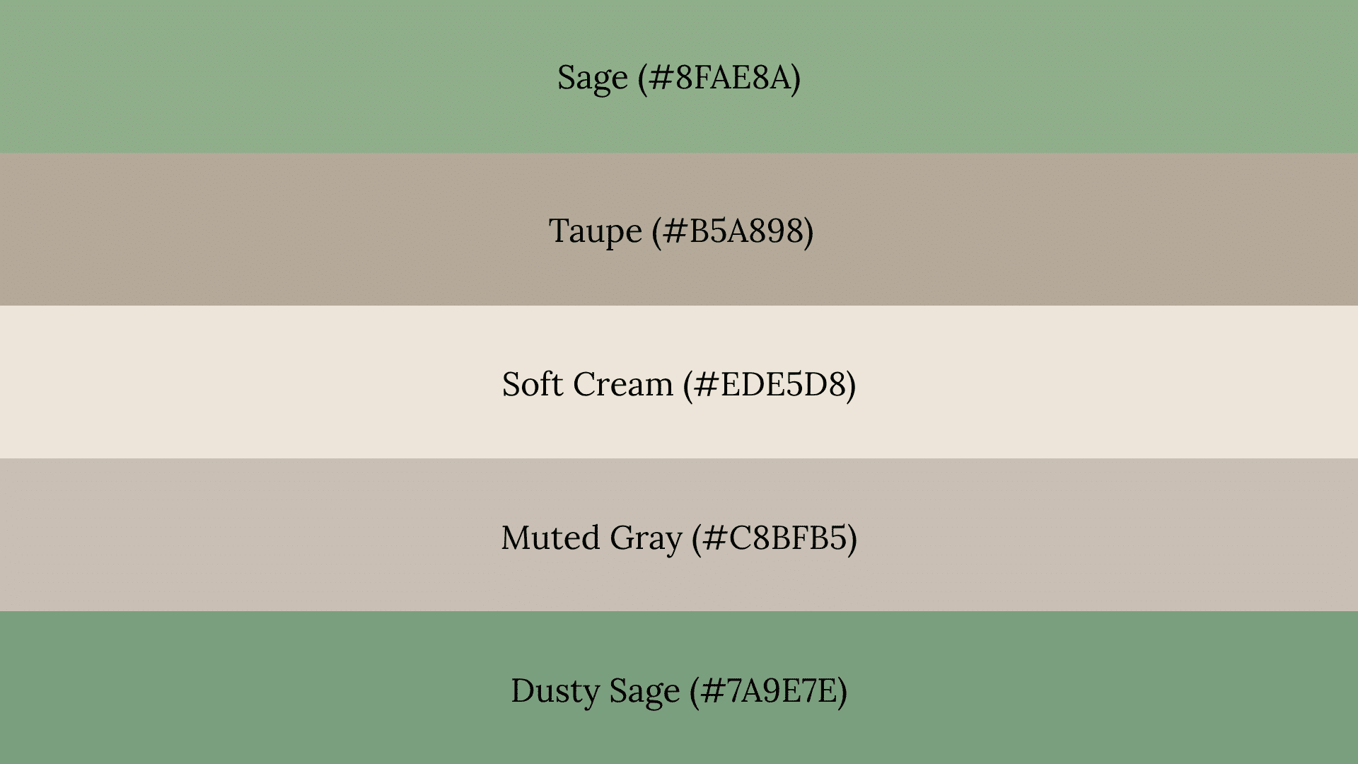
Soft neutrals like sage and taupe strip away the heaviness of traditional fall colors. The result is a minimal autumn look that works well for interiors and wedding color schemes.
Watch Out For: Stacking too many muted shades without contrast can make the palette feel washed out. Add one slightly deeper tone to give it a clear visual anchor.
6. Forest Floor
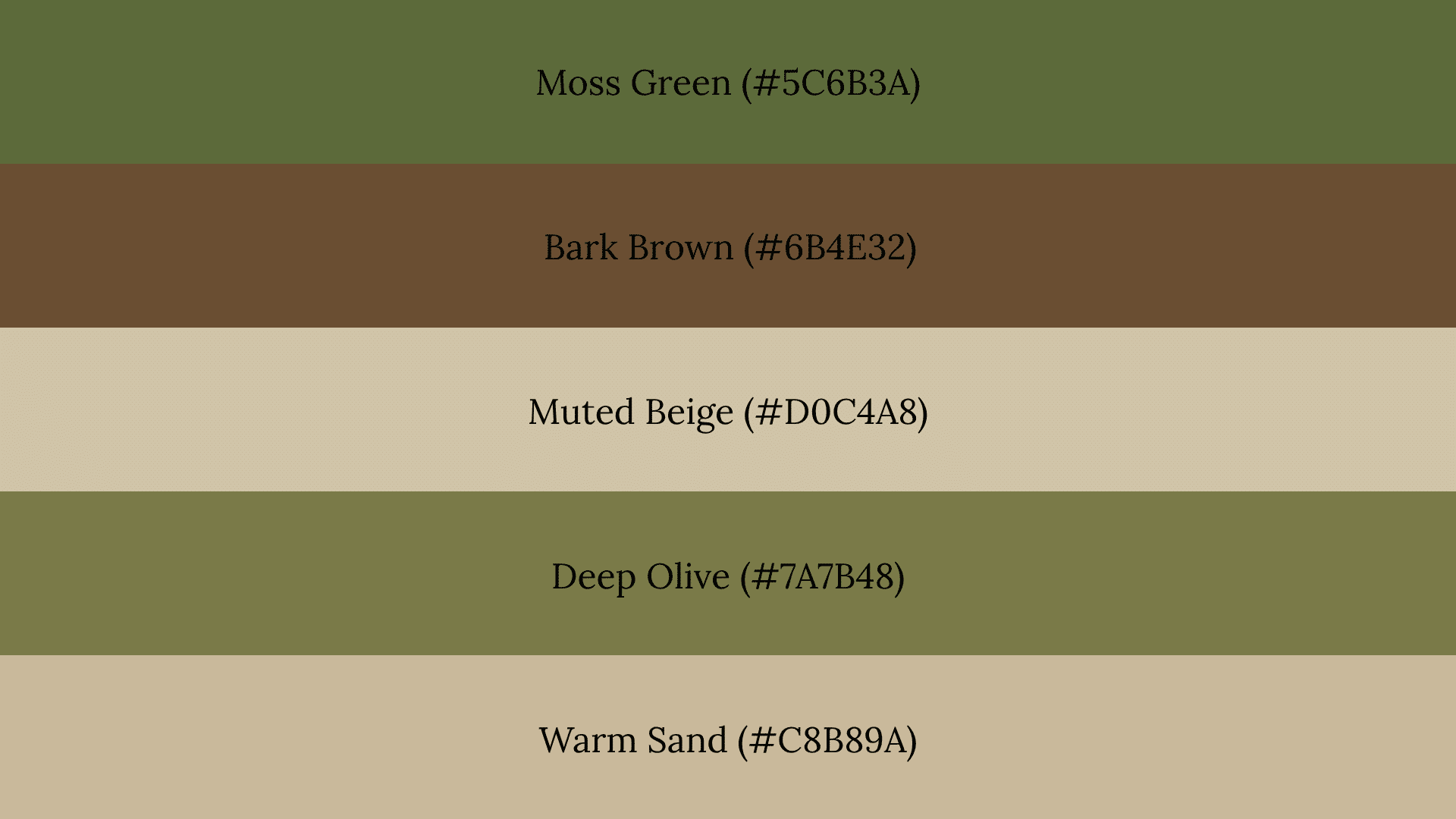
Moss green, bark brown, and muted beige recreate the layered, quiet look of woodland in autumn. Darker grounding colors add depth and stop the palette from feeling too soft or undefined.
Watch Out For: Removing the darker shades to lighten this palette strips away the natural, grounded quality that makes it work. Always keep at least one deep green or brown as an anchor.
Moody Fall Color Palettes
Deep colors reflect the heavy skies, bare branches, and long shadows of late fall. Dark tones add contrast and drama, making these palettes feel rich and intentional rather than simply dark.
7. Deep Forest and Espresso
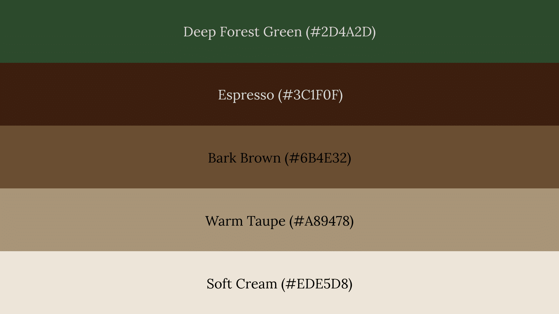
Dark green works better than pure black for fall because it stays warm and connected to nature. This palette suits masculine branding and moody interior styling well.
Watch Out For: Too many dark colors without a lighter accent can make the palette feel closed in and heavy. Always include at least one soft neutral to create breathing room.
8. Aubergine and Copper
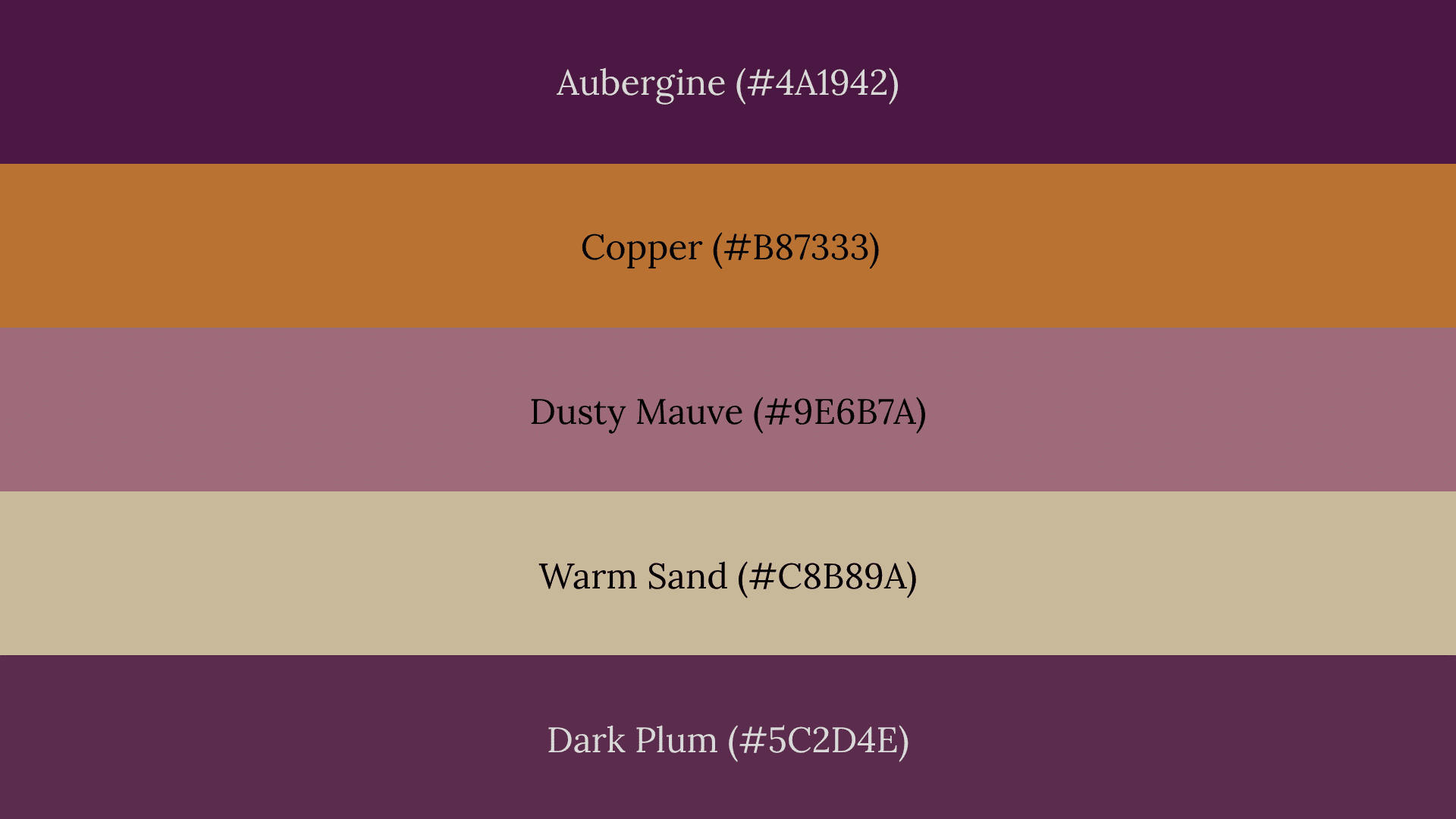
Warm metallic-inspired copper tones balance the depth of aubergine by adding just enough warmth. This palette works well for fashion, weddings, and editorial graphics.
Watch Out For: Cool-leaning purples can pull this palette toward winter styling. Keep the purple warm and brown-based to hold the fall feel.
9. Charcoal and Burnt Orange
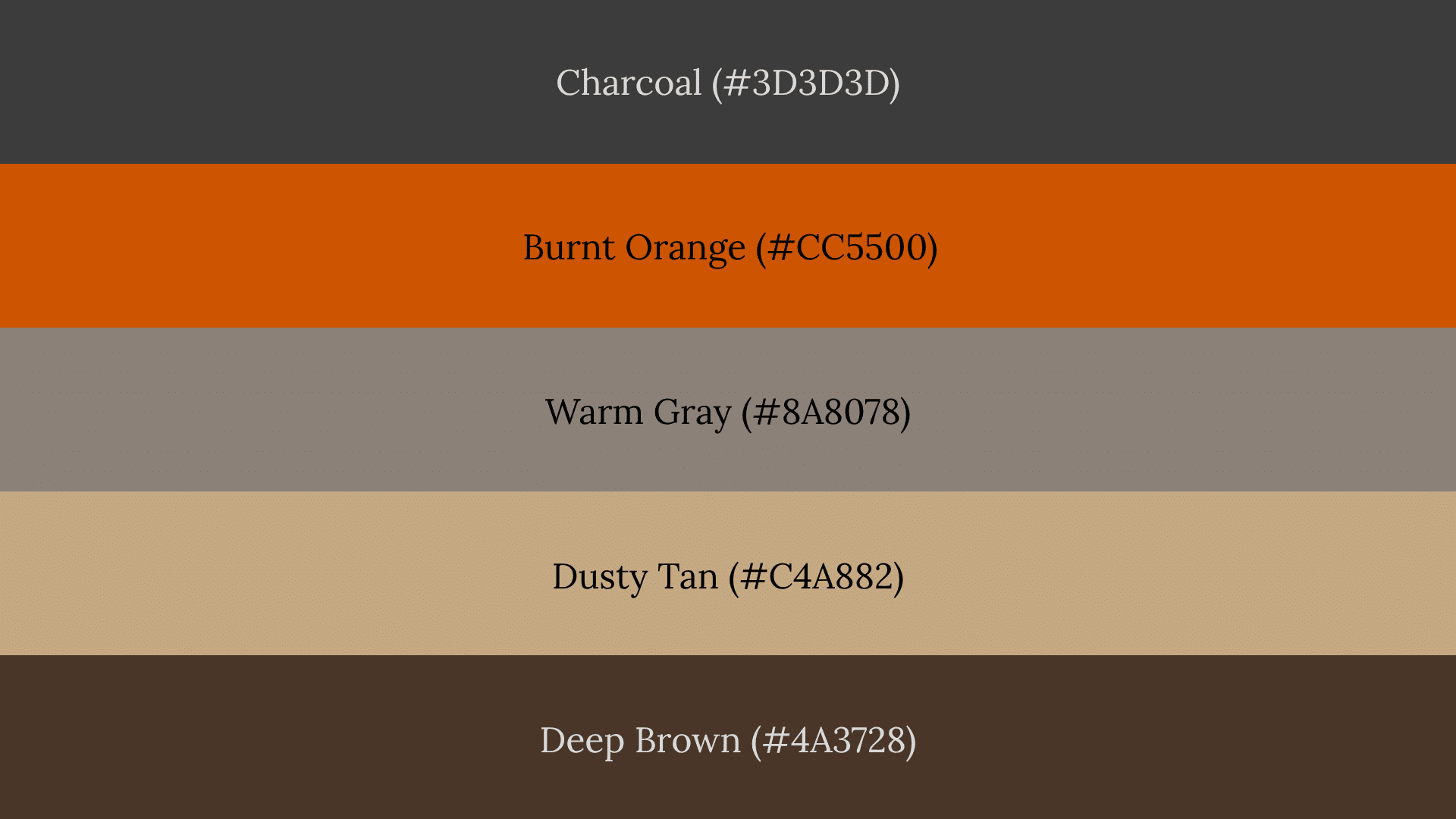
Muted orange softens charcoal by adding warmth without competing with it. This pairing works well for modern seasonal branding that needs a contemporary edge.
Watch Out For: Bright orange at high saturation overpowers charcoal completely. Use a muted, brown-leaning burnt orange to keep the balance right.
Cool-Toned Fall Color Palettes
Cool palettes still feel seasonal when paired with warm neutrals like camel, sand, or taupe. Slate blue, misty blue, and sage carry autumn mood without the heaviness of warm fall shades.
10. Slate Blue and Camel
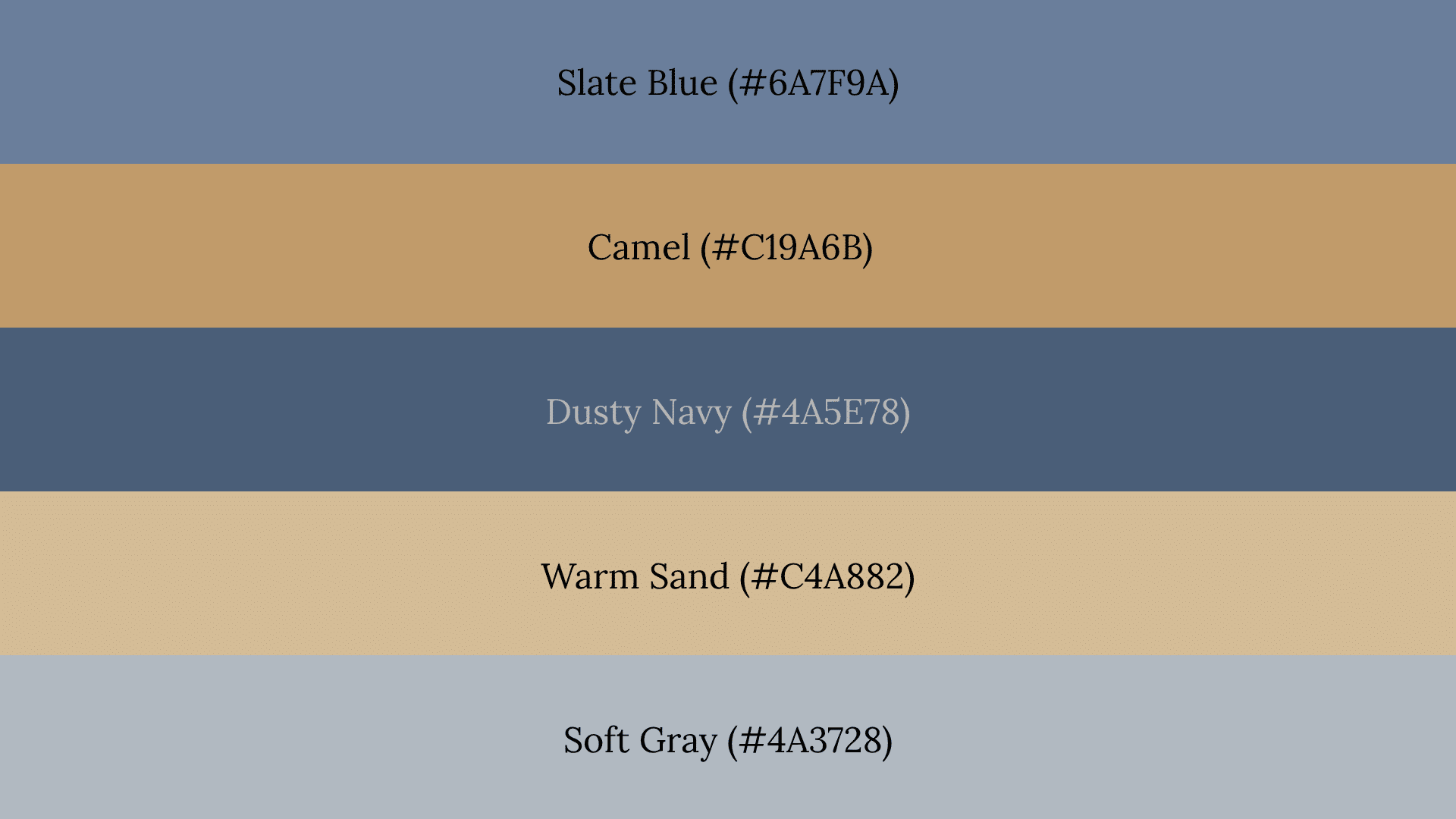
Camel keeps slate blue from feeling too cold or wintry by pulling the palette back toward warmth. This combination works well for fashion and minimalist decor.
Watch Out For: Using too much blue across the palette removes the autumn feel entirely. Keep camel and sand as the dominant neutrals with blue as the accent.
11. Misty Blue and Sand
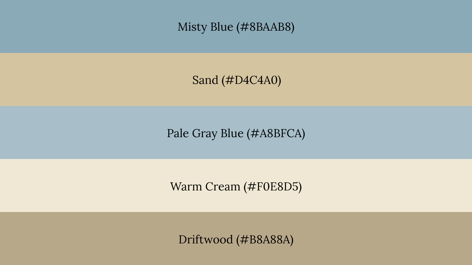
Sand and cream soften cool blue tones and keep the palette feeling seasonal rather than wintry. This combination suits wedding palettes and calm, understated branding.
Watch Out For: Low contrast between misty blue and sand can reduce readability in graphics and text-heavy designs. Add one deeper tone to create clear visual separation.
12. Rainy Autumn
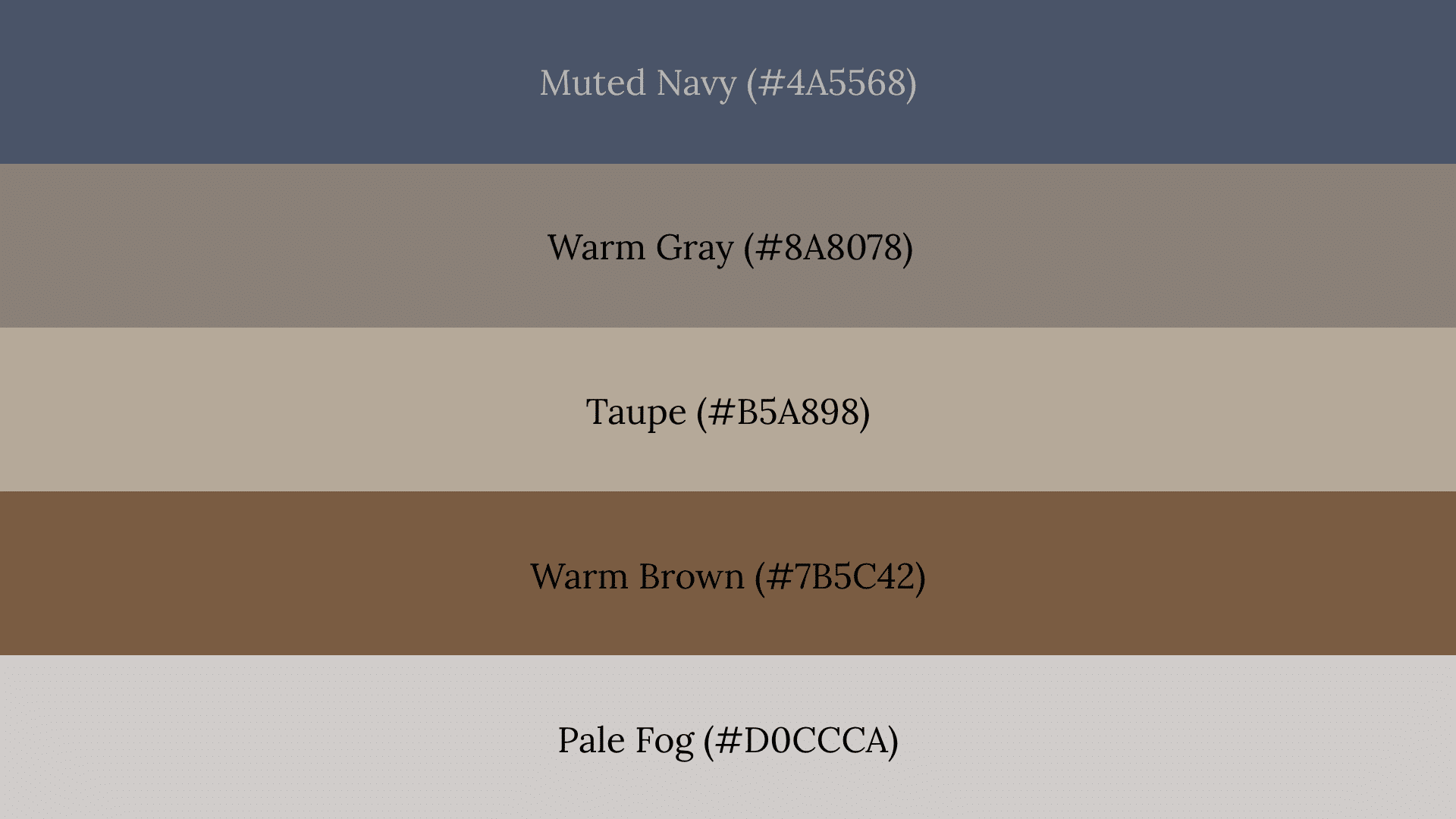
Muted navy, gray, taupe, and warm brown come together to recreate the soft, overcast mood of a rainy fall day. Low saturation across all shades creates a quiet, cohesive seasonal feel.
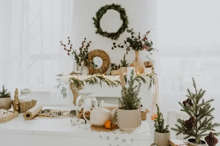
Fall Color Palettes for Home Decor
Fall decor works best when neutral foundations carry the base and accent colors bring in seasonal warmth. Layering through textiles, wood tones, lighting, and paint creates depth without overwhelming a room.
13. Cozy Farmhouse
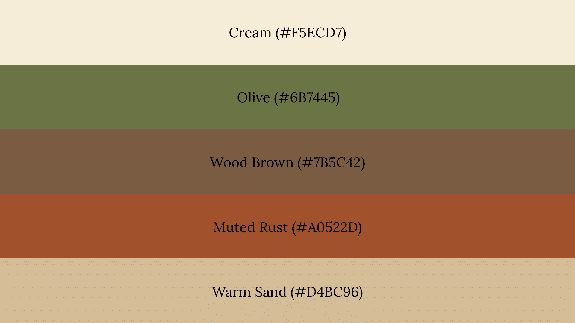
Cream, olive, wood brown, and muted rust work together because they all carry natural, organic undertones. Natural textures like linen, jute, and raw wood support these colors and make them feel at home.
Watch Out For: Mixing too many competing textures alongside this palette can create visual noise. Keep surfaces simple so the colors themselves carry the warmth.
14. Terracotta Living Room
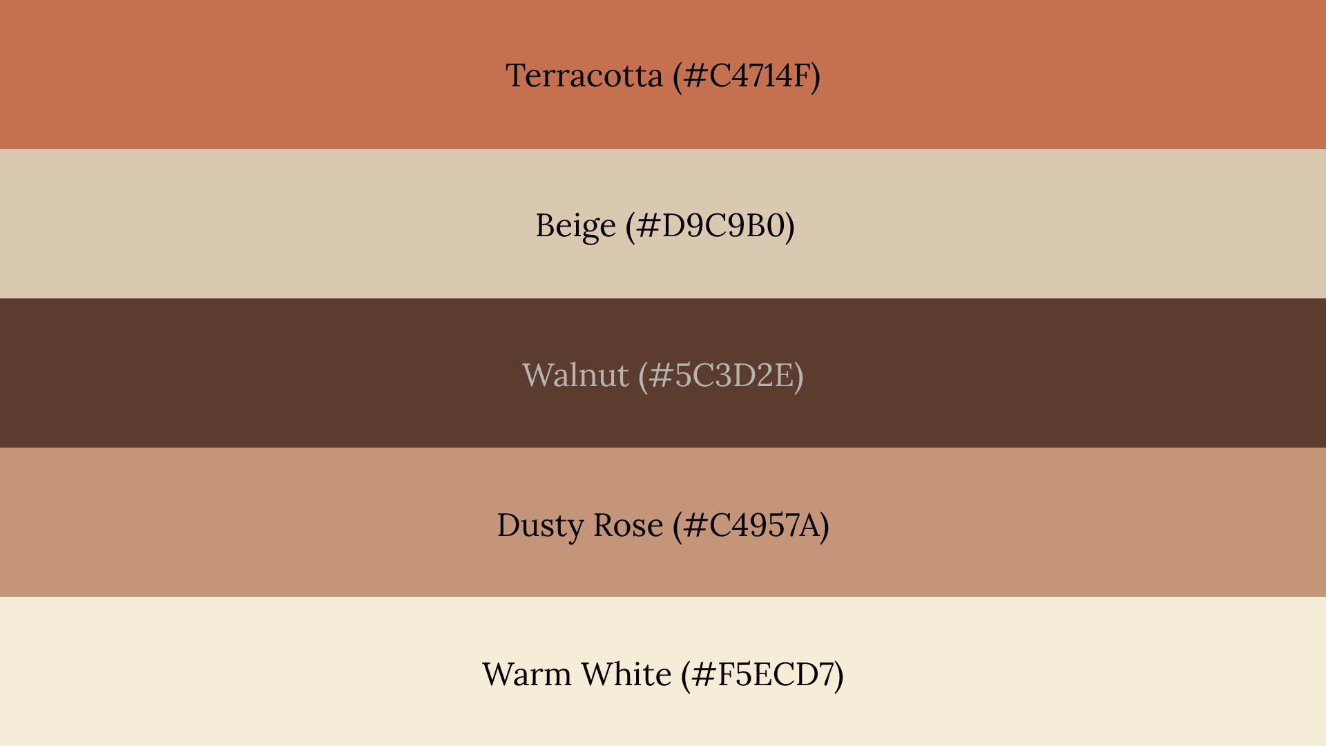
Terracotta creates warmth without the intensity of bright orange because it carries more brown and clay in its base tone. It pairs naturally with beige and walnut for a grounded, livable look.
Watch Out For: Pairing terracotta with bright white instead of warm white or beige makes the palette feel stark and removes the cozy quality entirely.
15. Soft Neutral Autumn
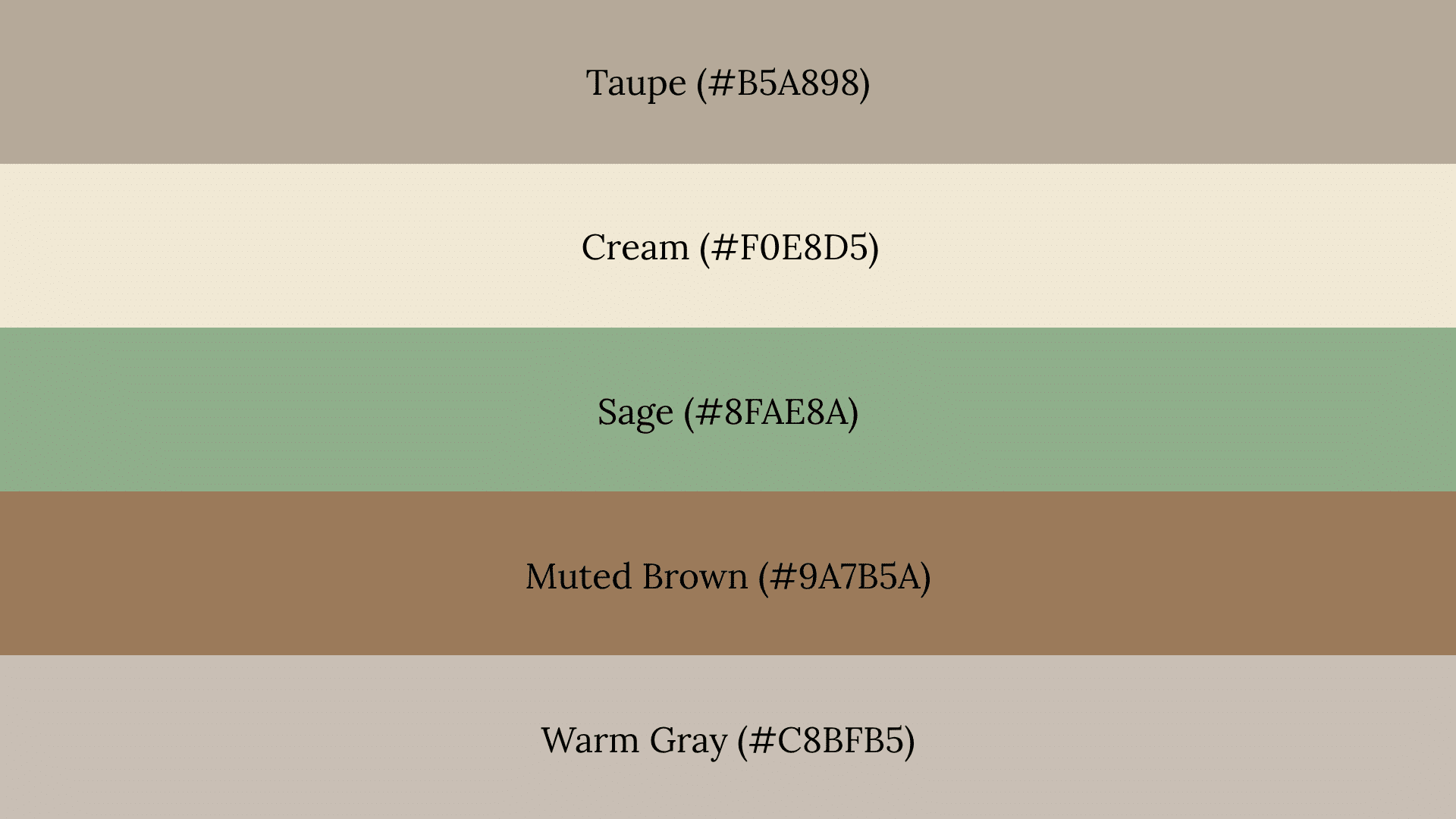
Taupe, cream, sage, and muted brown create a palette subtle enough to work across all seasons. Understated colors like these avoid feeling too seasonal, making them a practical long-term decor choice.
Watch Out For: Going too neutral without any variation in tone can make a room feel flat. Introduce contrast through texture and layering rather than adding stronger colors.
Fall Color Palettes for Family Photos
Coordinated tones photograph better than identical colors because they create natural variety without looking mismatched. Medium contrast and backgrounds with trees, fields, or foliage all affect how a palette reads on camera.
16. Olive and Denim
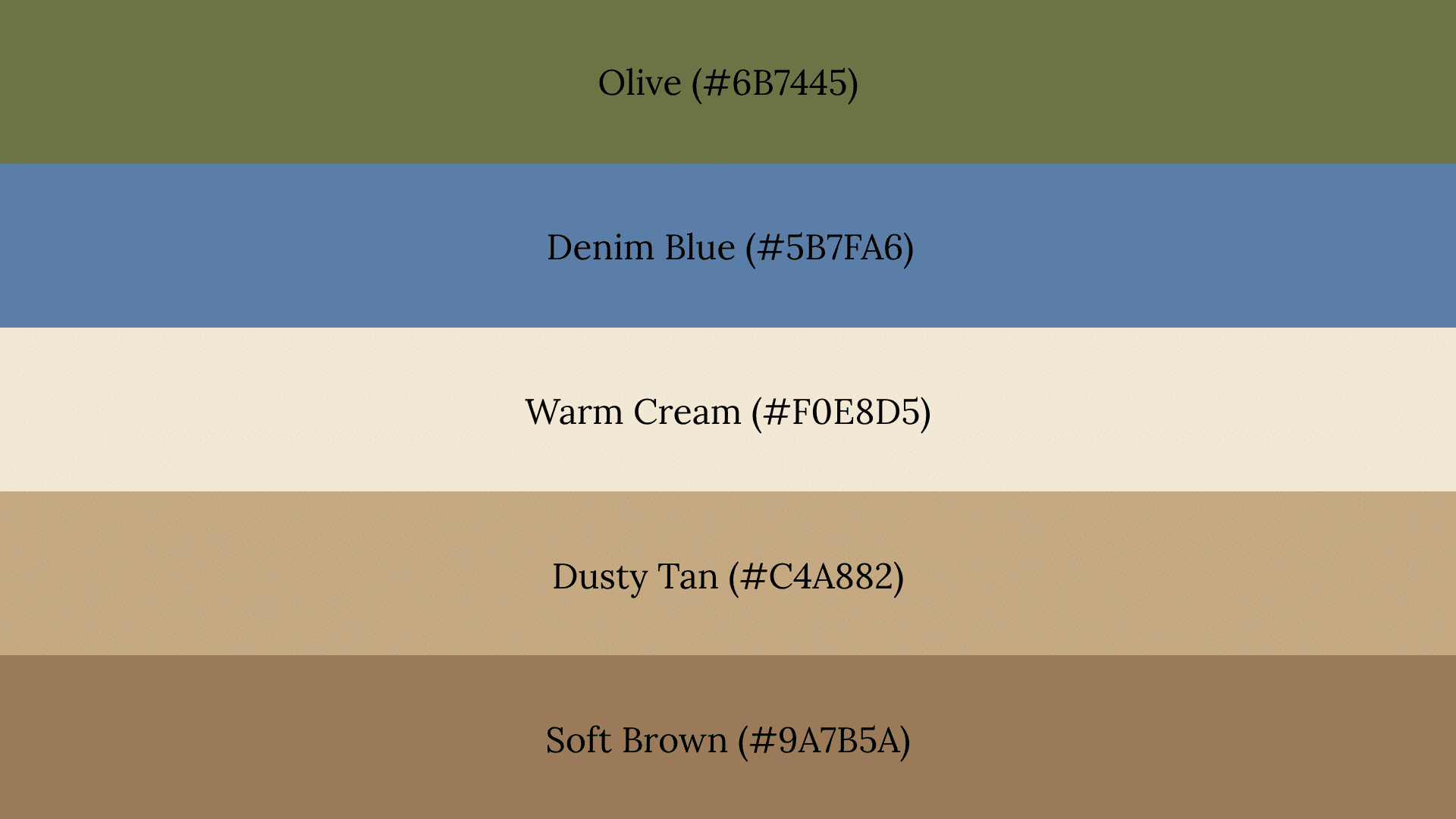
Muted blue balances olive naturally because both colors share a low-saturation, earthy quality. This combination works particularly well for outdoor shoots in natural settings.
Watch Out For: Bright or saturated denim can overpower olive and pull the palette away from its earthy quality. Keep the blue muted and slightly grayed down.
17. Cream and Rust
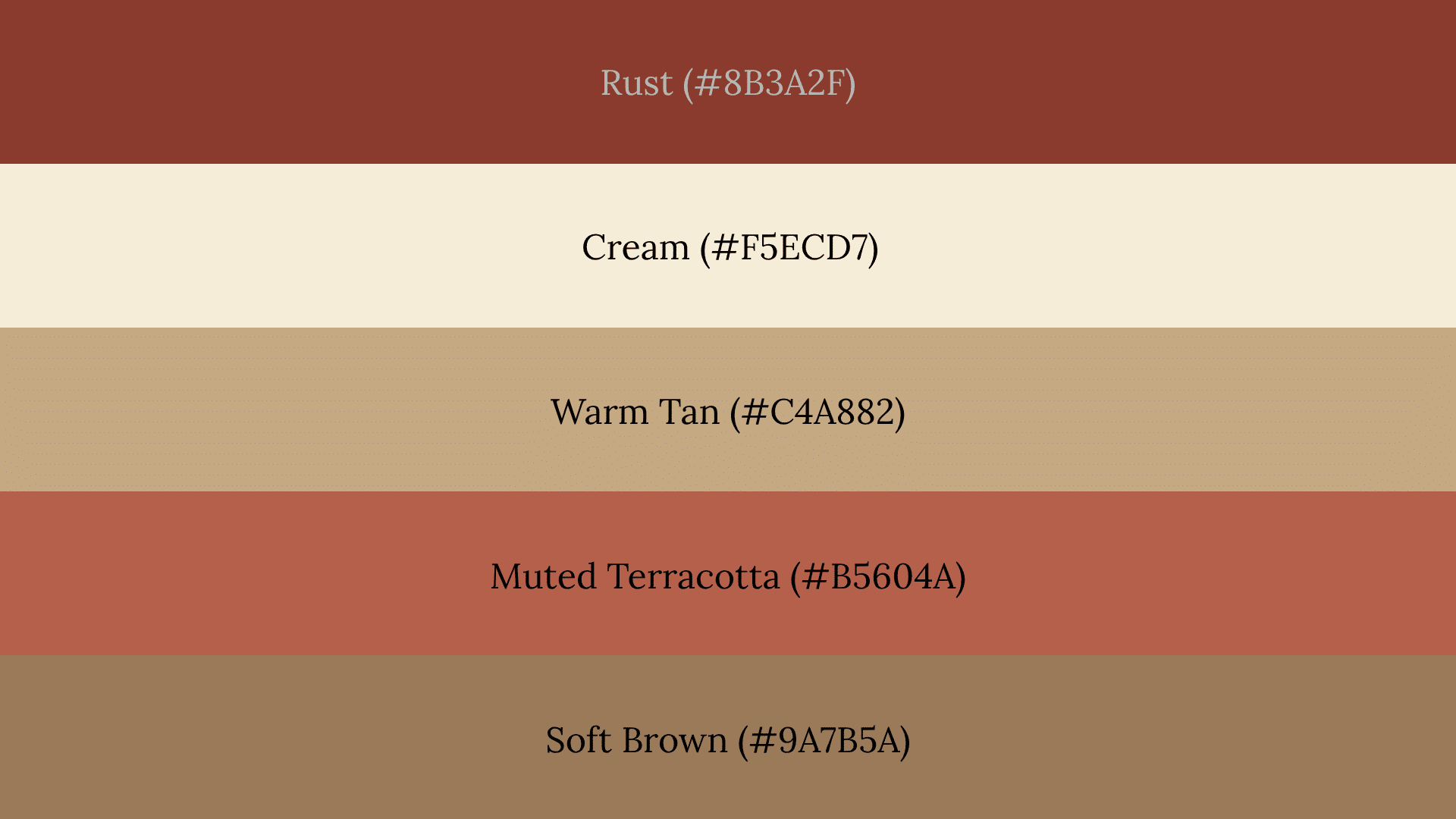
Cream keeps rust from reading too dark in photos by adding lightness and contrast around it. This palette looks especially strong in golden-hour photography when warm light hits the colors.
Watch Out For: Too many dark rust tones without enough cream can make the overall photo feel heavy and underexposed in shaded outdoor settings.
18. Muted Earth Tone
Beige, moss, brown, and soft burgundy photograph naturally because none of these colors reflect harsh light or create strong contrast with typical outdoor backgrounds. Muted tones stay consistent across different lighting conditions.
Watch Out For: Adding one highly saturated color into an otherwise muted palette draws the camera’s attention to that piece of clothing rather than the group as a whole.
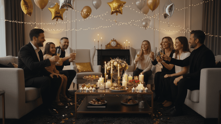
Fall Wedding Color Palettes
Fall wedding palettes work best when seasonal colors are balanced with soft neutrals that keep the overall look from feeling too themed. The right neutral prevents the palette from being too tied to one specific season.
19. Terracotta and Sage
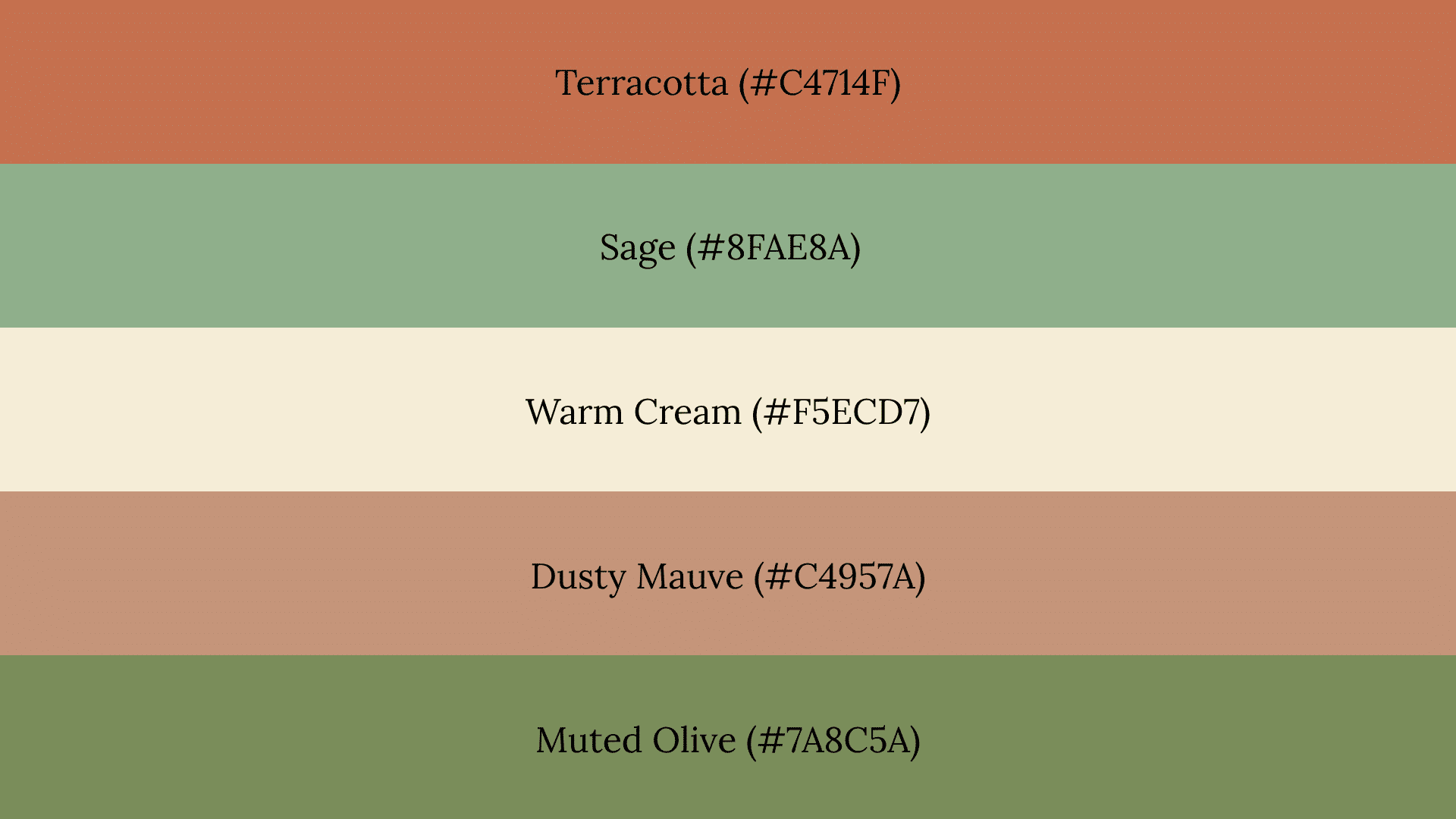
Sage balances earthy terracotta by cooling it down slightly without removing its warmth. This combination is a natural fit for rustic weddings with outdoor or barn settings.
Watch Out For: Using bright terracotta instead of a muted version can make the palette feel casual rather than wedding-appropriate. Keep the tones soft and dusty throughout.
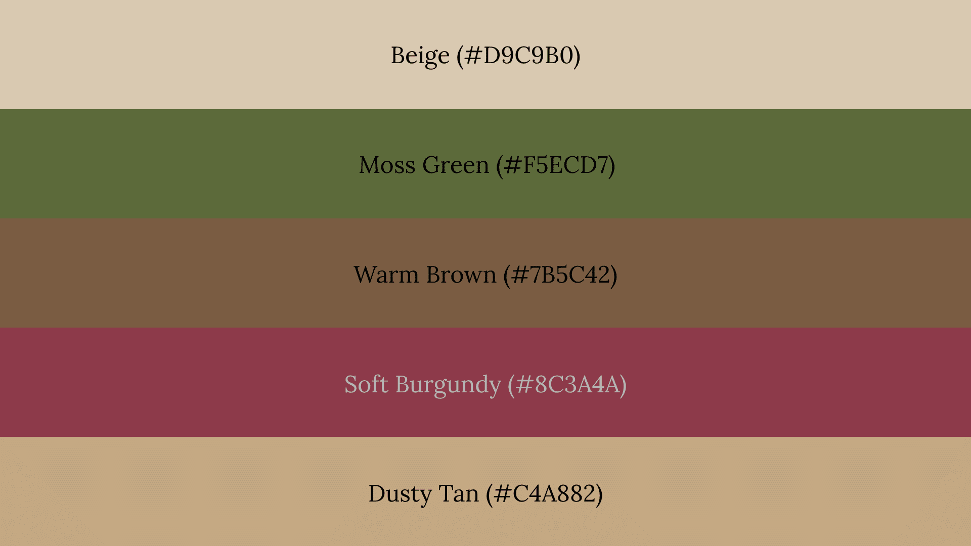
20. Wine and Gold
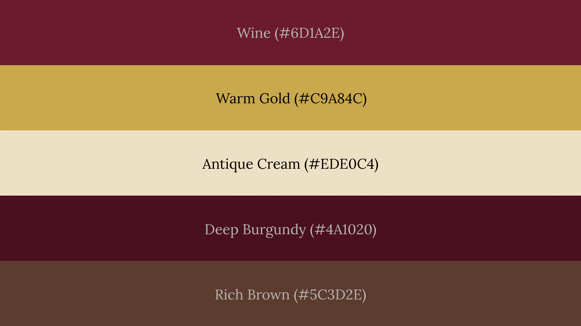
Deep wine creates a sense of richness and occasion without needing much else to support it. This palette works well for formal fall weddings and evening events.
Watch Out For: Too much metallic gold alongside deep wine can feel overly formal and heavy. Use gold sparingly as an accent rather than a primary palette color.
21. Dusty Autumn Neutrals
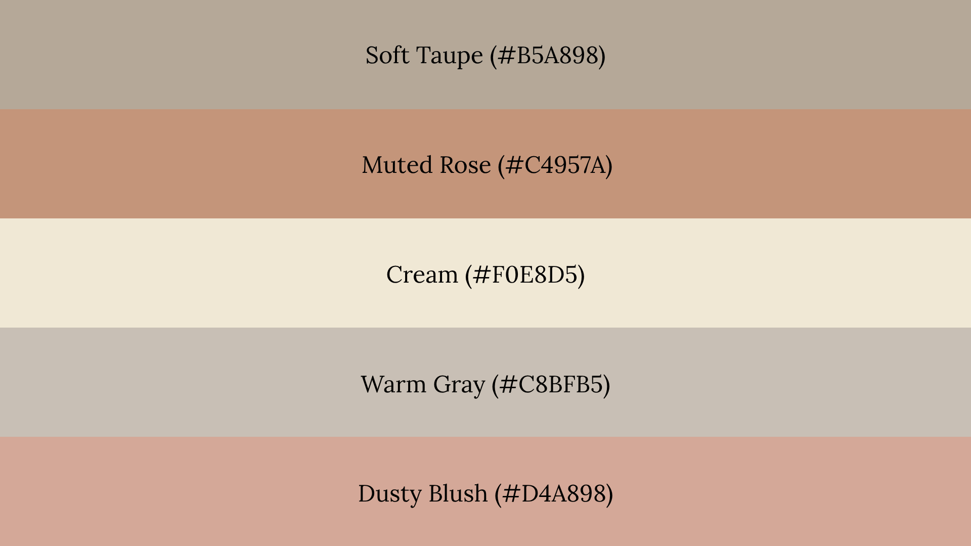
Soft taupe, muted rose, cream, and warm gray work together because their shared low saturation keeps everything feeling cohesive. Desaturated colors create a refined wedding look that does not feel tied to one specific season.
Watch Out For: Keeping all shades at the same tone level removes depth from the palette. Vary the shades slightly so there is a clear light, mid, and dark range to work with.
How to Choose a Fall Color Palette?
Before committing to any fall palette, run through these five checks. They help catch common problems early and make the final combination easier to use across different settings.
- Does the palette include a grounding neutral like cream, taupe, or warm gray?
- Is there enough contrast between the lightest and darkest shades?
- Do the undertones feel consistent across all chosen colors?
- Does it fit the intended use case, whether decor, photos, branding, or weddings?
- Does the palette still work outside of autumn without feeling out of place?
If any answer is no, adjust that color before moving forward. One weak choice can affect how the entire palette reads in a real setting.
Wrapping Up
Choosing the right fall color palette comes down to understanding undertones, contrast, and how each color will actually be used in a real setting.
A palette that works only in October is a limited one. The best fall combinations include a neutral that keeps the look usable year-round.
Now that the options are clear, the next step is picking colors that fit the specific mood, setting, and season being worked with.
Drop a comment below with palette suggestions or favorites from the list. Hearing what combinations are working helps shape future content in a useful direction.
Frequently Asked Questions
What Are the Trending Fall Colors for 2026?
The trending fall colors for 2026 include deeper terracottas, rich burgundy, warm wine tones, burnt olive, and muted forest greens. Most of these appear across the palettes covered above and are ready to use.
How Do I Create My Own Fall Color Palette?
Start with one anchor color, add a neutral, then build contrast with a third shade. Use the five-point checklist above to confirm undertones, contrast, and use case before finalizing.
What Are the 7 Colors of the Fall Color Palette?
There is no fixed set of seven fall colors. Common choices include rust, terracotta, mustard, olive, burgundy, sage, cream, taupe, and forest green, depending on the palette type.