Does your home feel bland when you want that perfect dark color that’s not quite navy and not quite black?
Finding the right dark paint proves tricky for most homeowners. You want something bold enough to make a statement but refined enough to feel sophisticated. Regular dark colors often look too harsh or don’t have the character needed.
Inkwell Sherwin Williams gives you exactly what you’re looking for with its rich blue black finish. This SW Inkwell shade brings instant drama to any room while keeping that polished look you want.
This review covers everything about using an inkwell in your home.
Learn the best rooms for this color, coordinating paint options, testing methods, and comparisons to similar dark shades.
Inkwell Sherwin-Williams (SW 6992) Basics
Inkwell brings instant character to any space with its deep, moody presence that sits perfectly between navy blue and true black.
This rich sw inkwell shade creates visual dimension while its cool undertones keep it feeling fresh rather than heavy.
SW Inkwell Specifications
| Property | Details |
|---|---|
| Light Reflectance Value (LRV) | 4 |
| RGB | 49 / 54 / 58 |
| Color Family(s) | Neutral |
| Hex Value | #31363A |
| Undertones | Cool (blue, charcoal hints) |
| Location Number | 251-C4 |
What Do These Terms Mean?
- Light Reflectance Value (LRV): A number from 0-100 that measures how much light a color reflects. At 4, Inkwell absorbs nearly all light rather than reflecting it back.
- RGB: The red, green, and blue values that create the color on digital screens. These numbers help match paint colors to digital designs and online inspiration.
- Color Family(s): The basic color category a paint belongs to. Blue-black means this paint sits between blue and black, giving it unique characteristics of both colors.
- Hex Value: The six-digit code used in web design and digital applications. This code ensures accurate color matching across different digital platforms and devices.
- Undertones: Subtle color hints that show through paint. Cool undertones include blue, green, and gray tones that make colors feel crisp and fresh.
- Location Number: The specific number Sherwin-Williams uses to identify each paint color. Use this code when ordering to get the exact shade.
Why Choose Inkwell by Sherwin-Williams?
Bold colors, like Inkwell Sherwin-Williams, transform plain walls into commanding focal points that lighter shades simply cannot achieve.
This deep tone works equally well both inside and outside your home, demonstrating its versatility across various applications.
The color suits all design styles from modern to traditional to eclectic, serving as either a statement piece or a grounding element.
While impactful enough to stand alone, it harmonizes beautifully with whites, warm metals, and natural wood tones.
Best Places to Use SW Inkwell
Certain rooms and applications showcase this paint particularly well. Consider these top options when planning your project.
1. Bedroom
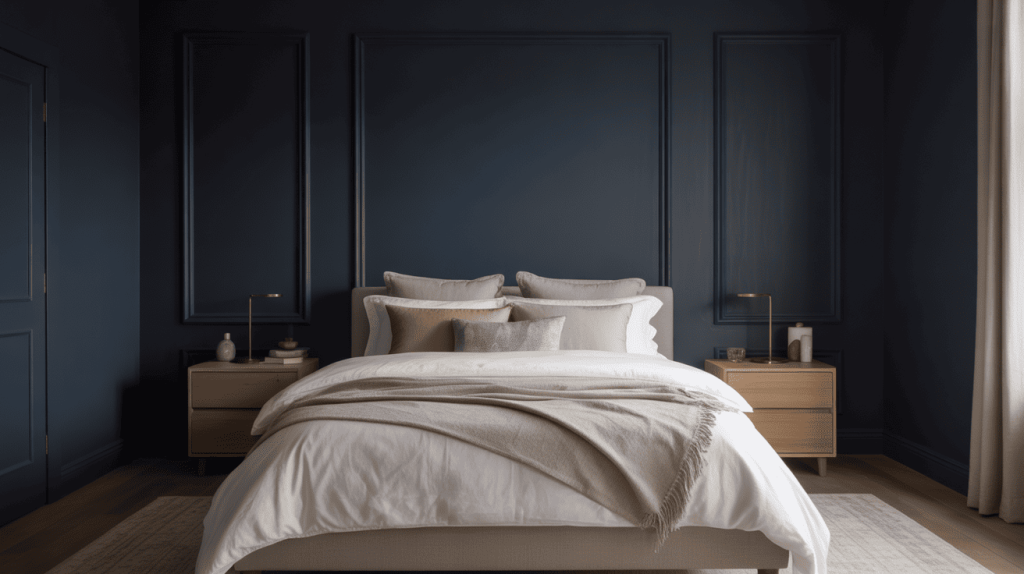
Bedrooms painted in Inkwell create a cozy, intimate atmosphere perfect for rest and relaxation. The dark color makes the space feel like a peaceful retreat while providing a sophisticated backdrop for bedding and furniture.
This rich tone works especially well as a feature wall behind the headboard or throughout the entire room for maximum drama.
2. Living Room
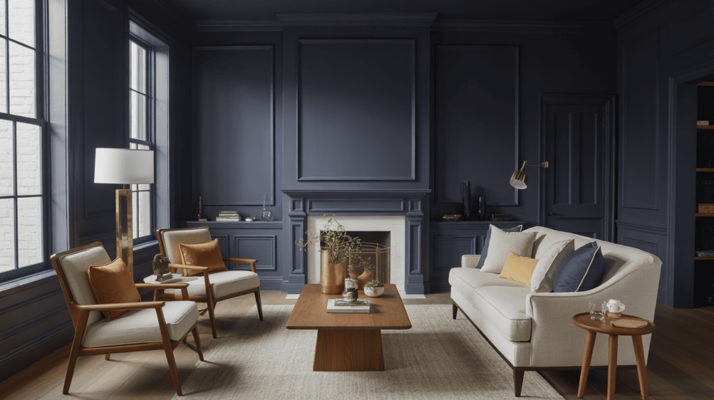
Living rooms benefit from Inkwell’s ability to create a refined, welcoming environment for entertaining and daily life.
The color adds visual weight and interest that transforms ordinary spaces into statement areas. Whether used on all walls or as a feature wall, Inkwell provides the perfect foundation for both modern and traditional furniture pieces.
3. Kitchen
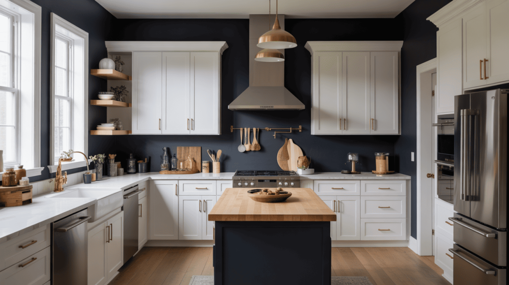
Kitchen walls in Inkwell create a bold cooking space that feels both contemporary and timeless. The color works particularly well with white cabinetry, stainless steel appliances, and natural wood elements.
This rich tone makes light-colored countertops pop while creating a dramatic backdrop for meal preparation and family gatherings.
4. Bathroom
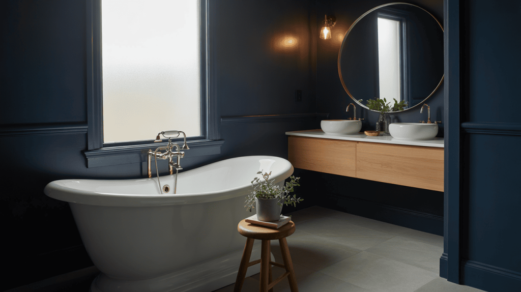
Bathrooms become spa-like retreats when painted in Inkwell, creating an upscale atmosphere perfect for relaxation.
The intimate scale of these spaces makes dark colors feel luxurious rather than overwhelming. This shade pairs beautifully with white fixtures, brass hardware, and natural materials for a sophisticated finish.
5. Exterior
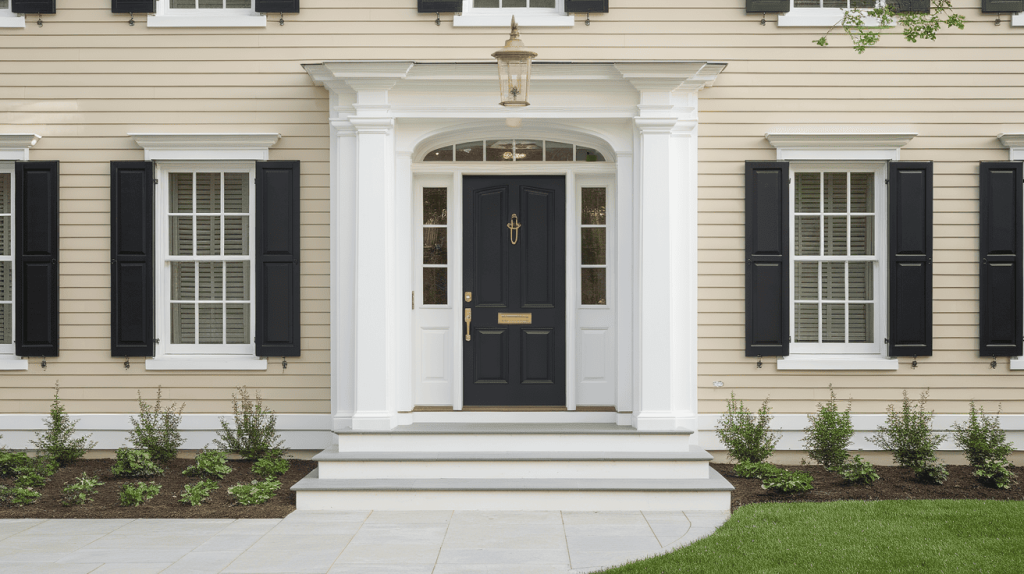
Exterior applications of Inkwell boost curb appeal instantly, creating striking first impressions for guests and passersby. Front doors, shutters, and trim work in this color create welcoming yet refined entrances.
The paint works on various home styles from colonial to contemporary and looks particularly stunning against light-colored siding or brick.
How to Choose SW Inkwell for Your Space
Not all paint colors behave the same in every room, and SW Inkwell is no exception. To ensure it’s the right fit:
-
Sample generously: Order multiple samples and paint large swatches on various walls.
-
Test lighting: Observe the color in both natural daylight and your room’s actual lighting.
-
Compare sheens: Try flat, satin, and semi-gloss finishes to see how sheen changes the look.
-
Match with decor: Place samples near furniture, flooring, and trim for a true compatibility check.
A little testing now saves big regret later. Let SW Inkwell shine in your space the way it should!
Coordinating Colors with SW Inkwell
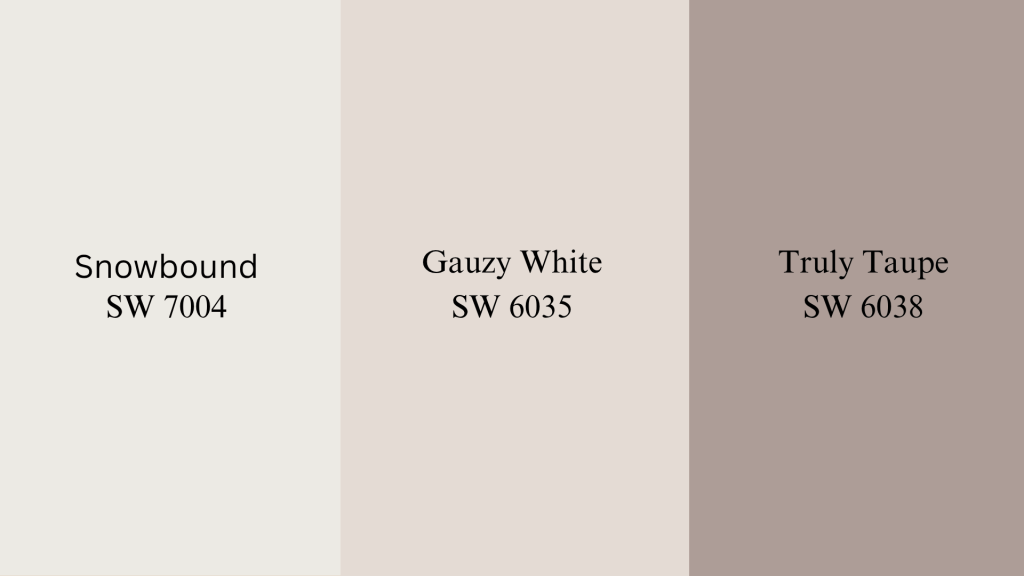
Successful color schemes require thoughtful coordination. These combinations work particularly well with Inkwell Sherwin-Williams:
1. Snowbound (SW 7004)
Snowbound creates a stunning contrast with Inkwell, making the dark color appear even richer and more impactful.
This soft white provides the perfect backdrop that highlights Inkwell’s depth without creating harsh transitions.
The combination works beautifully in modern spaces where clean lines and bold contrasts define the design.
2. Gauzy White (SW 6035)
Gauzy White offers a warmer alternative to pure white when paired with Inkwell, creating a more relaxed and inviting atmosphere.
This creamy white softens the intensity of the dark paint while maintaining sophistication and elegance. The pairing works especially well in bedrooms and living areas where comfort and style meet seamlessly.
3. Truly Taupe (SW 6038)
Truly Taupe brings earthy warmth to Inkwell’s cool undertones, creating a grounded and sophisticated color scheme.
This versatile neutral complements the dark paint while adding depth and richness to the overall palette. The combination works particularly well in dining rooms, studies, and spaces where refined elegance is the goal.
Inkwell vs Similar Shades
Understanding how sw inkwell compares to similar colors helps you make the right choice for your project.
Inkwell vs Iron Ore
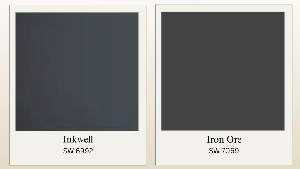
Iron Ore appears softer and more charcoal-like, making it more versatile with both warm and cool schemes. Choose Inkwell when you want maximum impact and aren’t afraid of bold color.
| Feature | Inkwell (SW 6992) | Iron Ore (SW 7069) |
|---|---|---|
| LRV | 4 | 6 |
| Undertones | Blue, charcoal | Gray, charcoal |
| Best For | Maximum drama | Limited natural light |
Inkwell vs Tricorn Black
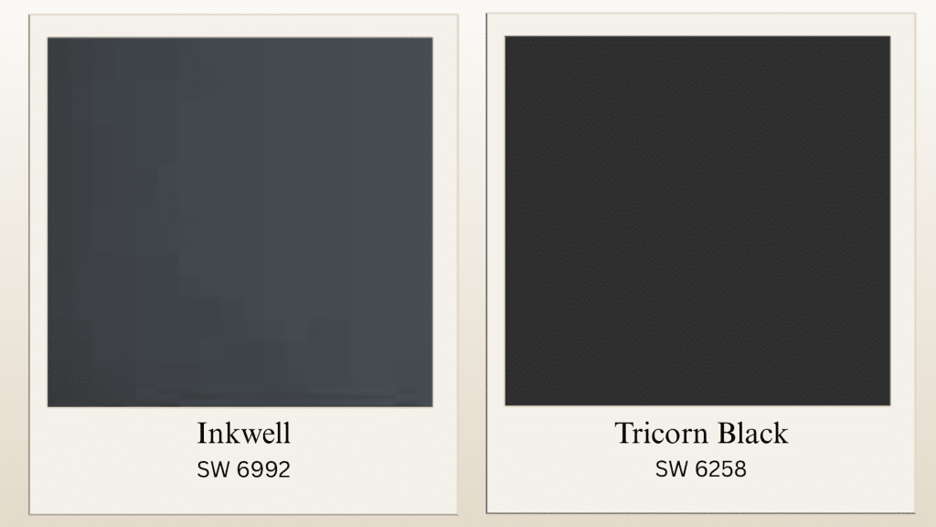
Tricorn Black represents a true black that works better for high-contrast schemes and pairs particularly well with bright whites. Inkwell offers more personality and visual interest with its blue undertones.
| Feature | Inkwell (SW 6992) | Tricorn Black (SW 6258) |
|---|---|---|
| LRV | 4 | 3 |
| Undertones | Blue, charcoal | Minimal undertones |
| Best For | Sophisticated drama | High-contrast schemes |
Inkwell vs Caviar
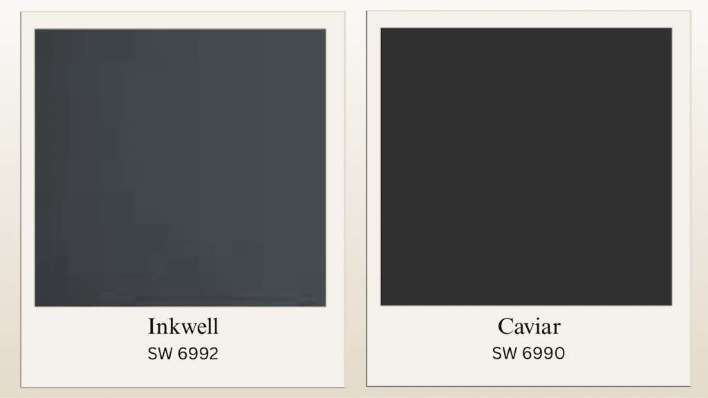
Caviar appears deeper and more neutral than Inkwell, making it better for high-contrast schemes and dramatic spaces. Choose Inkwell when you want blue undertones and more personality in your dark color choice.
| Feature | Inkwell (SW 6992) | Caviar (SW 6990) |
|---|---|---|
| LRV | 4 | 3 |
| Undertones | Blue, charcoal | Gray, black |
| Best For | Statement color | High-contrast schemes |
5 Expert Tips for Using SW Inkwell
Looking to bring bold sophistication to your space? SW Inkwell is a deep, moody hue that can instantly elevate interiors. Here’s how to style it like a pro:
-
Go Monochrome: Layer SW Inkwell with similar dark tones for a chic, dramatic look.
-
Highlight with Metallics: Gold, brass, or copper accents bring warmth and luxury to this bold shade.
-
Mix with Crisp Whites: Sharp white trims or ceilings create a clean contrast that makes SW Inkwell stand out.
-
Experiment with Small Areas: Use it on cabinetry, shelving, or even a statement ceiling for a unique touch.
-
Enhance with Lighting: Warm lighting will soften the tone, while cool lighting adds a modern, edgy vibe.
The Bottom Line
Inkwell Sherwin-Williams delivers consistent results on feature walls, kitchen surfaces, or exterior doors. This rich, blue-black shade complements various design schemes, from crisp whites to warm metals and natural wood tones.
Success with SW Inkwell depends on proper testing and coordination with existing elements. The color’s unique position between navy and black, with cool undertones, keeps it fresh and relevant.
Understanding how lighting affects the color throughout the day ensures the best outcome. With careful planning, this bold paint choice transforms ordinary rooms into refined spaces, proving why Inkwell Sherwin-Williams remains a popular homeowner choice.
Want to see how it fits your space? Try a peel-and-stick sample first to check the color before you paint.