Tired of paint colors that look completely different once they’re on your walls?
Sherwin-Williams Reflection SW 7661addresses that problem with its reliable, refined gray-blue personality, which delivers on its promises.
This isn’t just another gray paint. Reflection brings the perfect balance of cool refinement and warm livability that interior designers have been searching for.
With an LRV of 66, it naturally brightens spaces while maintaining the coveted blue-gray character in any lighting.
From spa-like bathrooms to productive home offices, Reflection adapts beautifully to every room in your house.
Ready to learn why this cool gray paint color with light blue-gray undertones is becoming the go-to choice for homeowners seeking style without the guesswork?
Sherwin-Williams Reflection: Key Details
Find the essential specifications of Sherwin-Williams Reflection (SW 7661), including its undertones, LRV, and finishes that make it a versatile, modern gray.
| Attribute | Details |
|---|---|
| Paint Name & Code | Reflection – SW 7661 |
| Color Family | Light Cool Gray |
| LRV (Light Reflectance Value) | 66 – Offers a bright, airy look while reflecting a good amount of natural light |
| Undertone Profile | Cool gray with subtle blue undertones |
| Available Finishes | Matte, Eggshell, Satin, Semi-Gloss, Gloss |
| Best Applications | Interiors (living rooms, bedrooms, kitchens) and exteriors (siding, trims) |
| Keyword Focus | Sherwin-Williams Reflection color specs |
What Does Sherwin-Williams’ Reflection Look Like?
Sherwin-Williams Reflection appears as a cool gray paint color with light blue-gray tones that shift throughout the day.
In north-facing rooms, it shows more pronounced blue hints and feels crisp and clean, while south-facing spaces reveal warmer gray notes with subtle blue undertones.
During bright daylight hours, Reflection appears fresh and airy, with a clear, blue-gray character.
However, under evening artificial lighting, it transitions into a softer, more neutral gray with gentle blue undertones.
This chameleon-like quality makes it perfect for homes where natural light changes dramatically from morning to night.
Where to Use Sherwin-Williams Reflection?
Discover the ideal spaces and design styles where Sherwin-Williams Reflection (SW 7661) truly shines, from cozy interiors to stunning exteriors.
1. Living Rooms

Reflection works beautifully in living spaces where you want to create an open, airy feeling. The high LRV of 66 reflects plenty of light, making even smaller living rooms appear larger and brighter.
This versatile shade complements both modern furniture and traditional pieces effortlessly. The cool undertones pair perfectly with white trim and colorful accent pillows, creating a fresh and updated look.
2. Bedrooms
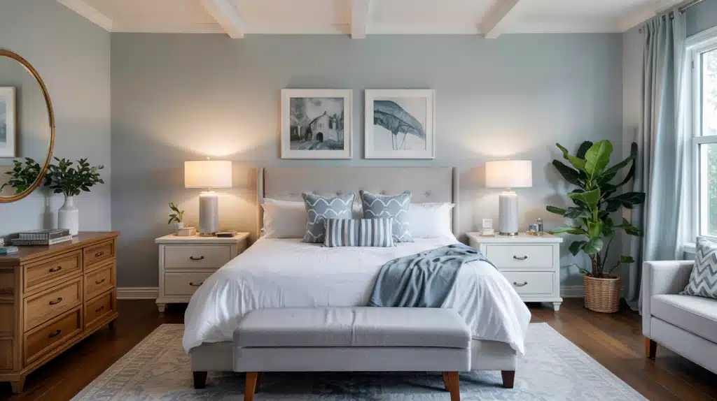
Create a peaceful retreat with Reflection’s calming blue-gray tones that promote better sleep and relaxation.
The soft color temperature helps your mind unwind after busy days while maintaining a refined, hotel-like atmosphere.
It works exceptionally well in master bedrooms where you want both style and serenity. The neutral base allows you to change bedding and decor seasonally without repainting.
3. Offices and Studies
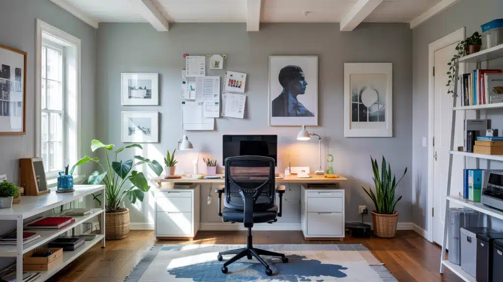
Boost your productivity with Reflection’s clean and clear appearance, which reduces visual distractions during work hours.
The cool gray helps maintain focus while preventing the sterile feeling that pure white can create in workspaces.
Natural light enhances the blue undertones, creating an inspiring environment for creative tasks. The color photographs well for video calls and virtual meetings as well.
4. Bathrooms/Spas
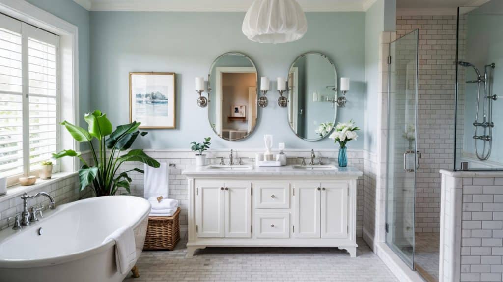
Change your bathroom into a spa-like sanctuary with Reflection’s soothing, water-inspired tones.
The color naturally complements white fixtures, marble countertops, and chrome or brushed nickel hardware.
High humidity won’t affect the color’s appearance, making it practical for steamy shower areas. The calming effect helps you start and end each day feeling refreshed and centered.
5. Hallways/Foyers
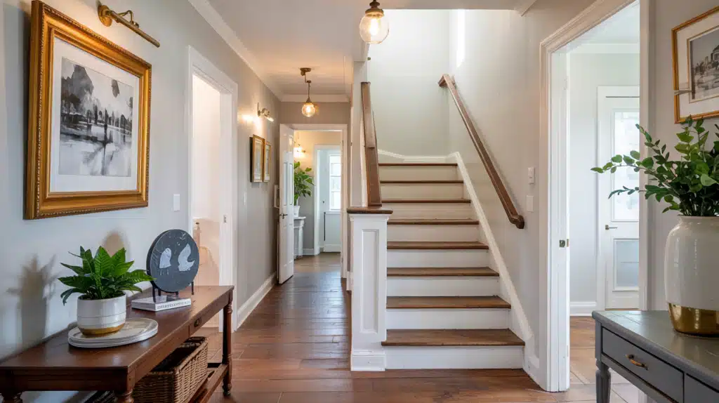
Make narrow hallways and small entryways feel more spacious with Reflection’s light-reflecting properties.
The welcoming gray-blue tone creates a positive first impression for guests entering your home. It flows smoothly between rooms without competing with other colors in adjoining spaces.
The durable finish options are ideal for high-traffic areas that require frequent cleaning.
Expert Tips for Styling with Reflection
Find professional design tips on how to style Sherwin-Williams Reflection (SW 7661) with complementary colors, textures, and décor for a polished look.
- Deep Blues – Pair Reflection with Naval or Gale Force to create a striking contrast that adds refined depth without overwhelming the space.
- Neutrals – Combine with Accessible Beige or Agreeable Gray to warm up Reflection’s cool tones and create a balanced, cozy atmosphere.
- Muted Greens – Pair Sea Salt or Comfort Gray with Reflection to create calming, nature-inspired color schemes ideal for relaxing spaces.
- Trims & Accents – Choose crisp whites, such as Ice Cube, for trim work and brushed nickel hardware to maintain Reflection’s clean, modern appeal.
Sherwin-Williams Reflection vs. Popular Gray Shades
Compare Sherwin-Williams Reflection (SW 7661) to other best-selling gray paints, examining their undertones, brightness, and versatility.
1. Passive SW 7064
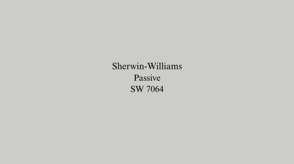
Passive leans more toward traditional gray with less blue influence, creating a slightly warmer feel than Reflection.
The lower LRV of 60 makes it ideal for larger rooms where you want a cozy, grounded atmosphere. It pairs beautifully with both warm and cool accent colors, offering more flexibility in decor choices.
Choose Passive when you prefer a classic gray without cool undertones.
2. Olympus White SW 6253

This lighter option with blue-green undertones works well when you want something brighter than Reflection but still colorful.
The higher LRV of 68 makes small spaces feel more open while maintaining subtle color interest. It functions almost like an off-white with personality, perfect for trim work or accent walls.
Olympus White bridges the gap between pure white and Reflection’s gray-blue tones.
3. Site White SW 7070

Site White offers a cleaner, more neutral alternative when Reflection’s blue undertones feel too pronounced for your space.
This true white works exceptionally well as trim color alongside Reflection or as a standalone choice for minimalist designs.
It provides a crisp, clean backdrop that lets furniture and artwork take center stage. Site White is your go-to choice when you need a reliable, versatile white with no color hints.
4. Repose Gray SW 7015
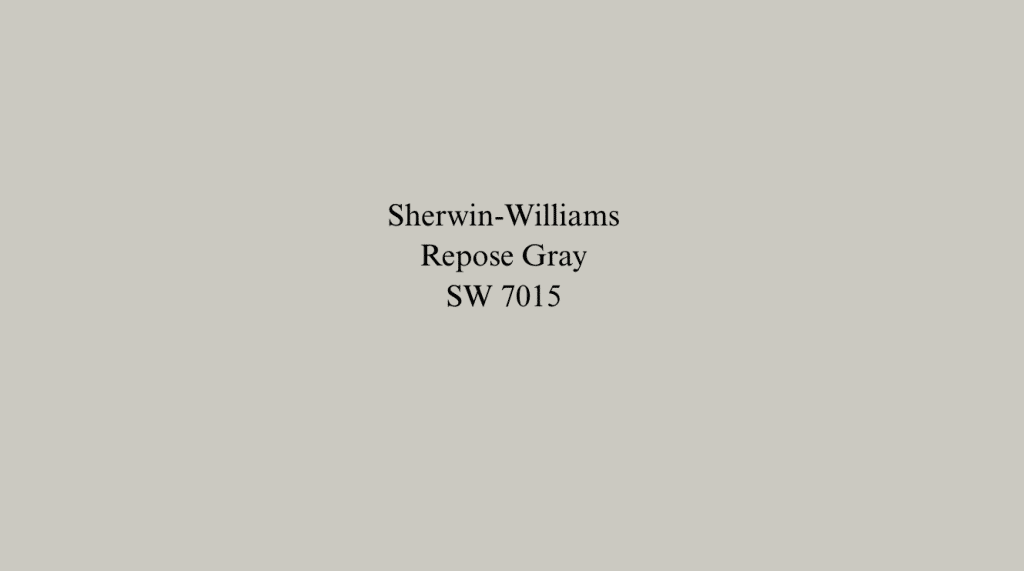
Repose Gray brings warmth through its greige (gray-beige) composition, making it ideal for traditional or transitional spaces.
The lower LRV of 58 creates a more intimate feeling compared to Reflection’s brighter, airier appearance. It complements wood tones and warm metals better than Reflection’s cool palette.
Choose Repose Gray when you want the refinement of gray with the comfort of beige undertones.
Final Thoughts
Sherwin-Williams’ Reflection proves that the right gray can change any space without drama or surprises.
Its reliable blue-gray character, high LRV of 66, and versatile nature make it a wise choice for modern homes.
From brightening dark hallways to creating spa-like bathrooms, Reflection adapts beautifully to your lifestyle and lighting conditions.
The cool gray paint color pairs effortlessly with both warm and cool accents, giving you decorating flexibility for years to come.
Ready to try Reflection? Start with sample swatches in your specific lighting before committing. Your walls will thank you for choosing a color that delivers on its promise.
Choosing the perfect shade? Explore more paint color ideas and inspiration.
Frequently Asked Questions
What Color Is Sherwin-Williams’ Reflection?
Sherwin-Williams Reflection SW 7661 is a cool gray paint with subtle blue undertones, appearing light and airy with an LRV of 66.
How accurate is Sherwin-Williams’ visualizer?
The Sherwin-Williams visualizer provides a helpful starting point, but always test actual paint samples in your specific lighting for true color accuracy.
What Is Sherwin-Williams’ Selling Color?
Agreeable Gray SW 7029 consistently ranks as Sherwin-Williams’ most popular and best-selling paint color across residential projects.