Finding the perfect white paint can feel like searching for a needle in a haystack.
With hundreds of options available, each claiming to be the ideal white, it’s easy to get lost in a sea of paint chips and sample pots.
I promise that understanding Simply White’s Light Reflectance Value (LRV) will make your decision much easier.
This popular Benjamin Moore shade has an LRV of 89.5, making it one of the brighter options that still maintains a hint of warmth.
In this guide, I’ll explain what makes Simply White special, how it looks in different lighting conditions, where it works best in your home, and how it compares to other popular whites.
Let’s find out if this might be the perfect white for your space.
What is Simply White LRV?
Simply White by Benjamin Moore has an LRV (Light Reflectance Value) of 89.5, placing it among the brighter white paint colors on the market.
This high LRV means it reflects nearly 90% of the light that hits it, creating a bright, airy feeling in any space. For comparison, a pure white would have an LRV of 100, while absolute black would be 0.
Most popular white paints range between 80 and 93 on the LRV scale, with Simply White sitting toward the higher end of this spectrum.
The high LRV of Simply White makes it particularly valuable in spaces that lack natural light.
In darker rooms, north-facing spaces, or areas with minimal windows, this paint color can help brighten the environment by maximizing whatever light is available.
Simply White Paint Overview
| Feature | Details |
|---|---|
| Paint Brand | Benjamin Moore |
| Color Code | OC-65 |
| Light Reflectance Value (LRV) | 89.5 |
| Undertones | Subtle warm undertones |
| Best For | Spaces need brightness with warmth |
| Light Reflection | Reflects nearly 90% of light |
Simply White Application Guide for Different Rooms
Here are some of the best applications of Simply White for different rooms in your home, showcasing its versatility and ability to enhance any space with its warm, inviting tone.
1. Living Rooms
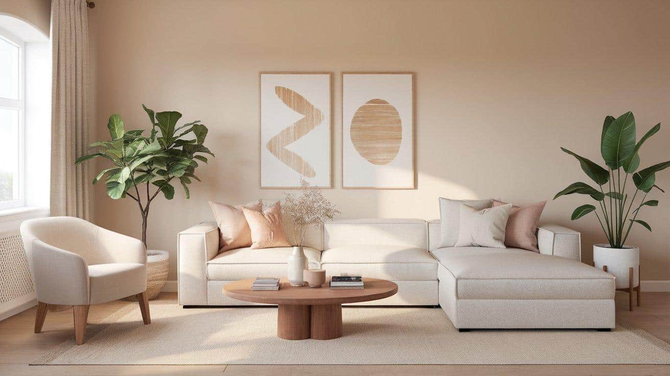
Simply White creates a refreshing, open atmosphere in living rooms, making them feel more spacious and welcoming.
In north-facing living spaces, its warm hints prevent the room from feeling cold or stark while maintaining a clean appearance.
For south-facing rooms, it reads as a crisp, bright white that serves as an excellent neutral foundation.
This versatile color pairs beautifully with both modern furnishings and traditional pieces, creating a perfect backdrop for deep blues, warm grays, and natural earth tones in your furniture and accessories.
2. Kitchens
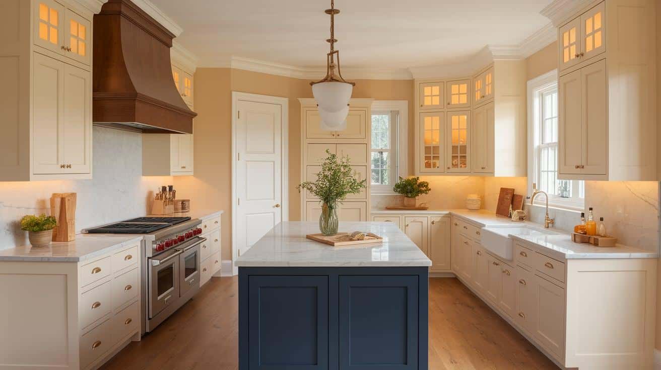
For kitchens, Simply White offers a timeless look on cabinets, walls, and trim. Its subtle warmth adds just enough depth without overwhelming the space.
Its high light reflectance helps brighten work areas, making food preparation easier and more pleasant, especially in kitchens with limited natural light.
The color’s clean appearance supports various kitchen styles from classic farmhouse to sleek contemporary designs.
Simply White pairs exceptionally well with wood elements, marble or dark countertops, and statement colors like navy or forest green for islands or lower cabinets.
3. Bathrooms
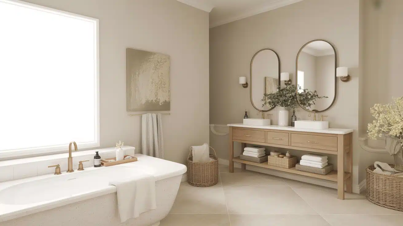
Simply White excels in bathrooms where cleanliness and freshness are priorities, creating an open, airy feeling even in smaller spaces.
Its light-reflecting properties help maximize brightness in bathrooms with minimal windows or north-facing exposures, preventing the space from feeling cramped or dark.
In artificially lit bathrooms, the warm undertones create a more flattering, cozy atmosphere than cooler whites would provide.
This versatile white complements many bathroom materials, including marble, porcelain, brushed metals, and darker accent colors, allowing fixtures and design elements to stand out beautifully.
4. Bedrooms
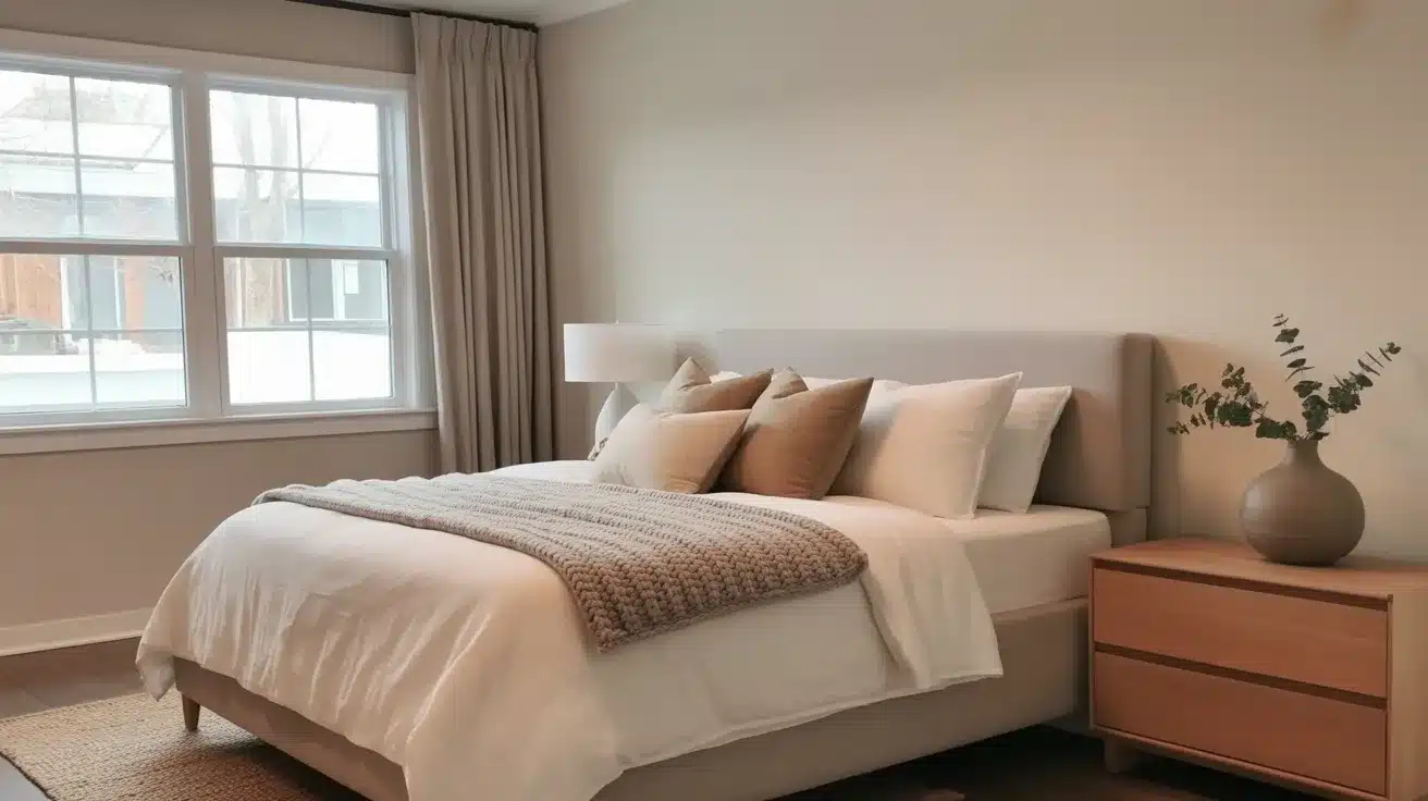
In bedrooms, Simply White creates a peaceful, bright environment that promotes rest while keeping the space from feeling closed in or dark.
Its subtle warmth makes it particularly effective in smaller or darker bedrooms where cooler whites might feel unwelcoming or clinical. The color’s adaptability allows it to work well with various bedroom styles, from minimalist to traditional, providing a neutral canvas for personal expression.
Simply White pairs nicely with almost any bedding color choice and furniture finish, including soft pastels, rich jewel tones, and natural wood elements.
5. Hallways and Entryways
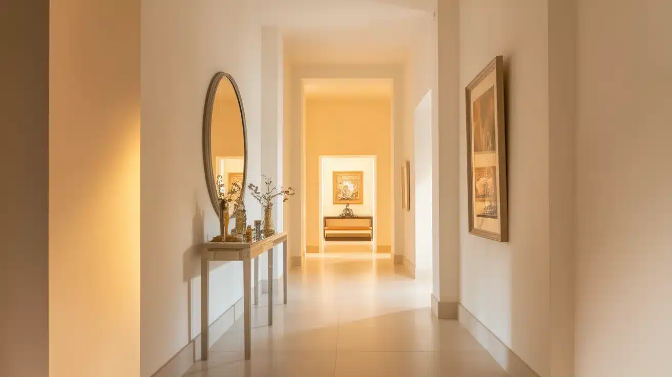
Simply White helps open up hallways and entryways, making these transitional spaces feel more welcoming and less confined.
Its high light reflectance is particularly valuable in these often windowless areas, helping to brighten dim corridors and create better flow between rooms.
The color maintains a consistent, fresh appearance throughout the day, even in spaces with changing or limited light sources.
Simply White provides an ideal neutral backdrop for artwork, console tables, mirrors, and decorative elements in these first-impression areas. It allows your entry decor to make a statement without competing with the wall color.
Comparing Simply White with Other Popular Whites
We break down how Simply White compares with other trending whites to help you choose the perfect shade.
1. Simply White vs. White Dove
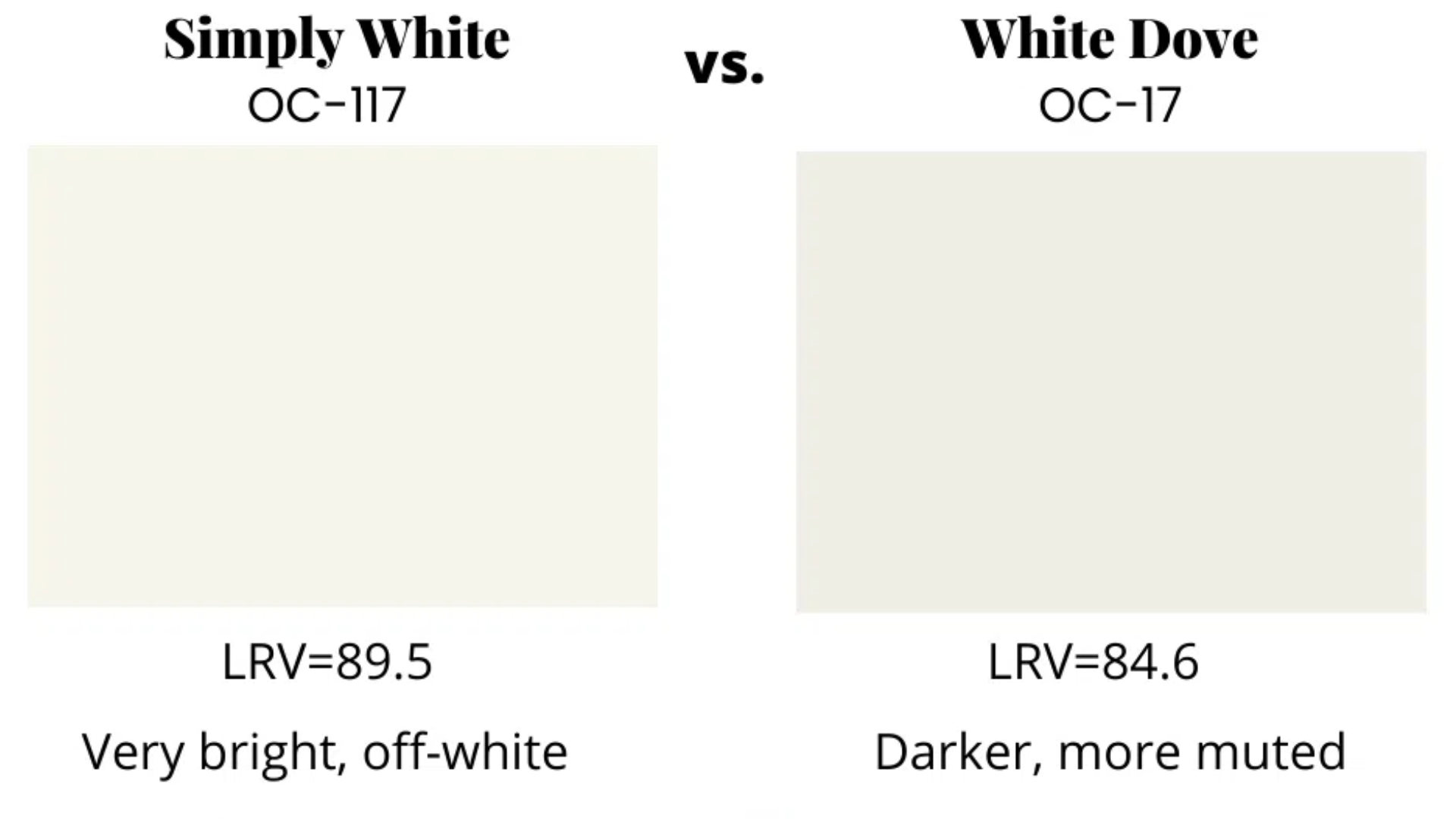
Benjamin Moore’s White Dove (OC-17) has an LRV of 85, making it slightly less bright than Simply White’s 89.5. White Dove contains more gray undertones, giving it a softer, more muted appearance.
While Simply White reads as a clean, bright white in most lighting, White Dove appears more clearly as an off-white.
White Dove works better in spaces where you want a more subdued, calming effect, while Simply White excels when maximum brightness is needed.
2. Simply White vs. Pure White
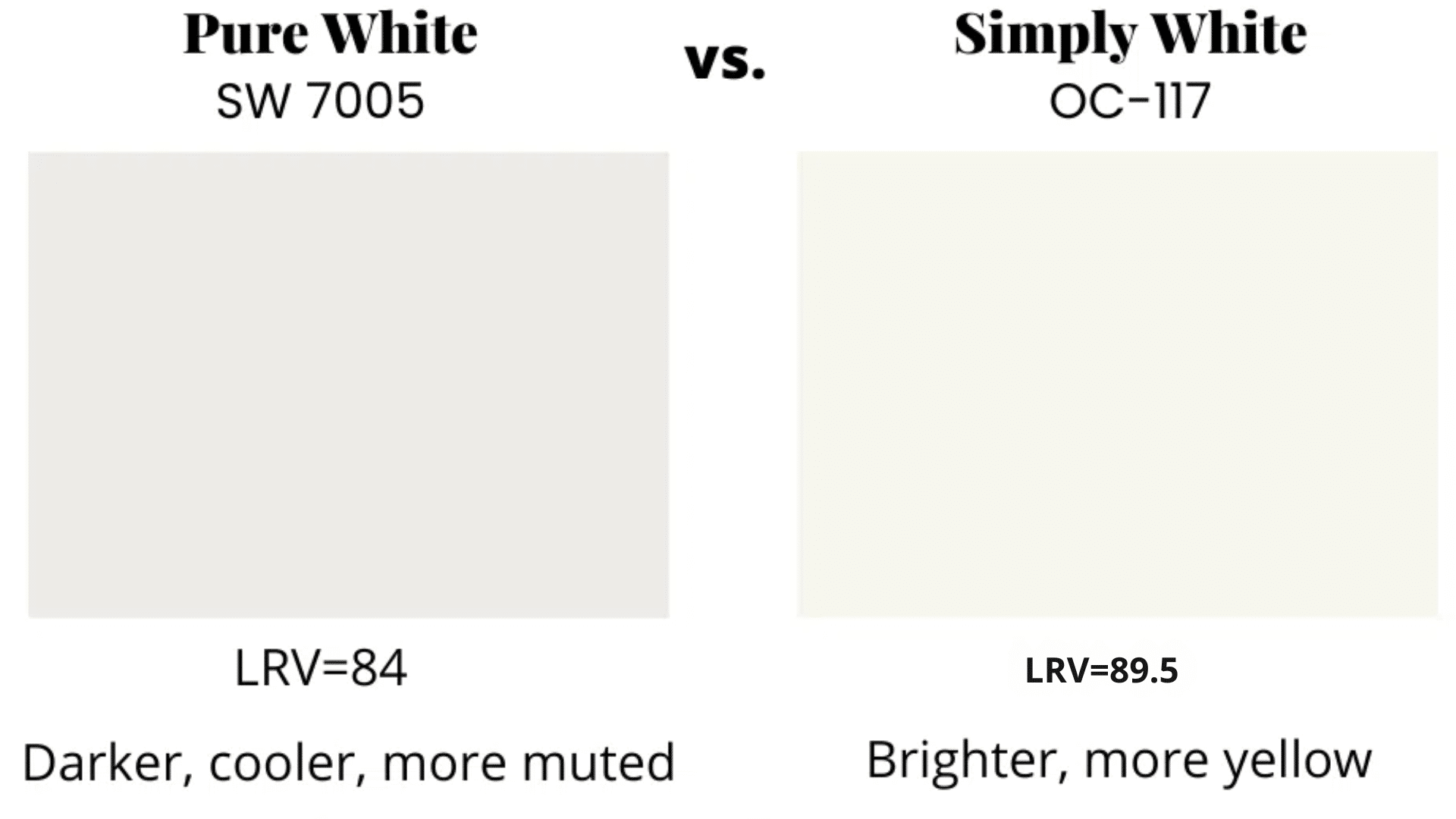
Sherwin-Williams Pure White (SW 7005) sits between true white and off-white territory.
With subtle, warm undertones that lean slightly more neutral than Simply White, Pure White offers a balanced option that works well with both cool and warm color schemes.
Pure White appears less warm than Simply White in north-facing rooms and tends to look more consistent throughout the day with fewer shifts in tone as lighting changes.
3. Simply White vs. Chantilly Lace

Benjamin Moore’s Chantilly Lace (OC-65) has an LRV of 92.2, making it brighter and more reflective than Simply White. Chantilly Lace is a clean white with minimal undertones, creating a crisper look compared to Simply White’s subtle warmth.
Choose Chantilly Lace for modern, minimalist spaces where you want a bright, clean backdrop, and Simply White when you need warmth to balance cooler elements in a room.
4. Simply White vs. Alabaster
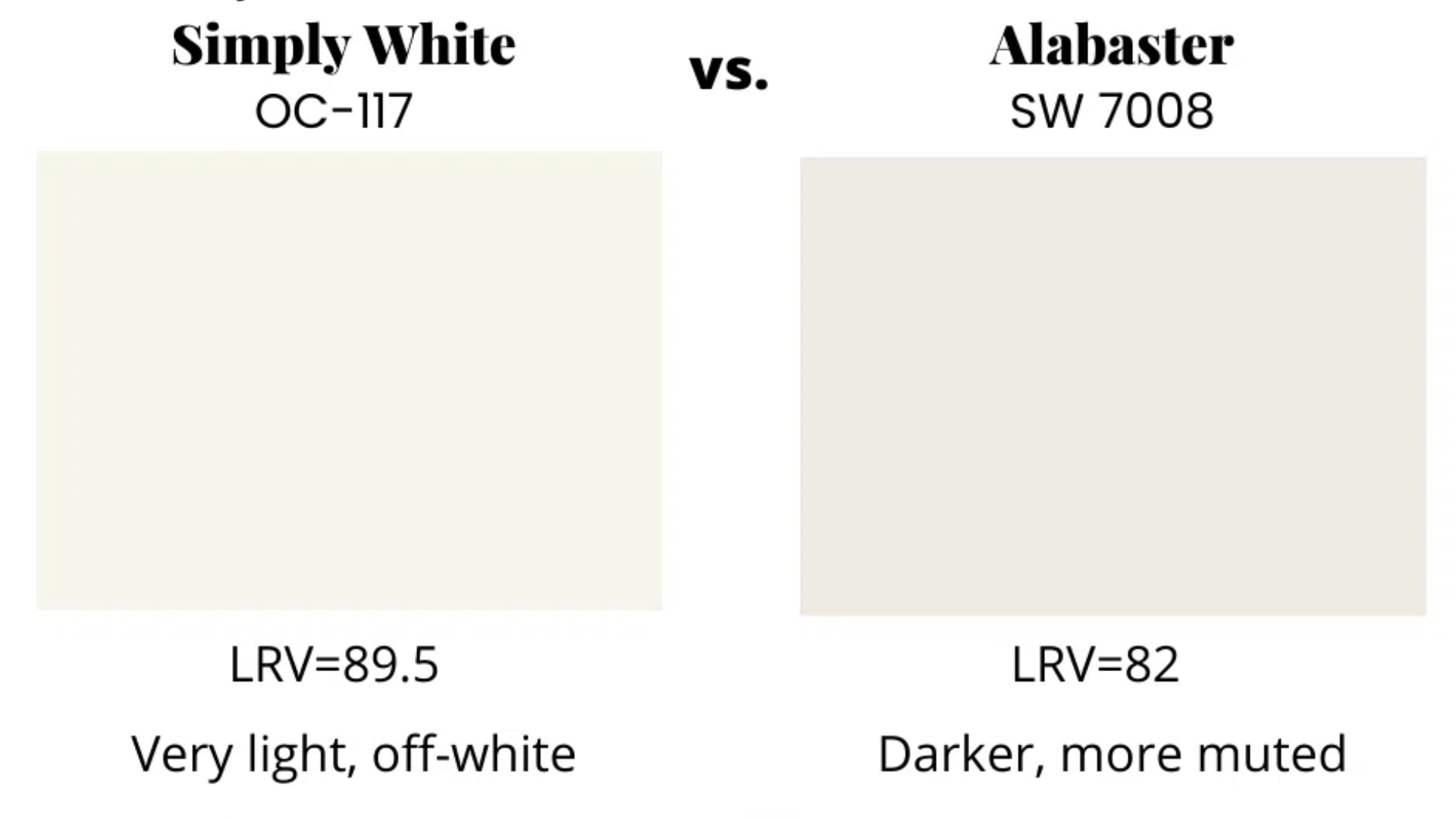
Sherwin-Williams Alabaster (SW 7008) has a lower LRV of 82 and appears creamier and more muted than Simply White. Alabaster has stronger yellow-beige undertones that become more apparent in bright light.
This makes Alabaster better suited for spaces where you want a definitely warmer, more antique white appearance, while Simply White maintains a cleaner look while still offering subtle warmth.
Final Thoughts
Simply White offers a high LRV of 89.5 with just enough warmth to keep spaces feeling comfortable. This combination makes it one of the most versatile white paints available today.
The color works well in various lighting conditions and complements a wide range of design styles, from modern to traditional. Its popularity comes from this flexibility and its ability to look fresh without feeling cold.
When choosing any white paint, remember that lighting dramatically affects how it appears in your home. The same color can appear differently in various rooms, depending on exposure and artificial lighting.
Taking the time to test Simply White properly ensures you’ll be happy with this popular paint color in your home for years to come.
Frequently Asked Questions
Is White Suitable for Dark Rooms?
Yes, Simply White works well in low-light rooms due to its warm undertones.
Can Simply White Be Used for Exterior Walls?
It’s not ideal for exteriors in direct sunlight due to its brightness.
Does White Appear Yellow?
In certain lighting, Simply White may show subtle yellow undertones, but it never appears too yellow.