Have you ever noticed how some rooms feel complete while others seem to lack something?
Trim colors are key in interior design, yet many homeowners overlook their importance. The right trim shade can add depth and contrast to your space, turning ordinary rooms into well-designed areas that catch the eye.
While walls get most of the attention, trim is the frame that pulls everything together. Much like a frame can improve a painting, well-chosen trim colors can make your walls stand out and create clear lines that define your space.
When picked with care, trim colors can make rooms feel bigger, ceilings appear higher, and bring out the best in your wall colors and furniture.
In this guide, we share all-time best trim color ideas to help you find the perfect match for your home.
What is Trim Paint?
Trim paint, designed for edges and outlines, covers areas like baseboards, crown moldings, and door frames. Due to frequent contact and wear, it must be more durable than wall paint. Most trim paints feature semi-gloss or high-gloss finishes, allowing for easier cleaning and a nice contrast with wall finishes, which are usually flat, eggshell, or satin.
Trim can be made from various materials, primarily wood, but also metal, PVC, or composite in newer homes. Each material may require specific paint types for optimal results and longevity.
Good trim paint can:
- Create clean lines between walls and other surfaces
- Add visual interest to an otherwise plain room
- Help tie together color schemes throughout your home
- Make wall colors appear richer by providing contrast
- Draw attention to interesting features like windows or built-in shelving
11 Interior Trim Paint Color Ideas
Here’s a collection of 11 trim paint colors that can help you find just the right shade for your home:
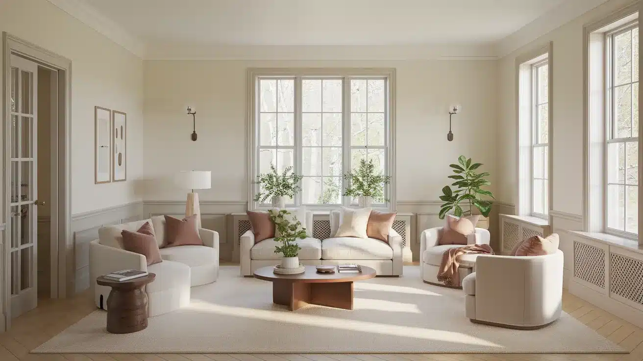
1. Sherwin-Williams Lullaby (SW 9136)

The living room here with Sherwin Williams Lullaby beautifully showcases how the soft light teal trim color seamlessly complements the neutral beige walls.
The subtle contrast between the walls and trim enhances the space, adding depth without overwhelming the room, creating a harmonious and tranquil atmosphere.
2. Benjamin Moore Swiss Coffee (OC-45)

The trim painted in Benjamin Moore Swiss Coffee, a warm, creamy off-white, contrasts softly against the pale walls, contributing to the room’s timeless elegance. The gentle warmth creates a welcoming and cozy ambiance in the space.
3. Farrow & Ball Cord (No. 16)

The trim in Farrow & Ball Cord, a warm neutral with yellow and green undertones, complements the earthy tones of the room. This color choice brings warmth and richness, grounding the space while maintaining a calm and inviting feel.
4. Sherwin-Williams Meander (SW 9522)

The trim painted in Sherwin-Williams Meander, a tan with green undertones, blends seamlessly with the room’s earthy tones. It adds a touch of warmth and depth while creating a balanced, natural feel throughout the space.
5. Sherwin-Williams Extra White (SW 7006)

Sherwin-Williams Extra White, a bright and crisp white trim, contrasts beautifully against darker or warmer wall colors. This fresh and clean look brightens the room and creates a modern, open feel.
6. Benjamin Moore Boca Raton Blue (711)

Trim painted in Benjamin Moore Boca Raton Blue, a soft aqua hue, provides a gentle contrast to the room’s neutral tones. This serene blue creates a calm, coastal vibe and adds a sophisticated touch to the space.
7. Sherwin-Williams Wool Skein (SW 6148)

The trim in Sherwin-Williams Wool Skein, a rich beige with warm undertones, contrasts subtly with the room’s softer hues. It brings a cozy, natural feel to the living room, adding warmth and depth without overpowering the space.
8. Farrow & Ball Green Blue (No. 84)
The trim in Farrow & Ball Green Blue, a versatile minty green-blue, shifts in the light, bringing a refreshing, dynamic element to the room. It creates a calming yet vibrant atmosphere that enhances the space’s natural light.
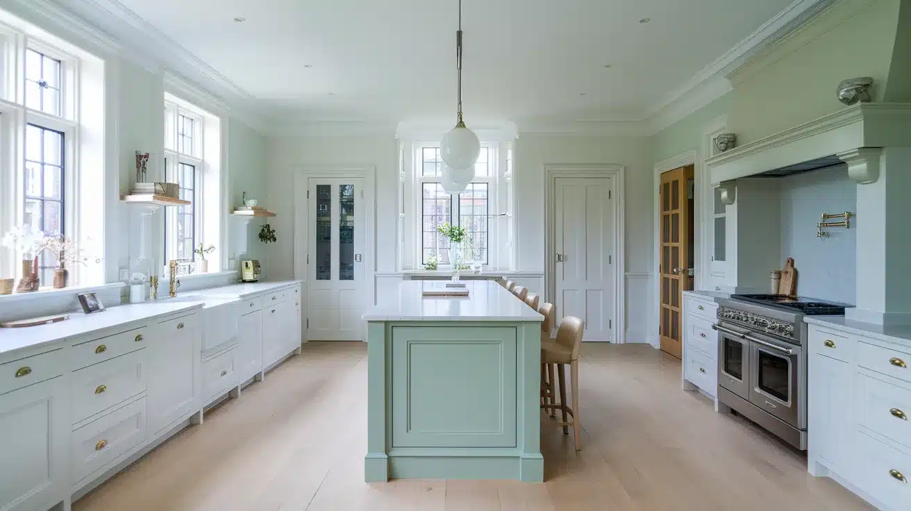
9. Benjamin Moore Garden Cucumber (644)

The deep green trim in Benjamin Moore Garden Cucumber adds a bold yet elegant contrast to the room. This trim color brings richness and sophistication, making the room feel inviting and grounded.
10. Sherwin-Williams Cotton (SW 9581)
Trim painted in Sherwin-Williams Cotton, a soft and creamy white, complements the walls beautifully, creating a clean and airy space. This neutral shade enhances natural light and provides a timeless look that fits with various design styles.
11. Farrow & Ball Pink Ground (No. 202)

The trim in Farrow & Ball Pink Ground, a muted earthy pink with subtle warmth, contrasts gently with the room’s neutral walls. This soft pink adds a unique yet sophisticated touch, infusing the space with a warm, welcoming atmosphere.
Conclusion
While often overlooked, trim colors serve as the finishing touch that completes any room design.
Like a good frame enhances a picture, well-chosen trim brings out the best in your wall colors and furniture pieces.
The 11 trim color ideas we’ve shared range from crisp whites to soft neutrals, giving you the best options to consider for your home.
Remember that the right trim shade can make spaces feel larger, highlight special features, and create a pulled-together look throughout your home.
Test different trim colors in your lighting before making your final choice. With careful selection, your trim can become a key design element that ties your entire space together beautifully.