“What’s the secret to picking the perfect green paint color?” I’ve tested countless green paint shades in homes, but Oakmoss Sherwin Williams repeatedly stands out.
After painting over more than fifty rooms with this color, I’ve learned exactly how it behaves in different lights and spaces.
The challenge many homeowners face is finding a natural green without turning a room dark or making it feel like a forest. It’s a tricky balance that often leads to disappointment and costly repaints.
I’m sharing my hands-on experience with Oakmoss (SW 6180), showing you exactly how this color works in real homes. I’ll help you decide if this rich, muted green is right for your space.
What is Oakmoss Sherwin Williams (#6A6C51)

Sherwin Williams Oakmoss (SW 6180) offers a perfect blend of depth and versatility in paint colors.
This deep, muted green brings natural tones indoors while maintaining a polished look.
Its yellow-gray undertones help it serve as both a statement color and a sophisticated neutral, making it a smart choice for various home settings.
Light Reflectance Value (LRV)

With an LRV of 13, Oakmoss absorbs more light than it reflects, creating a rich, substantial presence on your walls.
This lower LRV means the color will appear deeper in your space, but it’s not so dark that it overwhelms a room.
The color reveals its subtle undertones in brighter areas, while in dimmer spaces, it creates a cozy, intimate atmosphere.
Where Can You Use Oakmoss Sherwin Williams?
After painting countless rooms with Oakmoss, I can share exactly where this color shines.
Let me walk you through each space with real examples I’ve worked on.
1. Living Room
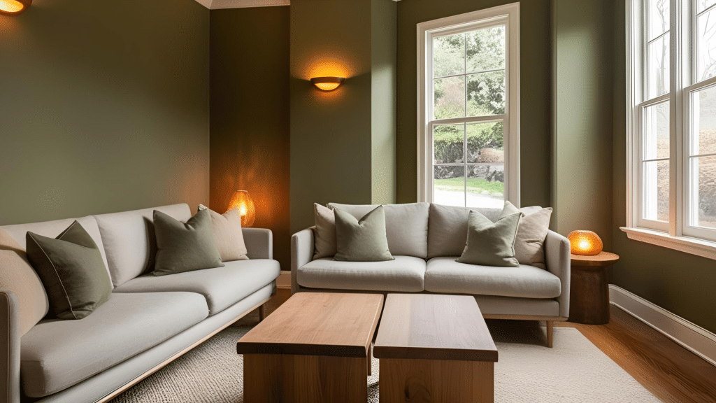
I recently used Oakmoss in a client’s living room, and it transformed the space.
The color created such an inviting atmosphere, especially when paired with their tan leather sofa and cream curtains.
The green walls made the brass picture frames and light fixtures stand out beautifully without feeling too bold.
2. Bedroom
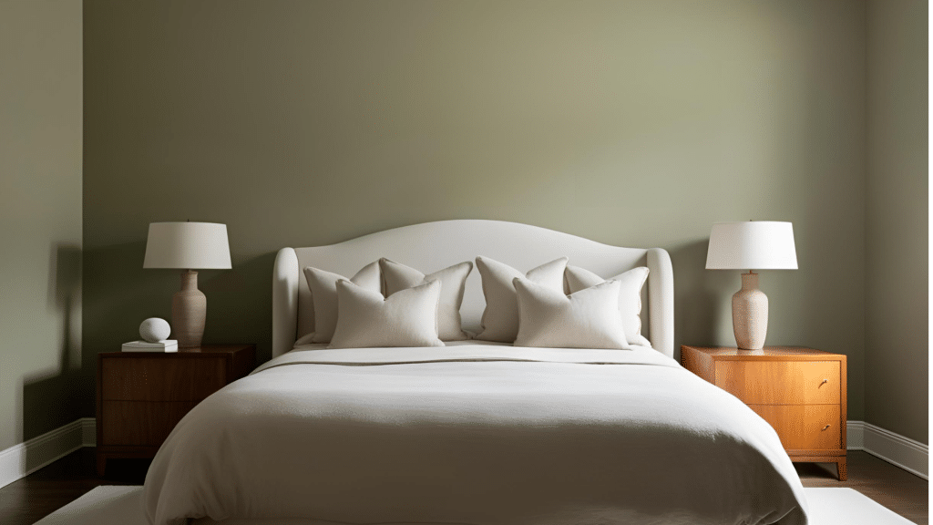
In bedrooms, Oakmoss does something almost magical.
I painted my bedroom in this shade, creating a cocoon-like feeling, perfect for rest.
Paired with soft white bedding and natural wood furniture, it establishes a peaceful retreat that feels grounded and calm.
3. Kitchen
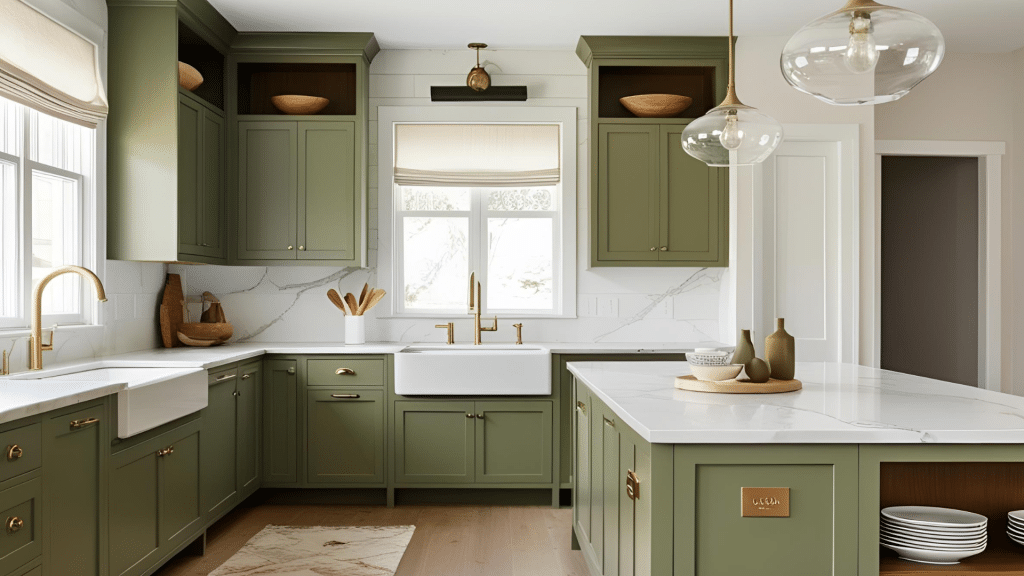
One of my favorite Oakmoss projects was a kitchen renovation.
The color paired stunningly with white cabinets, making them pop while adding sophistication.
The homeowners added copper cookware and brass hardware, and the warm metals looked even richer against the green backdrop.
4. Bathroom
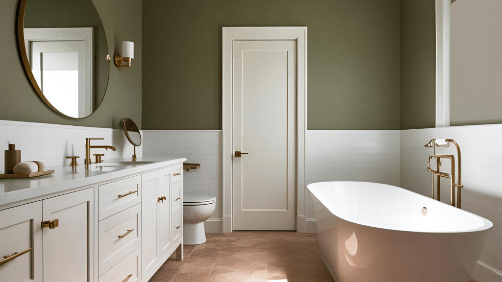
For bathrooms, Oakmoss can create that high-end spa feeling you see in luxury hotels.
I recently completed a bathroom where we used it above white wainscoting.
With proper lighting (I suggest sconces at eye level), the color makes the space feel more luxurious and refined.
5. Home Office

Looking for focus?
In-home offices, I’ve found Oakmoss helps create a productive environment without feeling corporate.
One client paired it with a walnut desk and white bookshelves – the combination made the perfect backdrop for video calls while keeping the space feeling professional yet personal.
6. Exterior

On home exteriors, Oakmoss really proves its worth. I used it on a craftsman-style home with white trim and natural stone accents.
The color changes subtly throughout the day, looking fresh in morning light and rich as evening approaches.
It’s particularly stunning when paired with natural materials like stone, brick, or wood.
The Best Colors to Pair with Oakmoss
Interior designers consistently recommend specific color pairings that bring out the best in Oakmoss.
For neutrals, warm whites like Sherwin Williams Alabaster create a clean contrast without feeling stark, while soft beiges and taupes complement its earthy undertones.
Rich browns add warmth and ground the space for a layered color scheme, while deep blues create subtle depth. Muted reds can serve as unexpected yet harmonious accent colors that don’t compete with Oakmoss’s natural character.
Pair Oakmoss with lighter sages or darker forest greens if you prefer a monochromatic approach. This creates visual interest while maintaining a cohesive feel.
To add sparkle to your space, incorporate metallic accents – brass and warm bronze fixtures especially enhance Oakmoss’s yellow undertones, while gold decor pieces add an understated luxury.
Oakmoss in Different Lighting Conditions
The way Oakmoss behaves in different lighting can significantly impact your space.
Let’s look at how this versatile color shifts throughout the day and in various lighting conditions:
Natural Light Performance:
- In bright daylight, Oakmoss reveals its true green tones with subtle earthy undertones
- Morning light brings out its earthy qualities
- The afternoon sun emphasizes its depth without darkening the space
- Shows its truest color between 10 AM and 2 PM
Room Direction Matters:
- North-facing rooms: Takes on a cooler, more muted appearance
- South-facing spaces: Displays warmer undertones throughout the day
- East-facing areas: Earthy in the morning, cooling as the day progresses
- West-facing rooms: Deepens and warm in the late afternoon
Artificial Lighting Effects:
- LED bulbs enhance the cozy aspects of the color
- Cool white lighting brings out more of the gray undertones
- Dimmed lights create an intimate atmosphere, deepening the color
- Under cabinet lighting can help prevent shadowing in kitchen spaces
Before committing to Oakmoss, observe how these lighting variations affect the color in your specific space throughout the day.
Testing samples in different areas and lighting conditions will help ensure you get the look you want.
Comparing Oakmoss with Other Sherwin-Williams Greens
Oakmoss is a popular green hue from Sherwin-Williams known for its earthy and calming tones. This color often evokes a sense of nature and tranquility, making it perfect for creating serene, welcoming spaces.
The following is a comparison of Oakmoss with a couple of other green shades from Sherwin-Williams to highlight their subtle difference.
| Color Name | Color Code | Hex Code | LRV (Light Reflectance Value) | Undertones | Hue | Best Use | Preview |
|---|---|---|---|---|---|---|---|
| Oakmoss | SW 6180 | #6C7B5D | 17 | Earthy, neutral | Green | Living rooms, Bedrooms |  |
| Laurel Canyon | SW 6181 | #A7B59B | 23 | Warm, yellow | Green | Kitchens, Bathrooms |  |
| Billiard Green | SW 0014 | #3C6D4F | 24 | Cool, blue | Green | Accent walls, Statement pieces |  |
Conclusion
Oakmoss Sherwin Williams stands out as more than just another green paint color – it’s a versatile choice that adapts to your space and style.
If you’re painting a cozy living room, a dining area, or refreshing your kitchen cabinets, this shade brings depth without overwhelming. Remember to test Oakmoss in your specific lighting conditions and observe it throughout the day.
Pay special attention to how it pairs with your existing decor and fixtures – those brass accents or warm woods can improve its natural beauty.
Ready to transform your space with Oakmoss? Start with a small area like a powder room or accent wall.
Frequently Asked Questions
What Color Is Oakmoss Sherwin-Williams?
A deep, muted green with yellow-gray undertones that reads as neutral while maintaining its green character..
Does Oakmoss Look Good in Small Rooms?
Yes, despite its lower LRV, Oakmoss creates a cozy atmosphere in small spaces without feeling too dark when properly lit.
Why Does Sherwin-Williams Paint Peel?
Usually due to poor surface preparation, moisture issues, or painting over dirty/glossy surfaces without proper priming.
How Long to Wait Between Sherwin-Williams Coats?
Wait 4 hours between coats in ideal conditions (70°F, 50% humidity). Allow longer in cooler or more humid environments.