Finding the perfect dark gray paint feels like hunting for a diamond among pebbles. I know the frustration of testing color after color, only to find them too blue, too purple, or just plain wrong in your space.
I promise there’s a solution that might end your search.
In this color review, I’ll walk you through everything you need to know about Amherst Gray – its undertones, how it behaves in different lighting, where it works best in homes, and what colors pair perfectly with it.
By the end, you’ll know if this popular dark gray deserves a spot on your walls, cabinets, or home exterior.
What Makes Amherst Gray Special?

Benjamin Moore Amherst Gray is a slightly warm, charcoal gray paint color.
In some lighting conditions, it appears quite neutral, but it does have a specific character that sets it apart from other gray paints.
With an LRV (Light Reflectance Value) of 18.8, Amherst Gray sits comfortably in the medium-dark range. This means it’s dark enough to make a statement but not so dark that it loses definition in low-light areas.
Unlike many darker colors that can look black in dim rooms, Amherst Gray typically maintains its character regardless of lighting conditions.
In rooms with lots of natural light, it will appear lighter while still creating a strong impression on your walls.
Understanding Amherst Gray’s Undertones
Let’s talk about what you really need to know: Amherst Gray has a slight green undertone.
This subtle green quality gives it more warmth and character than a purely neutral gray.
In certain environments, especially in spaces surrounded by greenery, this undertone becomes more noticeable.
However, with the right light and complementary colors, the green can become much less prominent, and the color reads as a rich, warm gray.
This subtle undertone is actually what makes Amherst Gray so versatile – it feels more organic and less cold than many other dark grays on the market.
Where Does Amherst Gray Work Best?
1. Exterior Applications

If your home has the right stone, brick, or roof materials, Amherst Gray makes an excellent exterior color choice. The key is ensuring these elements work well with the subtle green undertone.
For exteriors, Amherst Gray offers:
- A look that won’t feel dated
- Enough depth to create contrast with white trim
- Versatility across different architectural styles
- A warm alternative to stark black
2. Kitchen Cabinets
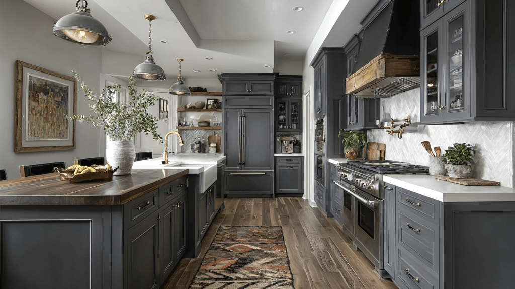
Amherst Gray has become particularly popular for kitchen cabinets. The warmth it provides makes kitchens feel both sophisticated and welcoming.
For kitchen applications, consider these points:
- It must coordinate with your countertop materials
- It pairs beautifully with brass or gold hardware
- It creates an excellent contrast with white walls
- It hides fingerprints and kitchen stains better than lighter colors
3. Interior Walls

Amherst Gray adds depth and character to walls, creating intimate spaces perfect for dining rooms, home offices, media rooms, and powder rooms.
It particularly excels as an accent wall where its rich qualities can make a statement without overwhelming the space.
What Colors Pair Well With Amherst Gray?
White Paints
For trim, doors, and ceilings paired with Amherst Gray walls, consider:
- Benjamin Moore White Dove for a clean, crisp approach
- Benjamin Moore Swiss Coffee or Linen White for a softer, warmer look
Complementary Colors
Because Amherst Gray often serves as an accent color (on cabinets, doors, or accent walls), it partners well with:
- Warm whites (it typically looks better with warm whites versus cool ones)
- Soft, warm beiges
- Warmer grays (in adjoining rooms)
Looking for Alternatives?
If you like the idea of Amherst Gray but want to explore options:
For a lighter option, Check out Benjamin Moore Chelsea Gray. While Chelsea Gray shares similar undertone tendencies, its higher LRV (22.16) makes it visually lighter.
For a similar look you can also refer to:
- Sherwin Williams Grizzle Gray
- Benjamin Moore Kendall Charcoal (slightly darker with less prominent green undertones)
Comparing Benjamin Moore Amherst Gray With Similar Colors
Understanding how Amherst Gray compares to other popular Benjamin Moore grays can help you make the perfect choice for your home.
Let’s look at how it stacks up against two common alternatives.
Amherst Gray vs Chelsea Gray

| Features | Amherst Gray HC-167 | Chelsea Gray HC-168 |
|---|---|---|
| LRV | 18.8 (darker) | 22.16 (lighter) |
| Undertones | More pronounced green undertones | Subtle green undertones that can flash violet |
| Color Type | Medium-dark warm gray | Medium warm gray |
| Best Use | Exteriors, accent walls, cabinets | More versatile due to higher LRV |
| Appearance | Reads as a rich charcoal in most lighting | Appears softer and more medium-toned |
Chelsea Gray provides a lighter alternative while maintaining similar undertones.
If Amherst Gray feels too dark for your space but you like its character, Chelsea Gray offers a more moderate option with a similar green undertone profile.
Amherst Gray vs. Kendall Charcoal

| Feature | Amherst Gray HC-167 | Kendall Charcoal HC-166 |
|---|---|---|
| LRV | 18.8 (lighter) | 12.9 (darker) |
| Undertones | Strong green undertones | More neutral green undertones |
| Color Type | Medium-dark warm gray | Dark charcoal gray |
| Best Use | Works well in varied lighting conditions | Better in well-lit spaces |
| Appearance | More colorful, shows undertones | More neutral reads as true charcoal |
Kendall Charcoal is one of the closest paint colors to Amherst Gray but is noticeably darker.
While both have green undertones, they’re more prominent in Amherst Gray, making Kendall Charcoal appear more neutral in most lighting conditions.
How to Test Amherst Gray in Your Space
Like with any paint color, I recommend using peel-and-stick paint samples to test Amherst Gray in your specific lighting conditions.
This allows you to see how the color shifts throughout the day and how it interacts with your existing furnishings and fixtures.
Remember that this color will look different depending on:
- The direction your room faces
- The amount of natural light
- The type of artificial lighting you use
- The colors of your furniture and fixtures
Conclusion
Now you’re fully equipped to decide if Amherst Gray Benjamin Moore is right for your home.
This medium-dark warm gray brings depth and character with its subtle green undertone, making it perfect for exteriors, kitchen cabinets, and accent walls.
Remember that while Amherst Gray looks stunning in most settings, it truly shines when paired with whites and lighter neutrals that highlight its rich character. Always test paint samples in your specific space to see how the color interacts with your lighting.
With its ever-lasting appeal and versatility, Amherst Gray remains a favorite choice for those seeking warmth in their color palette.