
Do you find yourself searching for that perfect gray that works in any room without feeling too cold or stark?
Sherwin Williams Dorian Gray SW 7017 paint color pulls you in with its perfect mix of warm and cool tones.
Many homeowners look for colors that feel both modern and timeless – and this shade hits that sweet spot. This neutral gray brings something valuable to any room.
Its warm undertones create comfortable spaces that feel grounded, while its versatility adds a sense of balance that fits in both current and traditional homes.
In this guide, you’ll learn how to bring Dorian Gray into your home effectively!
We’ll explain everything from how this color looks in real rooms, what colors match with it, and how it changes in different lighting conditions before making their final choice.
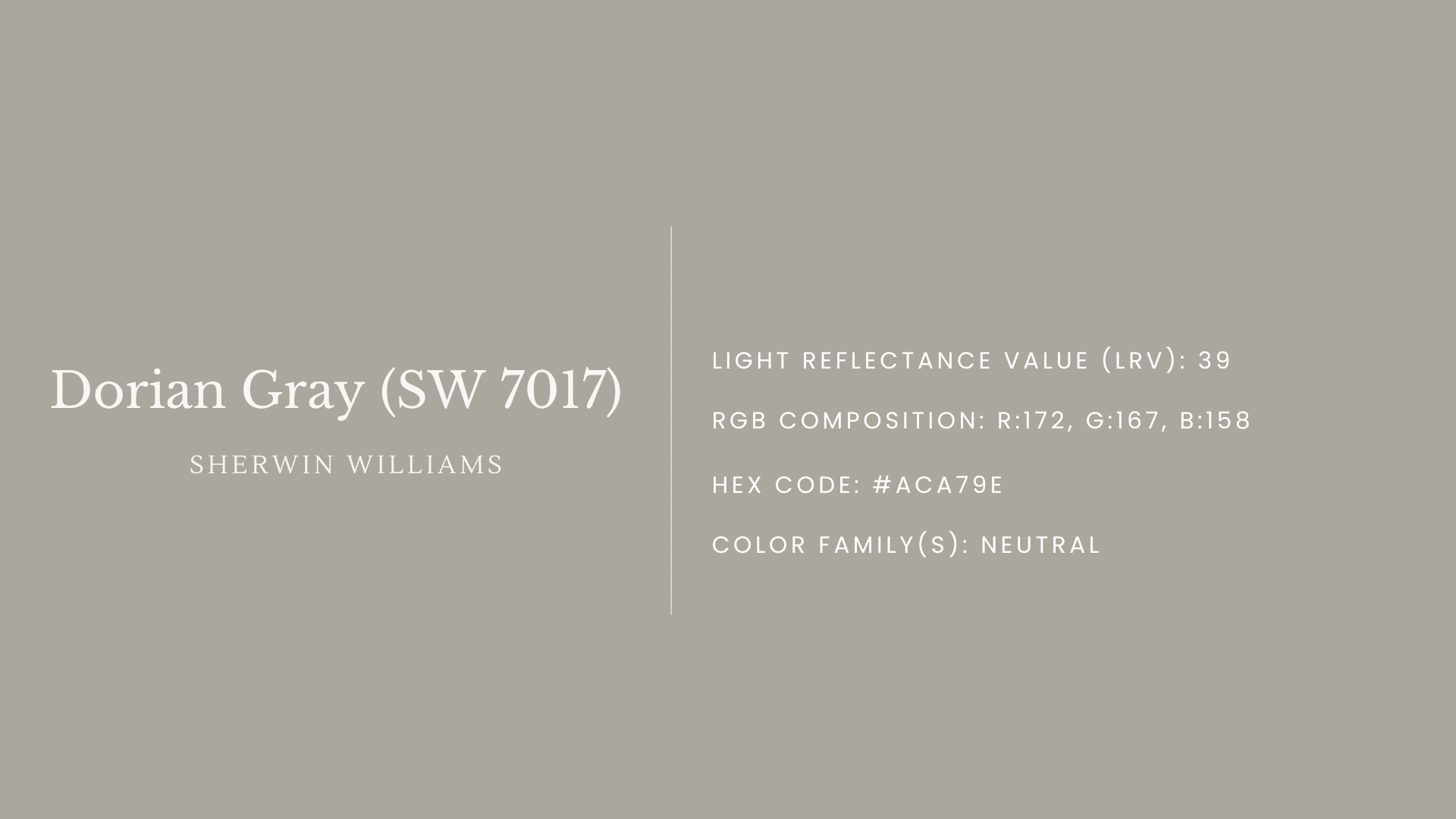
Dorian Gray (SW 7017) Color Characteristics
Understanding the specific traits of Dorian Gray helps you see why it works so well in different homes and settings.
Basic Specifications
Sherwin Williams Dorian Gray SW 7017 belongs to the warm gray color family and appears in Sherwin Williams’ main collection.
This placement makes it a dependable option for many design plans.
Technical Details
Here’s what makes Dorian Gray stand out:
- Light Reflectance Value (LRV): 39 – placing it in the medium range
- RGB composition: R:172, G:167, B:158
- Primary undertones: Shows soft taupe notes with slight green hints that become more noticeable in certain lighting
- Hex Code: #ACA79E
Color Temperature And Character
Dorian Gray brings a gentle, warm feeling to spaces while maintaining balance through its subtle depth.
This well-balanced shade:
- Creates comfortable, inviting spaces in both casual and formal settings
- Shows consistent color quality across different times of day
- Works well through all seasons, bringing a neutral backdrop in warmer months and creating cozy comfort in cooler seasons
- Functions as a foundation color that supports other design elements without competing for attention
Where To Use Dorian Gray?
The true value of Dorian Gray shows in how well it fits in different spaces across your home.
Its balanced blend of warm gray makes it suitable for both interior and exterior applications.
Interior Applications
Inside your home, Dorian Gray creates spaces that feel both modern and timeless, working across many different room types and applications.
1. Living Rooms
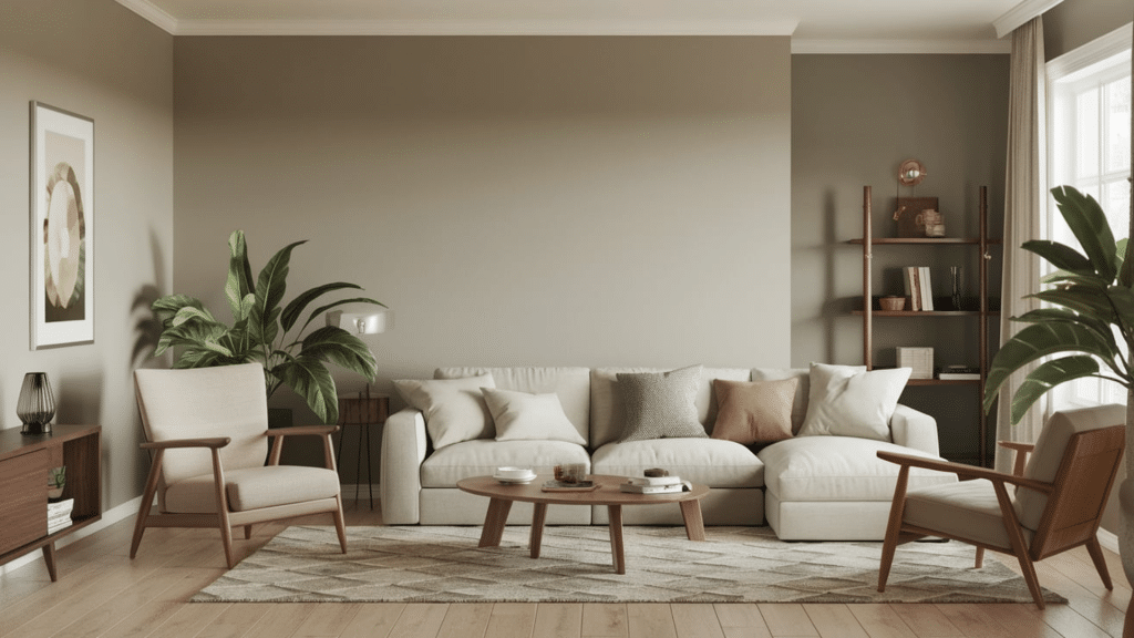
Dorian Gray creates a welcoming mood in living spaces. It works well as:
- A complete wall color paired with white trim
- A single wall feature behind main furniture
- A subtle background that helps artwork and wooden furniture stand out
2. Bedrooms
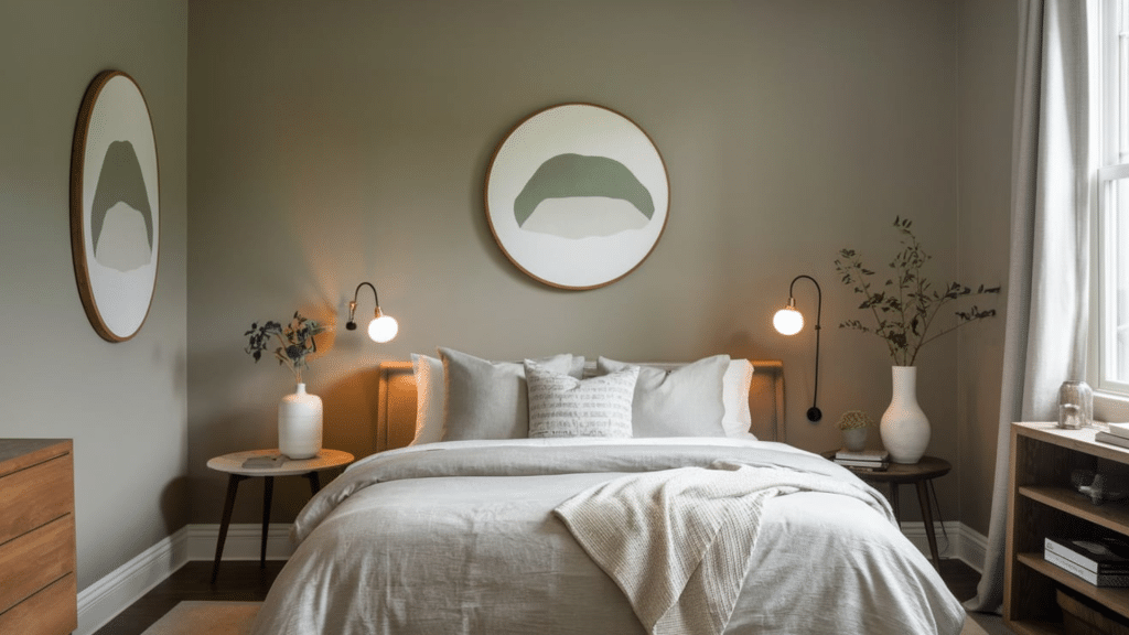
This color forms restful spaces perfect for bedrooms by:
- Making main bedrooms feel cozy and relaxing
- Adding a sophisticated feel to guest rooms
- Working well for various style preferences in teen rooms
3. Kitchen Cabinets
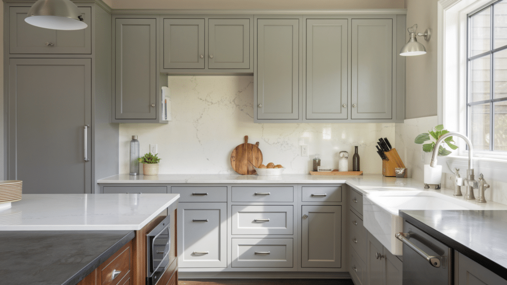
In kitchens, Dorian Gray shows its adaptability:
- Looks good with both light and dark countertops
- Creates visual interest without being too bold
- Keeps its true color in both natural and artificial light
- Pairs nicely with different hardware finishes, especially matte black and brushed nickel
4. Bathrooms
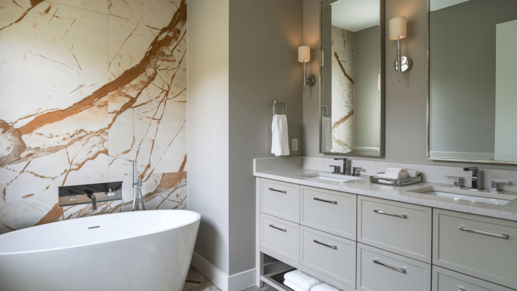
In bathrooms, Dorian Gray offers:
- A calming feel when used on all walls
- A subtle statement on vanity cabinets
- Beautiful coordination with marble and tile work
5. Home Office
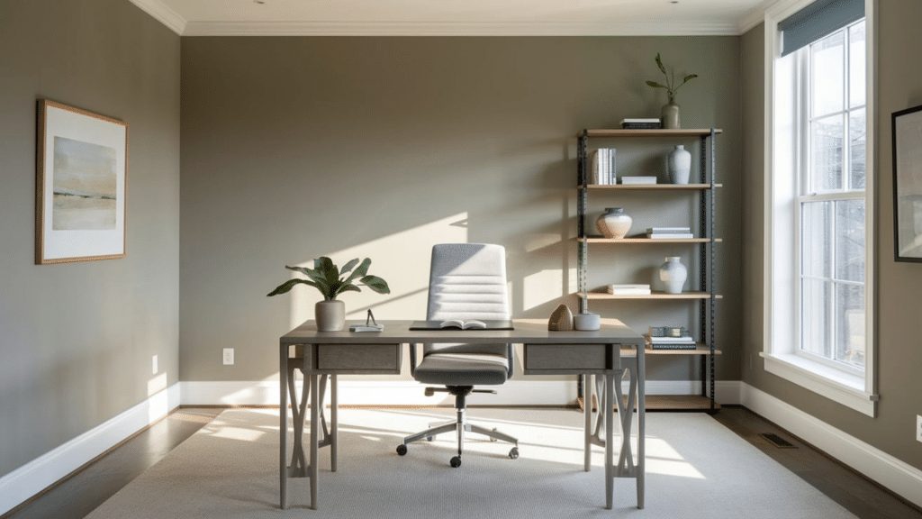
The color helps create focused work areas by:
- Reducing eye strain during screen time
- Setting a professional background for video calls
- Working well with both wooden desks and metal accessories
Exterior Applications
On your home’s exterior, Dorian Gray provides a neutral yet distinctive option that complements various architectural styles and materials.
1. Main Exterior Walls
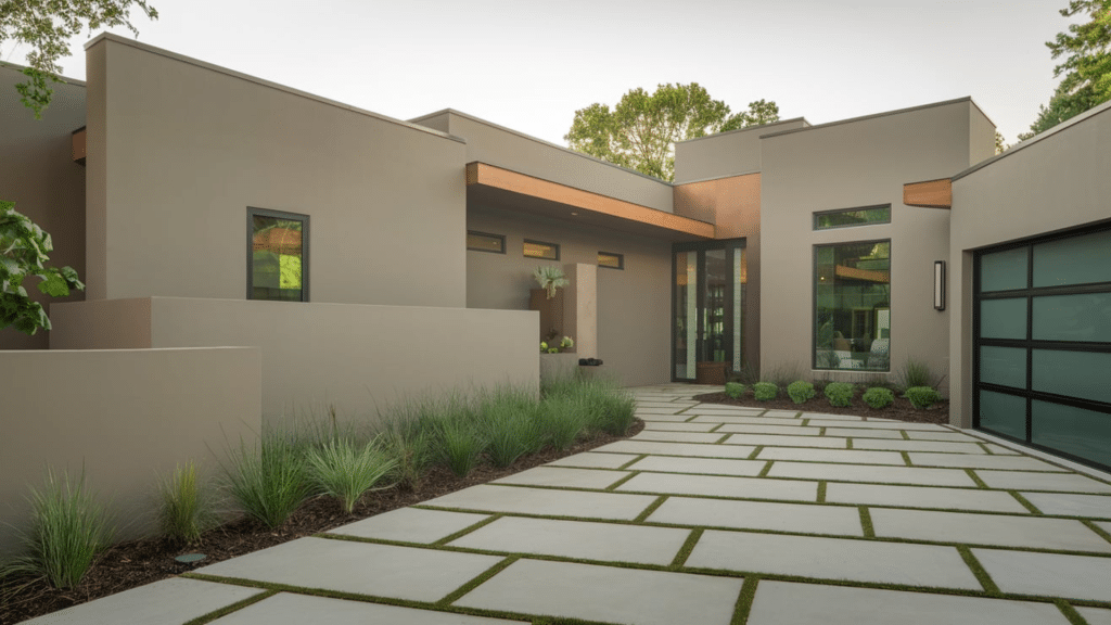
On home exteriors, Dorian Gray:
- Makes homes look inviting and well-maintained
- Shows different aspects of its color as sunlight changes
- Fits well with both older and newer architectural styles
2. Entry Doors And Window Shutters
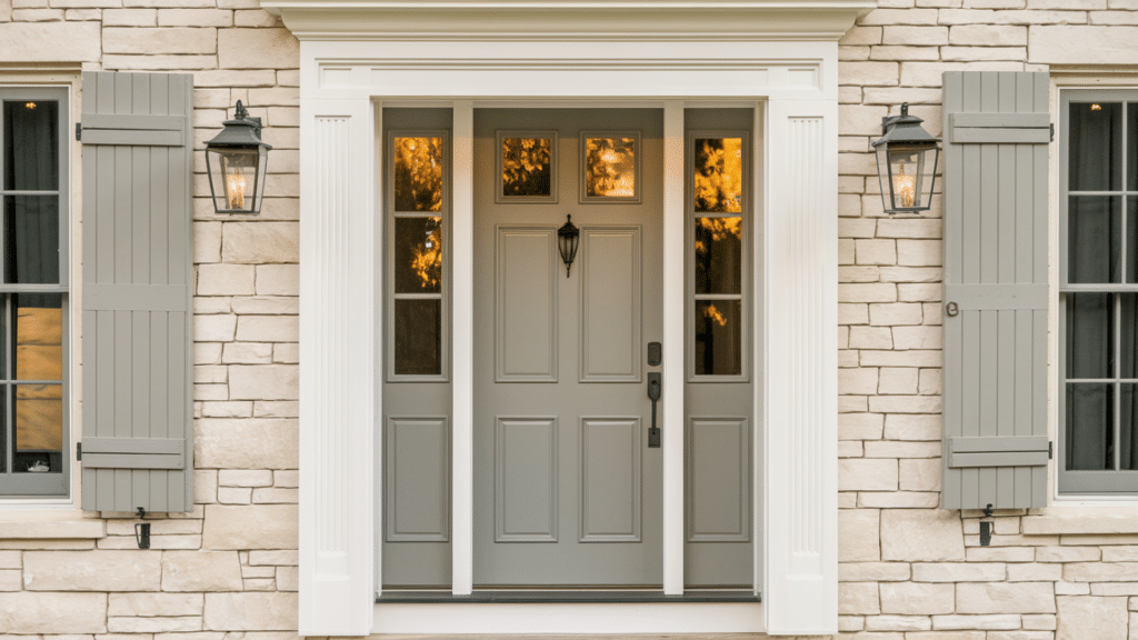
As a detail color:
- Creates welcoming entryways
- Provides just enough contrast from main walls
- Works nicely with brick, stone, and siding
- Offers a fresh alternative to common black or navy options
Coordinating Colors – Main Color Matches for Dorian Gray
The right color pairings help Dorian Gray shine in any space while creating a balanced, thoughtful look throughout your home.
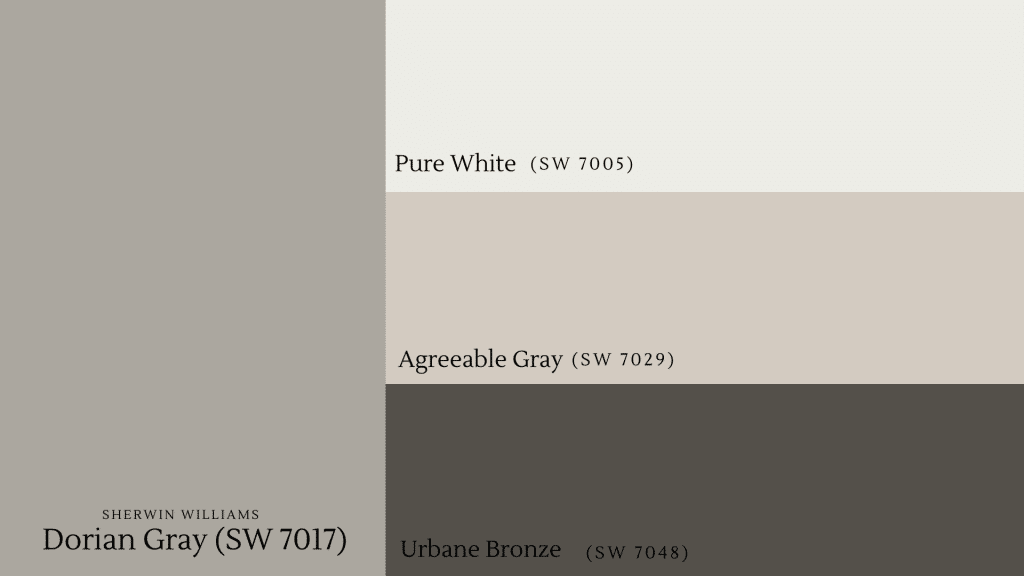
| Color | Description | Best Uses |
|---|---|---|
| Pure White (SW 7005) | Offers a clean, bright complement | Perfect for trim and ceilings, helps balance Dorian Gray’s warm notes, works well in adjoining rooms |
| Agreeable Gray (SW 7029) | Provides a soft, lighter partner | Excellent for creating flow between rooms, maintains the calm feel with subtle contrast |
| Urbane Bronze (SW 7048) | Adds a rich, deep accent | Makes for striking door and cabinet color, creates visual interest as an accent wall, grounds the lighter Dorian Gray |
Tips For Using Dorian Gray
Lighting Considerations
- Use large sample boards (12×12 inches minimum) to test the color
- Watch the color for a full day to see all light changes
- Add more light sources in rooms with limited sunlight
- Place lights at different heights for balanced color display
Room Direction Effects
| Room Direction | Color Appearance | Best Practices |
|---|---|---|
| North-Facing Rooms | Color appears cooler | Add warm wood tones, Use warm white bulbs in light fixtures |
| South-Facing Rooms | Shows truest color version | Maintains consistent look throughout day, Works well with natural materials |
| East-Facing Rooms | Looks warmer in morning light | Shows cooler tones after noon, Consider room use timing |
| West-Facing Rooms | Appears cooler until afternoon | Warms up in evening light, Perfect for afternoon-use rooms |
Best Ways To Use
Dorian Gray shows its versatility through numerous applications in both interior and exterior settings, each bringing out different aspects of this adaptable color.
As a full room color in bright spaces, it creates a cohesive and balanced environment that feels grounding and comfortable.
It especially shines on kitchen and bathroom cabinets, adding character without standing out too much.
It’s also ideal for built-ins and trim that benefit from its subtle depth.
On exteriors like doors and shutters, Dorian Gray adds interest without being too attention-grabbing.
I’ll create the next section on budget considerations for using Sherwin Williams Dorian Gray paint, following the structure from your reference document.
Tips For Budgeting When Using Sherwin Williams Dorian Gray
Smart planning helps you get the most value when using this versatile gray in your home.
Paint Cost Overview
Here’s a quick cost breakdown:
- Standard SW Paint Lines: $45-55 per gallon
- Mid-Grade Lines: $55-65 per gallon
- Premium Lines: $70-85 per gallon
1. Start With Samples: Start your project wisely by testing small amounts of Dorian Gray in your space.
This small upfront cost of $5-8 per sample saves money by confirming the color works in your lighting and with existing decor.
Testing prevents the costly mistake of repainting an entire room when the color doesn’t meet expectations.
2. Buy Smart: Time your paint purchase with store sales to maximize savings, as Sherwin Williams often offers substantial discounts of 30-40% during special events.
For bigger projects, consider 5-gallon containers which typically cost less per gallon than individual purchases, plus you ensure color consistency across all walls.
3. Save On Application: Taking on the painting project yourself can cut costs significantly, though it requires learning proper techniques and investing in quality tools.
Good brushes and rollers, while more expensive initially, help achieve better coverage with less paint and last through multiple projects when properly maintained.
4. Plan Ahead: Careful planning prevents waste and unexpected costs during your painting project.
Calculate your needs based on room measurements, including extra for touch-ups, and purchase all paint at once to ensure color matching.
This method prevents running short mid-project or having excess paint that might go unused.
5. Choose Paint Grade Wisely: Match paint quality to each room’s specific needs to optimize your budget.
High-traffic areas like kitchens and hallways benefit from premium grades that resist wear, while spaces like guest rooms work well with standard grades.
This targeted approach ensures durability where needed while saving money in less demanding areas.
Conclusion
Dorian Gray by Sherwin Williams delivers a balanced warm gray that creates inviting home spaces.
This versatile color works in both small applications and entire rooms.
The shade pairs perfectly with Pure White, Agreeable Gray, and Urbane Bronze for cohesive designs.
Its subtle character changes with lighting, adding natural interest throughout the day.
Remember to test samples in your actual space and plan your budget carefully.
With proper preparation, Dorian Gray creates welcoming spaces that stand the test of time.
What will you try with Dorian Gray next? Start small to see its transformative effect!